Samsung One UI 5 review: The perfect software update
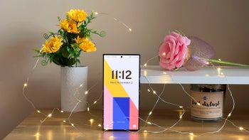
The trees are already shedding their autumn gowns, which means we're certainly nearing the end of the year, and that's a happy time for most Android users. It's when the latest major Android updates start rolling out for their Android devices, and the suspense of waiting for the anticipated software update is definitely an experience of its own.
Samsung fans have had fewer and fewer reasons to wait too long in recent years, and 2022 is by no means any different. That's good—it took Samsung just two months and some change to supply its flagship Galaxy S22-series with the newest Android 13 and One UI 5 user interface. Great job, Samsung!
And yes, that's right, we really did call One UI 5 the perfect software update, as it embodies everything that makes one of those a memorable enhancement for your phone.
What's so special about One UI 5? Well, as its name implies, its the fifth iteration of the modern user interface that now graces Samsung's phones. While it's arguably not a groundbreaking update and only introduces just a number of improvements over One UI 4, it's a vital software update for every Samsung user that's rocking an eligible device.
But arguably the most important new feature that One UI 5 brings to the mix are the major performance optimizations that have come along. Indeed, using a device running One UI 5 alongside the same one with the older version of Samsung's software feels like a day and a night difference as far as overall smoothness goes. For that alone, One UI 5 is a big W for the South Korea-based phone giant and its consumers as well.
But what else is new with One UI 5? Let's delve in deeper and unwrap Samsung's new software pride and glory.
One UI 5: Customization
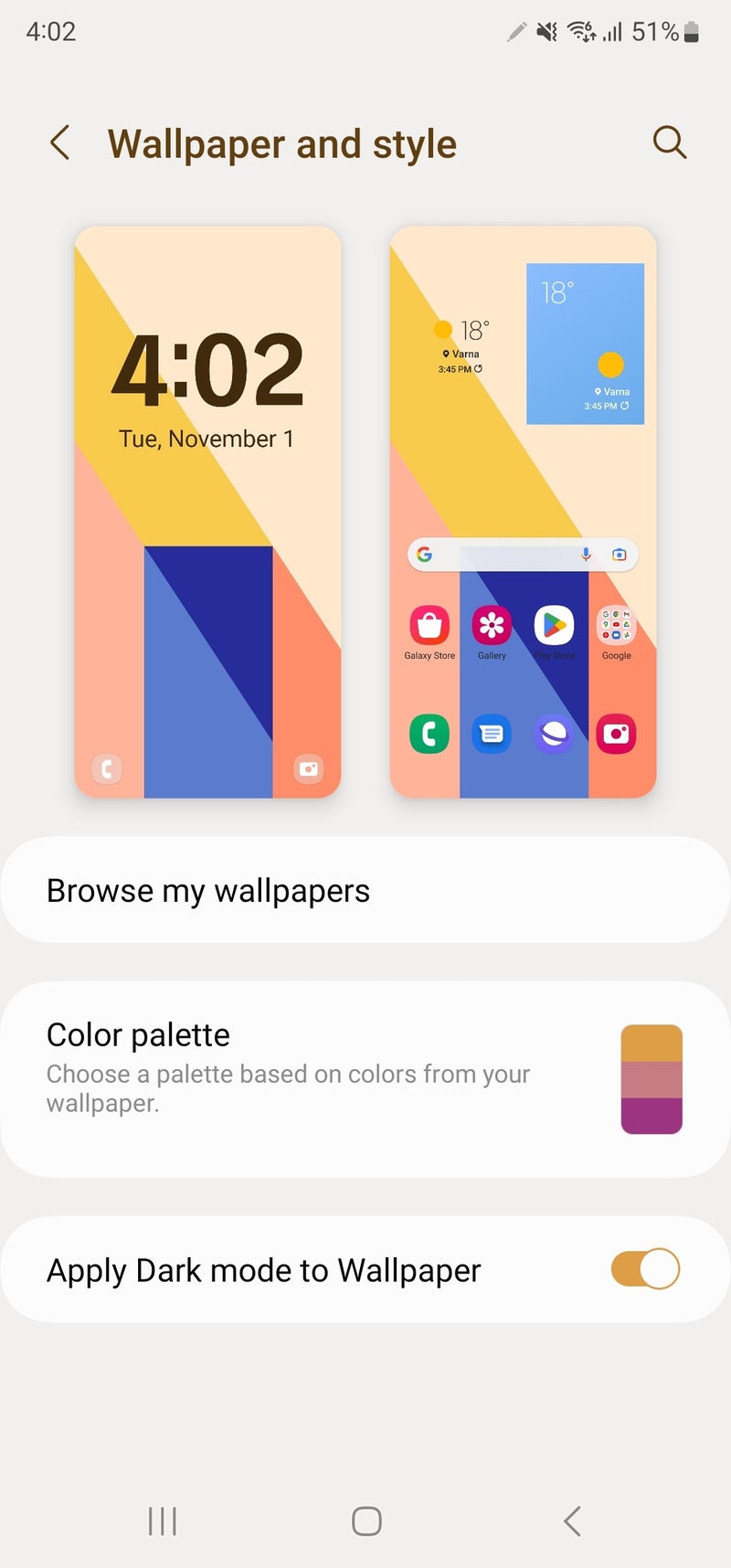
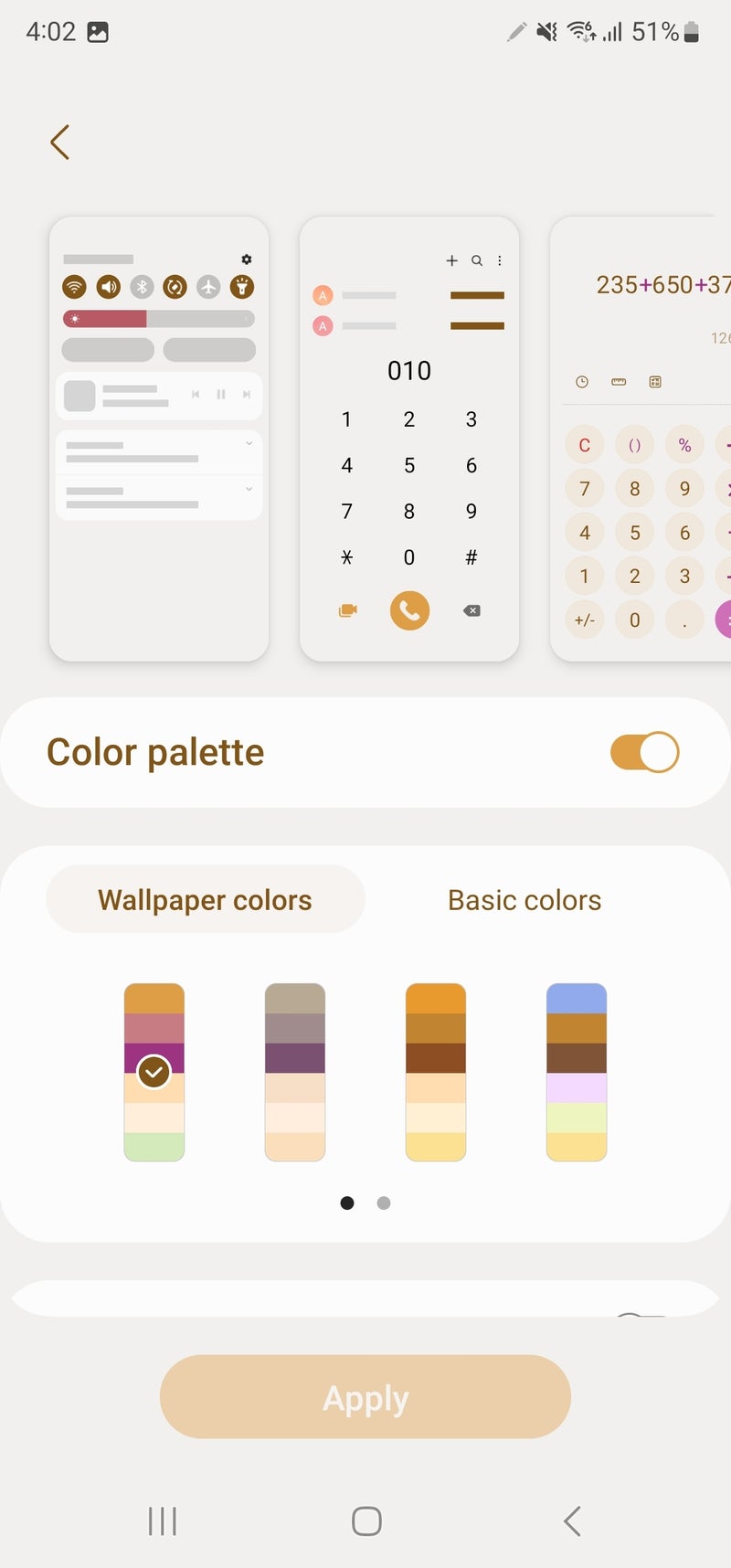
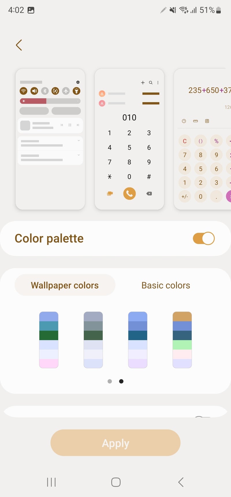
Color palette personalization
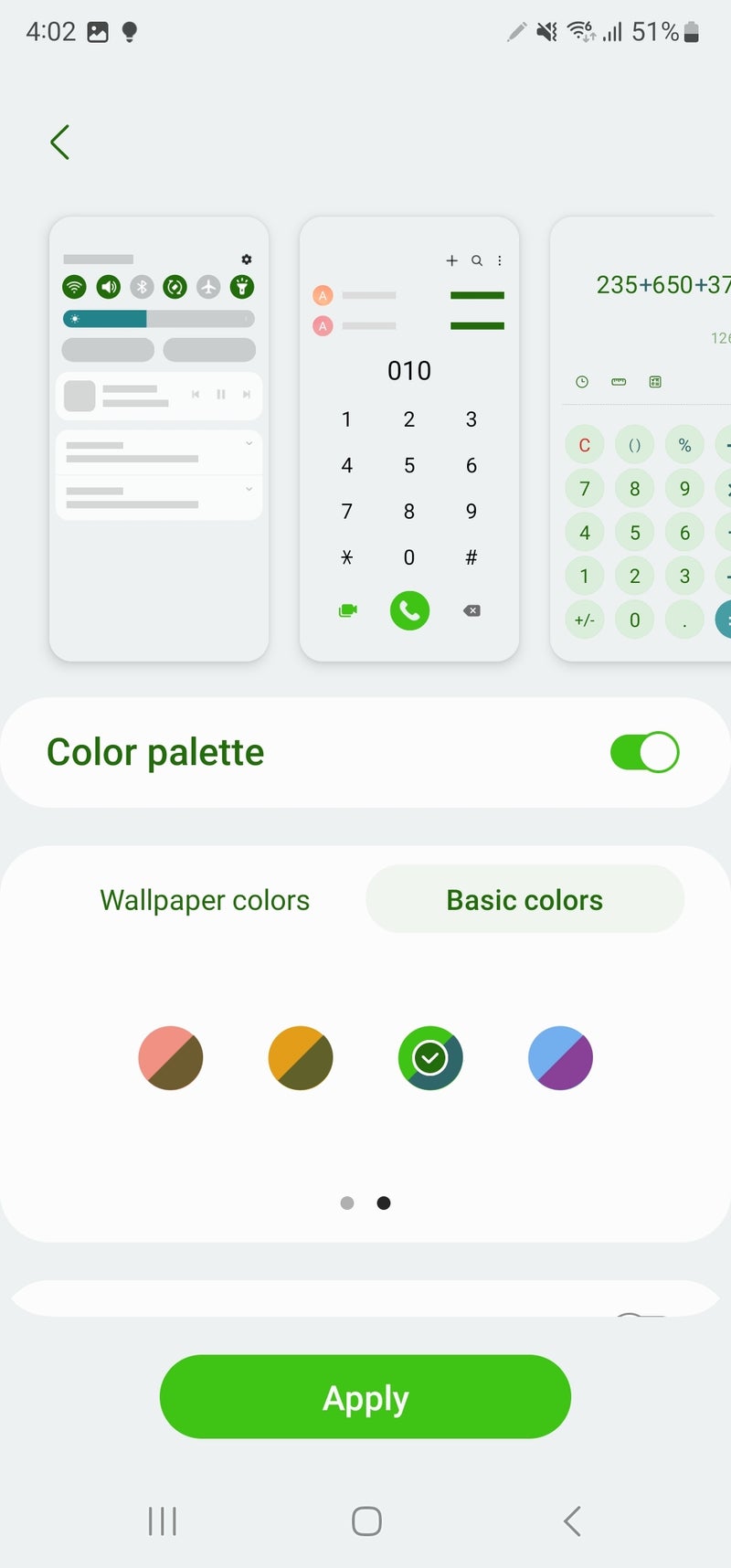
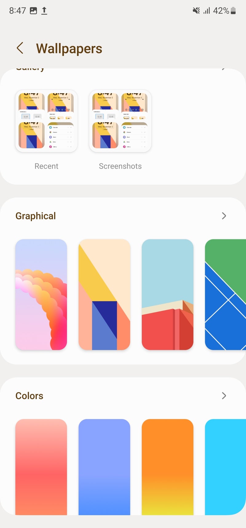
Android 13 expanded on the color palette interface customization that Android 12 introduced by greatly increasing the possible color combinations you can use to paint your interface. One UI 5, being fully based on Android 13, is coming with the expanded functionality, and now can feature up to sixteen different color palettes derived from your wallpaper for a seamless and coherent interface that helps your wallpaper of choice fit quite well with the adjacent elements. And if you're not a fan of the colors that the system chose for you, you can rely on a set of basic color palettes that are new on Android 13/One UI 5. Cool beans!
Lock screen customization
Technically, Android has always allowed for lock screen customization, but this functionality was mostly relegated to phone manufacturers to decide how to implement any lock screen customization. Some did better job than others, and some didn't even allow anything beyond basic lock screen message customization. Yawn!
It was actually Apple's first iOS 16 beta that urged Google, Android manufacturers, and users alike to pay more attention to lock screen customization on Android. And all of that was thanks to Cupertino's rather surprising expansion of the iPhone's lock screen customization, which was previously non-existent. Of course, Samsung die-hards will be quick to point out that Samsung's own Good Lock module has been around for years, allowing for pretty deep lock screen personalization of Samsung home screens, but the Good Lock app was a niche solution that is available in just a few regions.
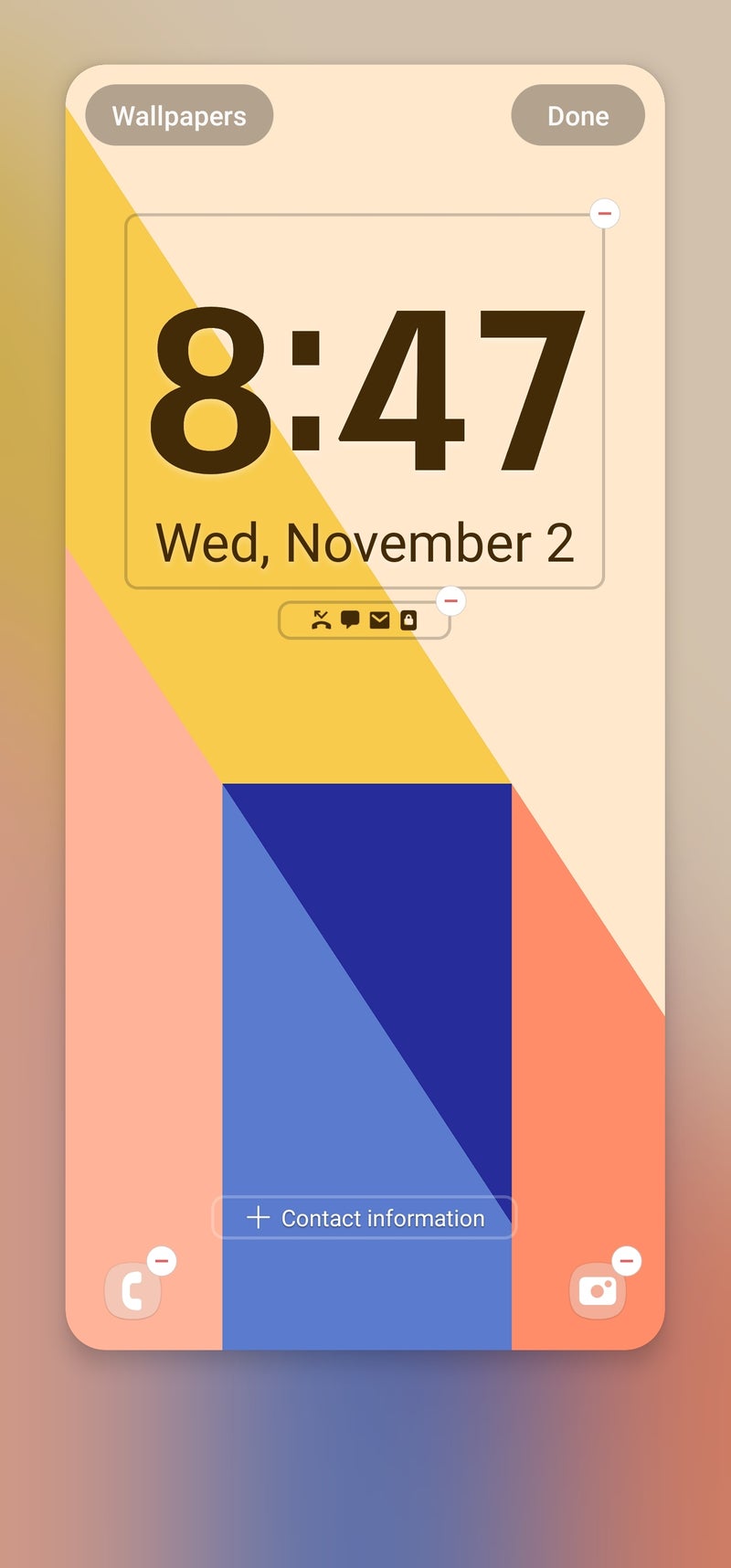
Well, a couple of months later and we have One UI 5, which incorporates some rather neat lock screen customization features, and those ship by default with the latest software update, so you don't need to tinker with yet another first-party app. With One UI 5, you are presented with a brand new lock screen customization experience. You can personalize your lock screen either from the main settings app on your phone or by long-pressing your lock screen, similar to iOS 16.
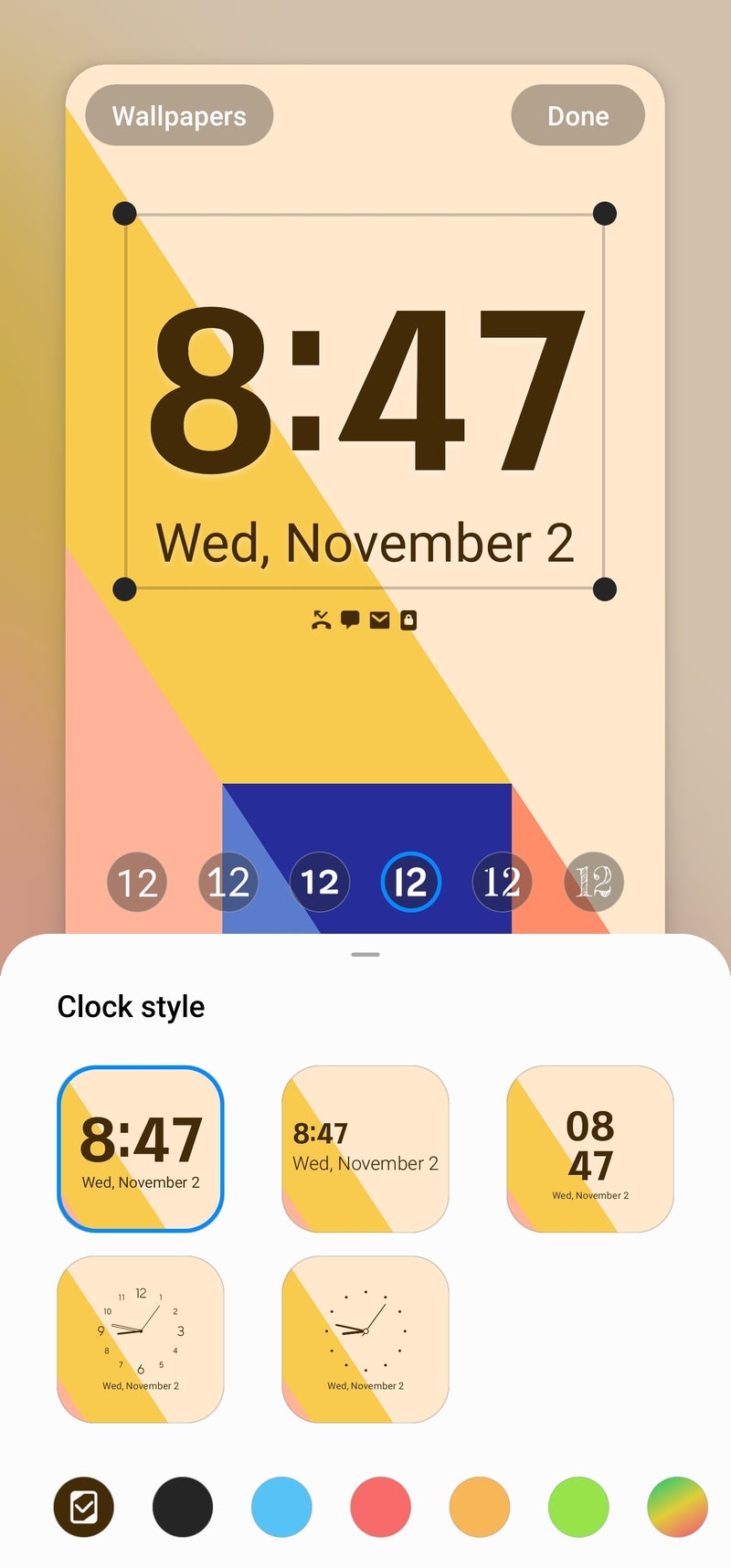
And just like iOS 16, One UI 5 has a number of different clock faces available, with six fonts to choose from and a very large selection of color and color combinations to choose from. The cool trick here is that you can alter the positioning of the clock, as well as increase or decrease its overall size, which unlocks even more customization possibilities.
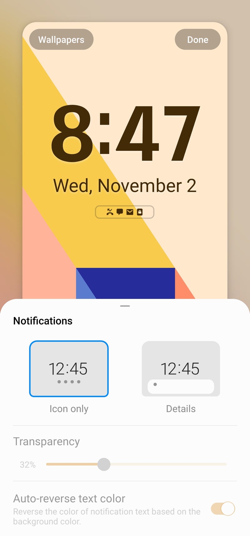
Surely, the One UI 5 lock screen also includes a host of widgets, but their numbers are limited to a few stock apps and essential functions, not to mention that to these are hidden and only show up after you tap on the lock screen clock, so their overall utility isn't that impactful. Finally, you can choose whether incoming notifications from apps are shown as full previews or merely icons (though tapping the latter expands the notification view). We've had this feature in One UI before, it's just way more useful now, and at the end of the day that's what matters the most.
There's some room for improvement in the lock screen and wallpaper customization experience. Samsung could have taken a page out of Apple's book and allowed for saving your favorite lock screen setups and wallpaper combinations for fast and easy switching, as well as allowing you to link those with One UI's Modes (which are similar to iOS' Focus states).
Widget stacks
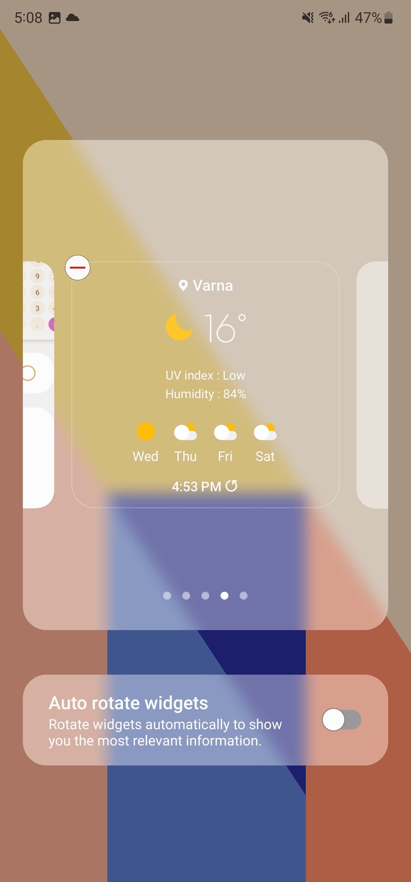
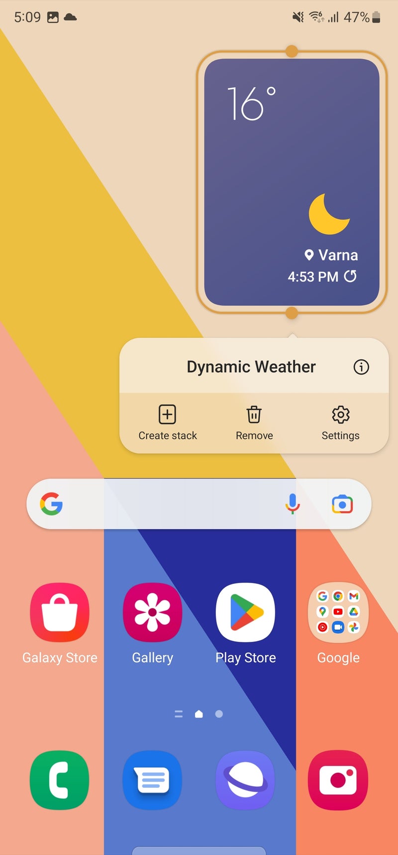
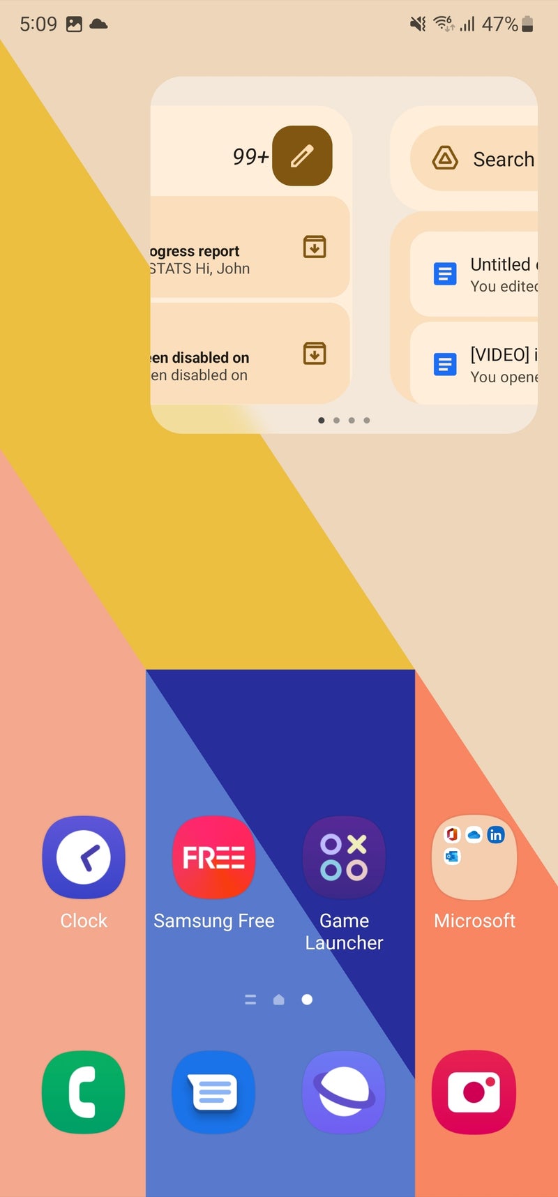
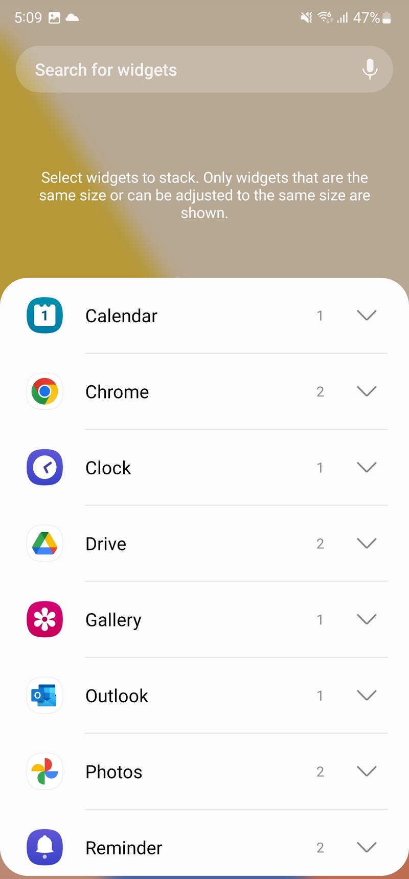
If you are a fan of widgets, they probably take up a good portion of your Home Screen. That is probably why Samsung introduced Smart Widgets with One UI 4.1. With this feature, you can stack up to seven widgets in one place and switch between them by swiping left or right, thus having a more organized home screen and more free space for more icons. And in One UI 5, Samsung has tweaked the way you stack and arrange widgets, making it easier for you to personalize your home screen.
Now, when you long-press a widget with a minimum size of 2 x 1, you will see a new button named "Create stack," which lets you choose among the available widgets on your phone and create a decent-looking stack. You can intuitively edit your stack by long-pressing it and flicking away the widgets you no longer desire.
To be honest, Samsung's stacked widgets look a lot like the ones Apple introduced with iOS 14. The difference is that in One UI, you swipe horizontally, whereas in iOS, you swipe vertically. But hey, apples and oranges, ultimately it's the ordinary users that benefit from such "borrowed" functionalities.
One UI 5: The new features
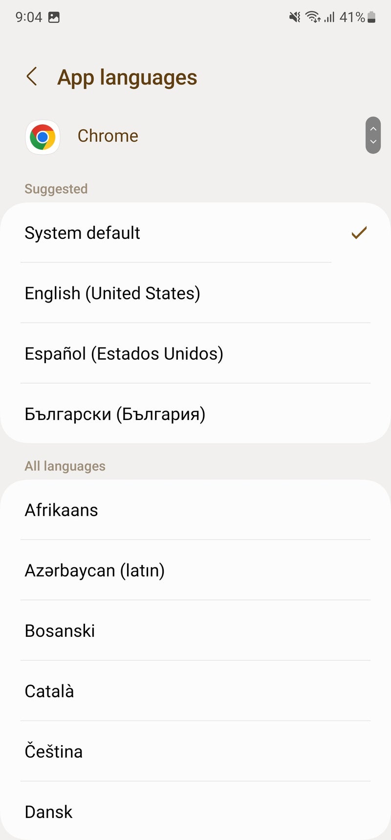
Choose a separate language for each app
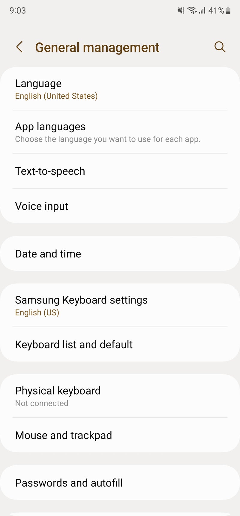
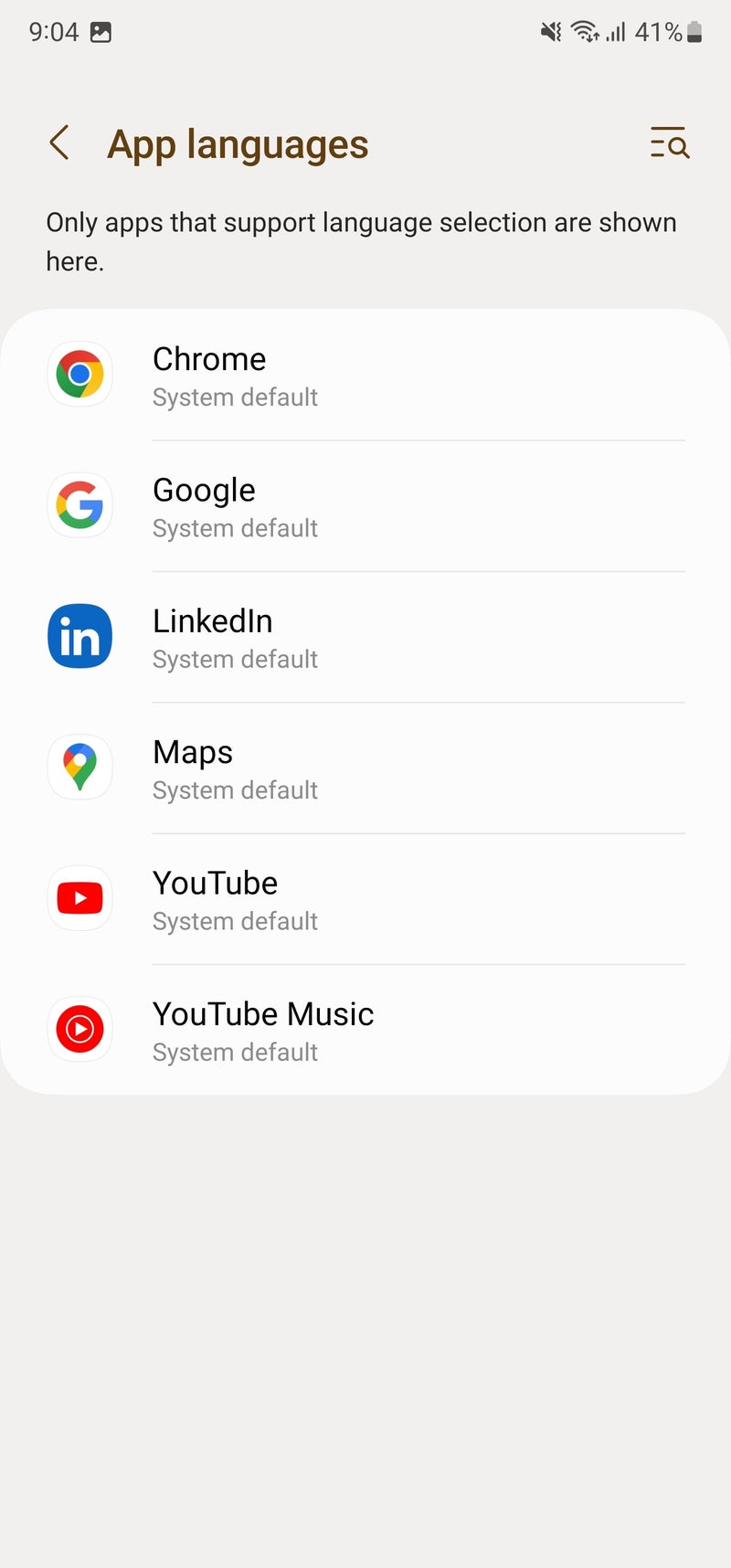
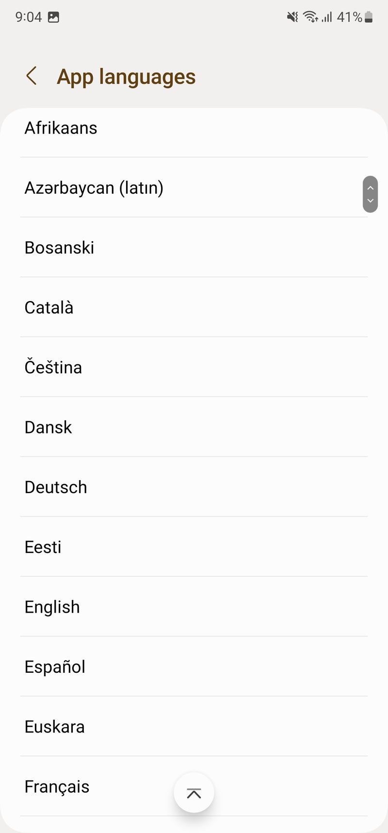
With Android 13, Google introduced a new feature that allows you to select a language for each app without changing the system's language. In One UI 5, this feature is called App languages and is located in the General management tab in the Settings app. When you tap on App languages, it will list all the supported apps.
If the app was running in the background while choosing the new language, just restart it for the changes to take effect.
Extract text from an image
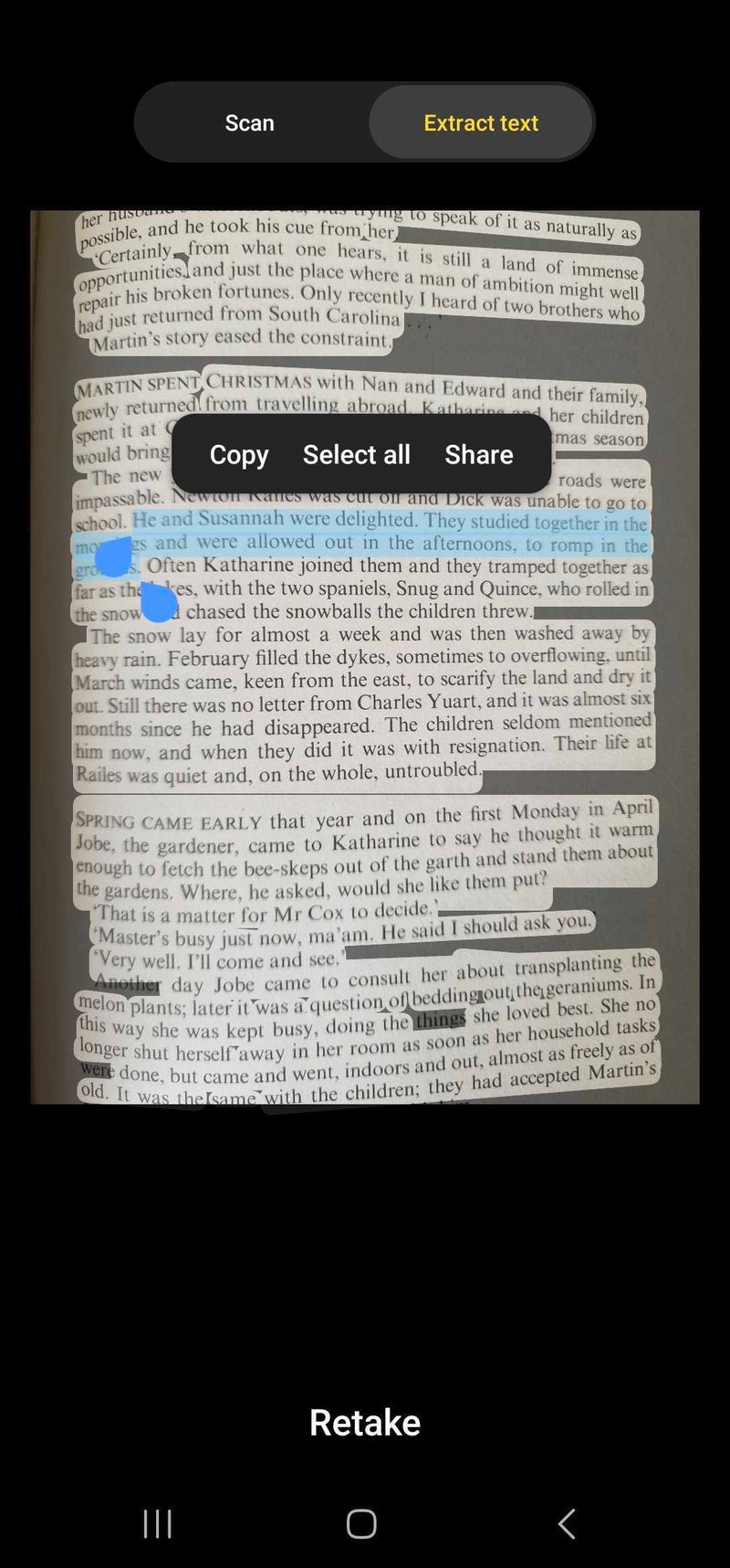
On One UI 4, if you need to copy text from a photo, you can use the built-in text extract feature in the Gallery app. You just take a picture with the Camera app and open it in the Gallery application, and then use the Bixby Vision icon.
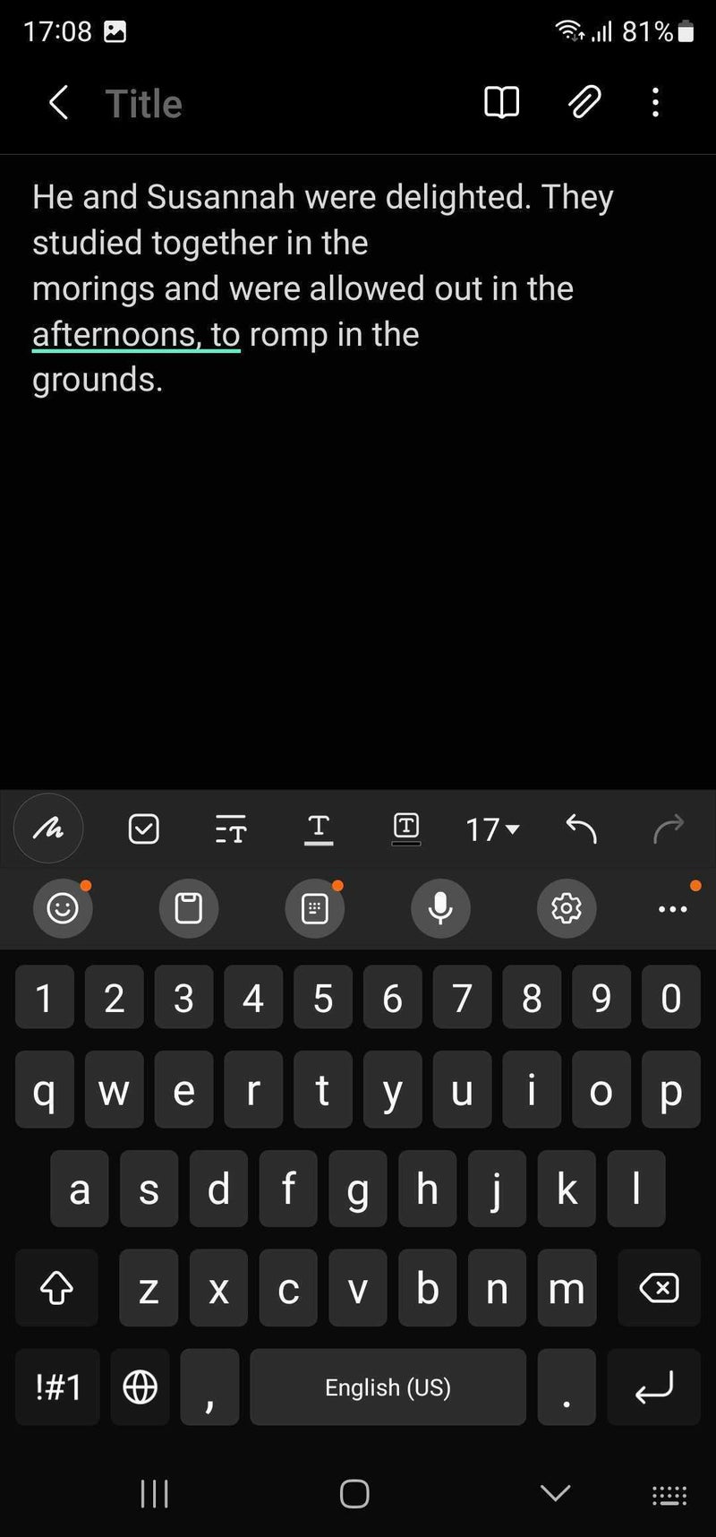
In One UI 5, however, this process is extremely simplified. Every time the Camera app detects written text, it will display a new yellow icon with a "T" on it, which, when pressed, will take a picture and let you copy the text directly from the viewfinder.
New help icon in Pro mode
Although the camera app hasn't scored some terribly exciting features, it's now more intuitive and helpful. The dedicated Pro mode of the camera now offers useful hints for you to while adjusting the different settings, which should come in useful to both camera geeks and photography neophytes alike. Pro mode is more advanced than your usual point-and-shoot camera experience, so it definitely is a welcome addition. This is why One UI 5 also comes with a new help icon for Pro mode, which explains what each option does and how it contributes to the perfect shot.
Create a link to share files with everyone using Quick Share
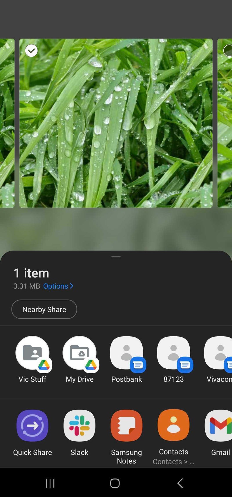
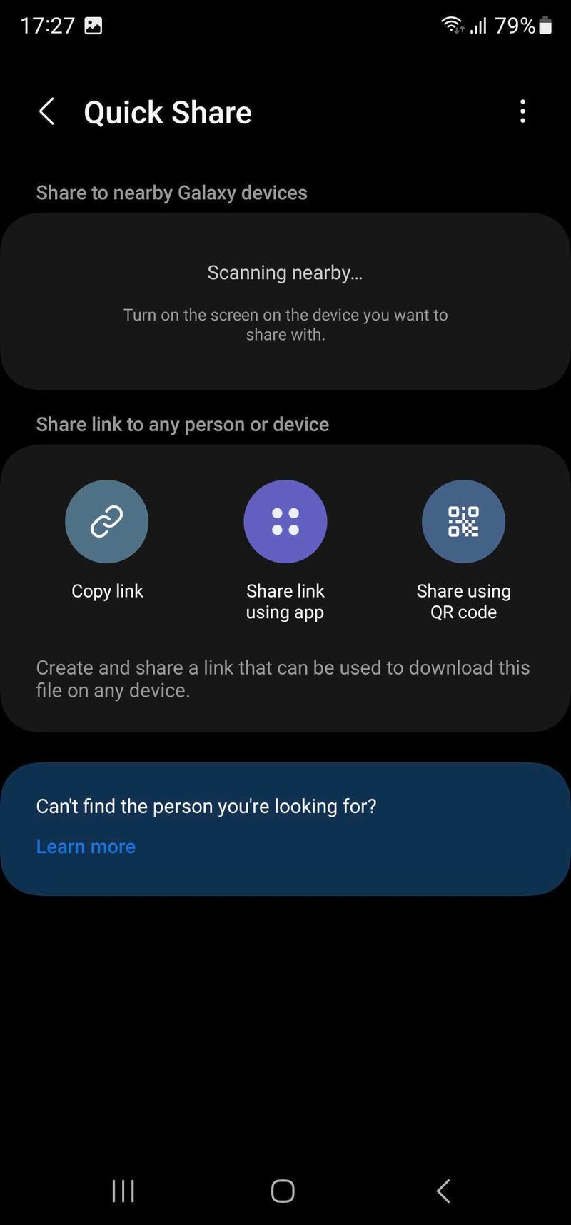
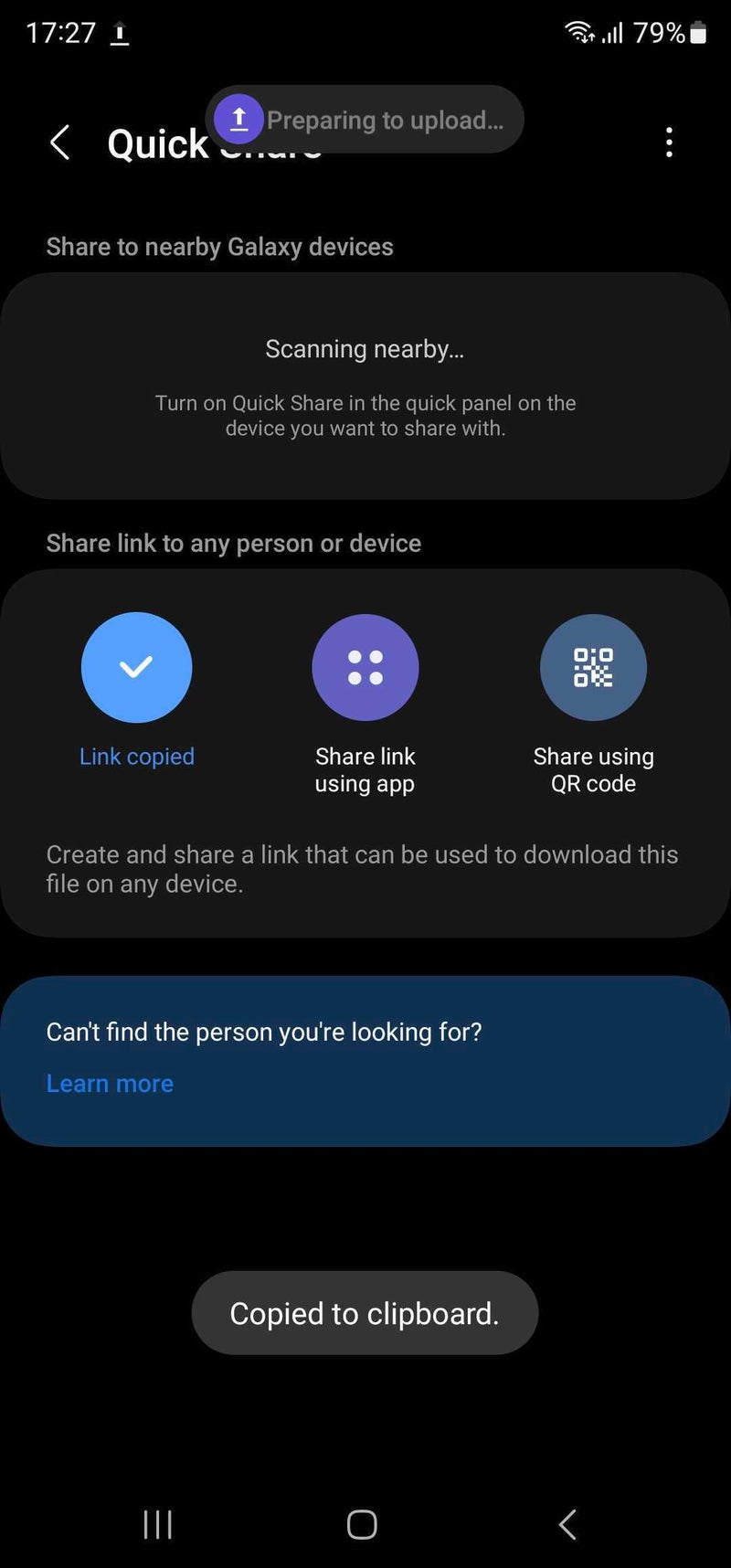
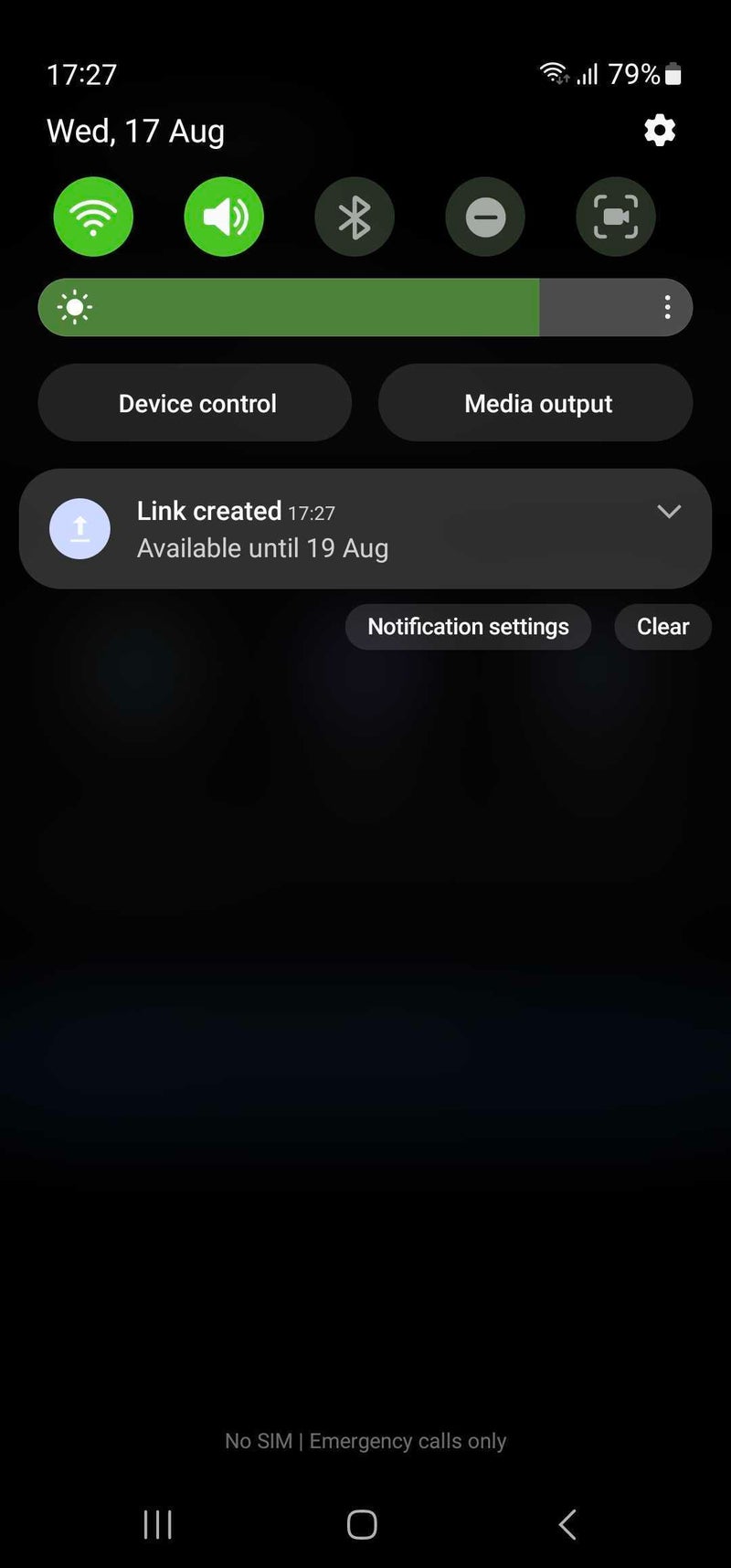
Android's Quick Share has positioned itself as an alternative to AirDrop, and Samsung has taken some creative liberties with the core Android feature, arguably making it more useful than before. With One UI 5, attempting to share files with Quick Share now lets you make use of a new "Copy Link" functionality, which uploads the files you want to share to the Samsung cloud. A link is generated and immediately copied to your clipboard, which lets you easily share it via a message in your favorite texting app.
When the person in question receives your link and taps on it, they will be redirected to a page from which they can download your shared files. This method is also extremely useful if you want to transfer files from your phone to your computer. However, you should know that the generated link and the uploaded files will be available only for two days, and there is also a daily upload limit of 5GB, which should be good enough for most file types you need to share.
New security dashboard
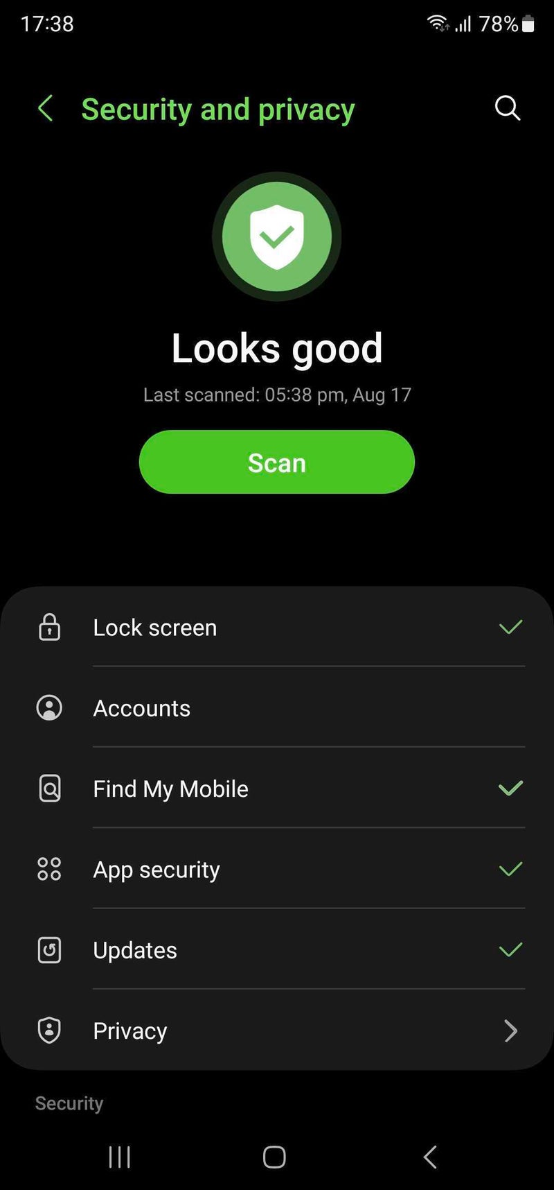
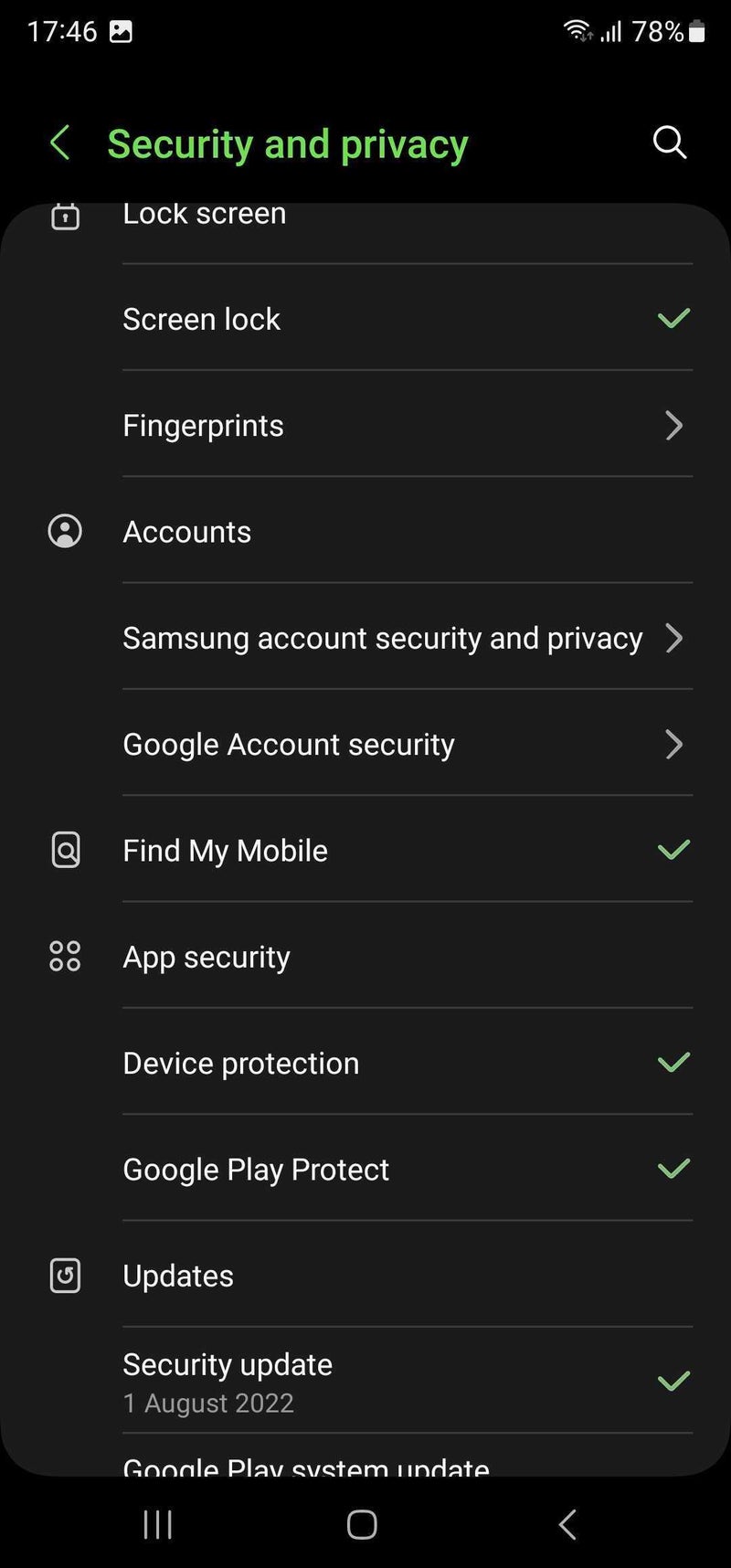
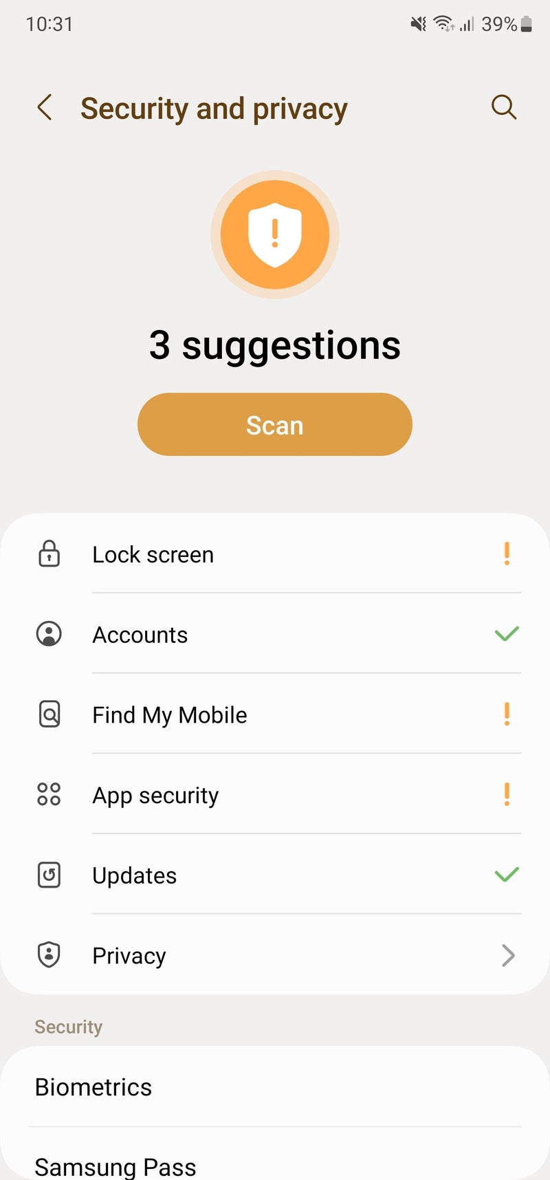
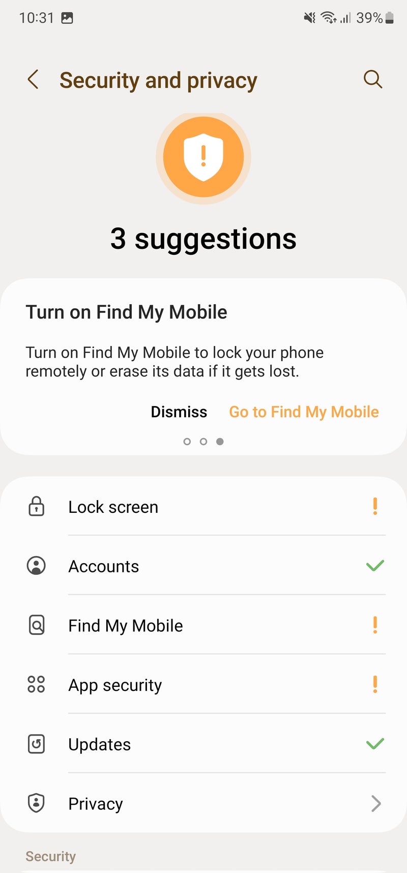
With Android 13, Google completely changed the look of the security and privacy settings. There is now a new security dashboard with a scanning feature, which should detect if there are some security issues with your phone, like outdated updates, disabled Device protection, no screen lock, disabled Find My Mobile, and more. Also, the dashboard links to most security and privacy menus, so you can jump between them easily. On One UI 5, the dashboard works like a charm, and we may say that with Samsung's skin on top, it looks quite intuitive and useful.
Better multitasking
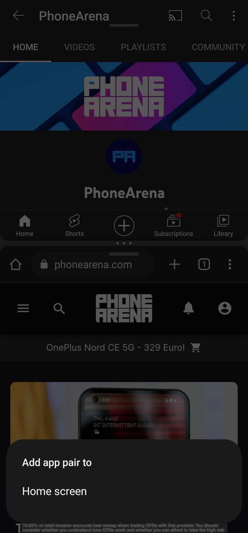
If you often need to use apps in split screen, you probably know that One UI 4 lets you save split screen layouts on the Edge panel. When you open two apps in split-screen mode and tap on the divider — the three dots between the two windows — you see an icon with a little plus sign and a side panel on it. When tapped, the it saves the current split screen layout on your Edge panel.
In One UI 5, however, you can save your desired split screen layouts on your home screen, in addition to the Edge panel. And instead of an icon with a plus and a side panel, you just have a new star icon. For all intents and purposes, it works in the same manner.
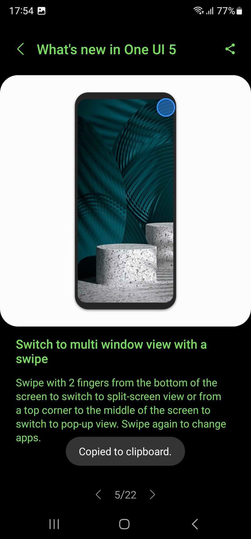
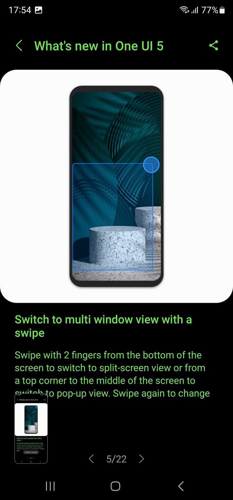
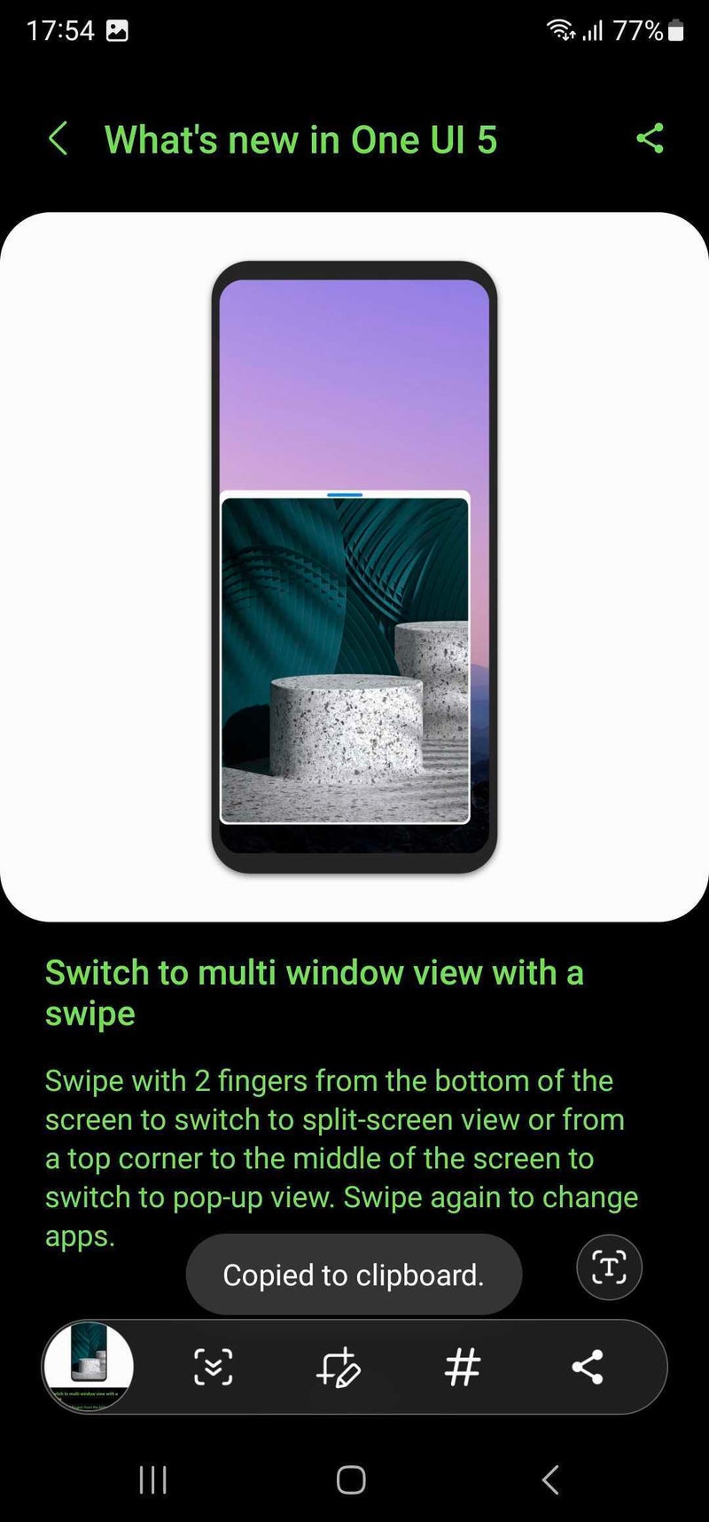
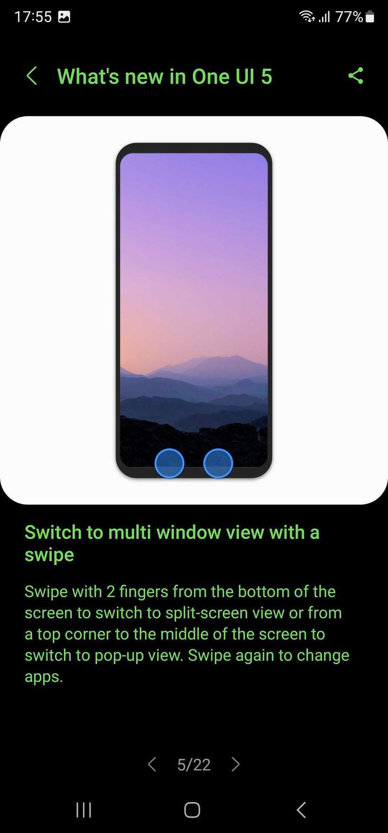
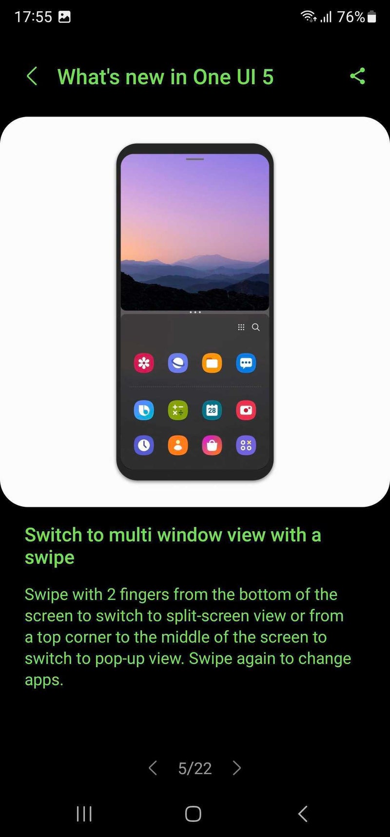
Furthermore, One UI 5 also lets you enter into multi-window mode with just a swipe. All you need to do is enable the feature from the "Labs" option, located in the Advanced features, open an app that supports split screen, and swipe up with two fingers from the bottom to the top.
There is also a new gesture that allows you to switch an app to a pop-up view. Just open an app, and from any top corner, swipe to the middle. A brilliant feature, which used to be on Samsung phones before and is now making a comeback.
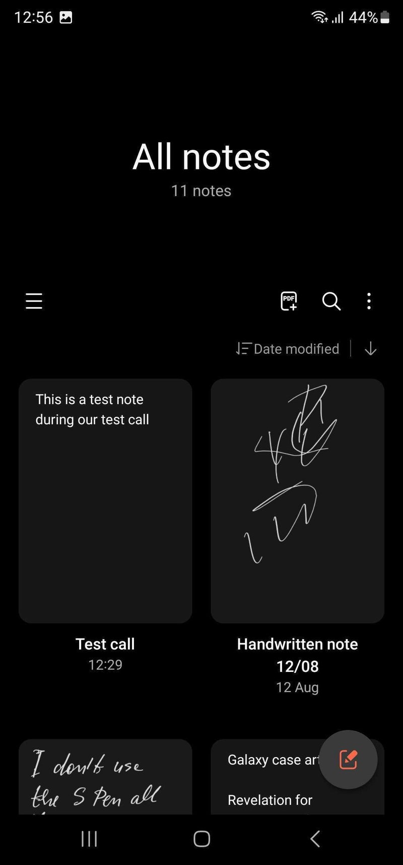
Take notes during calls
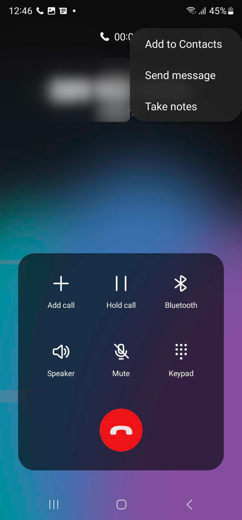
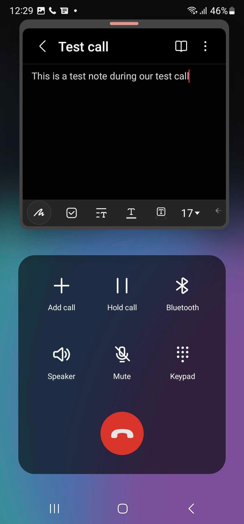
How many times have you had to write something down during a call? When you are in such a situation, you are probably searching for a pen, but it always takes ages to find one. Or, if you use an app for taking notes, you first need to minimize the call, find the app in question, open it, and then create a new note. What a hassle! But, with One UI 5, this annoyance will also be a thing of the past.
A fun fact is that many years ago, on Android 4.3, there was an option to take a note during a call on your Galaxy phone. Back then, it was called "Memo," but it worked the same way. Samsung probably saw that no one was using this feature and removed it at some point. However, it looks like the tech giant is giving it a second chance now. Let's hope that this time, more people will use this super useful feature.
Performance optimizations
One UI 5 feels faster and smoother than One UI 4, and the difference is palpable. Animations, transitions, and simply swiping down long lists and and the interface itself feels like a much more rewarding experience that is definitely welcomed. One UI 4, while an okay update in itself, was definitely not optimized as good, introducing micro stutters, animation lag, and overall a slightly disappointing UX experience. One UI 5 is what One UI 4 should have been from the get-go, and that's a fact.
Aside from being much smoother and better optimized, thus making your phone feel smoother and faster, One UI 5 is also more flexible in terms of performance options. For example, the RAM Plus feature that has been available on most Samsung phones since One UI 4.1, can now be disabled for good... which is a good thing. See, RAM Plus allocates a portion of your phone's storage to act as RAM and ultimately improve the multitasking capabilities of your device, but it has also been singled out as one of the reasons for sluggish performance in some cases.
The reason could be that storage, however fast, can hardly catch up with dedicated RAM in terms of performance, so if you're a really have user and force your phone to actively use the allocated storage as RAM, your phone will ultimately feel slower. So, yes, you're better off with RAM Plus disabled. On top of it all, aside from the potential better overall performance, you get a few GB of precious native storage back, which is a win!
To disable RAM Plus, head to Battery and device care menu in Settings, then tap on Memory, and the RAM Plus option will be at the bottom. Head inside, flick the switch off, reboot your phone, and you're good to go.
Final thoughts
Overall, One UI 5 definitely is an excellent software update despite the fact that it doesn't change that many aspects of the overall One UI experience. There are two reasons for that.
First of all, it introduces some deeper customization that greatly enriches the personalization potential of your Samsung phone. And when it comes to software update, one thing we all expect and generally anticipate are new ways to make our phones feel more like, well, our phones. One UI 5 passes this test with flying colors, and also sets the stage for further customization improvements in the future. It has also solidified its leading position in the Android scene as far as customization goes, offering one of the more intuitive and user-friendly user experiences.
The second reason for One UI 5 being an excellent software update are the optimizations under the hood which make it run oh-so-smooth. Take our anecdotal experience with a grain of salt, but there's a really big difference in perceived smoothness and performance gains.
All of this makes One UI 5 an exemplar software updates for the modern times, where we shouldn't expect revolutionary and groundbreaking changes with each and every yearly update, but gradual enhancements and improvements that make sense. With that taken into account, Samsung's One UI 5 is a winner.
Reviewed: TP1A.220624.014.S908BXXU2BVJA on Samsung Galaxy S22 Ultra SM-S908B/DS








Things that are NOT allowed: