Samsung Gear S2 vs Apple Watch: first look
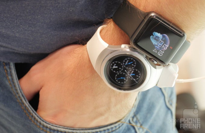
Samsung's new Gear S2 and Apple's 38mm Watch Sport
Circle versus Rectangle: a design rivalry
But as timepieces tend to be seen as fashion accessories by many, it's downright crucial for a contemporary smartwatch to exude a premium style, all the while serving its functional purposes. Apple knows this well, which is why it paid close attention to the materials used for the construction of the watch, as well as the plethora of straps that are being offered. However, Apple also thought about the practical side of things, which is why it decided to launch the Apple Watch with a rectangular display, rather than a circular one. When you have in mind that much of the content you're going to view on the Watch is organized in lists, the squarish form of the Apple Watch suddenly starts making a lot of sense. Still, could it be that when it comes to smartwatches, the circular watch face shape actually comes off as the more appropriate form-factor, seeing that they still have to live up to certain stylistic criteria? That's certainly our thought now that we have the Gear S2 in front of us. Samsung's timepiece sure looks beautifully simplistic, and undeniably modern at the same time. Of course, it'll be subjective whether a user prefers a circular or a rectangular watch, but at this point we're beginning to lean towards Samsung's vision.
As you can see in the images, both wearables' AMOLED screens are downright beautiful. Producing nice and crisp shapes and forms, their vivid and contrasty colors paint images that can make you forget you're staring at a wearable's tiny display. Both are touchscreens, so you can operate the Apple Watch and Samsung Gear S2 with your fingers, but why would you want to do that when they attempt to provide you with some funky interface tools of their own to help you enjoy content without your fingers obstructing (and smearing) your view? Anyway, both screens appear fascinating, through we'd give a slight edge to the graphics the Gear S2 delivers, probably because of the more advanced and sophisticated nature of Samsung's Tizen user interface, along with the stylish circular shape.
Rotating bezels and Digital crowns: the future against the past?
The Apple Watch is now a familiar thing. It's proven to be the typical Apple affair, complete with a closed platform representing the company's unique vision with regards to smartwatches. Apple has crafted a neat system that serves its purpose relatively well, but is by no means free of troubles. We've already gone through the major problems found with Apple's Watch OS, and we believe that if the Watch is to keep its current lead in the market, Apple might want get its Watch OS development process moving faster.
Meanwhile, Samsung may not yet enjoy Cupertino's financial successes with its wearables, but it has sure been generating expertise in the field during the last few years. And now the the Watch has arrived, Samsung has obviously gotten all the more motivated to prove its worth on this frontier as well. In other words, Samsung seems to have put crazy amounts of effort into the software of the Gear S2, and the results are spectacular. Not only has Samsung found answers to some of Apple's key differentiators, but it has also engaged its full innovation potential, producing impressive ideas and features of its own. As you can imagine, the rotating bezel proved to be an invaluable interface tool, simply because it enables us to quickly make our way from one end of the UI to the other and back in mere seconds. And while Apple's digital crown –– which admittedly also works well –– tends to come off as a bit of a retrograde form of operation, Samsung's rotating bezel is just the opposite – it still involves the manual operation of a mechanism, but manages to feel rather futuristic and satisfying.
Software features and UI design
So, the score is pretty much 2:0 for Samsung at this point, but wait till we tell you that the Tizen software of the Gear S2 also manages to attract us more than Apple's Watch OS. Apple's simplistic GUI approach with Watch OS is conductive in the context of using a smartwatch, but Samsung's UI is just as clean and optimized for usage on such a small screen. So what differentiates the Gear S2 then? Somehow, Samsung has made smarter use of the limited space on the watch's display, creating a UI that's as playful and rich as it is simple and approachable. It's an impressive mixture of visual goodness and practicality that ultimately makes the Gear S2's Tizen a more inspiring and developed platform. Just look at how the icons in the applications screen are arranged in a neat, circular formation, making them easy to browse with the rotating bezel, and creating a sense of coherence! The same goes for the superficial circular arrangement of the widgets that reside east of the watch face. It's an ingenious solution that proves Samsung currently has the will to push through and deliver the better experience on a wearable device. An impressive feat, indeed, especially considering that the UX area has long been among the weaker aspects of its smartphone portfolio.
Tizen's latest incarnation appears to include a stylish, fun, and comprehensive set of software features to really make the Gear S2 the complete package it deserves to be
Not only has Samsung gotten the user interaction right in the Gear S2, but it has also managed to pack a ton of useful and deeper-than-average functionality in its most ambitious wearable yet. From its functional and diverse watch faces, through the pretty and concise widgets, all the way to the rich applications such as S Health, Weather, Calendar, and Mail – Tizen's latest incarnation appears to include a stylish, fun, and comprehensive set of software features to really make the Gear S2 the complete package it deserves to be. At the same time, the Apple Watch by no means comes with barebones software. Apple's has made sure to deliver strongly on the software side of things, with must-have premium smartwatch features like an enticing activity app and support for standalone programs. We believe both wearables are pretty comparable when it comes to their feature sets, but it's the Gear S2 that tends to present its functionality in a more effective and straightforward way. Apple fumbled in delivering the traditional attributes of its software, such as utmost simplicity and intuitiveness, with the Watch, and now Samsung has managed to take the lead in the area, and in a decisive manner at that.
Expectations
Since its launch earlier this year, the Apple Watch has become the most popular smartwatch out there, partly because of its intricate execution, and partly because it's been relying on the Apple image. However, its task is going to become immeasurably more difficult when the Samsung Gear S2 and Gear S2 classic launch in the beginning of this October. Samsung has come up with a winner, and the company knows this. We guess that's why Samsung wants to avoid taking any chances, which is why it's making its latest Gear watches available to not only a select range of Galaxy smartphones, but pretty much any Android 4.4+ smartphone that happens to pack at least 1.5 GB RAM. What's more, we've been hearing that Samsung may be looking into bringing the Gear S2 to the iPhone in the near future, which is still unconfirmed information, though. However, if this happens, similarly to how Google managed to bring Android Wear support to iOS, Apple's Watch might be in for a great trouble, seeing how the Gear S2 consistently comes off as the better device in so many areas.
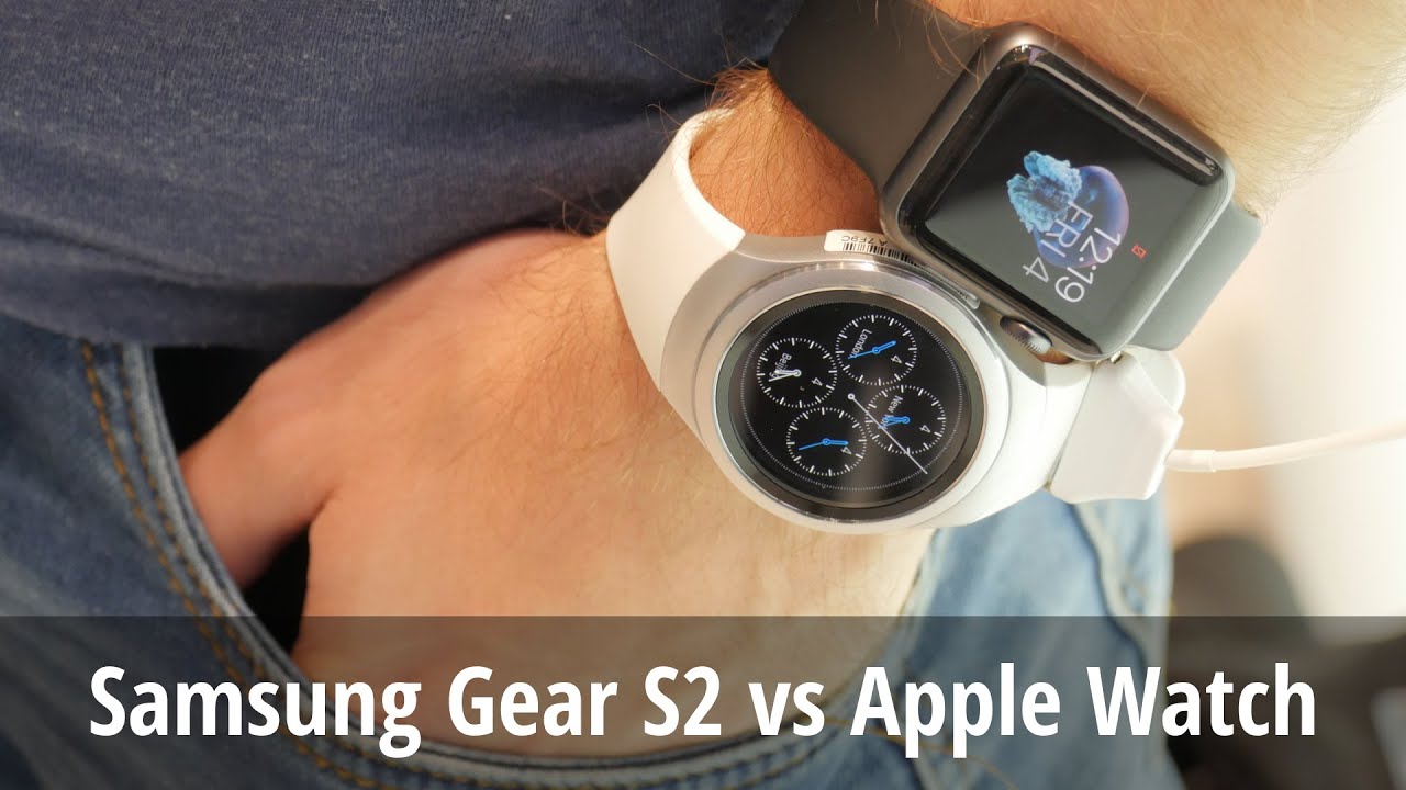
Samsung Gear S2 vs Apple Watch
Follow us on Google News



Things that are NOT allowed:
To help keep our community safe and free from spam, we apply temporary limits to newly created accounts: