Samsung Galaxy TabPRO 10.1 hands-on
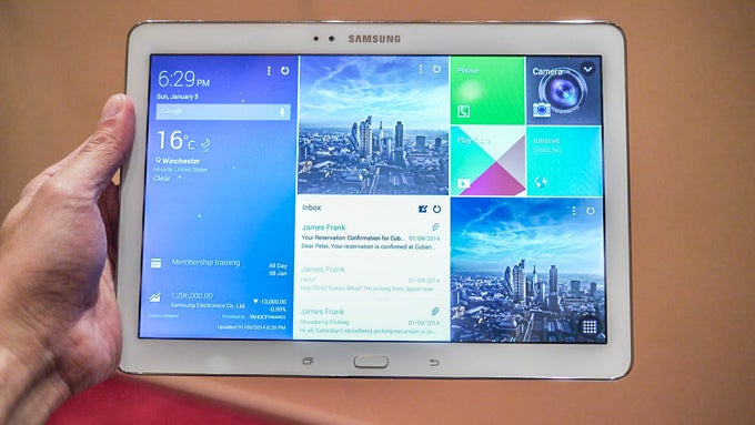
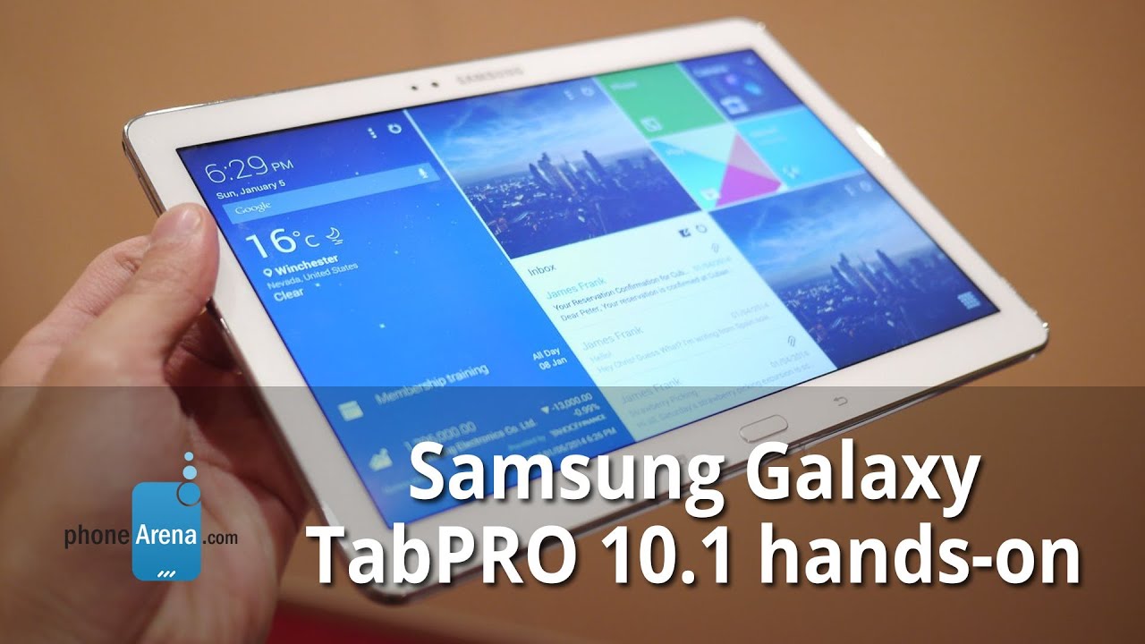
Samsung's focus on the tablet arena will mark its 2014 mobile efforts, and with tablets like the new PRO series it showcased how. Besides going large for the first time with the Note PRO and TabPRO 12.2-inchers, Samsung also has a new entrant in the most popular 10-inch category, dubbed TabPRO 10.1, which we took for a spin at CES 2014.
Design
At 243.1 X 171.4 x 7.3mm, the Galaxy TabPRO 10.1 is one of the thinnest tablets out there, and pretty comfortable to handle, though we'd like a bit more bezel on the sides to rest our thumbs on. The 477g of weight for the LTE version is about as light as the iPad Air, which is metal-clad, but with a smaller screen diagonal. In any case, that Samsung tablet feels feathery in the hand, ensuring your wrists won't be tired if you have to hold it for a prolonged period. Galaxy TabPRO 10.1 will come in black and white, and it carries the same faux leather back with stitching accents that began as a design cue with the Note 3, and continues in the new tabs from Samsung. It is actually pretty nice to the touch, and non-slippery.
Display
The 10.1" panel sports a very high 2560x1600 pixels resolution, whose 298ppi pixel density are more than enough for even the most discerning eye. From the distance you usually hold a tablet we couldn't spot any icon or text jaggies, let alone the individual pixels. The screen also has excellent viewing angles and is very bright, but we'll have to measure the panel before we give you the raw numbers in terms of color representation, which seems accurate at first blush.
Interface
The tablet, as all in the new PRO series, sports the brand spanking novel Magazine UX, which looks suspiciously like a certain tiled interface you might have noticed here and there. It lets you arrange the layout in long vertical or horizontal strips, housing your tailored news and social feeds, as well as information flowing from your most used apps. We have to admit that this time Samsung seems to have gotten the memo on the interface part, and found Magazine UX to be very easy to get used to, and functional for the type of multitasking you do on a tablet.
Processor and memory
Samsung didn't wait to futureproof its new tablets with, say, a Snapdragon 805, indicating that these are meant to have it covered with slate shoppers in the first half of the year, but a quad-core Snapdragon 800 in the LTE version, and an octa-core Exynos 5 will give you more oomph than KitKat will ever need anyway, even with that screen resolution. We didn't notice lag or stuttering, even in the display version of the Galaxy TabPRO 10.1 that we handled. Other than that the slate comes with the standard fare for a high-end tablet these days - 2 GB of RAM, 16/32 GB of storage and a microSD slot.
Camera
An 8 MP camera adorns the rear, which features zero shutter lag, and the plethora of shooting and scene modes, as well as color effects we've come to
expect from Samsung's camera interfaces. In addition, a 2 MP front shooter will take care of your video chat sessions.
Expectations
We expected Samsung to nail the hardware part of its 2014 tablet onslaught, and it did, with a thin, light and powerful PRO family. What surprised us is that Samsung has put a lot of its considerable resources to the software parts of things this time.
Not only will the tablets ship with the newest Android 4.4 KitKat, but the new Magazine UX also seems to grasp fully what you might want to do on a slate, presenting neatly arranged information nuggets to your eyeballs at any given time.






Things that are NOT allowed: