Android 9 Pie-based Samsung Experience 10 leaks out; big UI changes revealed
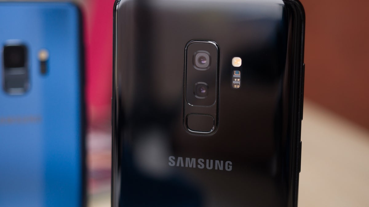
Samsung Galaxy S9+
Starting off with the lock screen, the South Korean giant has refined the overall look slightly by updating the fonts and moving the time and date to the middle of the display. Additionally, the previous quick app icons have been removed and in their place are simple stripes of color below the app names. Once the smartphone has been opened up, the most notable difference at first glance is the presence of modified on-screen buttons which are now much more simplistic, although they can be disabled in favor of a gesture-based UI. In any case, opening up the overview menu will now display recent apps horizontally rather than vertically. Additionally, a dock has been added to the bottom
Overall, Samsung’s next major software update looks set to bring some rather drastic changes to its overall experience. And considering the company has made so many modifications so early on, it appears the benefits of Google's Project Treble are finally paying off. Thus, the new update should rollout earlier than usual.
source: XDA Developers
Follow us on Google News






Things that are NOT allowed:
To help keep our community safe and free from spam, we apply temporary limits to newly created accounts: