Samsung Galaxy S8's new user interface: yay or nay?
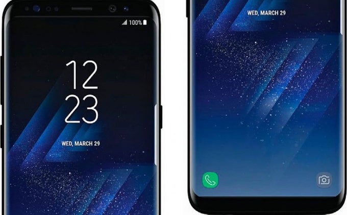
It's now clear that the Samsung Galaxy S8 should have been released under codename 'Titanic'. At this point, leaks for the thing just do not stop: we get a new picture, a new feature, a new rumor, a new something every single day and we do not see this slowing down until the March 29th official announcement of the phone.
One controversial new user interface
What we do not expect of the Galaxy S8 is to be a secret: practically everything about this phone is already well understood and known. And this includes the interface, which will be brand new on the S8, a UI that embraces minimalism and simplicity and takes them to the extreme.So much so that it has many of us here in the office wondering: isn't this a bit too much? So we decided to reach out and here your thoughts on this familiar, yet strongly changed new Samsung UI. Do you like it or not? Cast your votes in the poll right below and let us know why you think what you think in the comments section in the bottom.










Things that are NOT allowed: