Samsung Galaxy S8 vs Samsung Galaxy S7: what's new, anyway?
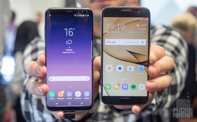
I could probably end this article right here and right now. All I need to say is that the Samsung Galaxy S8 is superior to last year's model, the Galaxy S7, in every imaginable way. But I guess one can arrive at the same (and maybe not quite accurate) conclusion without ever having seen either of the two phones. So let's approach this comparison from another angle – by highlighting the key differences between the two, and explaining why they matter. Shall we begin?
Design and display
Unbox your phone – that's the theme around which the Galaxy S8 has been designed. Samsung's goal is to break the status quo with its new flagship; to prove that phones can be more than flat, boxy rectangles with flat, boxy displays slapped in the middle. And it seems like its efforts have paid off. The Galaxy S8 is an impressively looking phone – both in photos and in person – and much of the effect is thanks to the curvy nature of the handset. The so-called Infinity Display visually flows off of the side edges of the device, while its rounded corners nicely complement the body's elegant shape. Of course, the sleek and shiny Galaxy S7 is also a looker, but next to the Galaxy S8, it does indeed look like a previous-generation product.
But perhaps a curved display isn't the most practical thing in the world. While testing the Galaxy S8's camera, I accidentally pressed the edge of the screen a couple of times, which registered as taps that changed my focus. I doubt that would have happened had I been using the flat Galaxy S7 at the time. And I wonder if the curved Galaxy S8 would fare better than the old-school Galaxy S7 in a drop test. Mind you, there's no flat version of the Galaxy S8, for those who might want one.
Taking a closer look at the two phones, we see that the Galaxy S8 has abandoned the physical home button – a trademark feature of the Galaxy series. Instead, it relies on on-screen buttons for navigation, unlike the S7 with its clicky home key. We're having mixed feelings about the sacrifice, but it is definitely easier to swallow when in return we're treated to a larger screen. Yet one thing that's definitely a step in the wrong direction is the placement of the fingerprint scanner on the back, next to the camera. While the scanner of the S7 is located in a perfectly convenient spot, the one on the S8 is more difficult to feel without looking. It's a change I could probably adjust to, though I don't think that I should, knowing how much the new Galaxy flagship costs.
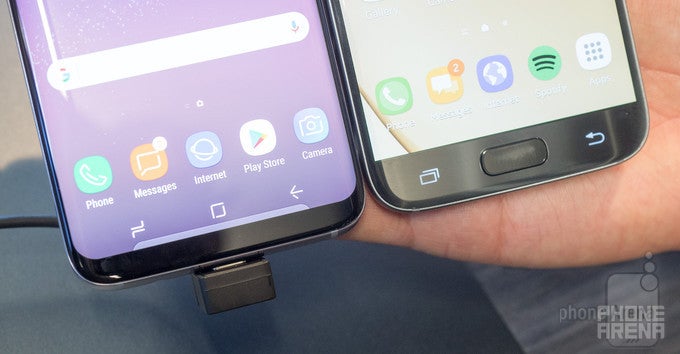
The Galaxy S8 uses on-screen navigation buttons instead of physical ones
On the topic of biometrics, the Galaxy S8 comes with two additional methods of user identification. Firstly, there's the iris scanner adopted from the Note 7, and then there's facial recognition. Given the new placement of the fingerprint scanner, I'm sure many Galaxy S8 owners would at least consider switching to one of these. Both, however, require you to have the Galaxy S8 within your line of sight in order to work as intended, and we're yet to test how factors like glasses, beards, and lighting would affect their reliability.
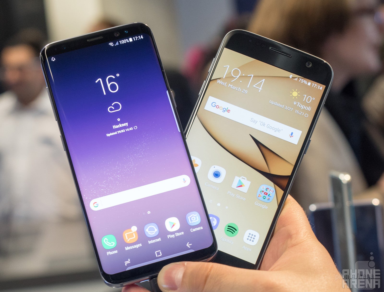
The Galaxy S8 fits a taller display in an equally wide body
Nonetheless, the screen on the Samsung Galaxy S8 is ideal for enjoying HDR video content. There are some pretty cool HDR shows available on Amazon Video, and the difference in image quality is easily noticeable. It is something I'd definitely recommend trying if you're getting an S8 anytime soon.
Interface and functionality
As expected, the Samsung Galaxy S8 and Galaxy S7 have a lot in common on a software level. Both run an up-to-date version of Android, loaded with goodies by Samsung, such as visual and functional tweaks. But only on the newer model you'll find Bixby – Samsung's personal assistant. To be clear, this isn't a feature we got to fully test ourselves, as it is still not ready for a global release, but we were given a demo showing off its abilities. For example, you can use Bixby to "scan" an object with the camera. If it is a product, such as a bottle of wine or a box of chocolates, you'll be provided a link to Amazon where you can buy one. If it is a place of interest, you'll be provided with information about it. Bixby will be integrated within multiple Samsung apps on the S8 and will be accessed via voice commands or by pressing a button on the side of the phone. As for the Galaxy S7, you should be able to use the Google Assistant once the right software update hits the phone (if it hasn't done so already).
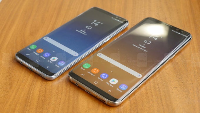
The software on the Galaxy S8 series is simplified and streamlined, if a tad boring
Bixby aside, the Galaxy S8 and its software tweaks make it a lot more user-friendly when it comes to side-by-side multitasking. It is the first phone that I can use to text-message someone while watching a YouTube video. On other phones, the Galaxy S7 included, the moment you pop-up the on-screen keyboard, the YouTube video gets pushed outside of the screen area. Also, Samsung has built in a feature allowing you to select an area of an app which you can pin to the top of your multitasking interface, leaving the rest of the area for other apps.
Visually, the software on the Galaxy S8 has been simplified, and while it doesn't look bad, I find it a bit boring with its gradient wallpapers and minimalist icon design. But I'm sure others might like this new look. Just like the Galaxy S7, the S8 supports user interface themes, including ones that can be downloaded from Samsung's software hub. Another notable change – the app drawer on the newer model is accessed with a swipe up from the home screen in a Google Pixel fashion. And one more thing – the Edge Panel we knew from the Galaxy S7 edge, with its shortcuts and widgets, is making an appearance on the S8. The, flat, non-edgy Galaxy S7 doesn't have that, although I wouldn't call that a dealbreaker.
Processor and hardware
This wouldn't have been a proper upgrade without some major changes under the hood. Sure enough, the Samsung Galaxy S8 comes with a Snapdragon 835 or a last-gen Exynos SoC, depending on the market. Either way, you get a 10nm chip that's smaller, more powerful, and more efficient than its predecessors, not to mention the fact that it supports 1 gigabit LTE connectivity. Is that kind of hardware faster than what's inside the Galaxy S7? Of course it is, and while the difference might not become noticeable with every-day tasks, heavier apps and games should perform better on the newer hardware, just as expected. For the record, we were kindly asked not to run any benchmarks on our Galaxy S8 pre-production unit, so we can't share any performance figures at this time. Be patient, friends.
While the amount of RAM – a factor that influences multitasking performance – hasn't changed, on-board storage has been doubled. The Galaxy S8 comes with 4GB of RAM and 64GB of room for your files, plus a microSD card slot for expansion. That's plenty of storage for most users, I'd say.
Another thing that hasn't been increased is battery capacity. Just like the Galaxy S7 before it, the Galaxy S8 ships with a 3000mAh, non-removable, quick-charging battery cell. But while official battery life figures aren't out of this world, the more energy-efficient processor could extend longevity in certain scenarios. We'll definitely test the phone's battery life extensively once we get our hands on a final unit.
Camera
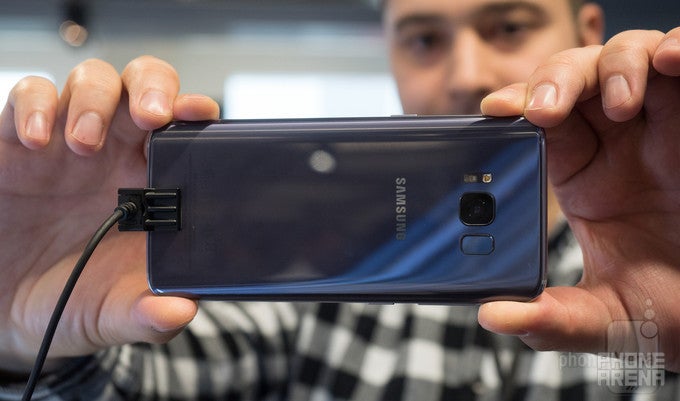
Remember the rumors about a new camera making its way into the Galaxy S8 – one that could take video at 1000fps and do all kinds of other neat tricks? Yeah, forget about those. The Galaxy S8 adopts the camera hardware from the Galaxy S7, meaning that you get a 12MP module with F1.7 aperture, OIS, and super-fast autofocus.
UPDATE: Recent reports indicate that the Galaxy S8 main camera uses a different image sensor. We've contacted Samsung for confirmation.
What's new, however, is the software controlling the camera unit. The Galaxy S8 captures three images instead of one and then blends them to create a better photo, even in low-light environments. While that sounds a lot like HDR, it is not exactly that. Samsung clarifies that the new image processing software is aimed at reducing defects in the image, including motion blur.
While the main camera hardware has remained largely the same, the front cam has seen a bump to 8MP and now supports autofocus. The goal is, of course, to let you take better selfies – sharper and more detailed than before. Focusing is pretty fast, working in tandem with facial recognition algorithms, and exposure is controlled adequately, prioritizing the faces within the frame. What I also noticed is that the camera lens isn't as wide as the one on the Galaxy S7's front-facing shooter.

The Galaxy S8 camera turns you into the King of Pop
As for the actual quality of the images, we don't want to go into details prior to obtaining a final unit, but below are some image samples we've provided for your viewing pleasure.
Expectations
The Samsung Galaxy S8 is a solid upgrade over last year's Galaxy S7, but some areas have been treated to more attention than others. Most notably, it is the design and the display of the new model that will grab your attention, and once you get a hold of it, you'll be impressed by how usable this 5.8-incher actually is. Of course, the Galaxy S7 is far from obsolete. It shares a significant portion of the S8's DNA, including the metal-and-glass construction, the shiny finish, and the water-resistant properties. But for a phone that can make heads turn, look no further than the S8.
Then come the improvements associated with actually using the phone. It is still too early to say whether Bixby is a useful, practical feature or more of a gimmick, but the enhanced multitasking abilities of the Galaxy S8 vs the Galaxy S7 seem kind of neat. And at a glance, the new UI feels a bit more streamlined, albeit a bit boring. All of this, including the integration of Samsung's peripherals, such as the DeX station and Gear VR, shape the Galaxy S8 as a milestone in smartphone evolution.
But evolution means change, and change often brings new things to adapt to. The omission of the home button is tolerable, but the new placement of the fingerprint scanner is confusing, while the iris scanner and facial recognition features have yet to prove themselves as solid alternatives.
Any disappointments? I would have loved to see an upgraded main camera, but the one adopted from the Galaxy S7 should prove good enough, especially with Samsung's tweaks applied to it. Additional battery capacity would have also been welcome. Oh well, perhaps we'll have to wait until later this year and the Galaxy Note 8 launch to see major steps ahead in these departments.
For those eager to get a Galaxy S8 to replace their Galaxy S7 (or any other phone, for that matter), pre-orders in the US are now open, with shipments scheduled to begin in 3-4 weeks.



Things that are NOT allowed: