Samsung Galaxy S8+ vs Galaxy S7 edge: The big-screen option gets even bigger
Introduction
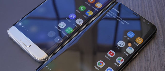
Nearly every aspect of building a smartphone involves a balancing act of some kind, trading one thing for another. Maybe you sacrifice thinness in order to find room for a massive battery, or give a user tons of storage, though driving the price of the phone up in the process. One of the most common of these decisions involves addressing the market's demand for large-screen phones, while trying to avoid making a phone that's physically very large (and uncomfortable to carry around).
Design and Display
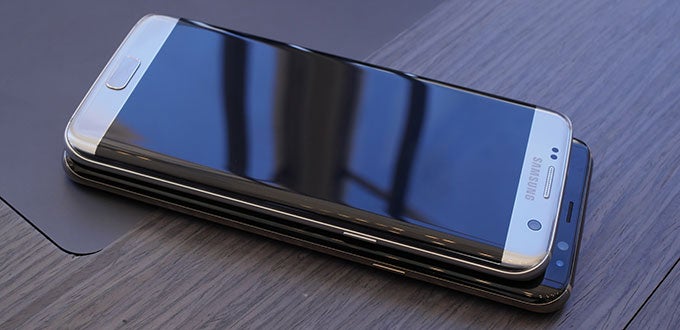
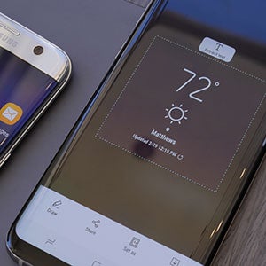
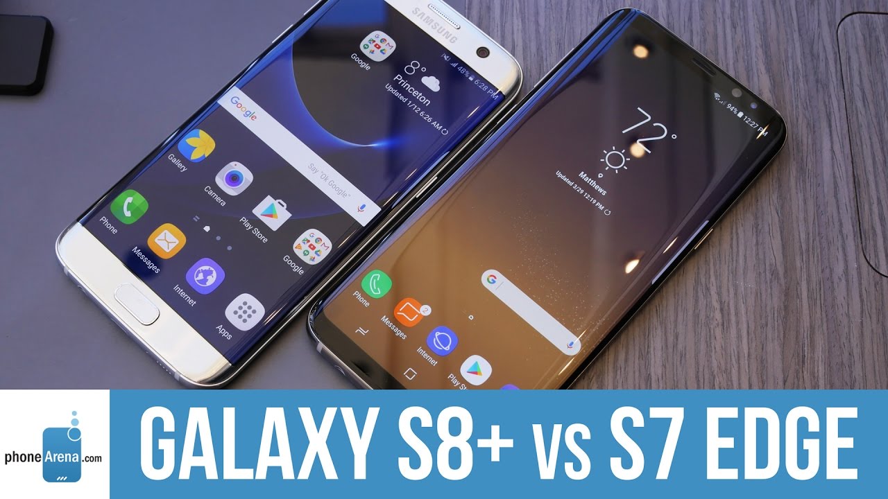
A curved-edge screen isn't for everyone, but it's hard to deny it results in a smartphone with a very distinctive look. With last year's Galaxy S7 edge, Samsung took that fabrication method about as far as it could go with traditionally-shaped smartphone screens, those with a 16:9 widescreen aspect ratio; in order to get any bigger, the phone itself would have to grow as well. Instead, with the Galaxy S8+ Samsung manages to cram in a whole lot more screen while minimizing the impact on handset dimensions, by switching to a new extra-wide 18.5:9 screen shape.
That results in a phone that, while it shares many of the same design cues as the GS7 edge, looks significantly different. Part of that is due to all the adjustments that need be made as a result of that larger screen, the most significant of which is Samsung's decision to ditch the physical home button. Instead, we've got on-screen virtual Android buttons, though with a much-appreciated dose of haptic feedback to scratch that “clicky” itch.
Samsung also loses room for prominent branding up above the screen, which we have to say is a move in the Galaxy S8+'s favor; say what you will about logos, but it's one thing to decide whether or not to plaster your phone in them, and another to not have room altogether – the display on this new handset is just that big.
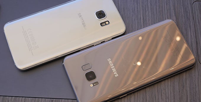
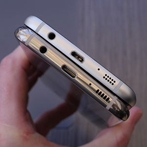
Elsewhere, we see more little tweaks signaling the modernization of Samsung's design: the move to USB Type-C, the relocation of the fingerprint scanner around back, and the arrival of a dedicated hardware button for Bixby, the company's new virtual assistant.
Hardware: processor, memory options, and camera
When you're comparing one year's flagship against another's, we're bound to see a lot of growth – and that's very much the case with the Galaxy S7 edge and Galaxy S8+. Obviously, we're looking at a new generation of processor, and while the GS7 edge gave users phones powered by either Samsung's own Exynos 8890 or the Qualcomm Snapdragon 820 – easily the most popular flagship chip of 2016 – the GS8+ upgrades to the very latest 10nm-processor tech, running either the all-new Snapdragon 835 or Exynos 8895. Being so new, we haven't been able to benchmark either of those GS8+ chips, but everything we've seen – to say nothing of our hands-on interactions (with responsive, smooth Android UI action) – sure suggests we'll be very satisfied with the phone's performance.
It's also a little surprising to see so little motion forward in terms of camera hardware. To Samsung's credit, the 12MP Dual Pixel camera on the GS7 edge was absolutely stunning, and produced some of the best pics we got out of smartphone cameras all year. And while we might have loved to get a big camera overhaul that pushed our expectations to the limit, it's difficult to fault Samsung for what it's doing on the GS8+, essentially giving it the same camera as the GS7 edge – just with some faster image processing and interesting new multi-exposure capture tricks. Rather than feeling let down, though, we're trying to take solace in knowing that Samsung started with a very good thing, and looks like it's made it better – even if not by a huge degree.
Battery capacity and charging
We're largely cool with Samsung's choice to bring the GS7 edge's camera back for the GS8+, but we can't say that same sentiment extends to other areas of the handset's hardware. Specifically, we're a little concerned to see the very same size 3,500mAh battery on both phones.
That capacity worked well for the Galaxy S7 edge, but the Galaxy S8+ has a bigger screen, with a fair number of additional pixels – and that tends to spell increased power demands. There's the potential that the new energy-efficient processors in the GS8+ will help rein in some of that consumption, but we can't help but think that the GS8+ might have benefited from a deeper well to draw from.
On the plus side, at least Samsung's versatile recharge modes return, and beyond standard wired fast charging, both phones are at ease with whatever wireless charging system you see fit to throw at them.
Expectations
Galaxy S8+ vs Galaxy S7 edge gallery
Follow us on Google News



Things that are NOT allowed:
To help keep our community safe and free from spam, we apply temporary limits to newly created accounts: