Samsung Galaxy S7 vs Galaxy S6: first look
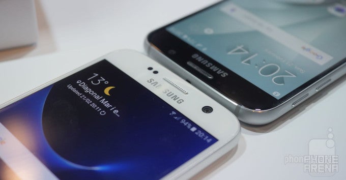
Just how different, however? Join us below as we take our first crack at the question.
Design
Alright, so design. As mentioned already, what we saw before Samsung's Unpacked event—what we all had very good reason to consider the real deal—is, indeed, what we got. A slightly modified Galaxy S6, the Galaxy S7 nevertheless offers a few improvements on the formula.
There are two main areas where this is apparent, and the more obvious one is the back of the S7. Taking note from the... Note 5, the Galaxy S7's back features the same curved rear glass that seeps into the metal frame of the phone, giving a more ergonomic feel in the hand. The device handles splendidly, though it should be noted that we immediately felt that it's heavier than its predecessor at 152 vs 138 grams (5.4 vs 4.8 ounces) and slightly thicker. This didn't detract from our experience, though we're certainly disappointed to see that Samsung has done nothing to protect the back from fingerprints. It's still a mess and will either require obsessive cleaning or a vinyl skin or a case.
Rotating to the front, the main differentiator is the slightly improved physical home button—it feels less rigid and more clicky, so good stuff on this front.
Finally, it's good to see Samsung continuing to work on miniaturizing its tech, as this has resulted in a slightly smaller Galaxy S7 compared to the Galaxy S6, or somewhere in the 2% ballpark as far as screen-to-body ratio goes. Considering the phone features a significantly larger battery than its predecessor and it's actually water- and dust-resistant, that's an impressive feat.
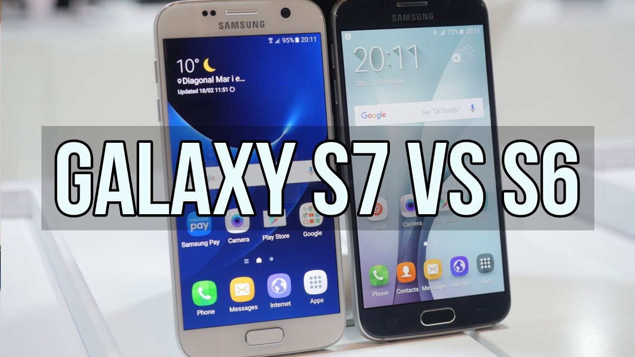
Overall? Even with these slight improvements in design, your average Joe is unlikely to be able to tell the S7 apart from the S6. So if you've shaken hands with the latter, you pretty much know what to expect from Samsung's new flagship.
Display
Samsung refrained from commenting on display properties, so a gambling man would assume that everything has stayed the same. Like the Galaxy S6 before it, the S7 sports a 5.1-inch display with a Quad HD resolution (1440 x 2560 pixels)—an overkill in our opinion for that screen size, but a benefit if you're one of them early VR adopters. Since we refrain from making conclusions about display image quality without conferring with our lab gear, and given the lack of relevant information, we're guessing that things like color fidelity and maximum brightness are either near identical, or slightly improved.
On a more positive note, just like the LG G5, the Samsung Galaxy S7 will improve upon its forerunner by including an Always-on-Display feature. This is nothing new on a Super AMOLED panel as we've seen from Motorola, and works in a similar manner: only a few pixels are dimly lit up to show you the time and date. Alternatively, you can have your calendar or a custom image, and Samsung tells us it'll be letting third-party developers add their own creations to the list.
Interface and functionality
At the surface, the TouchWiz build offered with the Galaxy S7 doesn't much differ from the Galaxy S6. Digging deeper reveals a few changes courtesy of Marshmallow, though, along with some design updates. The most noticeable of these is the notification panel, which is redone in white, along with the Settings menu. Apart from that, however, it's pretty much the same old user experience, though the unit we tested felt snappier than before.
It's also interesting to note that the Galaxy S7 has a feature that kills the app drawer, in line with what LG has done with the G5, and a departure from what previous Samsung devices have offered. So if you like the app drawer, you can keep it—it's on by default. But if not, you can do away with it.
Finally, the Galaxy S7 is the first to debut the Samsung+ app, which will give users access to live tech support, including device diagnostics, tips and tricks, and "exclusive content, giveaways and special offers". Just what these last three might be remains a mystery.
Processor and memory
The Galaxy S6 was a bit of a watershed event for Samsung last year, as it marked the first time the company strayed away from Qualcomm's loving hands. Instead of offering a Snapdragon processor, the company finally felt its Exynos system chips were up to the task, and ditched the US-based silicon slinger. Not only did the Exynos 7420 prove capable, it actually outdid the flagship Snapdragon 810.
Well, it seems that was a lesson worth remembering, for Qualcomm is back, and so is the old arrangement: buyers within the US will get the quad-core Snapdragon 820, while most other regions will be treated to Samsung's Exynos 8 series chips. Paired with that are 4GB of RAM (vs 3GB for the Galaxy S6), which ought to allow for hassle-free multi-tasking.
Finally, and this is a bigge for a lot of Samsung faithfuls, the microSD card is back with vengeance! Indeed, for regions like the US, the SIM card tray will be integrated with a microSD slot, while regions where dual SIMs are popular will have a hybrid miroSD/SIM slot and the option to use it however they see fit.
Camera
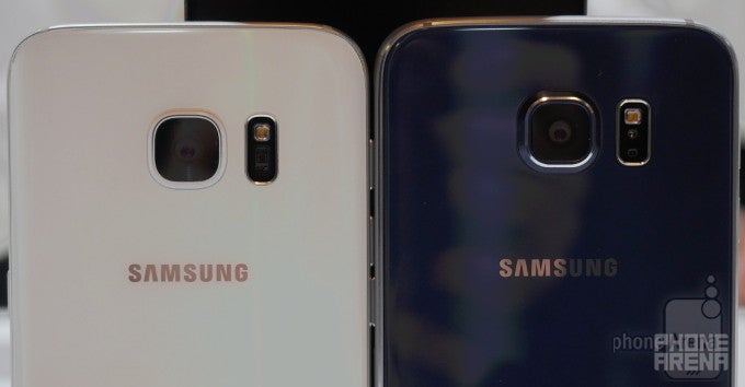
So far, we've been talking about mostly evolutionary upgrades when looking at the Galaxy S7, but if there's one area that Samsung certainly seems to have spent a lot of work on, it's got to be the camera on the back.
Finally listening to reason and not marketing people (which likely entailed a small rioting crew of engineers), Samsung has ditched the 16-megapixel unit of the Galaxy S6 and done the seemingly unthinkable: go for a lower resolution camera. But that's actually a step in the right direction, for the new 12-megapixel camera offers vast improvements in the areas that count—like pixel size.
This is not to say that the old sensor was disappointing—it was actually one of the best for its time—but we're far more excited to benchmark the new camera, especially since it's paired with largest-in-the-industry, f/1.7 lens. Theoretically, along with the increase in pixel size, the snapper of the S7 should deliver an improvement in light sensitivity somewhere in the 90% ballpark.
As a result, it follows that low light performance—long a pain point with smartphone cameras—ought to be significantly improved. And while we haven't had the opportunity to really dive into this, demo sets at Samsung's booth showed a very noticeable improvement over its predecessor when light is limited. We observed far less graininess and better color accuracy, all the while the image was brighter and therefore more detailed.
That's not all, however, and what's next is just as good: the phase detection auto focus mechanism of the Galaxy S7 has also seen huge improvements. According to Samsung, instead of making use of just 0.7% of the pixels available to find the proper focus as was the case with the S6, the new sensor is using all of them. Apparently, this has helped decrease the time needed to lock focus by a factor of two under normal lightning, and a factor of four in dark. And again, from what we saw, Samsung isn't making empty claims, for the Galaxy S7 proved extremely quick in locking its focus in low light, all the while the Galaxy S6 struggled.
So for those of you hoping for an even higher resolution sensor with the Galaxy S7, you might feel disappointed. But don't be—instead you're getting something much more meaningful.
Expectations
The freedom of snapping great photos wherever you are has long been one of the top reasons to get a smartphone—and the number one cause for the decline of point-and-shoots. If you're nodding your head right now—whether literally or not—then the Galaxy S7 is definitely going to be worth checking out. On paper, and from what little we've seen so far, the main camera unit has seen some meaningful improvements.
In regards to design, we also can't complain. The Galaxy S6 finally gave Samsung a reason to be proud of its designers, and the Galaxy S7 iterates on that with worthwhile improvements. Sure, the phone is heavier, but everything else is moving in the right direction. And we can't get over just how much better the new, clickier physical home button feels.
Ultimately, however, we can't really pretend that the Galaxy S7 will compete much with the Galaxy S6, given how the latter has depreciated in price since its introduction—and this process will only intensify going forward. But if you're an existing Galaxy S6 user simply trying to decide whether the Galaxy S7 is worth the investment, it'll probably come down to just how much you value low light photography and, hopefully, battery endurance.










Things that are NOT allowed: