Samsung Galaxy S7 edge: Edge UX demo and features
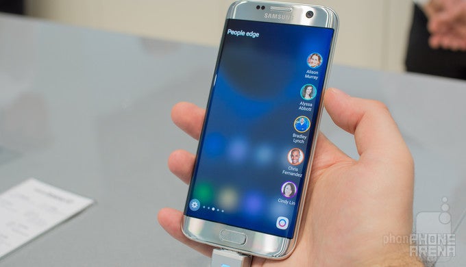
There are several very good reasons why one might want to get the Samsung Galaxy S7 edge instead of the Galaxy S7. First of all, the phone is bigger and carries a larger screen. Secondly, the dual-curved edge display is quite fancy and draws attention from afar. And thirdly, there's the new and enhanced Edge UX, which takes what we had on the Galaxy S6 edge and improves it dramatically.
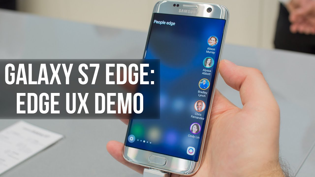
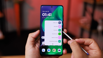
As before, Edge UX on the Galaxy S7 edge acts like a hub with shortcuts to apps and contacts, among other features. But it is now wider, with room for more to fit into the edge panel. Speaking of edge panels, there is a multitude to choose from. Some are mostly informational, showing things like weather details, the latest headlines, sports game scores, and stocks prices. There are also panels acting like shortcuts to favorite applications and web bookmarks. And the Tasks edge lets you have shortcuts to specific modes inside apps, such as the Panorama mode in the camera, or the stopwatch in your Clock app.
And that, in a nutshell, is the Edge UX feature, found solely on the Samsung Galaxy S7 edge. To see it in action, feel free to watch the video below, where we go through its menus, panels, and settings that are available.
Follow us on Google News



Things that are NOT allowed:
To help keep our community safe and free from spam, we apply temporary limits to newly created accounts: