Samsung Galaxy S6 edge: new TouchWiz interface in images
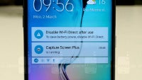
Samsung's TouchWiz is the blessing and curse of Android. Some people love it, others hate it, but it seems to leave no place for neutral opinions. An overwhelming majority of people agree that it's a feature-rich skin and its huge popularity prove that there is something very good about it, but speed does not seem to be one of those things.
That's why we were looking forward to see how Samsung changed TouchWiz, and good news is that at first sight it does appear to be a bit faster than before.
The Samsung Galaxy S6 and S6 edge come with a brand new version of the TouchWiz user interface that is also changed in terms of visual style - it's sleeker, with a modern view taking clues for Material Design with color-coded apps and some (but not all icons) touched up.
Of course, Android 5.0 Lollipop is under the hood, meaning you get the new card-based notifications, and all the other improvements coming with the latest version of Google's mobile operating system. Rather than talk about it, though, let's first explore it in this collection of Galaxy S6 TouchWiz screenshots.








Things that are NOT allowed: