Samsung Galaxy S6: Review of the various display modes
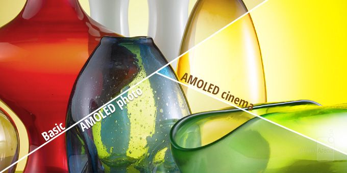
What exactly does each mode get you, though, and how does it differ from the rest? Today, we'll answer that question in detail, and hopefully provide a conclusive paragraph under each section that even everyday users that have no technical background can make sense of. If, at the end of it all, you still can't wrap your mind around what's being said, there's a dedicated color reproduction comparison slideshow at the bottom that aims to highlight the differences in behavior of all four modes.
Adaptive Display and why we'll not measure it
As mentioned, the Galaxy S6 ships with 'Adaptive Display' selected by default. The special mode tells the screen to change variables such as color saturation and contrast on the fly, in order to correct for the screen's otherwise lesser performance in trickier scenarios — such as in very bright sunlight. In such cases, the Galaxy S6 maxes out the screen's brightness, and reaches the excellent 563 nits, at the expense of color accuracy. In our view, this sacrifice is warranted, for a color-inaccurate display that is visible outside is preferable to an accurate one that you simply cannot see due to reflections and insufficient contrast. Indeed, this allowed the Galaxy S6 to climb to the very top of our outdoors visibility test we performed less than a month ago.
We won't be including measurements for Adaptive Display, though, for the very reasons we outlined above — the software tweaks the image dynamically, and this inconsistency precludes us from making any justifiable conclusions. One thing should be made perfectly clear, however — with summer right around the corner, Adaptive Display is the best mode you can choose, as none of the other three can crank up the brightness as much. Here's how the rest compare in this regard:

As you can see, manually setting brightness to maximum (via the brightness slider) will not allow the S6 to reach its peak of over 500 nits in Adaptive Display, so if you decide to use it, make sure you set it to 'Auto' and tweak the slider appropriately if needed. With other modes, going for it the manual or automatic way makes no difference in terms of the screen's brightness potential — using either is a matter of preference.
AMOLED cinema
Immediately underneath Adaptive Display is AMOLED cinema, so it makes sense we start with it. Samsung's intent with this dedicated mode is not entirely clear, though we can certainly speculate — the idea could very well be to tweak calibration so that movies and TV shows look more alike to what you get inside theaters. Indeed, just like the films projected in your local cinema aren't calibrated for the more common sRGB color space, so is AMOLED cinema created with such a philosophy in mind.

Unfortunately, content aimed at consumers calibrated with Digital Cinema Initiatives in mind (i.e. movies in theaters) is still exceedingly rare, so this particular display mode is mostly about effect. And effectual it is — we observe a color temperature of 7720K (6500K being optimal), meaning whites and grays look cold and bluish. As for color reproduction, hues tend to be overly-saturated hues across the spectrum. This is most noticeable with green, which dominates over red and even blue.
The latter effect (over-saturation) is easily observed with the help of a color chart, which shows you the difference between the target color and the actual color the display produces. As you can see below, colors like green differ from their target vastly, and have far higher intensity than is natural. At the same time, whites and brighter shades of gray are impacted negatively, and appear blue/green. In all of this, it's important to note that red is under-represented in the overall balance between the three primary colors (red, green, blue, or RGB), meaning that skin tones will generally lack some color, and appear as if they have a tiny case of that caked-on makeup look.

Gamma response is another area where we'd traditionally raise eyebrows, considering an average of 1.98 (2.2 is considered optimal). A lower gamma, too, contributes to that aforementioned, pale skin look, but it also ensures that the darker portions and highlights of an image are brightened up — even if unnaturally so. To get to that 1.98 gamma value, however, the gamma line twists and turns depending on the brightness of the image. As is observed when looking at the actual chart, gamma in AMOLED cinema is rather extreme in its behavior, and ensures that very dark portions of any image are even darker than natural, while highlights are significantly brighter.
In closing, while it may sound like AMOLED cinema benefits a twisted vision of reality — which it does — we have to remember that the purpose of the mode is to allow for a richer, more enjoyable viewing experience when watching movies on the Galaxy S6. Outside of this particular use case scenario, AMOLED cinema can be rather unpleasant — reds become blindingly red, greens go neon, and pure white simply doesn't exist. Still, if the 'livelier' colors of Samsung's Super AMOLEDs has been a major selling point for you in the past, AMOLED cinema gets you just that.
AMOLED photo
As with AMOLED cinema, Samsung made sure that AMOLED photo has its own niche of usefulness, narrow as it may be. We imagine that it's aimed at professionals whose flow includes work with the Adobe RGB color space, which is significantly larger than sRGB and offers richer greens and cyans, among others. Content for the web (and not only) is almost always created with the narrower sRGB gamut in mind, however. This means that the Galaxy S6 in AMOLED photo mode will, most of the time, have its color reproduction off, especially in terms of green, yellow, cyan, and even blue.

Going back to our measurements, we start off with a color temperature of 6385K, so AMOLED photo is slightly warmer than ideal. This is a striking effect, even though the deviation from the optimal 6500K value is almost negligible. That's because the vast majority of screens we've measured throughout the years are typically colder than ideal, not warmer. This imperfection shows in the grayscale chart, where pure white is rendered with a yellow/greenish tint. Why greenish, though? Simply put, this is the result of an over-represented green, which serves to mess up the RGB balance (the white point) and overpower the two other primaries — blue and red.
The next component of our display testing concerns color accuracy, but since Samsung probably aimed at delivering Adobe RGB (2) calibration with AMOLED photo, we tested the mode for both it and the sRGB color space (1). Generally speaking, our findings indicate that AMOLED photo is decently accurate for work with Adobe RGB content, but not perfect. When talking sRGB, things get much worse, though.
Finally, looking at gamma response, we have an average of 2.09, which is closer to the ideal 2.2 value than AMOLED cinema, but not ideal. In reality, gamma is relatively predictable across the brightness spectrum, meaning that both darker and brighter portions of an image are rendered relatively faithfully. Still, really bright chunks, and even darker areas of the image, are made even brighter than natural.
Quite frankly, this is as much proof as we needed — if terms such as color spaces are foreign to you, you probably should avoid the mode altogether. In fact, even professionals will likely find the discrepancies between AMOLED photo and a standardized color space such as Adobe RGB non-trivial — enough so to not really care about its existence.
Basic
Deceptively dubbed just 'Basic', this is actually the screen mode that finally earned our respect for Super AMOLEDs. In short, this is the screen mode if you're looking for color accuracy within an sRGB color space (Android uses sRGB, so you should care). But why?

Let's start with color temperature like before — it sits at the close-to-perfect 6584K. As you can see from the grayscale chart below, this allows the Galaxy S6's Super AMOLED screen to render actual pure whites when needed. Of course, having a great RGB balance helps with that, too — unlike other modes, in Basic green is significantly less dominant. Color error, too, is acceptable at dE 4.1 (dE 7.08 in AMOLED cinema and dE 5.68 (sRGB)/4.42 (Adobe RGB) in AMOLED photo). That's important, as dE is a measure that takes your eye's perception of color into account, and values under 2 are generally considered to be imperceptible.

Turning to gamma, this is also an area that Basic handles best — the average sits at the decent 2.11, and we only run into more severe deviations when talking highlights. In the case of the Galaxy S6, even in Basic mode, those are overblown, but at least not critically so.
Generally speaking, if you care about proper color calibration, then this is the mode you should go for with the Galaxy S6. Sure, when tested side-by-side with the rest, it will probably look underwhelming, but that tells you more about the other modes, not Basic. Unfortunately, if you plan on using your Galaxy S6 under the scorching sun this coming summer, Basic may very well end up disappointing with its relatively low peak brightness output.
Color reproduction comparison
So far, we've mostly covered technical measurements of screens that probably don't mean too much to you, and would have meant even less without clarifications appropriate for laymen. To correct for this, and to better exemplify the behavior of the Galaxy S6's display within the four distinctive calibration modes, we prepared several slides with images that aim to show the differences between them.
Of course, since we have no other way of showing you apart from taking a photo of the screen and then correcting the resulting image to better represent what our eyes are seeing, the crops below are approximations only. That is, they've been edited so that they give you a good idea of how the various display modes render identical images.
Conclusion
Samsung has come a long way since the early days of Super AMOLEDs — the Galaxy S6's 5.1-inch panel is a testament to that. Not only has the company finally delivered a precisely calibrated screen, but it has done so without at all siding with either of the two camps — fans and critics both get theirs. Said otherwise, if AMOLEDs won you over the moment you saw those overstated colors years ago, nothing is stopping you from getting just that — simply choose the AMOLED cinema display mode and you're good to go. If, instead, you're looking for a properly calibrated display, you can easily select Basic and be done with it.
Of course, all display modes that aren't Adaptive display are at a severe disadvantage, specifically now that summer is around the corner — none can match its excellent peak brightness of over 560 nits. It's thanks to this that we feel confident in naming the Galaxy S6's display better than even the panel on the Galaxy Note 4 — if only by a little.




Things that are NOT allowed: