Samsung Galaxy S5 with Lollipop vs Galaxy S5 with KitKat: UI comparison
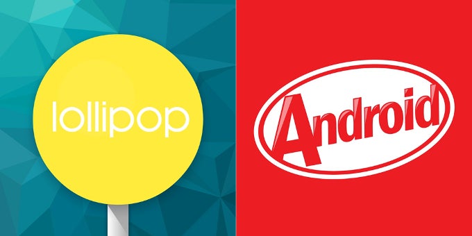
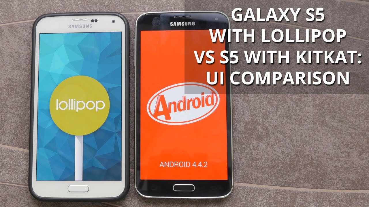
Guess what, we updated one of our Galaxy S5 champions with Lollipop! Well, we also have a backup one that is still running the TouchWiz variation of Android 4.4.4 KitKat on board. Curios as we are, we could hardly wait to put them toe-to-toe and check out what's changed and what's the same. That's right, it's time for a UI comparison!
We should also note that Lollipop running on our S5 felt a tad more snappier and less prone to lag. While KitKat showed a few hiccups here or there, its software successor surprised with its smooth performance. Yes, we were expecting the new firmware to fare better, and, boy, it didn't disappoint!
Without any more ado, let's explore the visual changes right below!
Notification drawer
Samsung has borrowed a lot from Lollipop as far the notification drawer is concerned. Your notifications are now listed as cards. The brightness slider has been merged with the toggles at the top, which further consolidates the looks of the drawer. Speaking of the toggles section, it now comes painted in a brighter and more vivid shade of blue. This might appeal to some, but we feel that it's less "contrasty" than the darker hue that is omnipresent across the KitKat variation of Galaxy S5's firmware. Also note that the drawer itself no longer sports a handle at its bottom, which further simplifies the looks. As a whole, the drawer now looks a little bit cleaner than before, and while it's still a bit overwhelming with information and buttons, it's a definite improvement over its KitKat counterpart.
Dialer, Contacts, Messaging
The white color that is widely-used as a background in many apps in Android 5.0 Lollipop is an AMOLED display's bête noire, but Samsung has decided that it should be used in its Lollipop build. That's why many of the system apps now come with a white background instead of darker one. A slew of default apps, namely the Dialer, Contacts, and Messaging, have been adorned with a Lollipop-y white background
Settings
Although the layout has retained mostly the same, the Settings app has also scored a white background. Alas! Apart from thisentirely visual change, the philosophy behind Samsung's tabbed interface has remained mostly the same. A pretty nice , yet somewhat hidden addition is the improved Running Apps tab in the Application Manager, which now provides you with a more advanced breakdown of your RAM, giving you a generally better understanding of what apps take up the most operational memory.
Battery consumption
The improved battery information menu that came along with Lollipop has landed on the TouchWiz variation of the OS. Galaxy S5 users will now know how long it will take to fully charge their device. When unplugged, on the other hand, it will show you an estimate of what battery life you'd be able to squeeze out of the juicer at the back. Nifty.
Recent Apps and active applications
Here it is, the overhauled Recent Apps menu that made a debut alongside Android Lollipop has been fully adopted by Samsung inside the brand new firmware for its flagship. The card-based carousel does not only show you all of your recent apps, but also all of your browser tabs, broken down to different swipable-cards. Yes, it gets populated faster than its KitKat counterpart, which shows you separate apps only. Samsung has, luckily, not forgotten to throw in a "Close all" button in the recent apps menu of its Lollipop build for the S5, something that is not present in vanilla Android 5.0. You can still access your active apps from there, too.
Calculator and Clock
Both of these apps have also scored a little something something from Lollipop. The ones coming alongside Lollipop look cleaner, though both have also scored the white background.
Gallery and Video
Prepare yourself for yet another round of apps that have waved goodbye to the battery-friendly dark backgrounds and welcomed the trendy white ones. It might be a placebo effect, but the gallery in the Android 5.0 build feels a little bit faster than its KitKat predecessor, which is a a most welcome improvement.
Conclusion: Should you hold your breath for the Lolllipop update on your Galaxy S5?
Yes. Although it is not a big improvement over KitKat, the new Lollipop firmware for the Galaxy S5 is definitely worthy of your unprecedented attention. It's true that visually it's quite similar to the older TouchWiz, but the hidden improvements will surely breathe some new life in your slightly-dated Galaxy S5 and make it feel snappier. We are yet to test the new firmware more extensively, but or first look at the new firmware of the popular Galaxy S5 is definitely more than positive.








Things that are NOT allowed: