Samsung Galaxy S10e hands-on: Big features in a smaller package
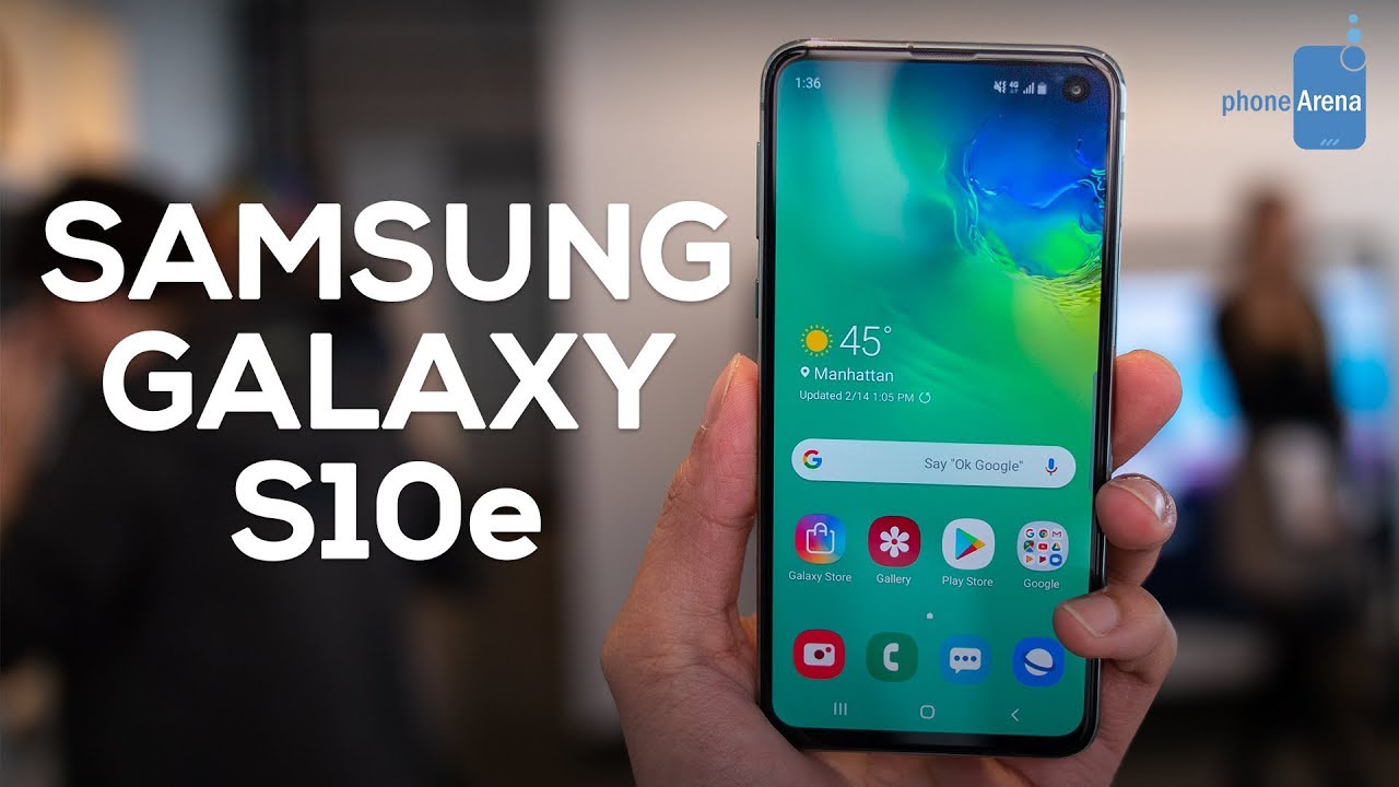
You knew it was bound to happen. Samsung has followed Apple’s strategy on several occasions in the past, so it should come to no one’s surprise that the Korean company is also coming up with a more affordable flagship model. In this case, it’s the Samsung Galaxy S10e, which is the company’s answer to the Apple iPhone XR with a starting price of $750.
The addition of this third model in the Galaxy S10 line simply means more choice for consumers, something that we appreciate considering how prices of $900 for the S10 and $1000 for the S10+ could be a stretch for many people. Even though the Galaxy S10e is not in the same sub-$600 price category with phones like the OnePlus 6T or the Honor View 20, it does come with some merits to validate its higher cost. And after having the chance to take it for a spin, we're convinced it's a phone that shouldn’t be overlooked!
Polished design with a flat screen
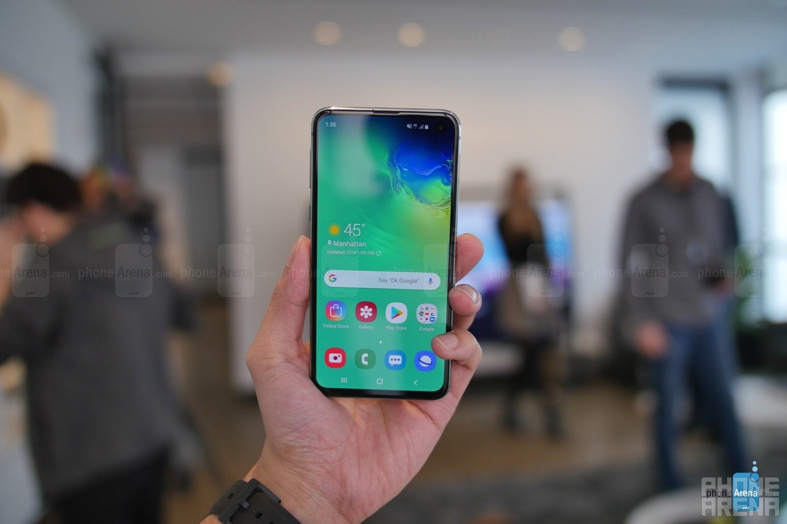
What jumped out the most with the Samsung Galaxy S10e upon our first interaction with it was its design, one that harkens back to the Galaxy S7. It doesn’t employ that catchy dual curved edge display that Samsung has implemented in its last couple of flagship generations. The flat look of the display definitely threw us off initially, but beyond that, the phone still flaunts the same metal-meets-glass construction of its siblings. You could argue it’s the “mini” version in the line, which is not a bad thing when its compact size makes it considerably more one-hand friendly.
Even better is that Samsung doesn’t make any major sacrifices with the design or functionality, seeing that the premium construction still manages to include a seamless edge-to-edge look with its Infinity-O AMOLED display, a standard 3.5mm headphone jack, IP68 water resistance, expandable storage courtesy of a microSD slot, and wireless charging. The latter supports the same “Wireless PowerShare” function that the S10 and S10+ employ – allowing the S10e to charge other devices wirelessly! The only thing missing here is the in-screen fingerprint sensor, which is swapped for a side-mounted one. Needless to say, it’s going to be different for anyone who has used Sammy’s flagships. It's up for debate whether a fingerprint reader on the side is more or less convenient than one on the back of the phone, as was the case with the Galaxy S9 and S9+.
Like the iPhone XR, the Galaxy S10e will come in an assortment of bright colors – including a yellow one that definitely stands out of the bunch!
Factoring how little Samsung compromised with the design of the S10e, it’s quite compelling to see this level of uniformity around this year’s S10 line. We’re amazed that they’ve crafted something a bit smaller in size, while still including all the features we mentioned above. Very few phones in general can match its package, more so when it’s a smaller phone we’re dealing with here.
Wickedly fast

Left to right - S10e, S10, S10+
We’re really digging the new Samsung One UI the Galaxy S10e is running on top of Android 9 Pie. Not only is the interface mainly driven by a new gesture-based system, but it also appears cleaner as a whole. This is potentially the most underrated thing about the new S10 line, given how other aspects seem to capture more priority. The experience is no doubt a step in the correct direction for Samsung, which – together with the slimmer size of the S10e – makes one-handed navigation a breeze.
Considering that the S10e is powered by the Snapdragon 855 SoC, the same chipset used by its esteemed siblings in the S10 and S10+, it's no surprise that the phone responds with the same instantaneous actions. Its quick responsiveness was evident right away as we briefly navigated around the interface, reminding us of the responsiveness of OnePlus’ OxygenOS. It’s really something because we’re talking about Samsung here! But it’ll be intriguing to see whether or not Samsung's software will be able to maintain this level of responsiveness months down the road.
A dual-camera implementation instead
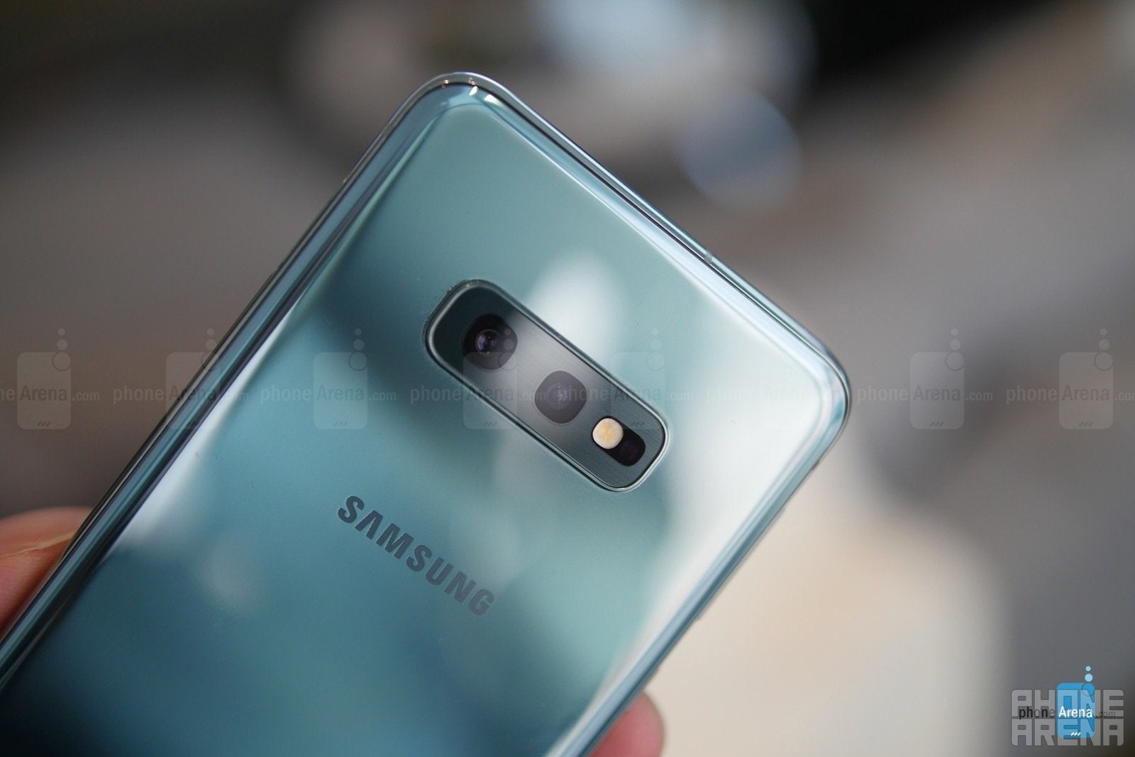
Unlike its siblings, the Galaxy S10e is only graced with a dual-camera system. That’s not terrible, to say the least, especially when it features the same 12MP f/1.5 and f/2.4 dual-aperture main camera, paired with a 16MP wide-angle one. The S10e does not have a proper telephoto lens, but hey, this configuration is still a versatile package, especially when it’s also going to be tapping into the same AI-powered scene recognition feature that promises to enhance photos accordingly. Low-light performance, in particular, should also benefit from AI scene detection, so we’re eager to find out how the S10e handles these conditions.
You’re still going to get the same „Live Focus” portrait effects as before with this dual-camera configuration, although the end result will look different due to the lack of a telephoto lens. You get the usual slew of video recording modes as well. If the camera performance and image quality are very similar to those of the S10 and S10+, then the S10e is going to have a compelling story attached to it. Around the front perched within that punch-hole display cutout is the S10e’s front-facing camera, capable of 4K video recording.
The new $750 contender
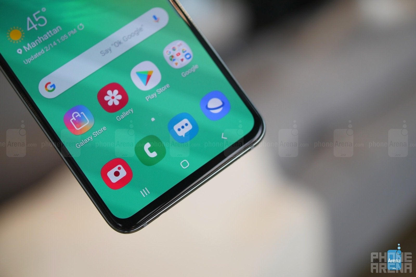
The more we think about the Samsung Galaxy S10e and its total package, the more we begin to think about how the Korean giant is blatantly competing toe-to-toe against Apple. And you know what? We gladly welcome this because it’ll force other manufacturers to realize that you can still achieve flagship-caliber qualities in a $749.99 smartphone. As of right now, the S10e has a ton of potential in being a major player in this particular price range!
Additionally, we can’t neglect comparing it to its sibling, the S10. For an additional $150 you would spend on getting the S10 at $900, the only major difference between them are the in-screen fingerprint sensor, rear triple camera system, and slightly more stylish design. It’s a tough call to validate those features and the higher cost. For those looking to minimize their investment, the S10e isn’t too shabby of a choice – more so when you still gain the core features, but in a more compact package. Saving money is always appreciated, so you’ll have peace in mind knowing that there aren’t substantial compromises with it.
The S10e will be up for pre-orders starting on February 21st, with in-store availability coming very soon! Now that it’s official, it’ll be interesting to uncover down the road which of the three new phones in the Galaxy S10 line will appeal to buyers the most.





Things that are NOT allowed: