Latest leak supposedly shows the Samsung Galaxy S10+ up close

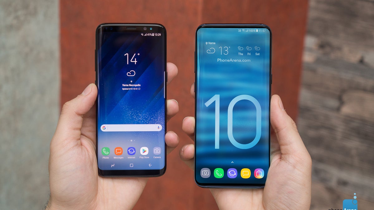
What the S10+ could have looked like if it wasn't for the front-facing cameras
Weibo leak on the left, AllAboutSamsung leak from a few days ago on the right
First off, the picture shows the phone with the recent apps menu opened with the suggested apps at the bottom, styled in Samsung’s latest One UI, so far so good. Taking a look at the top, however, we see some discrepancies between this leak and previous ones. The time here is positioned a lot closer to the middle of the display than it has been seen previously, tucked in the corner. Moreover, everything on the display seems to be at an angle slightly different from the device itself.
Another difference is noticeable around the side buttons. While on this picture the right-side button translates somewhere between the Bixby button and the volume controls on the left, like it is on the Note 9, for example, on previous leaks we’ve seen the right button a lot higher, closer to the level of the volume up button.
Follow us on Google News


Things that are NOT allowed:
To help keep our community safe and free from spam, we apply temporary limits to newly created accounts: