Rogue leaks give us a hint about the Windows 8 touch interface and apps

We are starting to piece together the path that the designers of Microsoft's "riskiest product release" (as per CEO Steve Ballmer), are taking in order to create a touch-optimized UI for Windows 8. We showed you the tiles in the tablet IE9, and the Metro UI elements in Win 8 and Office 15, and now we have some more things you could manipulate with your digits in Microsoft's next OS version, which we recently saw running on an NVIDIA Tegra 2 ARM-based chipset.
Everything is still in pre-milestone stages and on a laptop, so the guy that leaked this stuff is controlling it with a mouse, but one can easily see the way that the UI elements are becoming finger-friendly. First we have a login screen video, where you could draw a pattern for access, similar to what you can do with Android.
The clean font seems as if directly taken from the lock screen of a Windows Phone 7 device, reiterating once more that Windows 8 is taking clues from Metro UI. Note how the guy has taped up the lower part of the screen with the build number; we know that Win 8 will allow for an user avatar in the system tray, which can even be a video clip, and his is clearly showing under the tape.

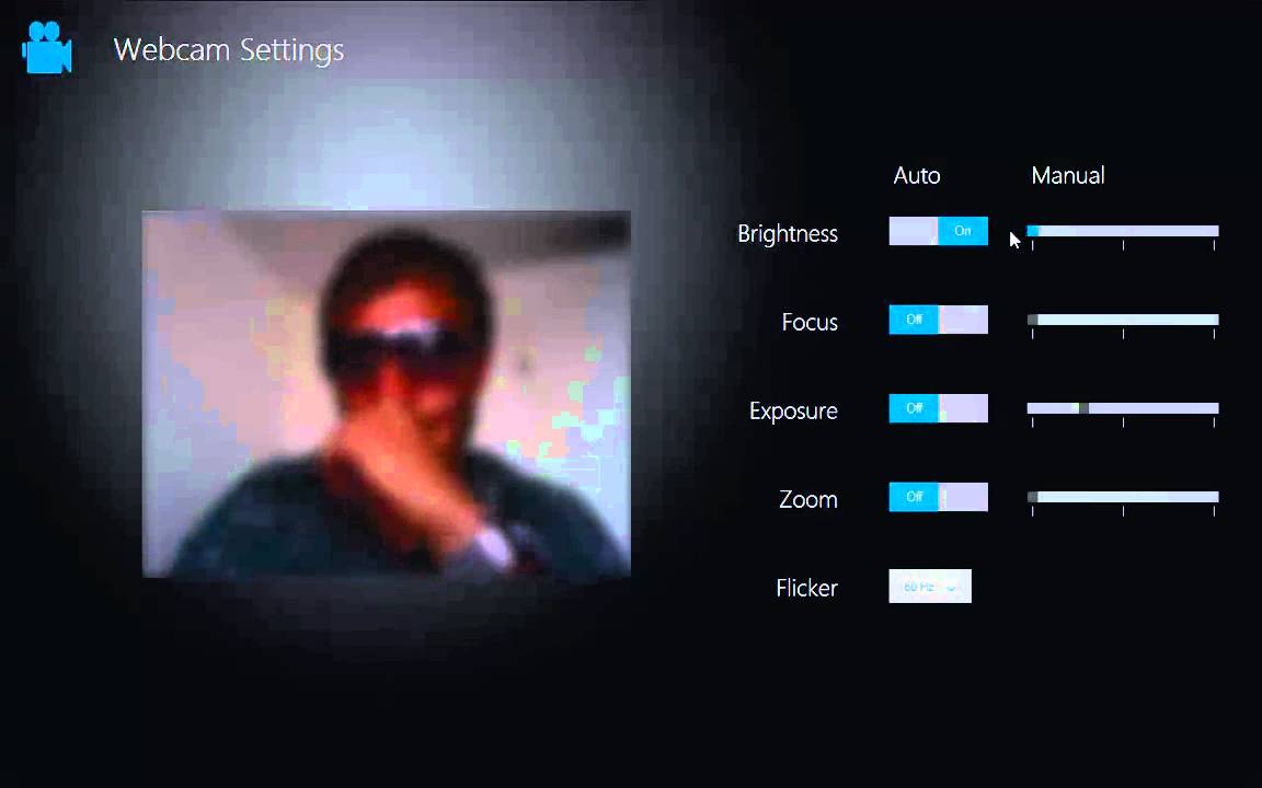
Next we move on to the type of built-in applications (sorry, programs, slip of the tongue), that might be coming with the touch-optimized Windows 8. The same guy demonstrates the webcam app, and singing to a great song in the process, but has blurred himself a tad for obvious reasons.
Despite that he operates the sliders with the mouse, here again we can clearly imagine our fingers pushing them back and forth, if we had a touch layer over the display. In fact, the styling of this app could have fooled us that it is coming straight from a WP7 handset - nothing wrong with that, as we love the clean looks of the Metro UI.
All these are fine and dandy, but what about the daily grind of navigating an interface made for a mouse and a keyboard? Obviously Microsoft is planning to take the Ribbon concept take centerstage here, and from the leaked screenshots they are going somewhere with it. The menial tasks like copy/paste, have now received glowing red dots to them that beg to be pressed with the tip of your finger. Also, those touch-friendly tiles we saw in the browser and in the pretty iOS Bing app, seem to be in use throughout the Win 8 mode with the Aero interface, not only the tablet-friendly one, nicknamed Immersive, as you can see below.
When we combine the above touch-optimized features, with the Live Tiles concept of Windows Phone 7 that is rumored to blanket the Win 8-powered tablets, one can finally see the approach Microsoft is taking for moving on to the post-PC era interface. Now, if only complex legacy programs that one can't imagine working without a mouse, like, say, Photoshop, could become touch-optimized... oh, wait, wasn't Adobe Photoshop getting a touch-friendly version very soon?
Hopefully Microsoft will stick with the initial plan to demonstrate the tablet mode of Windows 8 in June.
source: YouTube&Windows8Center
The clean font seems as if directly taken from the lock screen of a Windows Phone 7 device, reiterating once more that Windows 8 is taking clues from Metro UI. Note how the guy has taped up the lower part of the screen with the build number; we know that Win 8 will allow for an user avatar in the system tray, which can even be a video clip, and his is clearly showing under the tape.

Next we move on to the type of built-in applications (sorry, programs, slip of the tongue), that might be coming with the touch-optimized Windows 8. The same guy demonstrates the webcam app, and singing to a great song in the process, but has blurred himself a tad for obvious reasons.
Despite that he operates the sliders with the mouse, here again we can clearly imagine our fingers pushing them back and forth, if we had a touch layer over the display. In fact, the styling of this app could have fooled us that it is coming straight from a WP7 handset - nothing wrong with that, as we love the clean looks of the Metro UI.

All these are fine and dandy, but what about the daily grind of navigating an interface made for a mouse and a keyboard? Obviously Microsoft is planning to take the Ribbon concept take centerstage here, and from the leaked screenshots they are going somewhere with it. The menial tasks like copy/paste, have now received glowing red dots to them that beg to be pressed with the tip of your finger. Also, those touch-friendly tiles we saw in the browser and in the pretty iOS Bing app, seem to be in use throughout the Win 8 mode with the Aero interface, not only the tablet-friendly one, nicknamed Immersive, as you can see below.
When we combine the above touch-optimized features, with the Live Tiles concept of Windows Phone 7 that is rumored to blanket the Win 8-powered tablets, one can finally see the approach Microsoft is taking for moving on to the post-PC era interface. Now, if only complex legacy programs that one can't imagine working without a mouse, like, say, Photoshop, could become touch-optimized... oh, wait, wasn't Adobe Photoshop getting a touch-friendly version very soon?
Hopefully Microsoft will stick with the initial plan to demonstrate the tablet mode of Windows 8 in June.
source: YouTube&Windows8Center



Things that are NOT allowed: