Remembering the original Apple iPhone: A phone that really was ahead of its time

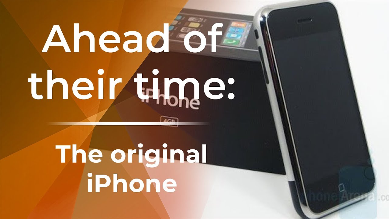
Just over 11 years ago, we witnessed the announcement of what is arguably the most revolutionary phone ever to be imagined and brought to life – the original Apple iPhone. It was a phone way ahead of its time – and one that defined what a modern smartphone should look and feel like. Brands that followed its example remained relevant on the market. Those who didn’t, faded into obscurity. But what exactly made the first iPhone so remarkable for its time? Join us for a trip down memory lane to find out.
A huge display and a revolutionary new form factor
First and foremost, it’s almost baffling how Apple, a newcomer in the mobile space at the time, managed to do the impossible by popularizing the all-touch form-factor that’s become the standard to this present day. Yes, there were other touchscreen smartphones prior to it, but Apple’s interpretation was a totally impressive reimagination that simplified things. Rather than boasting a clunky appearance, much like the smartphones with landscape sliding QWERTY keyboards at the time (Windows Mobile and Palm smartphones for example), Apple’s straightforward design resulted in cleaner appearance with very few buttons. In fact, there was only a single home button fashioned below the display – complementing the typical power and volume controls it also offered.
Touchscreens were around a long time before the iPhone’s arrival, but they employed resistive technology instead, which meant interacting with them largely required the help of a stylus – rather than the simple touch of a finger. Sure, it was still possible to interact with resistive touchscreens with your finger, but they weren’t as responsive or accurate as the capacitive technology employed by the original iPhone. We’ll have to credit Apple for popularizing touch interaction with our actual fingers, seeing that the capacitive touchscreen on the iPhone was significantly more intuitive. This may not seem all that ground breaking when we think about it now, however, it was a big deal back then because it eventually introduced us to gestures. And speaking of gestures...
A powerful web browser with pinch to zoom
The iPhone revolutionized our interaction, seeing that it brought forth this new idea of gestures. Even the simplest one, swiping your finger from one part of the screen to another, was a totally mind-blowing concept that wasn’t quite practical on resistive touchscreens. For many people back then, the iPhone’s simple “swipe to unlock” feature was astounding. It was something that just blew away many people, partly for its simplicity and ease. The other advantage of capacitive technology was its ability to register multiple fingers touching the screen, something that was again not feasible with resistive touchscreens.
This was new idea of multi-touch was really highlighted by the pinch to zoom gesture that was implemented in a variety of applications throughout the iPhone. Not only did it work for things like zooming in the picture gallery, but its usefulness was really exemplified within its new web browser – mobile Safari. This new gesture allowed users to zoom in/out by performing these pinch gestures, which were undoubtedly far more intuitive than how other browsers performed. For comparison, Microsoft’s mobile Internet Explorer performed the same functions, but required tapping on the screen to zoom, or alternatively, selecting the zoom level from the drop-down menu. Again, Apple’s interpretation just made more sense, which why it was often greeted as a revolutionary thing with surfing the web.
On top of that, mobile Safari redefined our expectations because of its impressive level of fluidness – thanks in part to this new “kinetic scrolling” concept that the iPhone introduced. The new terminology entered our tech vocabulary, and has since stuck on because of mobile Safari’s superior performance over other web browser at the time. We may take for granted to silky smooth movements with today’s modern web browsers, but before the iPhone’s introduction, scrolling from the top of a page to the bottom wasn’t the most intuitive thing – mainly because users often had to rely on scroll bars to achieve that. Apple’s approach focused more on being mobile friendly with kinetic scrolling, which brought that tight responsiveness by flicking or swiping with our fingers.
Quite frankly, the experience of web browsing was redefined by the iPhone.
A simple, user-friendly OS
When it was released, the software running on the phone was referred to as simply iPhone OS. Even though there was very little in the way of personalizing the user interface, which rival platforms like Windows Mobile did manage to offer at the time, the iPhone showed us that smartphones could be really speedy and responsive with their overall performance. Just like desktop PCs that could be bogged down by low memory and other junk, smartphones running Microsoft’s Windows Mobile were also prone to sluggish performances. With the iPhone, however, it retained a consistent performance!
Part of the reason why the iPhone managed to keep a tight overall performance was largely due to its simple, user-friendly operating system. The iPhone’s grid-like layout, which is still in use with today’s iPhones, made it easy for just about anyone to get acquainted with the iPhone – even if it was their first time! Want to send a text message? Easy, you just click on the icon on the homescreen and you’re in it. Want to go back to the home screen? That’s achieved by just a quick press of the physical home button. The simplicity of iPhone OS made it unbelievably intuitive over other smartphone platforms. Gone were the days of menu driver interfaces, redefined by the iPhone’s straightforward approach!
Becoming the ultimate music-listening gadget
And lastly, it wasn’t necessarily the most grandiose thing that the iPhone introduced, but doubling as an iPod surely cemented its position in being a celebrated music-listening device in history. Indeed, it wasn’t a totally new concept listening to music with a smartphone, but its integration with iTunes, the premier music service at the time, made it easy for any iPod user to quickly adapt to the iPhone. Considering that Apple had already amassed a huge following thanks to the success of the iPod and iTunes, their seamless integration with the iPhone just added to the phone’s immense arsenal. There was also cover flow! It brought this visual experience unseen before when scrolling through your music catalog.

Not only did the iPhone double as an iPod, but it introduced us to cover flow, which was a completely new visual for browsing through music on a smartphone.
A true redefining masterpiece
We can go on and on about the iPhone’s legacy, but without a doubt, it was a phone that was ahead of its time. Revolutionary is what it’s commonly referred to by many people, which makes total sense because it was and still is one of those generation defining gadgets of our time. Many of the things it introduced 11 years ago are still quite relevant today, so it’s a testament that Apple’s pride and joy continues to receive acclaim.
Most impressive of all is how it transformed Apple as a company, who as we mentioned earlier didn’t have any prior direct experience in the mobile hardware landscape. Many of its rivals brushed them off, believing that they would be an afterthought, but as history has shown all of us, the iPhone revolutionized the phone beyond our wildest imaginations. And that’s why it’s a phone that was well ahead of its time!


Things that are NOT allowed: