Google redesigns the Favorites UI for Android, replacing squares with circles and more
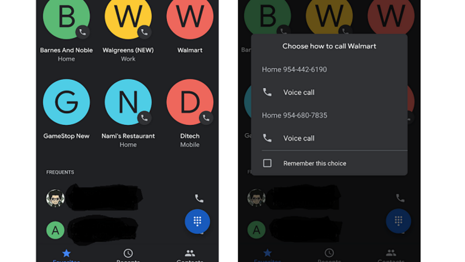
Just yesterday, we were about to make a phone call on our Google Pixel 2 XL when we noticed that Google had redesigned the UI of the Favorites tab on the Phone app. Previously, there were large colorful blocks with an image or the first letter of the name of each contact that was assigned to the Favorites section. This has been replaced with a series of circles with the same images and letters (view image at the top of this article, seen in dark mode). They are arranged in up to three rows with three favorites in each row. Underneath the favorites is a list of frequently called numbers.
Previously, tapping on one of the boxes under Favorites would automatically call the person or company. Now, tapping on one of the circles on the page will bring up several options. You can choose to make a voice or video call. This box will show up every time you tap on a favorite contact unless you tap on the "Remember this choice box" before selecting a voice or video call.
The new Favorites UI seems to be a server-side update. That means there is nothing you can do to hasten its arrival, so sit back and be patient. Soon, the new Favorites UI will adorn your Android phone.
Follow us on Google News







Things that are NOT allowed:
To help keep our community safe and free from spam, we apply temporary limits to newly created accounts: