Project Glass's UI detailed in new report

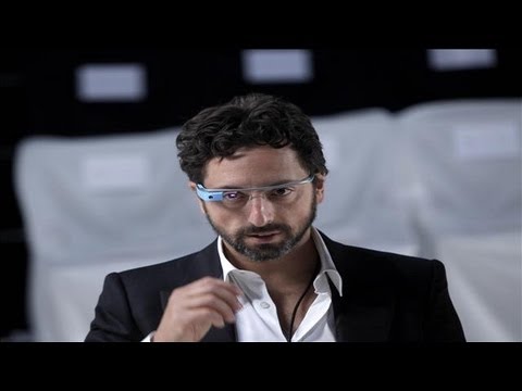
Working for the Wall Street Journal has its perks; in this case it was getting the closest look yet at Google Glass, including some quality time looking at the user interface of Google’s wearable computers. According to WSJ writer Spencer Ante, that UI is still very much a work in progress, although he was still bullish on the concept, likening them to wearable smartphones. His take on the current state of the UI after playing with it was this:
That may emerge as well in the coming year(s), but Google co-founder Sergey Brin already has one feature he loves – setting the camera to time lapse. He indicated that he does this when he plays with his children, with Glass snapping an image every 10 seconds. That way he’s sure to get several irreplaceable moments of his family life preserved for posterity, but without having to interrupt family time by pulling out a phone or camera and snapping the images himself.
After last weekend’s publicity stunt with runway models, we imagine we’ll be getting a steady diet of updates on Google Glass, but for those who want more right now you can watch this video interview posted on the WSJ right now:
source: WSJ via 9to5Google
After 10 minutes of playing with the glasses—which the company prefers to call Google Glass, since they don't have lenses—I could see their long-term potential. The device fit well. It was easy to snap a picture or video without taking my smartphone out of my pocket. It was cool to see the information there in front of my right eye, though a little disorienting. I kept closing my left eye, which was uncomfortable.
Of the parts of the UI that Ante wasn’t able to test out were the Google Maps portion, as well as the UI that would let you make a phone (or video) call or send a text message. Of course Google won’t be releasing a beta version until sometime next year (and then only to developers that ponied up $1,500 at Google I/O), so there is still plenty of time to add features and polish to the experience. Ante points out that one thing that would really help would be the introduction of a “killer app” the really drives home what Google Glass can do.

source: WSJ via 9to5Google





Things that are NOT allowed: