Poll results: the iPhone SE's design is too recycled for your refined taste in smartphones
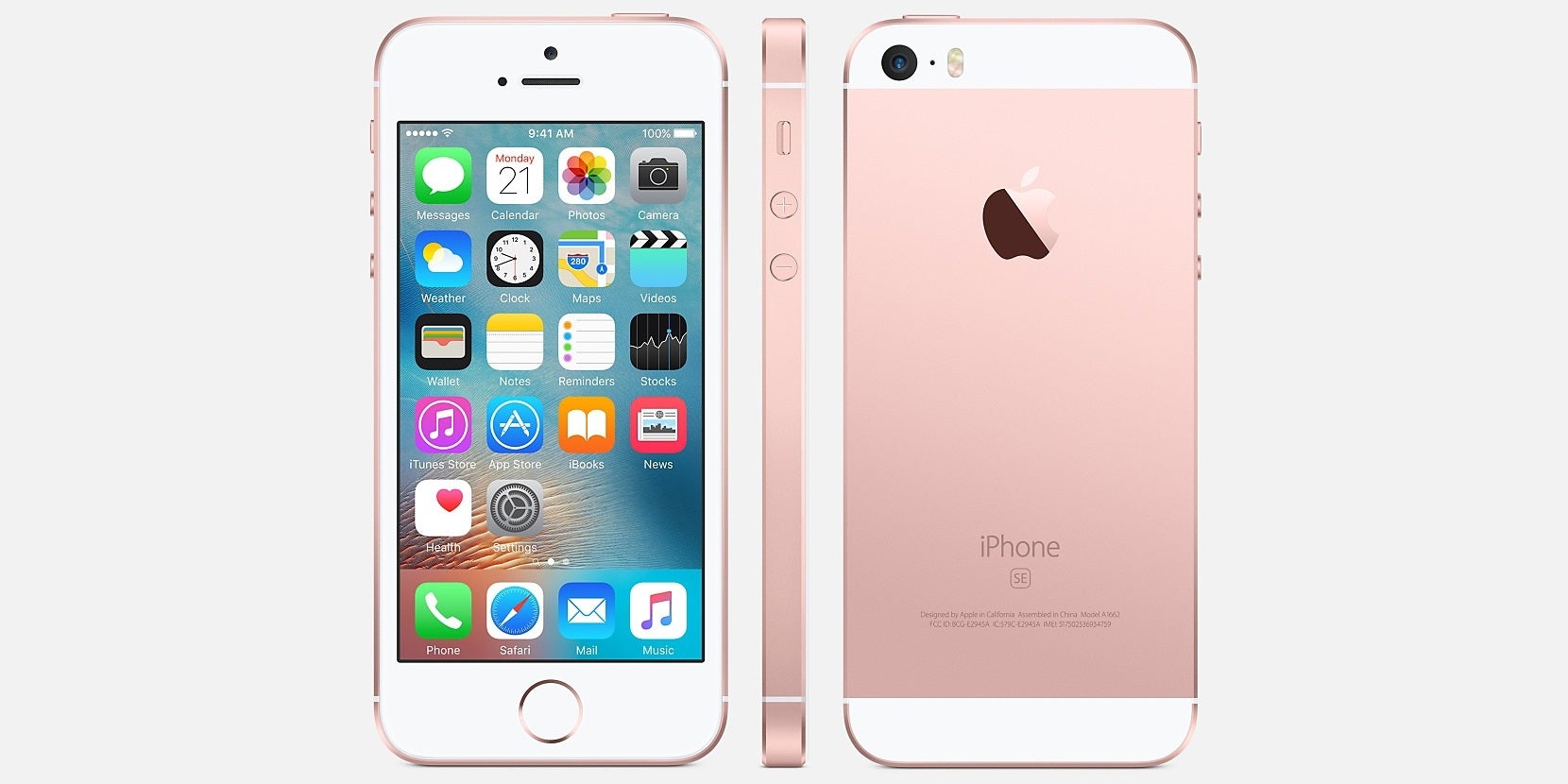
Still, one of the reasons behind the lukewarm response to the iPhone SE has to be the fact that, while unquestionably new, the device doesn't feel new, and therefore exciting. That's because it uses a three year-old design – that of the iPhone 5s (2013). And as you probably know, that handset was based on the iPhone 5 (2012), itself a rework of the iPhone 4/4s design (2010/2011) with a taller screen and aluminum back. Too much deja vu?
The iPhone SE is made for ones who know exactly what they are looking for.
We decided to ask our readers how they feel about it. While we're quite fine with the practical and aesthetic aspects of Apple's decision, our audience is anonymously dissatisfied with the iPhone SE's recycled design! 62.23% (1178 voters out of 1893) expected a brand new – or maybe not so outright familiar design to go together with the new iPhone announcement. Although the iPhone SE will certainly gather its limited, but loyal following, we can imagine many people will storms carrier stores asking for "the new iPhone", only to be surprisingly met by one that looks exactly like the one from 2013, but runs like the bigger, and altogether different looking one from 2015.Does the iPhone SE's recycled design bother you?
Yes, I expected a brand new design
62.23%
No, I'm content with Apple bringing the iPhone 5S love back
37.77%
Follow us on Google News

Things that are NOT allowed:
To help keep our community safe and free from spam, we apply temporary limits to newly created accounts: