OnePlus 5 vs iPhone 7 Plus selfie comparison: Battle of the doppelgängers
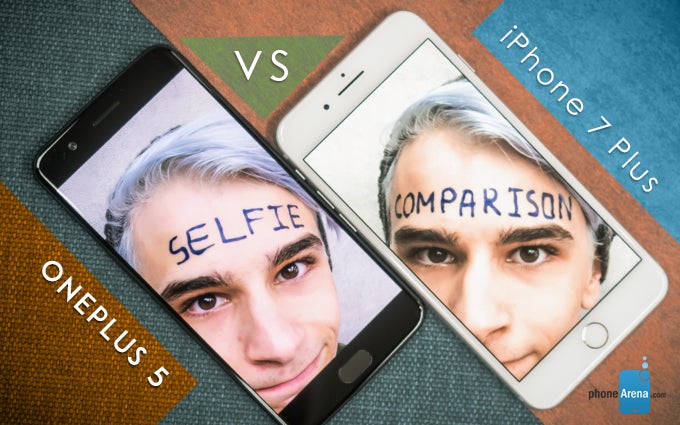
And to do just that, I took both of these babies out for a spin and am now back here with the results — so strap on and get ready to take a couple of very thorough looks at my ugly mug.
Scene 1: At the office
Winner: iPhone 7 Plus
Right off the bat we start with a somewhat difficult photo: the combination of a gloomy day outside and my seat being the furthest away from the window resulted in a shot in which my face was illuminated mostly from one side, a problem somewhat compensated for by both devices. The end result, however, is that neither of the two photos looks particularly good; passable yes, but the colors are just too dull and uninteresting.
In fact, the colors are a particular problem for the iPhone across the board — while it's debatable whether the yellowish tint looks better or worse, it sure isn't even close to what the scene was like in real life. My hair, which I make sure to maintain a bright, pearly white (and which desperately needs redyeing, but that is an entirely different matter) looks off and brassy, which in this case is unforgivable.
However, credit where credit's due: the OnePlus 5 pic is both more overexposed than its rival and also blurrier and less detailed (check out the eyelashes on my left eye). So the winner here is indisputably the iPhone, even if its color profile hurts my ego.
Scene 2: Outside
Winner: Tie
Ugly, abandoned buildings usually make for terrible scenery, but are actually pretty good when used as a background for, say, your latest Instagram shot — put anything in front of them, and it instantly becomes better looking in contrast with its surroundings. That's what I'm hoping for, anyway.
But it also means that you'll most probably get some decent lighting out of the environment, which is good if you want the photo to be at least a passable representation of what you look like. Or to put things in concrete terms, both the iPhone 7 Plus and the OnePlus 5 did pretty well, but each one's quirks are on full display nonetheless.
Namely, the iPhone's yellowish tint gives my face a more lifelike (but a little sunburnt, which is not the case) look than the OP5's ghostly hues. However, looking at the polka dot pattern on my shirt, or the wall texture to the right of my chin reveals the iPhone went a little too hard on the sharpening, resulting in some noticeable and unpleasant artifacts. On the other hand, the iPhone shows much better detail, both on my face and the wall behind me. And since there isn't a clear winner here, I'm calling this one a tie.
Scene 3: Not outside
Winner: OnePlus 5
I have a confession to make: this photo wasn't actually taken at the beach. Shocking, I know, but if you look hard enough you'll notice the frame of the painting sneakily positioned behind me. Though you'd have a somewhat harder time noticing it on the iPhone shot, thanks to its front camera's narrower field of view. In practice, this is both a blessing and a curse, as it means you'll get less face distortion, but you'll often find yourself struggling to take selfies with multiple people in frame.
As for the actual shot in question, rather than unseen, theoretical ones: the setup is a pretty difficult one, thanks to the combination of so-so lighting and fairly high-contrast background. And while both phones suffer in terms of up-close details, the iPhone's colors make the photo simply bad to look at: the exaggerated lighting on my forehead makes me look like some sort of grease monster, while the painting itself looks like the end result of someone cranking up the saturation slider to the max.
Scene 4: In the studio
Winner: iPhone 7 Plus
Forget for a moment that the iPhone pic even exists and take a look at the OnePlus' instead. Or to be more precise, look at its background, and try to notice all of the surroundings. Done? Good.
Now, if one of the things you noticed was a (fake) bonsai tree next to my left shoulder, then congrats! — you have better eyesight than I do. In fact, the OnePlus did a spectacularly bad job in this shot (of which there are four other copies, each one blurrier than the last), or at least it did in comparison with the iPhone, which brought out the details in the background while also not overexposing my face.
Scene 5: In the studio, but I was tired so I laid down
Winner: OnePlus 5
Look, it was a long day, okay? I don't want you judging me about this shot, especially considering that it's arguably the best possible indicator of the differences between the two cameras. Field of view? Check. Color tint? Check. Sharpness? Also check.
In fact, sharpness is once again the deciding factor here, but this time its absence is what gives the OnePlus 5 the crown. Take a look at my face in the iPhone 7 Plus picture (if you dare): the device's sharpening algorithm took the unpleasant shadows on and next to my cheekbones and then accentuated them — an effect that, ironically, actually serves to make the picture look mildly blurrier than the OnePlus'.
Conclusion
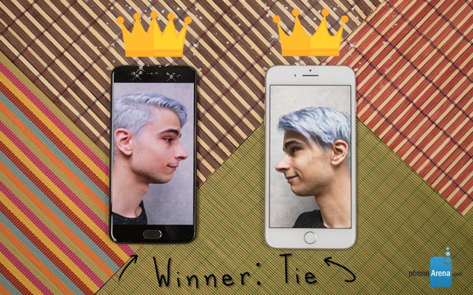
Calling a winner here is a bit hard, and the reason isn't just the fact that the score is a tie. You see, while in these particular scenarios the iPhone's sharpening and color profile did it no favors, they still do their job pretty well in most situations. Meanwhile, the OnePlus' camera has problems with details and dynamic range (and no, HDR was explicitly disabled on both devices), but offers much better color accuracy than its rival.
Also, if the iPhone 7 Plus isn't really your thing, there's also a second selfie comparison, this time between the OnePlus 5 and the Samsung Galaxy S8, so make sure to check it out as well!





Things that are NOT allowed: