OnePlus 11 Concept and Nothing Phone (1): What’s with the lights?
This article may contain personal views and opinion from the author.
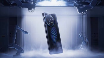
If you have been following MWC Barcelona 2023 rather closely, you might have noticed the most recent announcement from OnePlus. No, we are not talking about the company’s flagship for 2023, the OnePlus 11, we are referring to its cooler (pun intended) version - the OnePlus 11 Concept, which will likely never materialize unfortunately.
It should be noted that the differences between the two OnePlus 11 models under the hood are rather limited. Both devices are powered by the same processor, offer the same top-notch camera performance and have identical spec sheets.
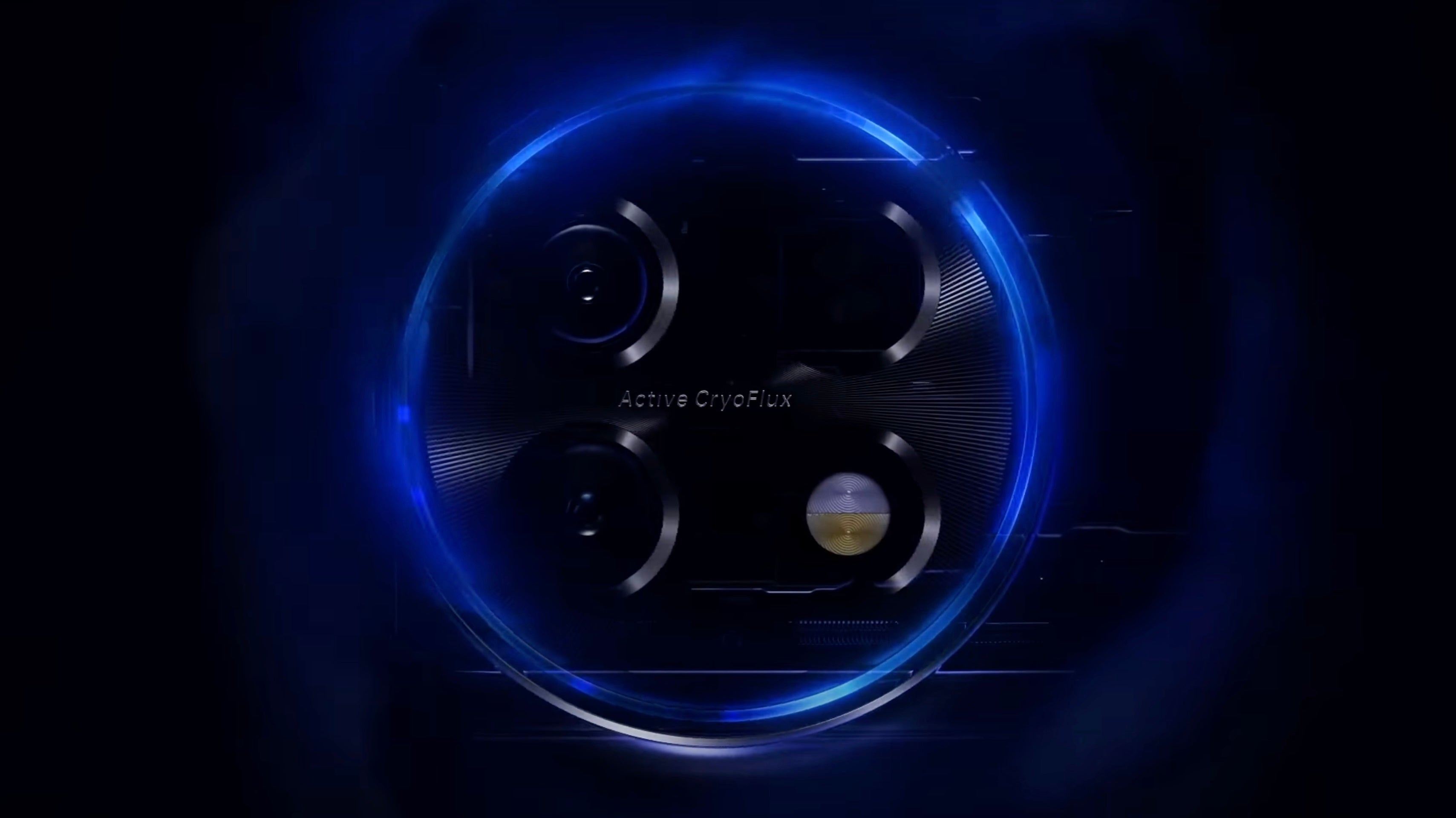
Practicalities aside, the OnePlus 11 Concept brings a very important visual element to the table, in contrast to its much more mundane looking brother. I do not want to downplay the functionality of the Active CryoFlux technology, but, with a Snapdragon 8 Gen 2 chipset under the hood, a couple of additional frames when gaming will not excite the average consumer.
But the fancy glowing blue pipelines might. And I believe I know why this approach works so well. Truth be told, had the OnePlus 11 Concept stuck with the good, but largely familiar design of the standard OnePlus 11, far fewer people would be interested in hearing about the Active CryoFlux system. Thus, it seems that the interesting aesthetic is a response to a growing sentiment that there are too few smartphones that look truly… unique.
In the following paragraphs, I will give my take as to why a couple of lights on the back of a smartphone could stir so much hype, as opposed to incremental improvements in performance and new features. But first, let us address the root cause of the problem - smartphone design in general.
Peak Smartphone Design: Closer to ‘Perfection’
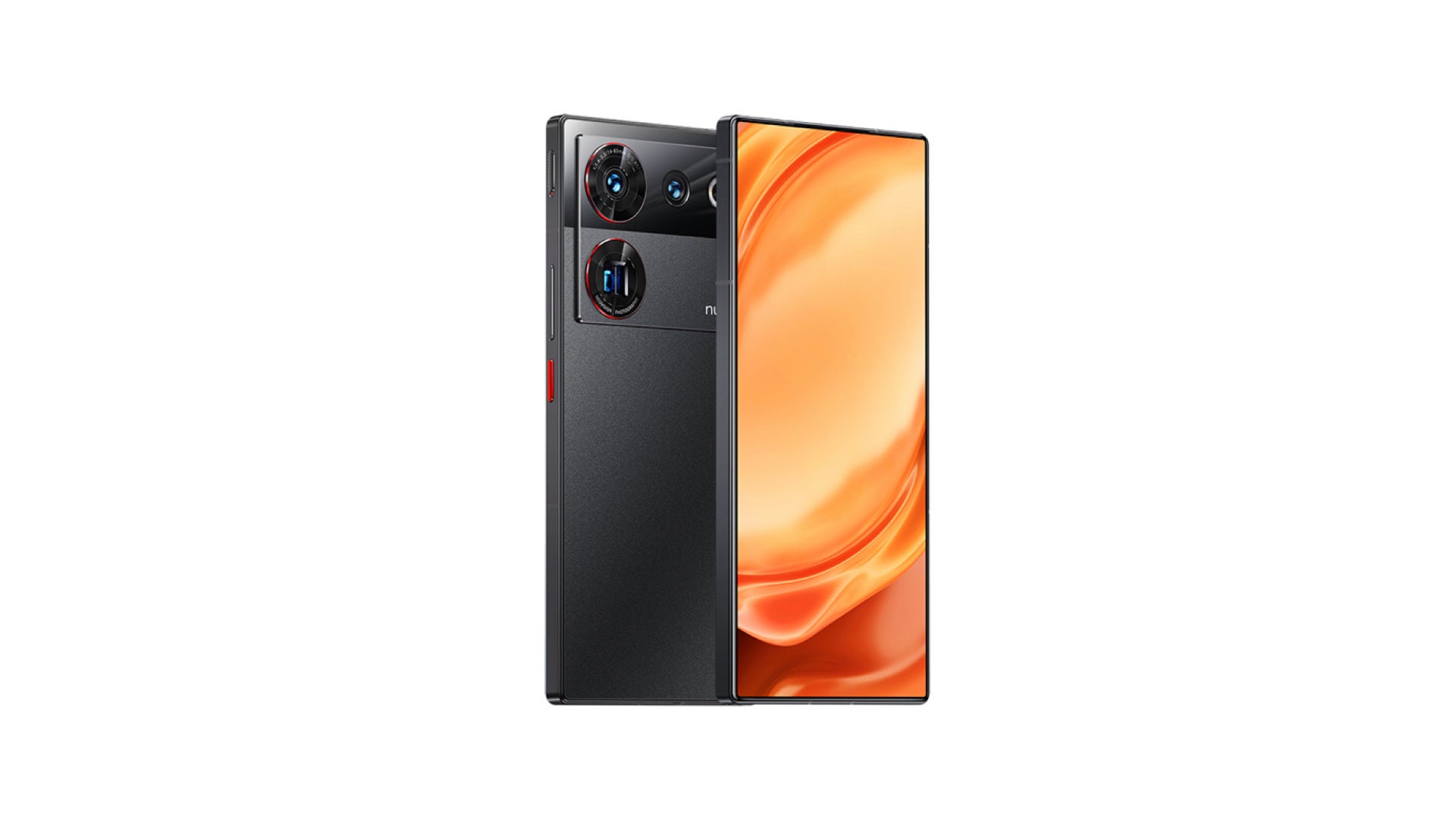
Over the last couple of years, the design of most flagships has steadily been approaching what many consumers and manufacturers believe is the ultimate ‘final form’ of conventional smartphones. Namely, a device that features a seamless edge-to-edge display, with almost non-existent bezels and, ideally, no hole-punch selfie camera cutout. On the front, there really is little room for maneuver. Essentially, you can imagine something along the lines of the Nubia Z50 Ultra.
Some companies have dabbled with under-display selfie cameras, but the technology is simply not there yet. Other less conventional solutions, however, have come off as rather gimmicky (i.e. pop up selfie cameras), and have failed to gain much following.
Hence, design on the display portion of the smartphone has plateaued in recent years. It will likely continue to stagnate until we find a way to deal with the front-facing camera without breaking our selfie game.

The situation when it comes to materials is also very similar. The vast majority of high-end smartphones tend to stick with a limited number of materials - most notably, glass and metal. There is the occasional ceramic wildcard, but the standard flagship almost invariably features a metal frame, a glass back and display, with a screen-to-body ratio that is as high as possible.
This aesthetic is, beyond a doubt, visually pleasing. It is also practical for a number of reasons (maximizing screen real estate, facilitating fast charging, offering sufficient durability etc.). But, when so many smartphones embrace it, we are left with a sea of rather unexceptional devices - each one slightly different, but not one that is truly unique.
Smartphones in 2023: Attack of the Clones
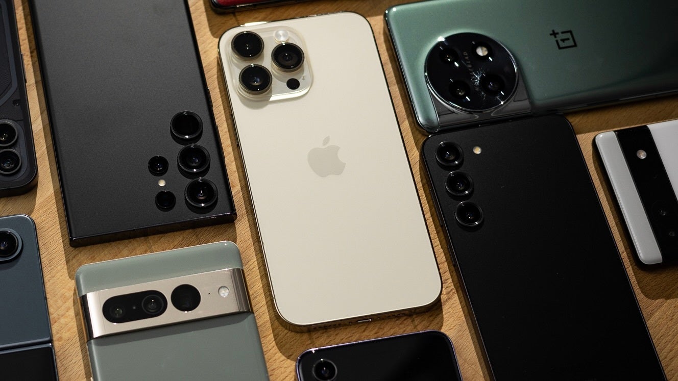
This brings me to my next point - there are a handful of devices on the market today that manage to have any semblance of character whatsoever. This might not be important for everyone, but I personally would think twice before splurging on a smartphone that has an unlimited number of doppelgängers on the market.
Truth be told, smartphones have gotten incredibly good nowadays, and even a typical midranger can deliver impeccable performance. So, when you are spending money on a flagship, you expect it to stand out. Design is the easiest way to ensure that.
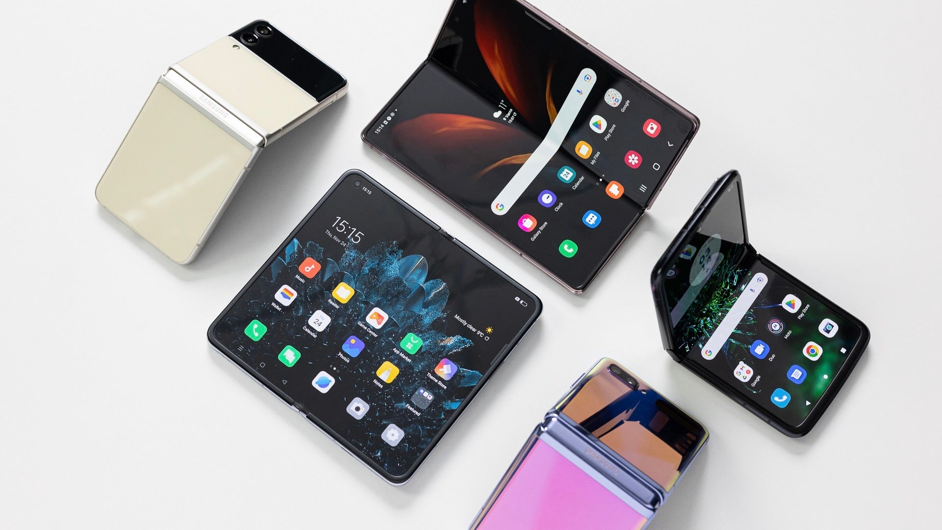
Speaking of foldables, I believe that the form factor as a whole is a reaction to how stagnant conventional smartphone design has gotten. Despite the many flaws, they look and feel different. That is a very understated part of owning a smartphone - how the device feels and looks is just as important as how good it works, especially when it comes to premium handsets.
Because the smartphone market has forsaken individuality in the pursuit of some conception of perfection, a niche has been opened for the less than perfect as well. For example, Apple’s iPhones, because of Face ID, feature much bigger cutouts than their Android counterparts.
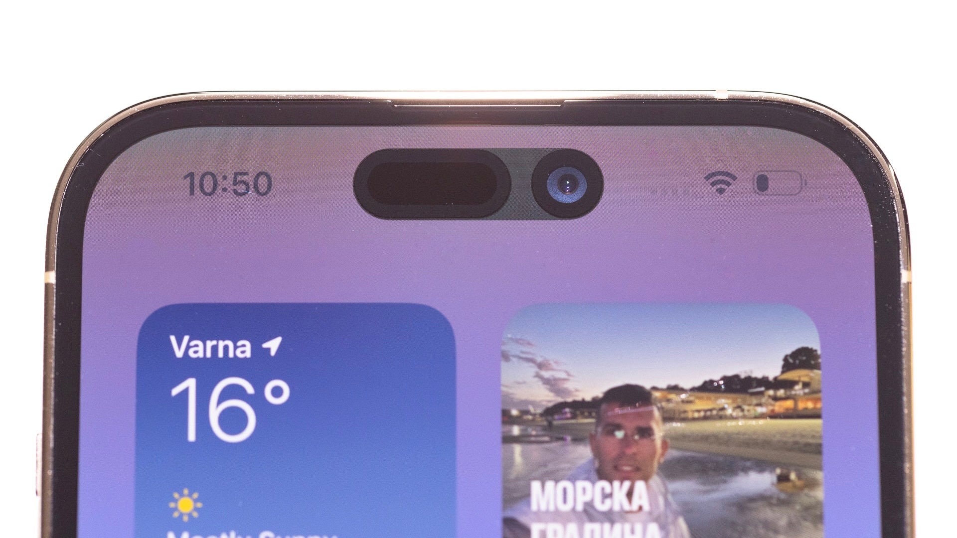
The ‘notch’, as controversial as it was when it made its debut, gave Apple’s smartphones some much needed identity. You simply could not mistake an iPhone when you saw one. The situation is very similar now with the implementation of the Dynamic Island. In truth, both cutout designs eat up more screen real estate than a punch-hole selfie camera, but they have become definitive features of the lineup.
After all, being different very often translates to being better (in a way). However, even Apple is doing its best to produce the ‘ultimate’ iPhone. The Cupertino company is already working on under-display Face ID sensors, which could arrive as soon as 2024. After that, the next logical step is perfecting the under-display selfie camera, something Apple is also keen on according to industry insiders.
Based on the technical challenges remaining for under panel cameras to meet discerning brands quality requirements as well as panel manufacturers' cost requirements, I still believe this roadmap makes sense for the iPhone. pic.twitter.com/3ck5X3sVcL
— Ross Young (@DSCCRoss) May 10, 2022
What manufactures are forgetting about: Smartphones have backs too
However, everything I said until now has not taken into account the other side of the equation or, in this case, the smartphone. While we simply have little more to do when it comes to the display, the back is up for grabs, an opening which companies like OnePlus are effectively exploring.
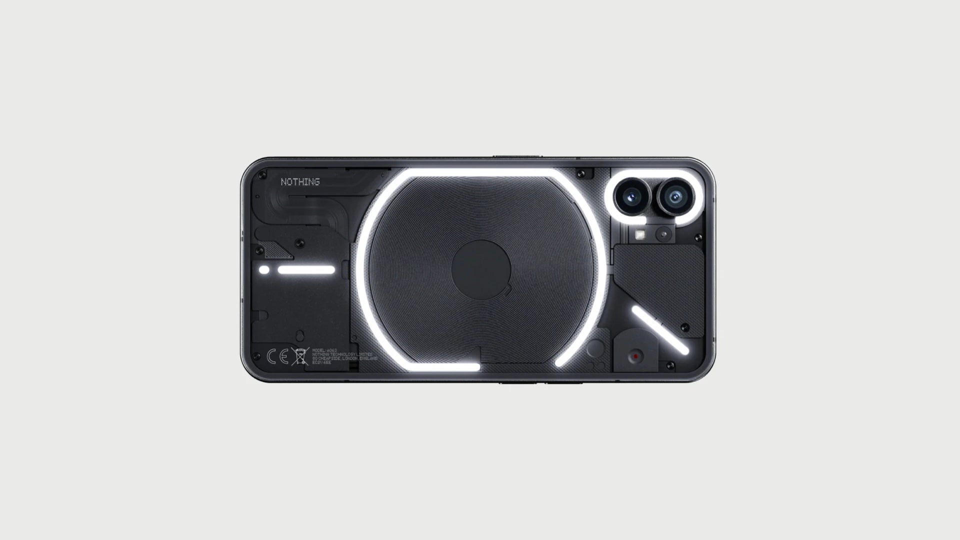
You might recall an even more ambitious example of this from last year - the Nothing Phone (1). The latter was a very capable midrange smartphone, but a major part of why it became so popular was its ‘Glyph Interface’.
Ostensibly, the LED stripes on the back of the device could be used to enable the user to interact with their smartphone by communicating bits of information through light patterns. As interesting as this sounds, it was little more than an excuse for the company to give the Nothing Phone (1) a one-of-a-kind aesthetic.
The pattern here is very obvious. The OnePlus 11 Concept features stripes as part of a cooling system, while the Nothing Phone (1) - as a way of creating a rudimentary communication method. In both cases, the general public often simply sees a glowing smartphone and is instantly interested in learning more.
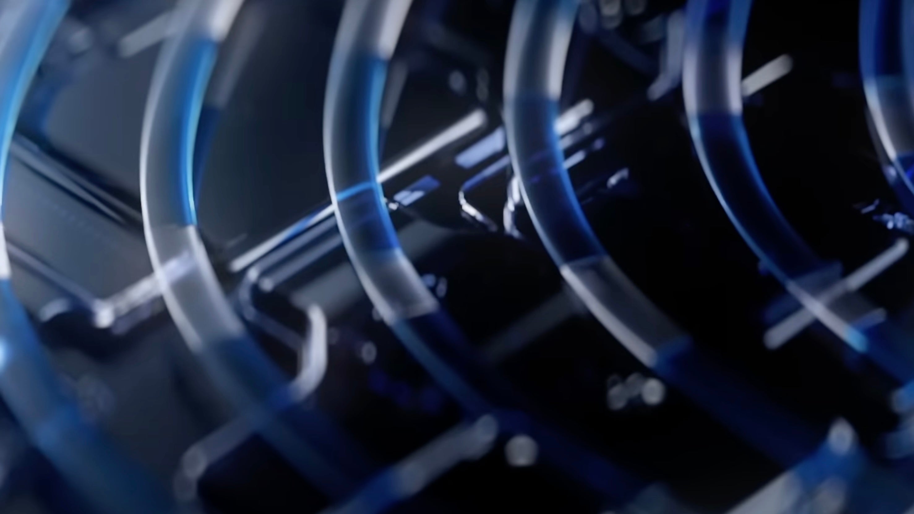
There is something innately fascinating about seeing glowing liquid circulating below the surface of your smartphone. Whether that really plays a big role in cooling is another matter entirely. Furthermore, the semi-transparent aesthetic that both of these devices rock makes them feel and look more like a prop from a science fiction movie than an average handset.
Conclusion: A Blank Canvas
In short, while most companies are playing around with how angular or round smartphone frames are and what the size and shape of the camera bump is, there is a big part of smartphone design that is left unexplored.
Devices like the OnePlus 11 Concept and the Nothing Phone (1) have done a good job of appreciating just how much potential all that space holds. While we are patiently waiting for the ‘ultimate’ smartphone design, there are still unique looks that can be experimented with.
Why stop at light strips? Why not put a whole E Ink display on the back that would enable the smartphone to change its design at will? You can then brand it as a smartphone with a built-in eReader. The possibilities are endless. We just need to stop fixating on the one we think is perfect.




Things that are NOT allowed: