Now that Material Design has been around for a while: do you like it?
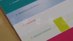
Back when Android 5 Lollipop was announced, Material Design became kind of a catchphraze. What it promised to do was to set a standard for how Android apps — both native and 3rd party — would look, behave, and feel, in order to provide a more streamlined experience for the end user. And sure, the ride was a bit bumpy. The guidelines, which Google had at the beginning have been broken by Google itself, then re-adjusted, and now seem pretty much clear. Developers have also gotten a hang of the concepts behind Material Design and are building apps whose interfaces blend lovely with the rest of the software on our phones.
And while many were happy that Android is about to get a more streamlined feel to it, some fans of Google's OS weren't particularly happy with the look that Material Design was going for. The flat appearance, the vibrant, candy-like colors that were showcased — they just didn't gel with everyone, and that's understandable. And many people do need some time to get used to a certain look and design elements before they could judge whether they like them or not.
So, now that Material Design is well-established, most popular apps and app developers employ it, and we've gotten used to seeing it everywhere — what do you think of Material Design? Do you hate its looks, but like that it streamlined everything, do you love it, or do you just not care?





Things that are NOT allowed: