Is the "waterdrop" notch better than the iPhone X-like notch?
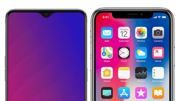
"The Notch" is one of the most controversial design choices in recent times. A lot of smartphone fans insist they hate it, phone manufacturers insist on putting it on their phone displays. Ever since the iPhone X first hit, we've been getting more and more phones with a screen that goes right up to the bezel, but there's this cutout on the top, which holds the earpiece, proximity sensors, and front-facing camera.
Very few phone makers have stayed away from this trend. Some have no issue with leaving some "chin" and "forehead" on their phones, other more obscure brands came up with some pretty amazing mechanical pop-up contraptions that hide the camera within the phone's body. The manufacturers that do come out with a "notched" phone either include the choice of hiding it entirely by having the display show a black bar up there, or boast about how their notch is smaller than others. Yeah, that was a thing.
So, now that a recent leak showed us that the OnePlus 6T will allegedly have the super-minimalistic "waterdrop"-type notch over its display, we wondered — is this better, just as bad, or worse than having a wider notch? So, we ask you — what do you think?
So, now that a recent leak showed us that the OnePlus 6T will allegedly have the super-minimalistic "waterdrop"-type notch over its display, we wondered — is this better, just as bad, or worse than having a wider notch? So, we ask you — what do you think?






Things that are NOT allowed: