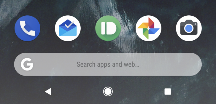
Nobody likes what Google did with the search bar on the Pixel Launcher

A recent change to the dock searchbox of the Pixel launcher has left users scratching their heads over Google's reasoning. The widget now features a text stating that it can be used to "Search apps and web.." or simply "Search..", as if you've forgotten what search boxes do.
Well, we haven't.
Just as you might imagine, this otherwise minor change has been the cause of tons of backlash that's aimed at Google itself. Sure, such a tooltip is a rather harmless addition to the stock Pixel Launcher that will be helpful to the average inexperienced user who is a novice Pixel owner.
But it's ugly and it feels like Google is adding things just for the sake of adding things. As you can imagine, that's a universally bad move. It adds unnecessary clutter to the otherwise clean aesthetic that the Pixel Launcher has going on. Sometimes minor changes are the most aggravating and it's easy to see why users would be unhappy at such an intelligence-offending change.
source: Google+
Follow us on Google News


Things that are NOT allowed:
To help keep our community safe and free from spam, we apply temporary limits to newly created accounts: