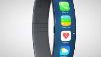
New iWatch concept beautifully builds on the Nike FuelBand concept

A few months ago, we saw a concept for the Apple iWatch from designer Thomas Bogner that modeled the device after the Nike FuelBand, and it was one of the better designs that we had seen (regardless of how realistic of a design it would be). Now, designer Todd Hamilton has expanded on that design and added in the iOS 7 UI, which looks very at home on a wearable.
As far as the design of the hardware itself, Hamilton has only made a couple tweaks, but seemingly important ones. First off, he has given more thought to the materials of the device, blending the screen with a glossy outside, and making the inner part of the band rubber. The other big change was in changing the orientation of the screen. Bogner's design had information displayed horizontally, which looks nice in a concept, but makes very little sense when placed on a human wrist. Hamilton has the data displayed vertically, which makes the whole system make more sense.

Additionally, the iOS 7 icons, clean design, and ambient color look far more dynamic and interesting on a smartwatch than you might expect. This looks like a device that we'd love to use. Of course, realistically it is fairly impossible right now for a device like this to be made, because we don't yet have quality curved batteries, flexible cables, and the other components to make it a reality. Still, we definitely prefer this idea to the silly iWatch S and C concepts we saw recently.

source: Todd Hamilton via Mashable


Things that are NOT allowed: