Motorola Moto X (2014) specs review

Has Motorola learned from its mistakes?
Has Motorola learned from its mistakes? The company uncovered the new Moto X today, and at first sight it seems that the answer is yes: the 2014 Moto X features a premium-feeling metallic frame, a larger, 5.2” display with a higher, 1080 x 1920-pixel resolution, a powerful (even though not cutting edge) Snapdragon 801 system chip, and a non-experimental 13-megapixel camera. Check, check, check. Let’s look at all that in detail.Design: leather back, metal frame
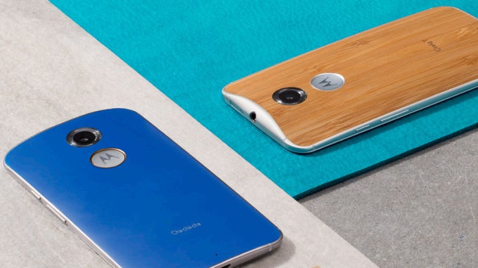
Good design is something elusive: it’s subjective and somehow universally accepted at the same time. That’s why it’s hard to give a definite judgment about a particular design, and the new Moto X is a particularly difficult phone as it seems that it draws polarizing reactions: some love it, and others hate it. First, though, the backstory: the new Moto flagship was designed by Motorola lead designer Jim Wicks, the same person behind the acclaimed Moto 360 circular looks. It puts the focus on symmetry - the front grills are symmetrical on the top and bottom (but only the bottom one is a speaker, we have no stereo speakers in the Moto X), perfectly aligned, on the back, the camera eye is doubled by a second, equally large dimple with the Motorola logo. This creates an unusual look, and the oversized logo and camera definitely look on the weird side. Add to that the three infra-red beamers on the front of the device (used for its gesture recognition), and you surely have a very distinct design.

What impresses more, however, is the departure Motorola took from plastic: last year’s flagship Moto X did not exude a feeling that you’re holding something premium, precious. This year’s Moto X? Much closer. It’s got a sturdy metal frame with accented buttons that look gorgeous. Even small details like the riffled lock key are nice. Even nicer is the improved Moto Maker with wider choice of materials: along with the plentiful colorful plastic cover choices, you have 4 wood and 4 leather finishes. The latter are all new and exclusive for the new Moto X.
Display: more AMOLED

Last year’s Moto X also shipped with an AMOLED panel, but with all of its advantages, we have to remind you it was pretty wildly oversaturated, with unrealistically blown-up colors and a slight but noticeable bluish tint. We are seeing similarly boosted colors on the new Moto X, but that’s only our first impression: we’d be coming up with more definite measurements in our upcoming review.
Interface: always-on voice
One of the things Motorola is loved for is the clean, Android stock-like interface. It’s a lightweight, fast, and responsive user interface. Motorola has proven it can be very quick with updates as well, so even though the new Moto X launches with Android 4.4 KitKat, it’s likely that it will get the new Android L update soon after the fall roll-out.
Always on voice with any command, not just 'Ok, Google'
Moto Voice, the always-on voice assistant, is on board as well, but this time you can choose the phrase to wake it up yourself, while previously you needed to use the ‘Ok Google’ wake-up call. Now, anything with 5 syllables or more will work, so you can just say something like ‘wake up, buddy’.The new element with the Moto X is Moto Actions. Using the three front-facing infra-red cameras, the phone can easily and accurately detect motion, so you can wave your hand in front of the phone to, say, silence an incoming call.
Processor and Memory: good, but not cutting edge

Camera: put a ring on it (that flash!)
After an experimental run with the 2013 Moto X which shipped with a 10-megapixel ‘ClearPixel’ camera by OmniVision, this year, the new Moto X skips on those experiments and relies on the tried and tested 13-megapixel Sony IMX135 sensor.
That’s one of the most popular sensors out there that is also used on devices like the LG G3, LG G2, and the Samsung Galaxy S4. It is noticeably smaller than the previously used OmniVision one, but has a higher resolution. Naturally, this translates into tinier, 1.1µ pixels, smaller than the 1.4µ on last year’s Moto X. Is this a worthy trade-off? We have already seen that pixels of such a small scale are not the ideal solution for night shots where images often pick up more noise, but we’re yet to analyze the new Moto X camera samples in our detailed review that’s coming up.

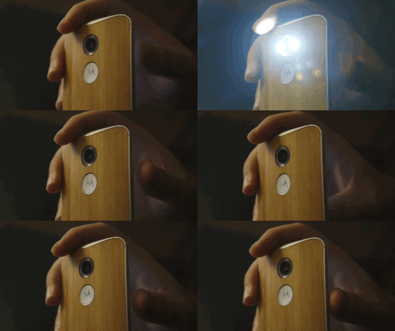
Moto X's new ring flash, animation courtesy of TheVerge
More (daytime) camera samples from the new Moto X surface
Daytime camera samples courtesy of Android Authority.
Motorola Moto X (2nd Gen.) low-light camera samples.
Battery
With a 2300mAh, the Moto X does not stand out with a particularly huge juicer, but it claims to have made some optimizations and promises a full day (yes, that means 24 hours) off the charger. Obviously, the company is well aware of the risk taken with such a comparatively small battery, and we hope that it has managed to optimize well. We’ll run our extensive battery benchmarks and tell you more about the battery life in our upcoming Moto X review.

Conclusions and Expectations
Overall, the Moto X is a welcome upgrade on all fronts. Unlike last year’s device, it does not feel cheap and plasticky, nor does it ship with any specs that could bring it down (last year’s 720p resolution and comparatively dated processor were exactly that). It is also not on the cutting edge, though, as it lacks the latest Snapdragon 801 system chip, and we’re yet to see how has it optimized the 13-megapixel Sony IMX135 sensor and the 2300mAh battery. Instead, it focuses on innovation in some meaningful things - the new features are nice, without cluttering the interface and the phone is zippy and premium feeling. Moto Maker is even nicer, and all of that would give the new Moto X extra allure. But it’s got a steep hill to climb with fierce Android competition.

Motorola Moto X (2014) specs review
Follow us on Google News


Things that are NOT allowed:
To help keep our community safe and free from spam, we apply temporary limits to newly created accounts: