Motorola DROID mini hands-on
Introduction:
Small, medium, and large. That seems like the mentality with Motorola nowadays, as they announced its latest devices in the longstanding DROID family line with Verizon. Although some would believe that there would be a compromise made with a device that’s attached with the ‘mini’ moniker, Motorola intends to buck the trend by delivering a new DROID that doesn’t compromise much – aside from size, of course. Well, that’s where the Motorola DROID mini comes to mind, as it really is a miniaturized version of its siblings.
Display:
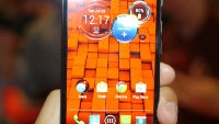
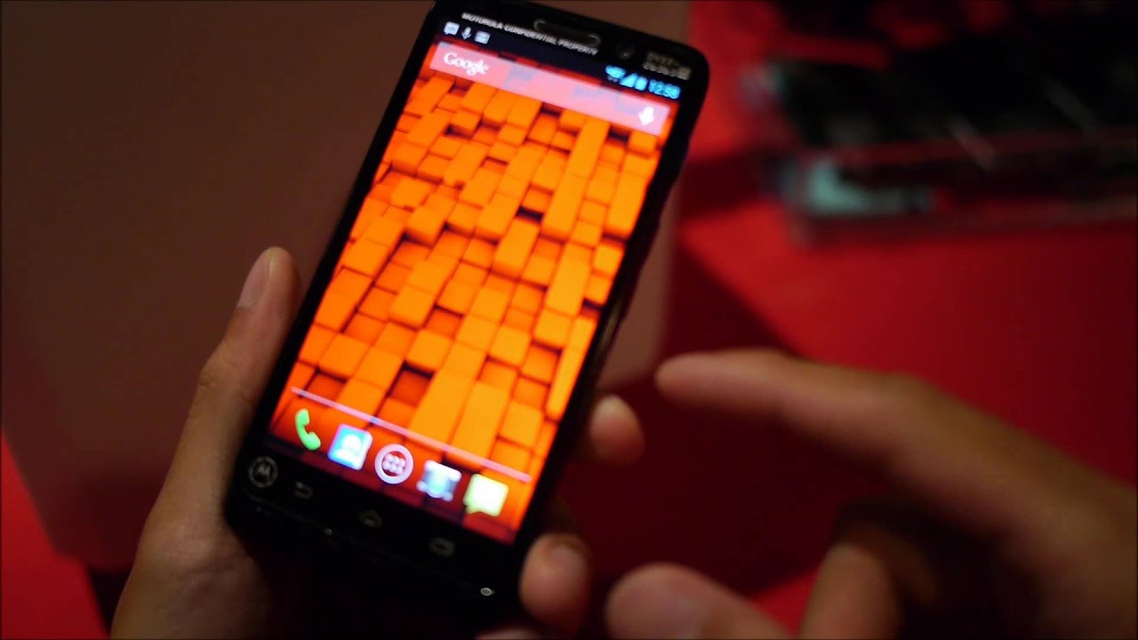
Just like the DROID RAZR M from last year, the DROID mini features a 4.3-inch edge-to-edge display that’s more fitting for a device tagged with the ‘mini’ name. Rather than being AMOLED based, like what its siblings are using, this one is actually a TFT display, which interestingly enough, still has a polarizing look to its aura – thanks mostly to its iridescent color output. At the same time, it’s wickedly detailed too with its 720 x 1280 pixel resolution (720p), which delivers an admirable 342 ppi pixel density. At the end of the day, it still has that same glow to attract attention – albeit, there’s a subtle amount of distortion at wide viewing angles.
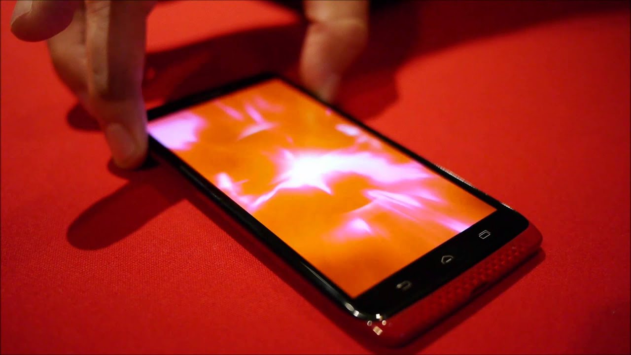
Gone is the rubbery Kevlar material employed by the DROID RAZR M, and instead, it’s flaunting a glossy finish that’s more prone to fingerprints and smudges. Despite that one unfavorable aspect, we truly love how this is super compact and easier to hold in the hand – something that’s significantly easier over the other new DROIDs. It’s not as thin as the DROID Ultra, but frankly speaking, its smaller size easily makes up for a lot of things. Still, when we look at the thing, it’s quite evident that Motorola didn’t want to steer clear from the design aesthetics of its predecessor.
Interface:
We won’t get into any more detail in this particular category, seeing that it’s running the same Android 4.2.2 Jelly Bean experience that’s showcased on the DROID Ultra and DROID MAXX as well. Visually, it pays homage to the style of stock Android, but it receives some new enhancements that deepen its functionality (touchless controls, active notification, and quick camera access). As we’ve detailed from the beginning, Motorola made sure to provide users with an uncompromised experience with the DROID mini. And surely enough, that seems like the case here!
Oh snap! The Motorola DROID mini has one snappy performance that remarkably seems similar to what its siblings are also able to produce. Surprise-surprise everyone! The reason why it’s moving so effortlessly with the same tasks is because it’s running the same processor under the hood, a dual-core 1.7GHz Motorola X8 Mobile Computing system that’s complemented by 2GB of RAM and a 400MHz quad-core GPU. By now, this handset is proving to us that it isn’t like the other ‘mini’ devices that its rivals offer, but instead, it’s so much more.
Expectations:
Don’t let its size or name fool you, mainly because the Motorola DROID mini is a small bundle of joy that doesn’t have the same compromises we'd typically be exposed to by something of this caliber. Rather than gracing it with a lower resolution display and fluffier processing hardware, Motorola is somehow able to magically give almost everything that’s in the Motorola DROID Ultra into the DROID mini. Concurrently, it’s receiving a price point that’s also half the cost of its sibling too – $99.99 with a 2-year contract. At the moment, we’ll be reserved with our judgment until we check out a final version, but it’s shaping out to be a wonderful mid-range offering.
Small, medium, and large. That seems like the mentality with Motorola nowadays, as they announced its latest devices in the longstanding DROID family line with Verizon. Although some would believe that there would be a compromise made with a device that’s attached with the ‘mini’ moniker, Motorola intends to buck the trend by delivering a new DROID that doesn’t compromise much – aside from size, of course. Well, that’s where the Motorola DROID mini comes to mind, as it really is a miniaturized version of its siblings.
Just like the DROID RAZR M from last year, the DROID mini features a 4.3-inch edge-to-edge display that’s more fitting for a device tagged with the ‘mini’ name. Rather than being AMOLED based, like what its siblings are using, this one is actually a TFT display, which interestingly enough, still has a polarizing look to its aura – thanks mostly to its iridescent color output. At the same time, it’s wickedly detailed too with its 720 x 1280 pixel resolution (720p), which delivers an admirable 342 ppi pixel density. At the end of the day, it still has that same glow to attract attention – albeit, there’s a subtle amount of distortion at wide viewing angles.
Design:
Gone is the rubbery Kevlar material employed by the DROID RAZR M, and instead, it’s flaunting a glossy finish that’s more prone to fingerprints and smudges. Despite that one unfavorable aspect, we truly love how this is super compact and easier to hold in the hand – something that’s significantly easier over the other new DROIDs. It’s not as thin as the DROID Ultra, but frankly speaking, its smaller size easily makes up for a lot of things. Still, when we look at the thing, it’s quite evident that Motorola didn’t want to steer clear from the design aesthetics of its predecessor.
Interface:
We won’t get into any more detail in this particular category, seeing that it’s running the same Android 4.2.2 Jelly Bean experience that’s showcased on the DROID Ultra and DROID MAXX as well. Visually, it pays homage to the style of stock Android, but it receives some new enhancements that deepen its functionality (touchless controls, active notification, and quick camera access). As we’ve detailed from the beginning, Motorola made sure to provide users with an uncompromised experience with the DROID mini. And surely enough, that seems like the case here!
Expectations:
Don’t let its size or name fool you, mainly because the Motorola DROID mini is a small bundle of joy that doesn’t have the same compromises we'd typically be exposed to by something of this caliber. Rather than gracing it with a lower resolution display and fluffier processing hardware, Motorola is somehow able to magically give almost everything that’s in the Motorola DROID Ultra into the DROID mini. Concurrently, it’s receiving a price point that’s also half the cost of its sibling too – $99.99 with a 2-year contract. At the moment, we’ll be reserved with our judgment until we check out a final version, but it’s shaping out to be a wonderful mid-range offering.






Things that are NOT allowed: