Motorola DROID Ultra hands-on
Introduction:
The DROIDs have landed! And boy is it a refreshing thing to experience, especially when you take into consideration that the line gets updated once a year. In fact, it’s not too often nowadays that Motorola outs any amazing high-end devices ever since they were acquired by Google. Broken up to different classes, the Motorola DROID Ultra seems like it’s the all-around performer out of the bunch, mainly because it has that high-end goodness we crave in a smartphone – but it’s all packed in one incredibly thin body!
Display:
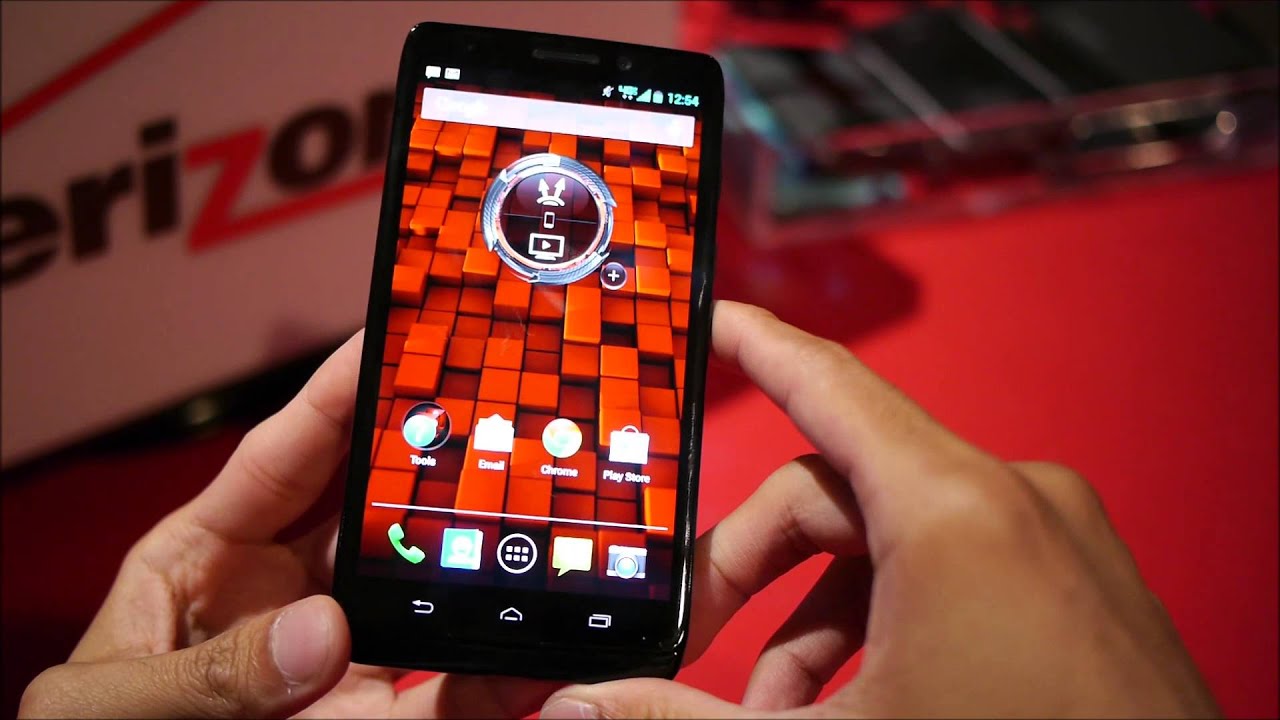
Even with that thin body, the Motorola DROID Ultra is able to pack along a display that’s large enough to tangle with the greats in the space. Increasing in size, the DROID Ultra is now sporting a 5-inch Super AMOLED HD display, which is larger than the 4.7-inch display from last year’s DROID RAZR HD. Sadly though, its resolution is lagging behind at 720 x 1280 pixels – 720p no doubt, but we were hoping for nothing less than 1080p. It’s indeed unfortunate, but it doesn’t dissuade us because it’s no longer relying on a PenTile matrix arrangement. Upon closer inspection, there’s a fine level of sharpness that gives even the smallest of details enough clarity.
Design:
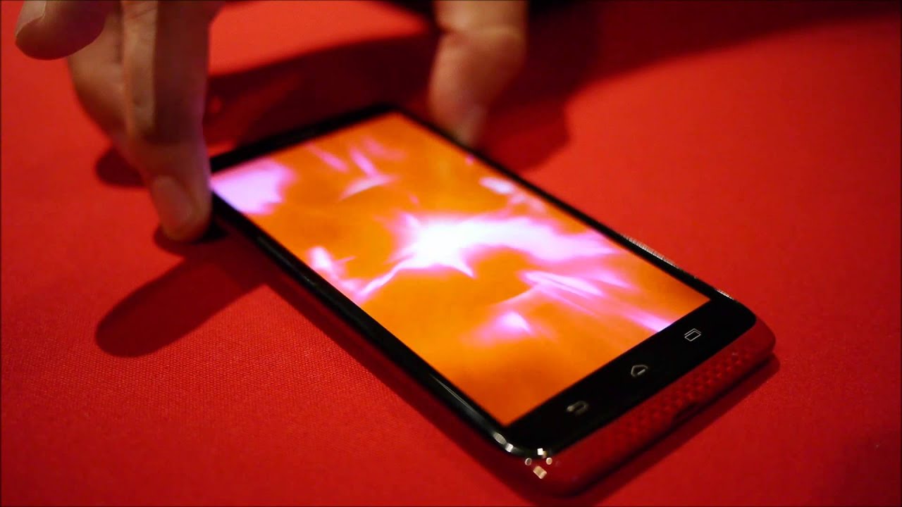
Aside from the hot red color version of the handset, it still looks very much like the DROID of last year. Being a new year and a new device, the DROID Ultra is treated to an even thinner body than its predecessor – it’s at an amazingly thin 7.18mm! Looking at the thing, it really makes us wonder how they’re able to stuff everything into its body, but just like before, the handset gradually becomes thicker towards the top where the camera is housed. This time though, it’s not as pronounced, which is a pleasant thing to find. Going back to the Kevlar pattern of its rear, the bright red color really makes this handset stand out, but then again, the glossy finish of the surface makes it prone to smudges and fingerprints. Regardless of that, the construction is excellent, as everything about it has a sturdy feel. Ultimately, the emphasis here is on the ridiculously thin body of the DROID Ultra. It’s impressive to say the least, but we’re itching to see a new direction with the design at this point.
Interface:
Taking a peek at the DROID Ultra’s experience, it doesn’t really look a whole different to what we experienced with last year’s model. Specifically, the only major visual changes we see are mostly cosmetic, as some of the widgets we’re accustomed to seeing with Moto’s DROID devices have been updated. Aside from that, it’s a mostly stock Android 4.2.2 Jelly Bean experience – so we’re pleased that it has all the features, personalization, and functionality we’d expect from the platform. Packing along some new surprises, these new line of DROIDs have a few exclusive features that make them unique over other Android smartphone.
First, there’s the new Touchless Controls feature, that allows the handset to actively listen to what you’re saying – even when the display is turned off. From sending text messages to placing phone calls, you simply speak what you want to accomplish, and the handset goes on to do it. In practice, the handset seemed to struggle to comprehend what we were saying, but then again, the noisy environment of the room doesn’t help. Secondly, you have the new ‘active notifications’ feature with the experience, which essentially allows us to nudge the phone when it’s turned off and placed on a flat surface, to show us some notifications. Rounding things out, a quick shake of the phone a few times when it’s turned off launches the camera app instantly.
Call it a departure from the norm, the DROID Ultra is powered by a dual-core 1.7GHz Motorola X8 processor coupled with 2GB of RAM and a 400MHz quad-core GPU – something that’s been developed from the ground up by Moto. Being a newcomer and all, we’re impressed by the performance we’re seeing with the device, and that’s despite it still being a pre-production unit. Everything just runs so darn fast and smooth! We’re just enamored by the level of finesse of its performance, which proves to be one of the snappiest devices we’ve checked out in recent memory.
Expectations:
Being the middle child in the new family of DROIDs, the Motorola DROID Ultra is seemingly the device that’ll be going toe-to-toe with some of the other flagship devices out there – especially when it’s going to be priced at $199.99 on-contract when it launches shortly. It’s funny how today’s smartphones tend to focus on a particular aspect more than anything else, and for this, it’s all about its insanely thin profile, lightweight feel, and its new head turning red paint job. Like a high end sports car, the handset has the looks to enchant almost anyone that peeks at it, but it’ll interesting if people will favor design above everything else in search for that balanced phone.
The DROIDs have landed! And boy is it a refreshing thing to experience, especially when you take into consideration that the line gets updated once a year. In fact, it’s not too often nowadays that Motorola outs any amazing high-end devices ever since they were acquired by Google. Broken up to different classes, the Motorola DROID Ultra seems like it’s the all-around performer out of the bunch, mainly because it has that high-end goodness we crave in a smartphone – but it’s all packed in one incredibly thin body!
Even with that thin body, the Motorola DROID Ultra is able to pack along a display that’s large enough to tangle with the greats in the space. Increasing in size, the DROID Ultra is now sporting a 5-inch Super AMOLED HD display, which is larger than the 4.7-inch display from last year’s DROID RAZR HD. Sadly though, its resolution is lagging behind at 720 x 1280 pixels – 720p no doubt, but we were hoping for nothing less than 1080p. It’s indeed unfortunate, but it doesn’t dissuade us because it’s no longer relying on a PenTile matrix arrangement. Upon closer inspection, there’s a fine level of sharpness that gives even the smallest of details enough clarity.
At the same time, seeing that it’s based on AMOLED technology, it employs all the characteristics we love about the panel type – like its vibrant color production and wide viewing angles. Overall, the display still has that wow factor when we glaze over it, but in the back of our minds, we would’ve preferred a 1080p display just to keep it in good light with the competition.
Design:
Aside from the hot red color version of the handset, it still looks very much like the DROID of last year. Being a new year and a new device, the DROID Ultra is treated to an even thinner body than its predecessor – it’s at an amazingly thin 7.18mm! Looking at the thing, it really makes us wonder how they’re able to stuff everything into its body, but just like before, the handset gradually becomes thicker towards the top where the camera is housed. This time though, it’s not as pronounced, which is a pleasant thing to find. Going back to the Kevlar pattern of its rear, the bright red color really makes this handset stand out, but then again, the glossy finish of the surface makes it prone to smudges and fingerprints. Regardless of that, the construction is excellent, as everything about it has a sturdy feel. Ultimately, the emphasis here is on the ridiculously thin body of the DROID Ultra. It’s impressive to say the least, but we’re itching to see a new direction with the design at this point.
Taking a peek at the DROID Ultra’s experience, it doesn’t really look a whole different to what we experienced with last year’s model. Specifically, the only major visual changes we see are mostly cosmetic, as some of the widgets we’re accustomed to seeing with Moto’s DROID devices have been updated. Aside from that, it’s a mostly stock Android 4.2.2 Jelly Bean experience – so we’re pleased that it has all the features, personalization, and functionality we’d expect from the platform. Packing along some new surprises, these new line of DROIDs have a few exclusive features that make them unique over other Android smartphone.
First, there’s the new Touchless Controls feature, that allows the handset to actively listen to what you’re saying – even when the display is turned off. From sending text messages to placing phone calls, you simply speak what you want to accomplish, and the handset goes on to do it. In practice, the handset seemed to struggle to comprehend what we were saying, but then again, the noisy environment of the room doesn’t help. Secondly, you have the new ‘active notifications’ feature with the experience, which essentially allows us to nudge the phone when it’s turned off and placed on a flat surface, to show us some notifications. Rounding things out, a quick shake of the phone a few times when it’s turned off launches the camera app instantly.
Expectations:
Being the middle child in the new family of DROIDs, the Motorola DROID Ultra is seemingly the device that’ll be going toe-to-toe with some of the other flagship devices out there – especially when it’s going to be priced at $199.99 on-contract when it launches shortly. It’s funny how today’s smartphones tend to focus on a particular aspect more than anything else, and for this, it’s all about its insanely thin profile, lightweight feel, and its new head turning red paint job. Like a high end sports car, the handset has the looks to enchant almost anyone that peeks at it, but it’ll interesting if people will favor design above everything else in search for that balanced phone.







Things that are NOT allowed: