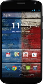
Moto X size comparison: excellent phone-to-screen size ratio

Well, lookie what we've got here - when sized up with current handsets, the Moto X turns out to be with one of the best phone-to-screen-size ratios we've ever seen, upwards of 70% in our quick calculations. Granted, at its thickest it can be considered chubby compared to the Android anorexics, but this is due to the arched shape of the back, which slopes down to the razor thin 5.6 mm at the ends for the thinnest top and bottom edges so far.
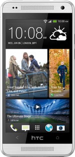
In fact, the Moto X is not only shorter and narrower than the 5-inchers - its shrunken bezel makes it with less frontal surface than the fellow 4.7-inchers, like the Nexus 4, or the Ascend P6. In fact it is shorter, and only slightly wider than the 4.3" HTC One mini, which, of course, had to fit those BoomSound speakers somewhere.
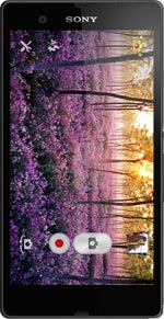
Again, we might be looking at one of the best phone-to-screen-size ratios, where the crown is on the Sony Xperia ZL's head, and Motorola explained how it achieved that barely visible bezel. It stretches edge-to-edge, they say, molded carefully at the ends to fuse with the front housing for a seamless look and "the perfect balance between readability and one-handed use".







Things that are NOT allowed: