Moto 360 (2015) hands-on

Motorola, you’ve managed to spark our interest just a little close to a month ago when the Moto X Style and Pure Edition were announced, bringing on board the classic customizable design of the series with larger than life specs. Not to mention, they were able to really open our eyes by undercutting the competition when it comes down to cost. As we continue to move ever so closer to the fall season, we’re again being treated to yet another magnificent offering from them – the Moto 360. No, not the Moto 360, but the 2nd generation Moto 360, or 2015 edition. Whatever you want to call it, they’re still referring it to its simple and recognizable name.
Design
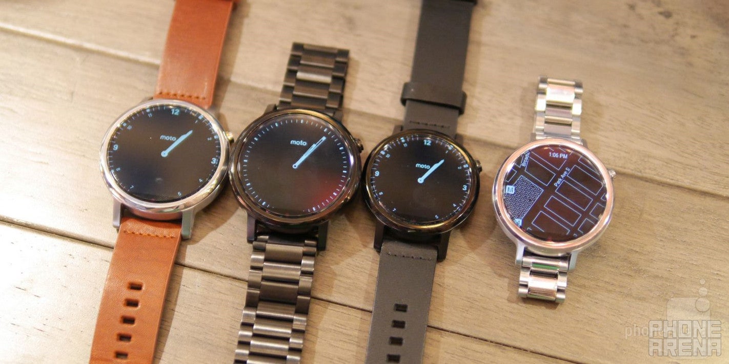
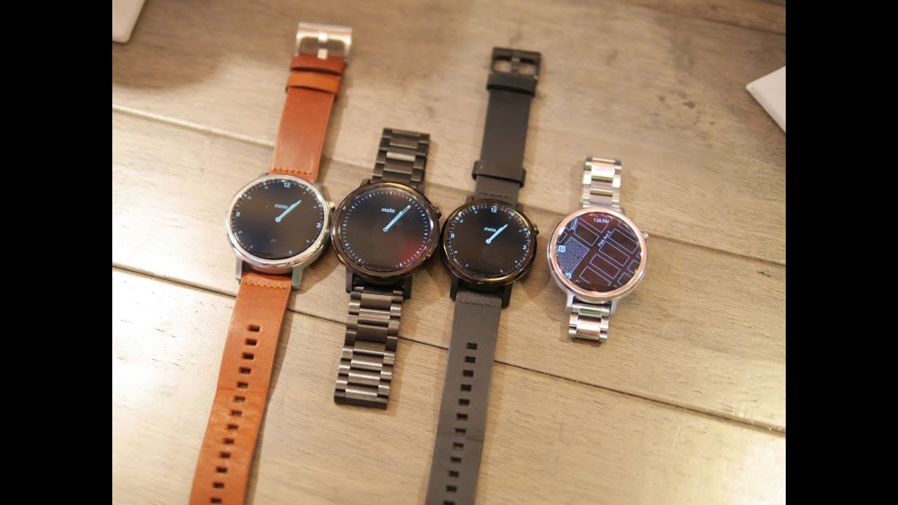
The original model undoubtedly turned heads with its round-face design, since many of the other smartwatches at the time still favored a square face construction. Rightfully so, Motorola made some minor iterative design changes with its second-generation model. First and foremost, it’s now available in two sizes – 42mm and 46mm. That’s great considering last year’s model looked pretty over-sized on folks with dainty wrists. This solves pretty much the major complaint for most women, as they now have a separate women’s style Moto 360.
Motorola talked big about how it features one of the best screen to body ratios around in a smartwatch. And true their word, the display without a doubt takes precedence above everything else. However, it’s still sporting that same flat tire look, which is seen a detracting quality to its round-face style design. Love it or hate it, the flat tire look is there to achieve the best screen to body ratio in its class. Without it, the case would’ve been thicker and larger.
Another great thing about the new Moto 360 is that Moto Maker is available right from the get-go, allowing prospective buyers to customize pretty much every aspect of the smartwatch – down to adding an imprint design around the bezel. Therefore, if you prefer a more casual look, you can opt to go with a Horween leather strap. In contrast, if you’re going to a business affair of some kind, any of the new metal link straps will certainly add another level of premium to its already established looks.
Just as before, it features a heart rate sensor on its underside to measure our pulse, which works in conjunction with the new Moto Body app that aims to keep us fit by tracking our activity. In addition, it relies on the same wireless charging system as before. With the strap, they’ve decided to make it less of a pain this time by going with a quick release system that unhinges the strap in a matter of moments. It’s honestly a breeze and something we’re glad to find this time around, seeing that before, it was nearly impossible for anyone to figure out how to remove without referring to the instructions. Quick and painless, that’s the experience we’re now exposed to here when it comes to swapping the straps and whatnot.
Display
Speaking of the screen, we have a 1.37-inch 360 x 325 display on the 42mm model – while the larger 46mm casing gets bumped up to a 1.56-inch 360 x 330 screen. Both employ LCD technology, which sport almost the same qualities as last year’s unit. While it’s still detailed enough to the eye to make out most things that pop up on its screen, it’s certainly not class-leading in the space. At the same time, too, it doesn’t have the same level of intrigue that we generally find in smartwatches with AMOLED screens. Don’t get us wrong, we love the generous size and its jewelry-like look when it’s turned off, but we’ve been spoiled by some other better looking displays of late.
Interface
Over on the software side, there’s really not a whole lot new or different – besides the two new additions that Motorola has brought along for the ride. We’ve already explained Moto Body, but on top of that, we also have new Live Dials that act as alternative watch faces to the ones that are normally attached to Android Wear. They actually display other relevant information on the watch face, such as the battery level, current weather, and much more.
Expectations
Last year, the Moto 360 ruled the land with its gorgeous looking design in a sea filled with square styled watches. Like we said, it was hip to be circle. In the course of a year, however, the competition has caught up, and in some instances, surpassed what the Moto 360 achieved. With this second generation model, there’s nothing really dramatic about its design or functionality, but we do appreciate the iterative changes.
What’s really going to cause some internal strife for most people is its price, which is looking to be in a good position at a base starting price of $299.99. Depending on what you select through Moto Maker, that starting price can go up to $429.99 if you opt to go with finer materials. The $300 starting cost isn’t bad for an Android Wear smartwatch, but there’s looming competition on the horizon that might steal its thunder. For its time in the spotlight right now, it’s not bad in terms of pricing, but its particular style might not be a home run for some people – more so when you also have other options, such as the Huawei Watch, to think about before making a final decision.


Things that are NOT allowed: