Most useless software features in Samsung's past smartphones
Ah yes, the Samsung Galaxy Note 9 has been making the rounds of late, showing to us all why it’s going to be one of the smartphones to beat this upcoming holiday season. No doubt a beast in nearly every facet, the Note 9 is yet evidence in how Samsung has conformed over the years to deliver a smooth, intuitive, and rich experience with its software. Indeed, there are still quite a few tricks and features packed into the Note 9’s arsenal, but we can say with confidence that many of them are useful to the user.
Well, that wasn’t always the case for the Korean company, as they’ve developed and introduced their fair share of questionable features. When they were beginning to reach their pinnacle, it made sense for them to go after that “bigger is better” approach, but as we’ve seen, that’s not necessarily the best way to enhance a smartphone’s experience to appeal to the masses. Enthusiasts can probably still recall TouchWiz, the user interface that Samsung developed and used for many of its Galaxy devices, and with it came the horde of useless features.
In this piece, we’re going to take a quick trip down memory lane to remember those awful, redundant, and useless features in Samsung’s smartphones that made us all ask the question why. Many of them are downright obvious, but others may have slowly diminished from our memories – so we’re here to shed light on them once again. Without any further wait, here are the most useless software features in Samsung’s smartphones.
Air View (Samsung Galaxy S4)
Technically it first debuted back with the Samsung Galaxy Note II, the phablet’s Air View feature with the S Pen was seen as a useful addition that turned the venerable stylus into a mouse cursor. Hovering over certain elements in the interface, like photos in the gallery list, allowed users to get a preview with this new Air Gesture feature. Since the display can accurately track the S Pen hovering over it, this feature functioned smoothly as it was intended.
Its popularity made Sammy port it over to the S Pen-less Galaxy S4, which was no doubt seen as a bold move on their part, but unfortunately the implementation was an agonizing experience. Not only was the tracking of the finger inconsistent, but it just felt super odd keeping a finger hovering over the display – it just didn’t feel right. Unlike the S Pen, which had a super sensitive tracking, the Galaxy S4’s implementation was just sluggish and unresponsive.
Air Gestures (Samsung Galaxy S4)
Another one that made its debut with the over-the-top Galaxy S4, Air Gestures seemed to have promise on paper, but reality told us otherwise. Dubbed as a basic, watered down version of Microsoft’s Kinect technology for the XBOX 360 at the time, Air Gestures relied on users to wave their hand vertically or horizontally over the phone to perform functions such as scrolling in the web browser or gallery. Rather than the customary scrolling with a finger, Air Gestures required users to only wave their hand over the display.
Yeah, the feature can be useful for certain situations, like in the event you’re washing dishes and can’t use your fingers to scroll, but much like Air View, it wasn’t the most responsive. In fact, waving too fast or very lazily didn’t initiate the function, which seemed to be delayed by just a smidgen as a whole. Considering that the feature is no longer in existence in Samsung’s recent smartphones, it’s quite telling that it was useless from the onset.
Smart Pause (Samsung Galaxy S4)
Really, we’re not trying to nit-pick the Samsung Galaxy S4! This smartphone is memorable for many reasons, but there’s yet another useless software feature that made its introduction with the S4 – Smart Pause. If you were just too lazy to hit the pause button on a video you’re watching to take a break, don’t worry because Smart Pause ensured that you didn’t have to lift a finger.
Basically, the Galaxy S4 knew when you were looking at the phone or not – so in the case of watching a video, it would instantly pause the moment it can’t track your eyes. Sure, you could still gaze slightly away, but as soon as your head is looking or tilted in a direction that’s not straight at the phone, it would pause. This becomes more maddening when you look away and look back again frequently, which just simply made for a jittery and jarring experience.
Face Unlock (Samsung Galaxy S III)
We know, it’s hard to believe it, but Face Unlock was something that was available with the Samsung Galaxy S III – a smartphone that’s well over 6 years old at this point. Finger print sensors weren’t even a standard at this point either, so it’s kind of amazing that the Galaxy S III offered face unlock. However, out of all the security options that were offered, this one was the least secure. Well, at least more secure than having no security at all.
If you managed to use this feature, your smartphone was significantly more susceptible in being broken into versus the traditional PIN or PATTERN options. Even Samsung made users aware that it wasn’t the most secure form for protecting your phone from unwanted users. Sure, it worked as promised, allowing users to quickly unlock their phones, but it could also be tricked by using a photo of yourself. We suppose that was reason enough for Samsung to drop this by the time the Galaxy S5 came around.
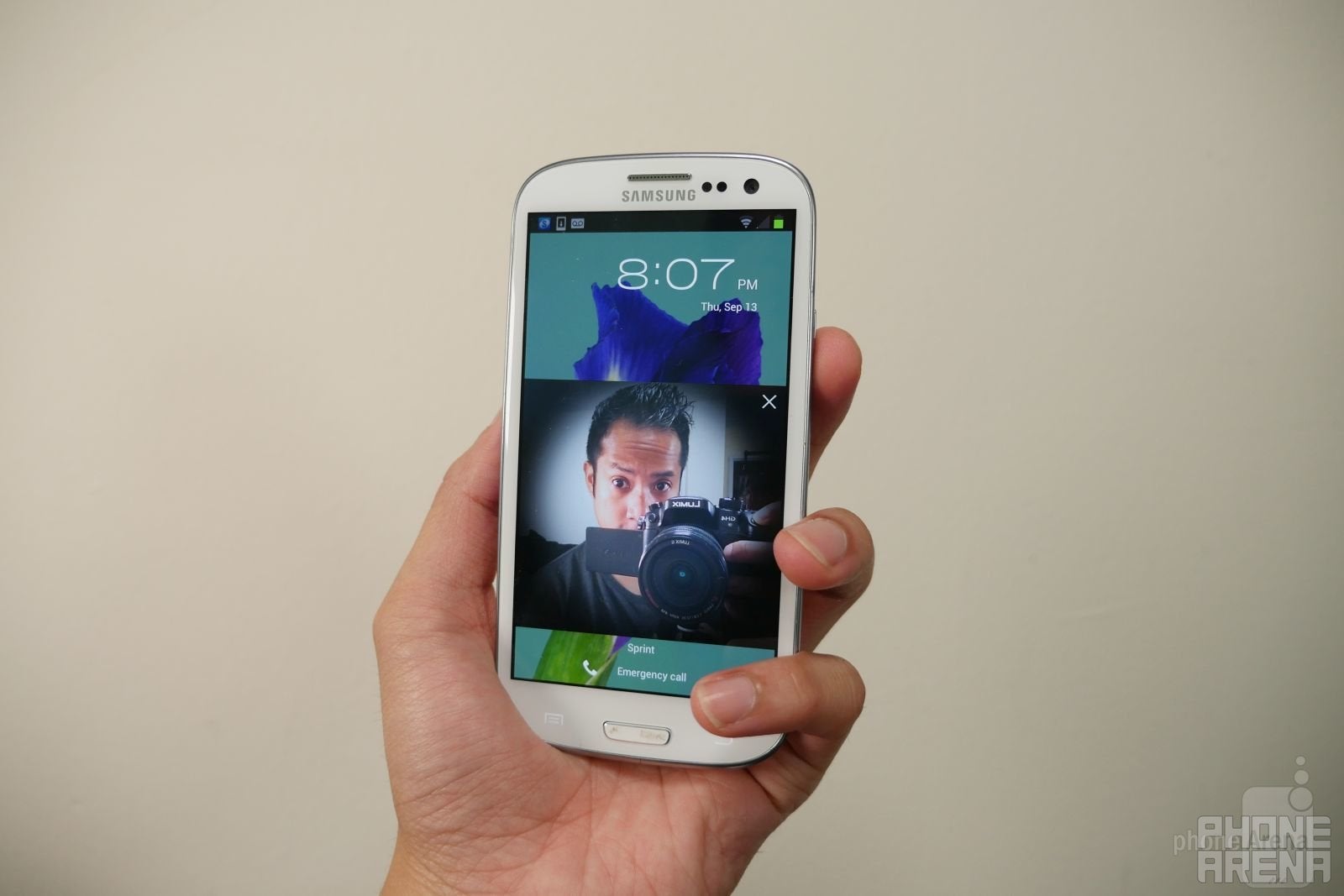
Hey, we had face unlock back in 2012. Too bad it was easily fooled!
Virtual Shot (Samsung Galaxy S6)
The first one that’s camera-related to make it onto the list, Virtual Shot was just one of many camera features in Samsung’s smartphones through the years. If we’re to read into its premise now, this would probably be regarded as a forward-thinking innovation, seeing that an image you’re capturing with the camera would become digitized to be viewed virtually. Sadly, though, Virtual Shot was nothing more than just a clip that gave off the illusion of being rendered into 3D.
Instead, it merely just produced a short video clip, very similar to a gif, in that we could view an image from multiple side angles. It’s hard to believe that this was a feature that someone believed to be useful, just because it still required users to move the phone around the thing they’re trying to capture – and if you were shaky with the capture, it would show with the end result.
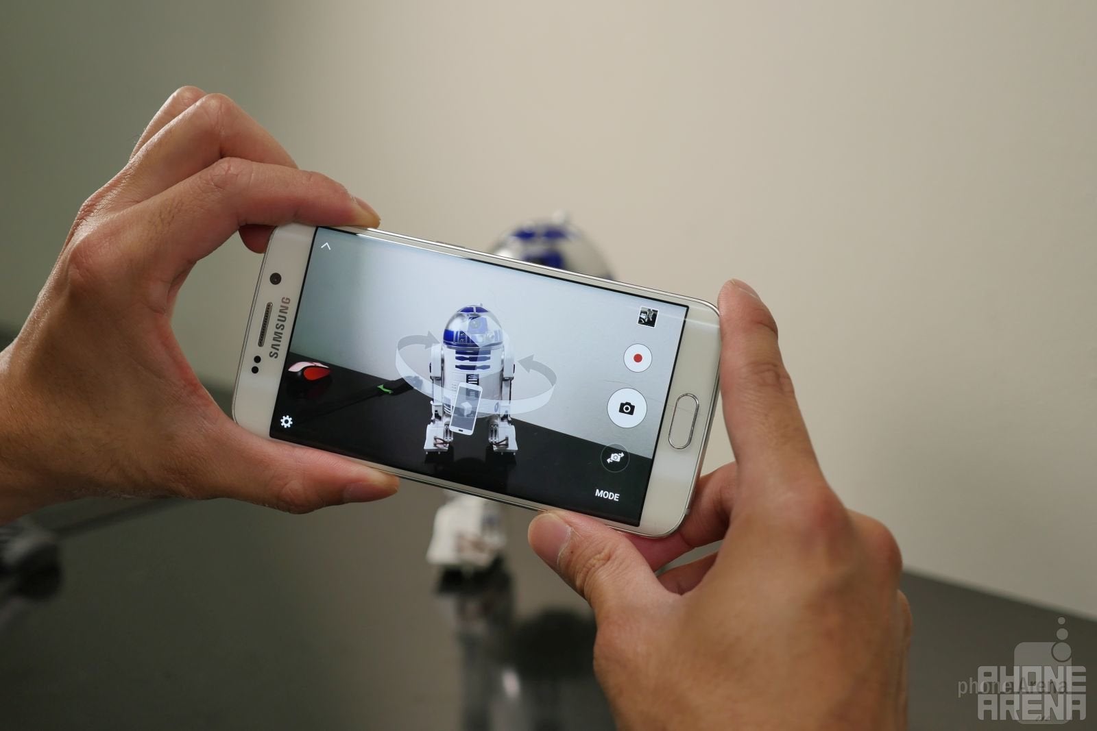
It's not going to be virtualized, but instead you get a gif with virtual shot.
Edge Lighting (Samsung Galaxy S6 edge)
We can be notified a myriad of ways of who’s calling us. Back in 2015, however, Samsung brought the idea of being visually notified with its new Edge Lighting feature with the Galaxy S6 edge. Some people may argue that it was done to highlight the sweet looking dual curved display that the phone was rocking, a very new concept at the time, by illuminating the curved edges whenever an incoming call was coming.
However, there was one fatal flaw with this implementation. And that was the fact that the smartphone needed to be placed on a surface with the display facing down. We’re not sure about some of you out there, but the idea of a naked screen coming into contact with potentially rough surfaces just for this feature to work just makes us cringe! Even though Edge Lighting is still currently being offered on new devices, like the Note 9, it’s no longer tied to phone calls.
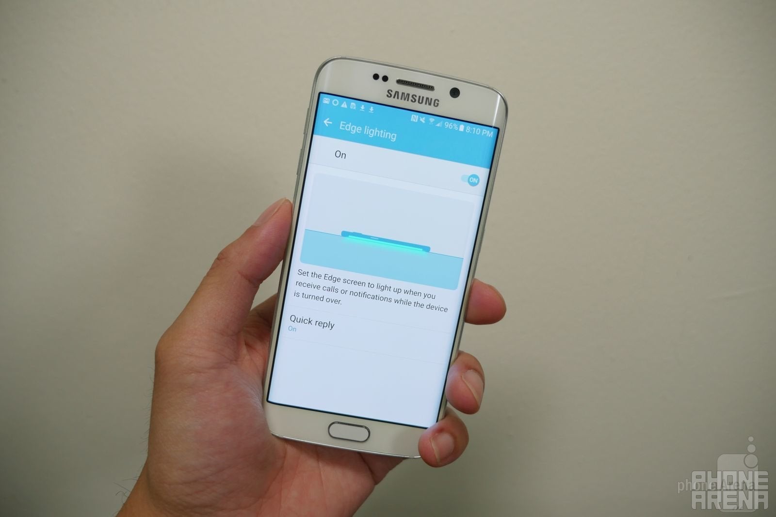
Pretty colors, but say no to placing a phone down on its display. You won't forgive yourself if there ends up being a scratch on there.
Sensor-powered pinch gesture (Samsung Galaxy S III)
Samsung loved going about several ways accomplishing the same functions. Take for example zooming in/out in the web browser, which to this day is mainly done by using pinch gestures with your fingers. First introduced on the Galaxy S II, sensor-powered gestures were implemented to allow users yet another way of zooming in/out.
Holding two fingers against the phone’s display, usually the thumbs to be exact, you then proceeded to tilt the phone forwards or backwards to mimic the zooming functions. Seriously, it’s redundant because pinch zooming was still far more effective for the occasion. It was seriously a useless feature, which is why it was eventually removed by the time the Galaxy S5 arrived.
Smart Scroll (Samsung Galaxy S4)
Out of all the useless software features that somehow came to fruition with Samsung’s line of smartphones, the one that to this day still irks us was smart scroll on the Galaxy S4. The phone was simply a guinea pig for the company, especially considering how it laid claim to a ton of features. Smart Scroll tops our list because it was extremely wonky and unintuitive.
Relying on a combination of eye tracking and gesture movements, smart scroll enabled users to scroll only vertically in the web browser. We don’t know how many people leveraged this feature, seeing that the same thing can be accomplished by just scrolling with a finger, but Samsung thought it was going to be useful. Due to its sluggish response and inability to properly track eye movements in different situations, it was eventually omitted with the release of the Galaxy S5 the following year.
And those are the most useless software features in Samsung’s smartphones. Thankfully, the company listens to feedback from its users, which is why you won’t find many of these features in today’s phones. In a way, they’ve streamlined the experience tremendously – opting instead to go after a more simplified approach. Did we happen to miss some? If so, let us know in the comments what were some of your least favorite software features.






Things that are NOT allowed: