Material Design - this is the new look of Android "L Version"
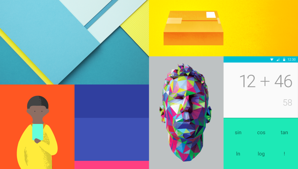
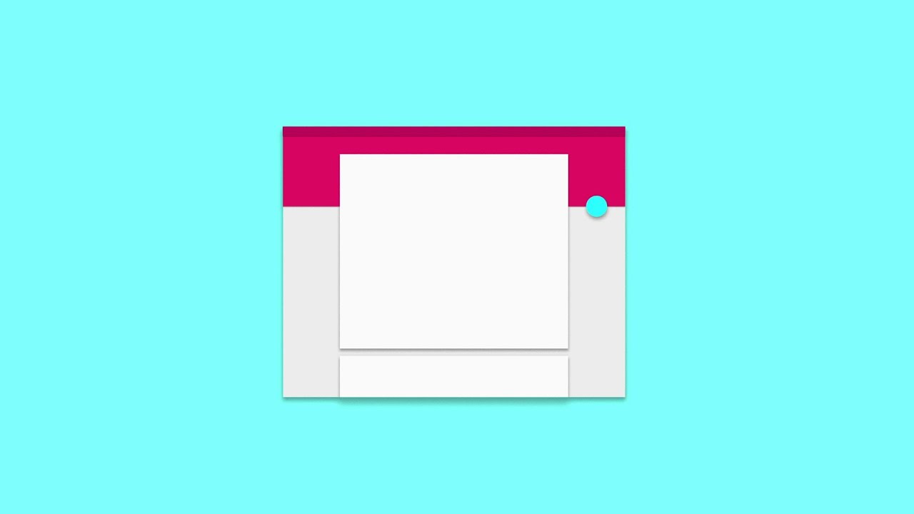
Fandroids and fandroidettes, Google I/O is on, and we're already getting a taste of big changes to Android's look and feel. The operating system has a whole new design language which Google demonstrated with this short teaser. It's called Material Design. At a glance, we can only describe it as a big, bold, mature change to Android's 'stock' look. Nothing has been spared from change - not even the software keys!
The apps and menus look cohesive, colorful, and clean. We can broadly compare their looks to the direction which LG's design team took for the LG G3's Optimus UI - flat, minimal, and very user-friendly. They must have gotten an early clue. The Holo theme and its various incarnations are a thing of the past. All Google apps and interfaces have been treated to a unified look, one we can't wait to experience for ourselves.
Material Design will be available for developers to create online and native apps ahead of Android "L Version"'s launch later this year. Does this mean all Android apps will now sport the same uniform look, like in iOS 7? It most likely does - talk about a change!
Feel invited to gaze at the new Android interface in the gallery and video below.
Android's new clothes


Popular stories



Latest News


![The Galaxy SmartTag 3 is here offering an alternative to the AirTag for iPhone users [UPDATED]](https://m-cdn.phonearena.com/images/article/183654-wide-two_350/The-Galaxy-SmartTag-3-is-here-offering-an-alternative-to-the-AirTag-for-iPhone-users-UPDATED.webp)

Things that are NOT allowed:
To help keep our community safe and free from spam, we apply temporary limits to newly created accounts: