Living with the Samsung Galaxy S5, week 3: the many faces of TouchWiz

Week 1 and 2: A recap
It's now been three whole weeks since I first took the Samsung Galaxy S5 in my keep, and it's time we sat down and talked about the hottest-selling Android flagship on the planet once again. So far in the series, I've spent a lot of time talking about the truly mind-boggling number of features and perks the Galaxy S5 and its TouchWiz software make possible, and that's not at all coincidental. Indeed, beyond Samsung's strong grip on supply, distribution, and marketing, one of the main reasons its Galaxy smartphone series have been received as well by the mass market is the abundance of out-of-the-box extras it offers. These are not necessarily exclusive to its devices, but some of them are, and there's no such thing as perfect information as those of you who have graced an ECON 101 will know.
In the usual manner we do stuff around here, I went ahead and delved deep into each one of them so far, and even now, having gone through my previous verdicts, feel confident that this is their true nature. While some have been quick to criticize my... well, critique of some of the features (completely disregarding the praise others received), I nevertheless maintain the opinion that this approach, while a very successful sales strategy (empirically-proven), also means that Samsung has to spread itself quite thin and invest effort and resources into a massive feature set that just keeps on growing and stretches across several departments at its software division. This will become extra clear after you go through this week's findings, which are exclusively related to the Android 4.4 KitKat-based TouchWiz software powering the S5.
TouchWiz again?
You got me there. Last week I promised to look into the critically-acclaimed camera of the GS5, and its heaps of special shooting modes, yet I am about to blab about TouchWiz again. Some of you will wonder why, so I'll save you the effort: there are two reasons.
First and foremost, the TouchWiz feature set (including customization options, special software and hardware features, and even built-in apps) is just gargantuan, and there's still quite some stuff I have to go through before I can claim I've painted a sufficiently-detailed picture for you. That's the core aim of this type of articles -- to go into great detail, explaining exactly what your hard-earned dollar gets you. And second, the number of camera shots that satisfy my rule of being both acceptable for public sharing, and visually-descriptive of a problem or advantage (that you can't see from our latest camera comparison), is just insufficient. After all, you do spend a good 10 to 15 minutes going through these pieces -- you deserve to make the most out of them.
The many faces of TouchWiz: Special Modes

As you may know, the S5 has a whole lot of special work modes to choose from. Those usually change the look, feel, and overall capabilities of the latest Galaxy flagship quite a bit, though that's not a rule (Private Mode). These are, indeed, mostly useful. What I dislike about Samsung's approach here is the utter lack of uniformity on how these are to be accessed. Let me explain what I mean.
Say, you want to activate Kids Mode -- to do so you need to find the app and click it. But say you want Easy Mode or Private Mode, or Blocking Mode, or Emergency Mode (or Ultra Power Saving Mode) -- these are all features only available through the settings menu (and split into different categories, which makes a certain amount of sense, but is still messy). And lastly, you have Car Mode -- a feature that is only available from the notifications panel, and only if you expand the toggles menu. Yep, no uniformity to be found here.
Anyway, let's go through what these bring to the table.
Easy Mode
The Galaxy S5 can be a complicated device if you're unfamiliar with Android and modern smartphones, which is probably why Sasmung decided to include an Easy Mode that simplifies things a ton. The typical Android navigation bar on the bottom goes away, and you only get three homescreens -- one with quick access to contacts, the default screen with a few main apps and several widgets, and a tertiary, app-dedicated screen that allows access to the app drawer. The settings menu, for example, is also stripped down to the very basics, though you can access the full arsenal if you so desire.
I suppose Easy Mode is appealing to elderly folk, especially those with poor eyesight, as most UI elements (like apps) are enlarged significantly. Sure, I wouldn't recommend dropping a few hundred bucks on the GS5 if you mean to gift it to your folks (doesn't apply to everyone!), though I could imagine that Easy Mode comes in handy if somebody is just new to the platform, and wants to slowly grow his understanding.
Kids Mode
Speaking of Easy Mode, it's only natural that we next take a look at Kids Mode. As the name suggests, Kids Mode is a special mode that will both get your little bugger off your case whenever he feels like playing with your prized GS5 and also provide a safe environment, in which he's protected. Said otherwise, you won't have to worry about him stumbling upon those semi-nudes you have in the Gallery, or that he'll somehow browse (similarly) inappropriate content on the web.
Indeed, during setup, you're required to enter a parental pass code that is used to activate and deactivate the mode, after which you're required to pick apps that you deem safe and appropriate for your little ones to use. What's more, the entire UI theme is changed to a cartoonish one that sits more at home in the hands of a child -- your kid can even poke a friendly-looking crocodile on the secondary screen, and it'll laugh. Icons, built-in apps, and pretty much every other UI element is similarly-themed.
Car Mode
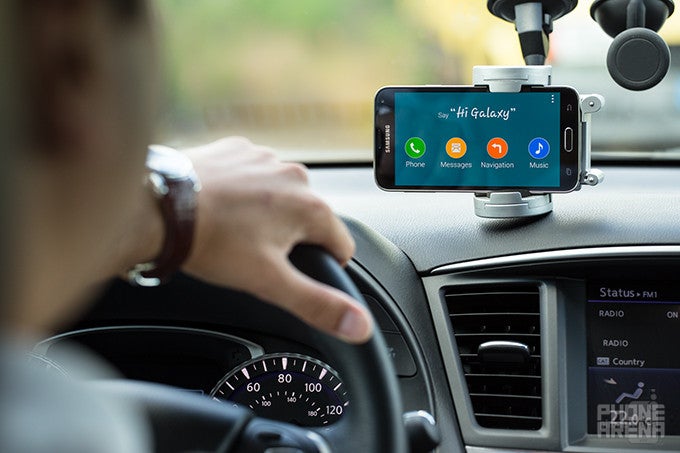
Accessible exclusively through the expanded notification bar's quick toggles menu (swipe from top with two fingers to save yourself time), Car Mode is something of a high-powered vehicle GPS system. In other words, apart from providing (Google-powered) turn-by-turn navigation, it also lets you phone or message favorite contacts and listen to music. Best of all, you don't have to touch the screen at all -- the mode has an always-on voice listening assistant just waiting to do your bidding. She's fairly decent at understanding your commands, too, though excessive noise (happens when you're on the road) does make things more difficult.
There's some necessary setup needed, and I encourage you to go through it if you're a frequent driver. For example, you may want to set up the GS5 to automatically go into Car Mode every time it connects with your car via Bluetooth, and also set your favorite places, like your home, workplace, and whatever else destination you'd like. Handy!
Emergency Mode
I've touched on this in week 1, but let me re-iterate -- the Samsung Galaxy S5 is chock-full with 'emergency' features that ought to increase your chances of survival should a horrible natural disaster strike your area. The culmination of Samsung's new obsession with safety (not that this is a bad thing) comes in the form of a dedicated Emergency Mode.
Make no mistake -- Emergency Mode is just like Ultra Power Saving Mode in that it seeks to extend your battery life by turning off connectivity when the screen is off and by setting your screen to monochrome (bye colors!). The difference here is that, by default, you get a different set of available apps (you can edit those), like Torch, an Alarm that makes a distinctive noise, likely to attract attention, and even a way to quickly send your location and call for help (you need to set up emergency contacts). I sure hope I never get in a situation where either of those means a light in the tunnel, which is a go-around way of saying no nasty earthquakes, please!
Private Mode and Blocking Mode
Next up, we have two modes that differ from the rest in that neither of them introduces any serious visual changes.
Private Mode, for example, allows you to temporarily enter a special mode that will allow you to hide content from a specific number of apps (like the Gallery, Video and Music players, and File Explorer). Once you're done, you just exit the mode, and everything goes back to normal -- only the hidden content can't be accessed. Should you wish to re-gain access, you have to go back into Private Mode, enter your pass code, and go from there. I'm using this in concert with App Lock (a third-party app), and I am definitely liking the power of the combo -- it's not for everybody, but it's there if you need it, and it works well.
As for Blocking Mode, this is a rather simplistic Do Not Disturb mode that allows you to block calls, notifications and alarms during a given time period (say, when you're sleeping). Thankfully, you can still whitelist specific contacts, or groups of contacts, in case you're worried about missing an emergency. Good stuff!
Fitness & Wellness done right: S Health

Despite my displeasure with the S5's embedded heart rate monitor (I feel it's more of a gimmick, and I'll touch on this again in a bit), I've got to admit that Samsung has done some solid work with the S Health app, or should I say the S Health hub of apps. Indeed, the company has managed to integrate a seriously impressive amount of functionality into it, and the result is both functionally and visually satisfying.
Overview
As soon as you open S Health up, I suggest you go right ahead and create your profile, and connect it with your Samsung account. This is beneficial in two ways. First, the app will need essential information about you, like height, weight, gender, and date of birth, in order to better track your progress and to provide better coaching. And secondly, everything is (anonymously) stored (and then synchronized across the many S Health apps) into your Samsung account.
Once setup is complete, you might find yourself a bit overwhelmed by the many features S Health offers -- that's normal, and it'll take an investment of your time to figure it out. But I've found that it's worth it.
There are 7 main modules in S Health, all related to your fitness and general wellness. In addition, there are three robust third-party apps you can download through S Health, all of which come with a free premium subscription -- Iark, Workout Trainer and RunKeeper.
Pedometer
By far my favorite, the Pedometer is first on S Health's list. Thanks to the built-in, low-power pedometer sensor, the GS5 can accurately track every step you make, so long as it's on your person. The interface is simple enough -- you get to set your daily goal -- I've set this at 10,000 (set this higher than you'll walk on average, trust me) -- and track your current progress. As the days go by, you'll slowly build a history, and you'll be able to dissect it.
Since, by default (removable), the steps you've taken appear on your lockscreen, I've found this to be a surprisingly good motivator. Indeed, I now often find myself digging into my pockets just to check the progress I've made for the day, and on several occasions even extended my dog's daily walk in order to hit a higher number. And no, I don't always hit my daily goal of 10,000 steps (roughly 10 kilometers), but aiming high definitely helps. Loving this.
Exercise
Exercise is another functional suite that seeks to track your routine over four categories: running, walking, cycling, and hiking. You can set a distance, time or calorie goal with each one of those, but only in running mode do you get an extra, 'Training effect goal'.
This one is a bit more complex, and basically allows you to choose the intensity of your workout and the time frame you have allocated to exercise. Once that's done, a voice guide will try and keep your tempo regular and compatible with the goals you've set yourself. Ironically, however, this will only work if you have an external heart rate monitor accessory -- the built-in heart rate monitor is no good. This touches upon the points I've made about it in the past -- a proper exercise requires constant, real time updates, and not occasional and sporadic ones that require you to halt whatever it is you're doing (that's right, the heart rate monitor won't work unless you're still and quiet).
Food, Weight, and Sleep
In order to better keep track of your fitness regime, S Health obviously needs to factor in your calorie intake, and the Food tab is where this takes place.
I've got admit that doing this manually is a tad laborious, and local cuisine was nowhere to be found, but the industry hasn't found an easier way, so let's hope it does one day. You better man up until then.
The Weight tab allows you to continuously update your weight, which, in turn, will allow your S5 to keep track of how you're doing. Again, this is not the simplest of tasks, but that's just the way it is for now.
That is, unless you have a Bluetooth-enabled weighing scale (like this one from Samsung) which will automatically synchronize with S Health. Unfortunately, those are not exactly cheap (the Samsung one is low on inventory, and costs some 50 GBP in the UK).
Unfortunately, no -- S Health Sleep isn't alike to the trendy sleep-tracking third-party apps out there, which is a shame. Nevertheless, if you have a compatible smart accessory that can track your sleep, you can connect it with S Health and get your readings (along with a history).
Stress
Yep, you read that right. The Galaxy S5 claims it can measure your stress level, too. As far as I can tell, there's currently no information on exactly how this feature works, though the fact that it uses the heart rate monitor on the back is a clue.
Also informative is the fact that you need a good full minute to get a reading, which initially led me to believe that the GS5 could be trying to measure my HRV (Heart Rate Variability). Unintuitive as it may sound, it's been found that a low HRV could actually signal stress levels and even mental disorders, so perhaps Samsung is onto something here.
That said, the readings I've been getting so far don't really corroborate that notion -- I consistently get higher stress readings when I purposefully pump up my heart beat (in order to test it out), and low ones when my heart rate signals that I am resting. I'll get in touch with Samsung, and see what they have to say about it.
Coach
Perhaps most interesting of all these features is the one that is last on the list: Coach. The Coach feature does what it promises -- it tries to coach you through the process of getting fitter and just healthier overall. To do that, you're required to take a few short quizzes that will determine your 'Lifestyle score" and then select a goal (e.g. weight loss, reduced stress, better fitness, etc). The Lifestyle score is the sum of five categories, directly tied to the (hopefully honest) answers you gave to Coach -- exercise, food, sleep, stress, and weight.
Once this initial setup is complete, Coach will offer you a somewhat personalized list of 'missions' that aim to help you improve in your weaker areas first, and work up the ladder. You have your Coach's top picks, and a number of additional goals that you can decide to pick up. For example, I've been exercising very little lately, so Coach's first order of business is to motivate me to get off my behind and exercise at least twice a week and stretch more. Based on the answers I gave to my diet, I was also recommended to eat more wholegrain foods. I was even told I should go ahead and identify and then jot down the five main causes of stress according to me.
Best of all, the feature (powered by Cigna) tries to provide informative and motivating reasons for the missions it asks you to take up. That sure helps!
The promise of productivity: MultiWindow, Toolbox and S Voice

The Galaxy S5 may not have the productivity appeal of the Note 3 with its S Pen stylus, but Samsung has nevertheless included a few features that can help you do more for less.
Prime among those is the now well-known MultiWindow feature. Once activated, MultiWindow will create a small arrow at the edge of the S5's screen, allowing you to call upon its wizardry with a just a few clicks. Once inside the dedicated MultiWindow interface, you can have two apps work side by side (on top of each other) simultaneously, though not all third-party code is supported. What's more, whenever you open attachments from your E-mail or Messenger, MultiWindow will power on automatically, without needing you to prompt it.
In general, the feature works well. Unfortunately, a 5.1-inch screen just isn't large enough to make for a comfortable multitasking, and I've often issued misclicks. I have not found much use for this feature so far, though that could have something to do with my usage habits.
In a way, Toolbox is much alike MultiWindow. Once turned on, the feature adds a small, movable, always-on-top circle that, when clicked, expands and allows quick access to five apps of your choosing. The idea behind it is to allow you to quickly launch your favorite apps no matter what you're doing right now, thus saving you the few taps it will take you to navigate to your homescreen (or app drawer) to hunt down said app. Unfortunately, I've found that having both Toolbox and MultiWindow on is a bit overwhelming on a 5.1-inch screen, though just Toolbox is certainly not an issue.
And lastly, Samsung's insistence on providing in-house solutions to all major features categories spawned S Voice a while back -- a direct competitor to Google Now.
Available with a double click of the home button, S Voice is a notably slower, poorer alternative to Google Now (long-press the home button), and it's generally not worth your time. Not only does it take a considerable amount of time for S Voice to process your speech and return a result, but the sophistication of Samsung's voice recognition engine pales in comparison (I've specifically tested the same phrases on both, and Google Now is far more reliable, not to mention functional). And this is what I mean by Samsung refusing to drop non-competitive functionality -- after all, it's unlikely that it'll be able to match Google Now any time soon, considering that's a major priority to Mountain View-based company. Especially now, with Android Wear, whose backbone is exactly Google Now.
It's an early Christmas with the Galaxy S5: freebies
Samsung made good on its promise of providing you with a sizable list of apps that you can download directly from the S5's Galaxy Gifts widget (or its app store). More importantly, however, these all come with free premium subscriptions -- usually good for half a year or longer.
The list is goes through notable apps, such as Deezer, Evernote, Box (free 50GB storage), Kindle for Samsung (a free book every month), along with the likes of the The Wall Street Journal, Bloomberg Businessweek+, and NYTimes, all of which also come with a free premium subscription.

That's a whole lot of freebies, and they really exemplify Samsung's dominance in the market -- the company's pockets are either deep enough to allow for this extra expense, or the scale at which the Galaxy S5 is sold is leverage enough to motivate developers to forgo short-term profits and hope for a return on their investment down the road.
On the horizon: week 4
Well, there you have it -- as brave an attempt to decipher the many facets of Samsung's latest TouchWiz software, and, by extension, the Galaxy S5's. I'll be the first to admit that this is not a conclusive walk-through, but the majors are all there. There's just one major functional pocket left: the GS5's camera, which will be the object of my in-depth inspection during the next few days. There are definitely some intresting stuff there, like 360 panos, Virtual Tour, and Animated Photo.
In my mind, this lengthy journey through TouchWiz qualifies me to arrive at a verdict, and hopefully the insight provided so far has already helped some of you connect the pieces and reach a similar conclusion themselves. I will however leave you with this vague categorization, and sum up the bulk of my experience, both positive and negative, in my final piece two weeks from now. In the mean time, do sit tight!


Things that are NOT allowed: