Living with the Samsung Galaxy S5, week 2: exploring the depths of TouchWiz
Week 1 in review
Last week marked the beginning of a journey for the duration of which the Samsung Galaxy S5 had a front row seat. Actually, scratch that -- a more proper way to put this would be to say that exposing the S5's every nook and cranny is the end goal -- the journey itself is nothing more than a facilitator. Like we have in the past, we felt like Samsung's latest flagship is a many-layered device -- layers that a uniform review process doesn't necessarily uncover.
And while much of last week's input dealt with introductions and disclaimers, it did also mark the beginning of what is shaping up to be a really in-depth plunge into the core of the Galaxy S5 -- it's new TouchWiz software. But before I share the insight born out of my latest exploits with the S5's proprietary Android version, a quick overview of last week's findings, along with a few additional notes, are necessary.
It takes two weeks to learn the TouchWiz settings menu
That's right, I complained at large about the mess that is the TouchWiz settings menu last week, and for a very good reason -- it really is messy. That said, it's certainly not impossible to learn, and after about two weeks of time spent one-on-one with the Galaxy S5, I finally feel comfortable in my knowledge that I can locate any setting I might need quickly and efficiently. It still stutters, and I still consider it mighty disorganized, but you will get used to it. At some point.
Goodbye fingerprint scanner, and good riddance!
Despite my utter disappointment with the embedded fingerprint scanner on the Galaxy S5, I felt like extending its lease for a few days more, even after the initial first week I had allocated passed. For no other reason than being thorough. Well, my opinion remains the same -- this is not a good enough implementation unless you have nerves of steel. And even then.
Week 2: Exploring the depths of TouchWiz
I barely scratched the surface last week, especially when it comes to the bottomless pit of functionality that is TouchWiz. This changes today.
Indeed, I finally had enough time to delve deep into the plethora of features the Galaxy S5 strings along. After a while, it's hard to argue there's a certain, bewildering type of uniformity -- most features are either outright great, or just poor or useless. In fact, there are very few software perks that actually behave in a manner that can be categorized as non-extreme. Surely enough, and regardless of where you stand on the Galaxy S5, you're likely to come to recognize this bipolar behavior inherent to the device. With this in mind, let's get this started.
My Magazine

In simple terms, this extension to your typical Android homescreen arrangement serves as a moderately-convenient way (you still could just fire up Flipboard, for example) to catch up on news and content across a plethora of fields -- from art, through sports, down to business and politics.
Unfortunately, you can't hand-pick the sources yourself, though you can give My Magazine access to social media you subscribe to -- e.g., Twitter, LinkedIn, Google+ -- and content from there will be funneled into a clean-looking, vertical feed. The full list includes the likes of Tumblr, YouTube, Flickr, 500px, and even RenRen and Weibo -- popular with Asian users.
Honestly, I don't mind My Magazine at all, especially since you can remove it completely (long-press on one of your homescreen > Home screen settings > untick My Magazine). But I certainly don't appreciate the very real delay in the transition animation whenever I decide I want to go for a read. It's not intolerable, sure, but it still disturbs me that even with as powerful hardware the interface can still feel sluggish.
Heart rate monitor, because of reasons
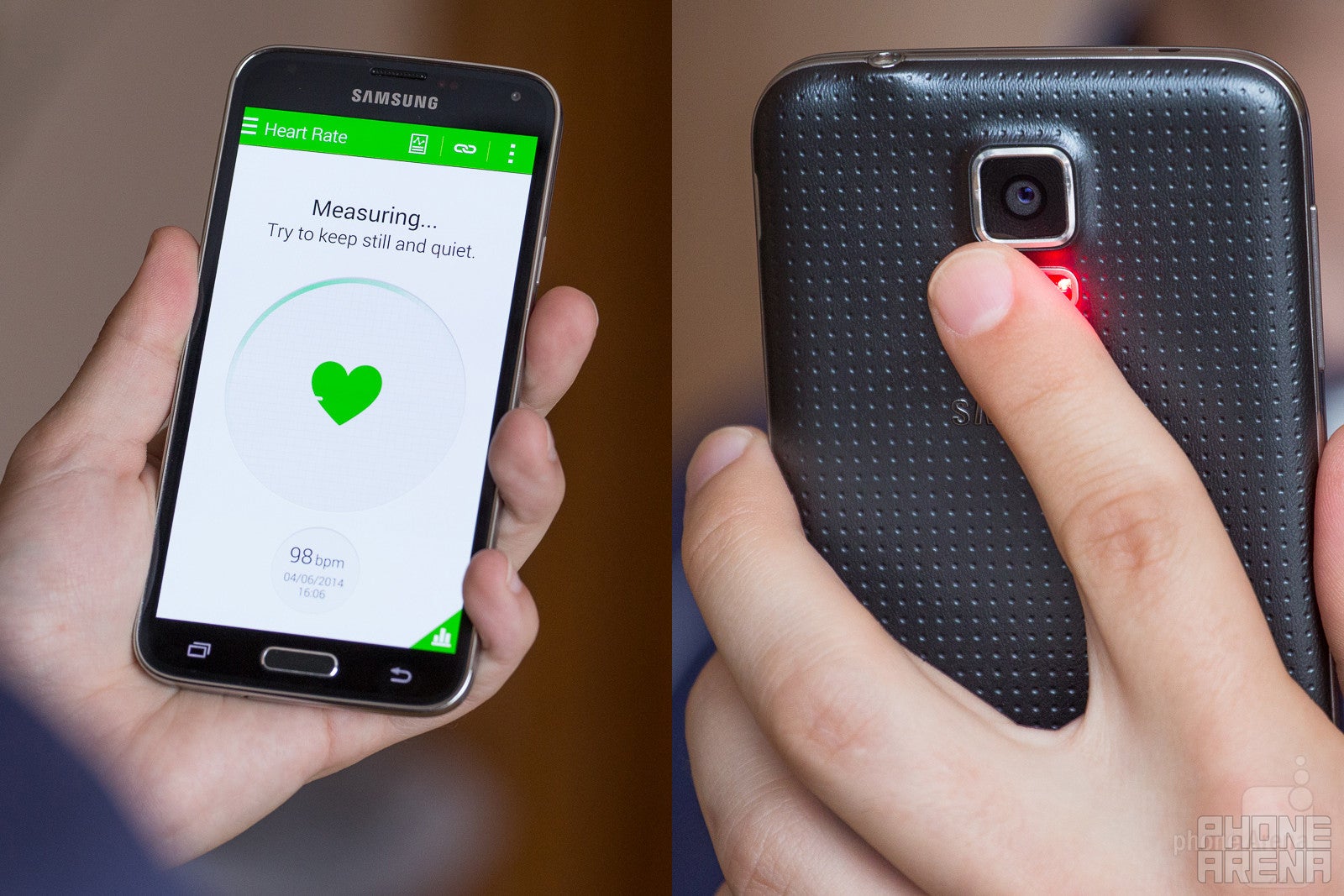
Despite its near utter uselessness, the heart rate monitor is definitely one of the stand-out features of the Galaxy S5, if only because of its novelty status.
The truth is simple: the heartbeat monitor serves little practical use. It's nothing more than an enhancement to your geek cred.
Interestingly enough, while the sensor initially experienced certain difficulties in detecting your pulse, one of the several S Health updates that were pushed over the course of the last month or so have improved performance notably. The trick to getting consistently fast measurements is to have the 'pillow' part of your finger directly on top of the sensor, and apply minimum pressure -- enough for you to clearly feel the surface, but not so much as to feel like you're pressing it. It usually takes anywhere from 4 to 10 seconds for a reading, and back-to-back measurements appear to be mostly correct, too, with a margin of error of about 5 to 10 BPM.So far, so good, but an overarching question remains: what practical purpose does this serve? Ever since the Galaxy S5 came out, we've been trying to provide a legitimate answer in Samsung's stead, but none ever sprung to mind. It certainly isn't suited for pro's, or even hobbyists -- if you're serious enough about your exercise, you'll likely want constant, real-time updates, instead of the ability to occasionally measure your heartbeat. Indeed, even friends that rightfully fall into the sporty type category, who are initially impressed, usually need about a minute or two to start wondering what the purpose of the monitor is. The truth is simple, though -- there is none. It's just one of those things that add to your geek cred and nothing more.
Worse yet, typical heart rate monitoring apps, available for free off the Play Store, produce very comparable results.
One-handed mode: The best implementation by far
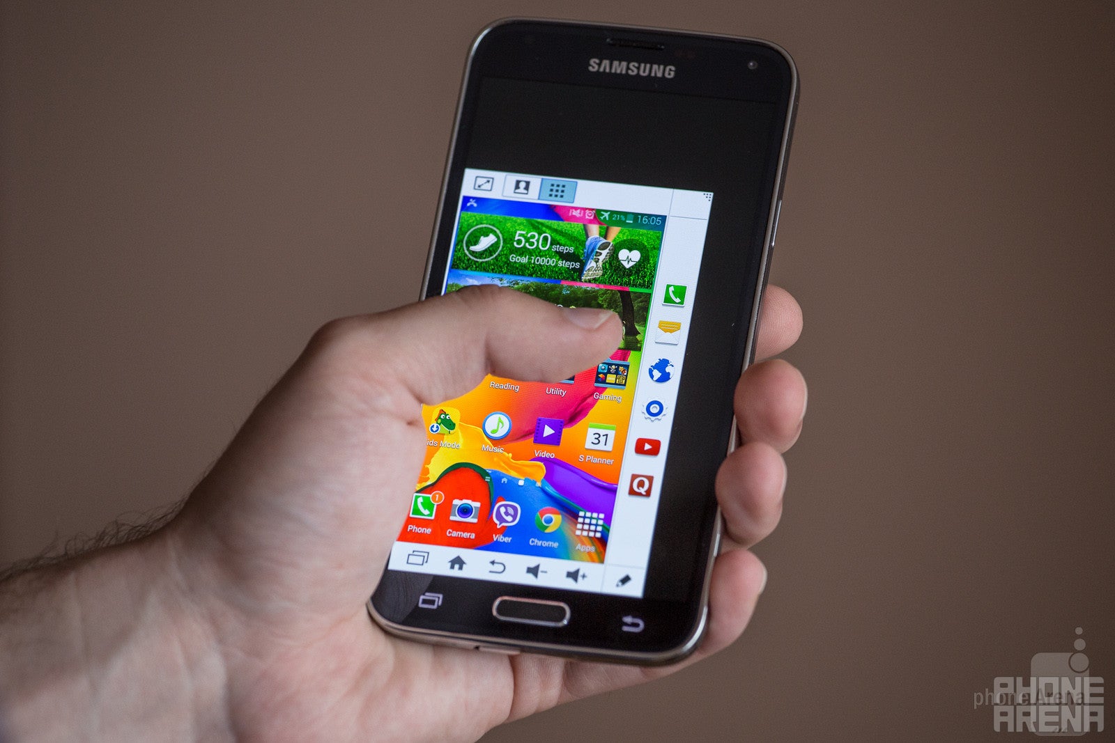
Let's cut to the chase: even if you have larger-than-average paws, chances are that most Android flagships currently on the market will prove a tad too large for you to handle completely one-handed. The Galaxy S5's 5.1-inch screen is no exception to that rule, and if you often have to quickly access the device on the move (like I do), you'll absolutely love Samsung's implementation of the so-called one-handed mode.
Available from Settings > One-handed operation, the special mode outshines pretty much every competing solution I've come across to this day, and on two fronts. First, it's super-easy to launch -- just slide your finger from the edge of the screen towards the middle and back, in a very quick motion. This will launch a re-sizable, movable miniature of your whole UI, regardless if you're already inside an app or not. And second, in typical Samsung manner, the mode has several extra features, including quick access to contacts and apps of your choosing, along with easy volume controls.
Said more explicitly, Samsung really hit the nail right on the head with this one. Bravo!
Toying with Pandora's box: Screen modes
Once the first round of Samsung Galaxy S5 review units started reaching the various news outlets scattered around the globe, a recurring topic was hard to miss (or ignore): the Galaxy S5's display is the best there is, they said. Sidestepping the obvious mind-boggler that is the definition of "best" (in anything, really) for now, we often struggled to recreate the conditions in which the S5 indeed proves to be the "best" display out there. Is it maximum brightness? Yeah, sure, on paper, but certainly not in reality. Color accuracy? Hell no -- at least not according to objective measurements. "If you want color accuracy, go for cinema mode, or any other of the S5's build-in screen modes!", some still argued. However, the truth is that even then the AMOLED screen on the S5 proves color-inaccurate, at least relative to the best out there.
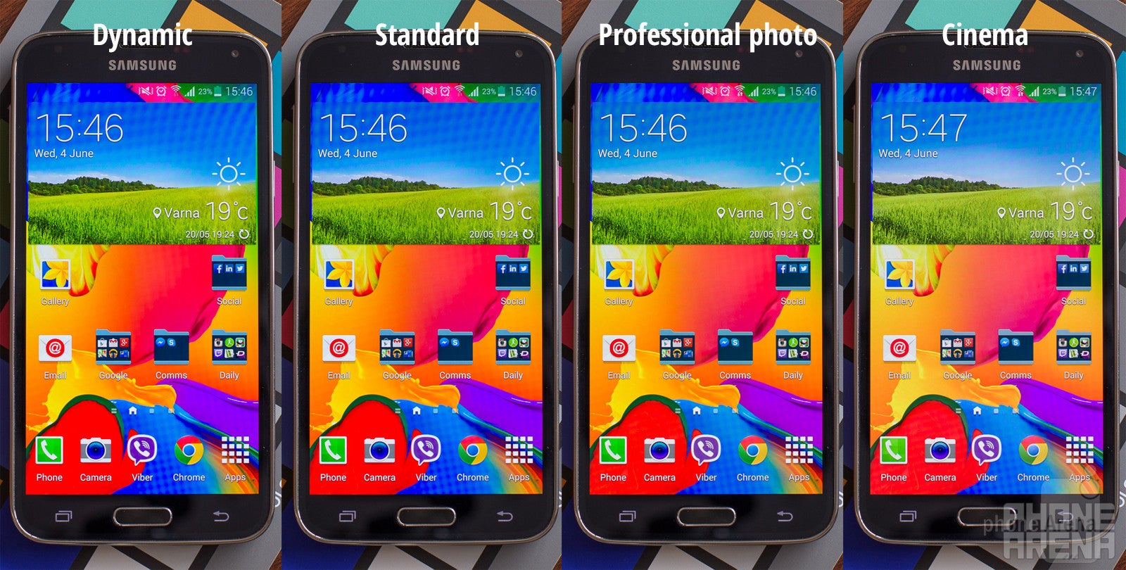
Subtle difference, you say? Make sure you zoom in first.
But there are two sides of the coin. Yes, the S5's color rendition will not satisfy color purists, but should you really care? Myself, I wasn't sure. Of course, when pointed out, these discrepancies were hard to ignore (human skin tones should never look alike to a boiled lobster), but the average Joe out there doesn't know the first thing about color calibration, nor does he really care. The best for him is usually what appears most vivid, and in that regard the S5 is in a league of its own. The colors are incorrect, sure, but nothing gets close to the steroid-infused colors the S5's display can produce if you set calibration to 'Dynamic' (Settings > Display > Screen mode). In fact, I've been using the S5 in that very mode for the past week, and it turns out that I don't mind.
But Dynamic is just one out of five screen modes. Adapt Display, for example, attempts to optimize color range and saturation when displaying content from built-in apps including Gallery, Camera, Video, and Samsung's Browser app, but otherwise behaves like the default 'Standard' calibration profile. Don't let the name fool you, though: Standard mode is color-incorrect, with an overly cold color temperature (resulting in bluish whites and grays) and notably incorrect colors (not as much as in Dynamic mode, though). The often-hyped Cinema mode isn't perfect either (and looks completely lifeless), even though, technically, it's closest to a perfectly color-accurate image rendition. Lastly, Professional photo is something of mix between Dynamic and Cinema mode.
Why am I telling you all of this? Quite frankly, for no other reason than to make you aware of the choices the GS5 provides in this regard, and to motivate you to consider your own needs and preferences. And don't be surprised by the strictly polarized community -- the S5's screen, by default, induces either a hate or a love relationship. You simply have to decide which camp you're in, so it's best to check out Samsung's flagship in person before coughing up a few Benjamins.
Air wake up, Smart Scroll, and Smart Stay: Not fit for a triumvirate
Starting with Air wake up, the feature originally debuted with the Samsung Galaxy S4, but it found its way to the S5, too. What it does is simple: wave over the proximity sensor (located next to the ear speaker) with the flat of your hand, and your Galaxy S5 will wake up and introduce you to the lockscreen (if you have one). Sounds simple enough.
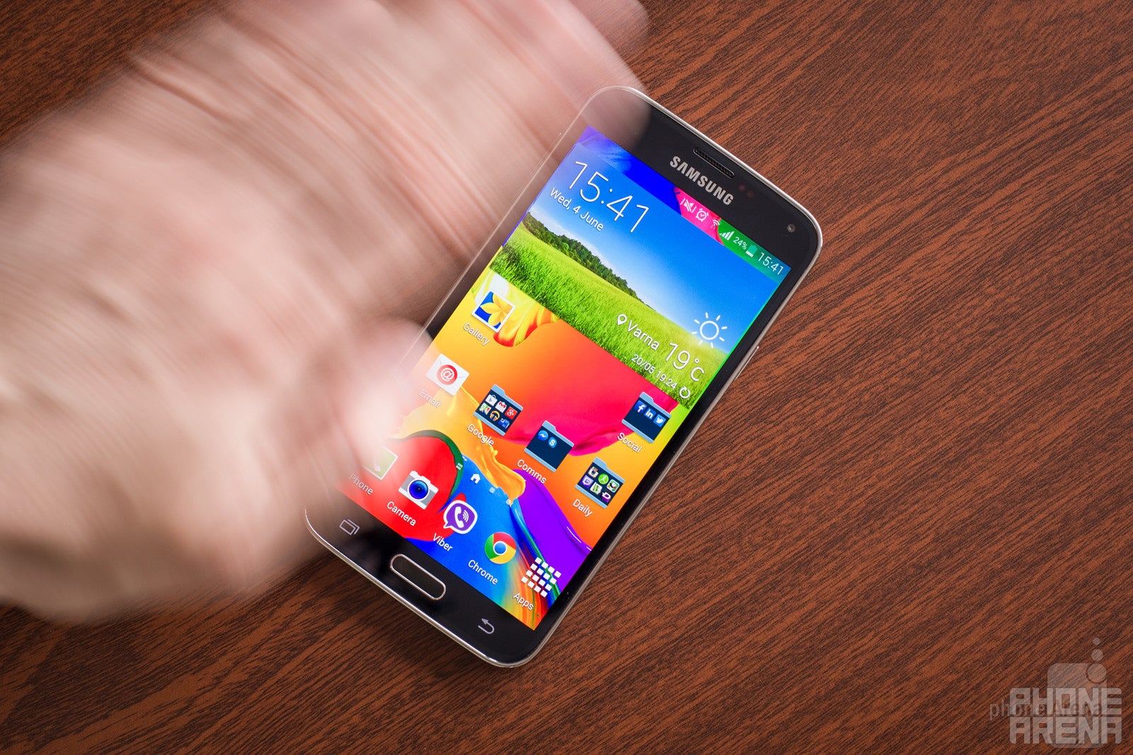
I'd strongly recommend you keep that one off, however. The reasons here are two, but one is definitely a bigger factor than the other: first, it's not the most reliable of features (don't try it from a distance over a few centimeters), and second, it's a battery hog. Indeed, we've had days where 8 to 12% (less than that on average) of the total power drain was attributed to Air wake up, not least because you'll often wake your display unintentionally.
Smart Scroll is much worse, however. In theory, it should allow you to scroll through the contents of websites, e-mail, and a few other built-in apps, by just titling your head or device. But in reality, either of the two modes is unreliable, uncomfortable, and just not useful overall. I mean, why would you ever want to settle for such an imprecise feature when you have perfectly good hands to do the job for you?
Last on the list is Smart Stay -- the Big Brother-ish feature that ensures the S5 is looking at you at all times, and knows when you're being naughty. I'm kidding, of course -- the idea behind this stare contest is to actually allow the phone to keep the screen on whenever you're looking at it. In fact, Smart Stay works so well that you'll hardly ever notice its presence. It's especially handy if you, like me, prefer to keep a very low display timeout setting to conserve battery, but also read/browse heavily on your phone.
Next, on "Living with the Galaxy S5"
Even those unaware of Samsung's usual approach towards software customizations should, by now, realize that stuffing the interface with options is a signature Sammy move. I'm certainly not done detailing every worthwhile feature on the GS5, and while we'll continue right where we left off next week, I'll hopefully be able to provide some practical insight on an overly-important category for most: camera performance.
Instead of focusing on just image (or video) quality, however, I'll walk you through the diverse jungle that is Samsung's camera software and its many shooting modes. Trust me, there are some interesting stuff there. Talk to you in a week!




Things that are NOT allowed: