Living with the Samsung Galaxy S5: a longer-term review
Introduction
But we reviewed the S5. Months ago. So if you felt a little uncomfortable when faced with the title of this particular piece, that's understandable. It's important to lay ground rules, and we often do, even though most of this is done behind the curtain and you're all presented with a polished piece for the most part. So why should you read this one, and what does its very existence mean? Are you to discredit our initial review in favor of this one? Is this piece saying that we didn't do our job back in April, and we'd like a second shot? No. And a resounding "no" at that. Instead, what you're about to read should be viewed as an addition to it (the original review) -- one that is, at its core, different in the way it goes about looking at what the S5 has to offer.
Indeed, the reviewing process necessarily needs to be a standardized one. This means that scientific measurements are at the core of what makes up our professional opinion, as those are hard to fool and leave claustrophobic room for bias. Whatever can't be quantified or measured, we usually steer away from, unless the issue (or advantage!) is significant enough to warrant a comment born out of a more personal opinion. That's because there's no such thing as one-size-fits-all, and what doesn't appeal to the editorial team may appeal to you. A good example is the Galaxy S5's display and its TouchWiz interface, both of which we'll go through in just a bit. But instead of focusing on what objective benchmarks say about the Galaxy S5, I'll focus on what I, as a user, found about Samsung's latest and greatest, both in terms of the good and the bad. And through that, my hope is that you'll be able to draw a parallel (something that us humans are very good at), and possibly gain a more conclusive insight into the inner workings of a device that many of you are shortlisting even now, and one that is likely destined to characterize Samsung throughout 2014.
Design and Display
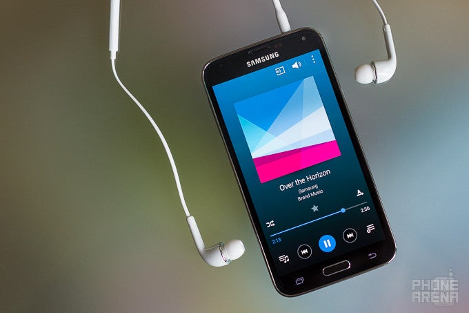
In order to kick things off into a higher gear, I'm about to start with two contested territories: design and display. Both of these have been a source of massive controversy, and have caused many consumers to naturally run for shelter in order to quelch the noise, and make up their own mind. I'd like to try and accommodate those people.
Starting off with design, I have to admit that the Galaxy S5 is not striking in terms of its looks and the feel you get when handling it. This is only amplified by the fact that the company's design language has been cloned and rehashed a hundred times over on lower end devices, even though most of them are reminiscent of the slightly different Galaxy S4. In any case, I didn't feel like I was using something unique. That said, I've found that I like the white model the most, and I definitely hold it in higher regard. Even then, however, the S5 is not the most stylish choice currently on the market.
It is utilitarian's choice, though. In fact, if I had to draw a parallel with the car industry, the Galaxy S5 would be the Volkswagen Passat of the smartphone world, at least in terms of its design's practicality. Indeed, out of the new crop of flagship devices from rival manufacturers, it is the S5 that keeps physical size in check, and that makes it by far the most comfortable phone to use, specifically when compared with the clunky Z2, G3, and even One M8. And while its exterior isn't as premium as some of those, it's definitely the most grippy, ergonomic, and pocket-friendly, and it's not like anybody confuses it with anything else than a high-end device.
Pandora's box: The AMOLED display
As for the display, it reminds a lot of how certain groups of people feel about the Tesla Model S -- the majority love it, but there's a protective and unyielding minority that is dismayed at the possibility of deriving fun from driving an electrical vehicle. The overzealous color reproduction of the S5 has people split in much the same way and proportions, as most people downright cherish the overly-saturated hues, while a stoic, but comparatively smaller faction, refuses to settle for a color-inaccurate panel like that.
As for me, I think most people are right not to be too bothered by the color inaccuracies of the screen. In fact, I specifically put the Galaxy S5 into the Dynamic screen mode (which exhibits by far the most overly-saturated colors of all modes) two weeks in, and I found that I quickly got used to them and never changed them back. The only time those would get a bit unpleasant is in darkness, where the extreme saturation wasn't as easy on the eyes. Do, however, keep in mind that the S5 is not a very feasible device to make online purchases through, especially if you're picky about colors and ordering clothes, for example. These can, in reality, differ palpably.
Because of these color inaccuracies, some of you might be tempted to go for the so-called Cinema screen mode, which is, according to our measurements, the least color-incorrect mode of the S5's AMOLED screen. Having said that, I generally wouldn't advise you go for it unless you're actually watching a movie, as the colors are downright lifeless-looking, and not in a fun way. In any case, and on the whole, this is a great display, and one that is easily made out even under strong and direct sunlight, which makes it perfectly-suited for use even on the beach.
Interface and functionality
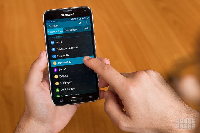
Time and time again, I've found that Samsung's Android-based TouchWiz software is something of an acquired taste. As such, there's a learning curve, and unless you've been exposed to it before, you're probably more likely to look at it with disdain than loving appreciation. Indeed, the interface can be quite busy, and the variety of features and options can be downright overwhelming. This is to say that the Galaxy S5 is definitely not the best pick for people who are just getting to know Android, and specifically if their background reads "iOS", which is, in comparison, extremely simplistic (which is not necessarily a 'pro'). Indeed, at times, the GS5's interface just feels messy, and I think that's fair to say. For example, why are the plethora of special modes (Private Mode, Kids Mode, Car Mode, etc.) all over the place in the sense that one you activate exclusively through the settings, another through an app, and the third -- exclusively through the expanded quick toggles menu? And why are features like Smart scroll and Air wake up buried several levels deep into the God-frosaken Accessibility menu, and not in the more obvious Motions and gestures menu? Certainly that would've made more sense.
But all this isn't to say that the skin doesn't have its appreciators -- in fact, for the longest time, I've been observing a very clear (and extremist) split in the community, a love/hate type deal if you will. That said, I happen to agree with both sides of this particular argument -- TouchWiz can be better organized and less bloated, but I can also see why groups of people are worried about all the negative feedback. To them, functionality and customization are what make Android their platform of choice, and it's also why they buy into Samsung products in the first place. These are the power users in the crowd, who are not as easily thrown off their game, and are usually extremely knowledgeable. To them, to criticize TouchWiz is to risk the versatility of the custom software.
I believe that, while subjective in a strict sense, this is a very open interpretation of what TouchWiz really is, though I'm sure not all will agree.
Features overload: Gimmicks or actually useful?
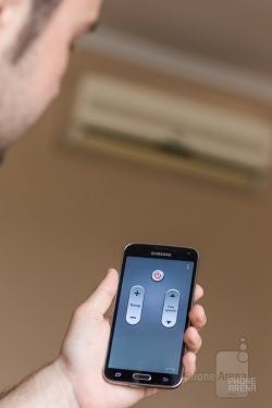
The GS5's built-in IR blaster is a miracle in disguise -- this is the kind of useful features we want.
There's a finite quantity of resources that can, are, and will be allocated to software development, whether we're talking human or financial, even at a company as massive as Samsung. And while I agree that simply because I, personally, fail to see enough use in a certain feature doesn't automatically discredit it, I'd argue very hard that a few of those available on the Galaxy S5 are nearly useless, or at least badly-implemented enough to be tagged the same.
By the above, I mean the likes of "Smart" scroll, the heart rate monitor (which can be substituted with a free app), and Air wake up, for example, all of which are just resource hogs and, save for the monitor, offer little practical benefit except in terms of marketing the phone. So yes, while Samsung has probably done its homework, and has found and confirmed that extra features attract consumers, I'd love to see the day in which the company frees up some more resources currently locked into gimmicky features and allocate them to as comprehensive and successful projects, such as the S Health suite, or well-executed features like Smart stay, One-handed mode and Multi Window, for example. You simply got to love those.
While still on the topic of functionality, I am basically required to mention the all-new fingerprint scanner. I've made my feelings towards Samsung's implementation clear in Week 1, and even after giving it a second chance in Week 4, my opinion remained unchanged. In the simplest of words, the fingerprint scanner is not reliable enough for me to use on a daily basis, and its inferiority is especially noticeable when you get to compare it with what Apple offers with the iPhone 5s. And no, this isn't an Apple-can-do-no-wrong type of statement, it's the reality of the matter.
So what's wrong with it? Admittedly, there are a number of things that factor in, including the somewhat awkward position of the sensor and the fact that it's of the swipe type, and not touch. This makes the GS5 hard to unlock with one hand, and even registering your fingerprint sideways during setup isn't of much help, as you need to perform a rather flawless vertical swipe, which is, again, just an awkward exercise that often had me thinking of how long it'll take for me to finally drop the phone while unlocking.
Performance: Awesome and disappointing at the same time
Benchmarks can be misleading, at least if you do not quite get their purpose. I'd say that the Samsung Galaxy S5 is something of a case study in this regard, in that it scores amazingly in those synthetic tests, but can also be a bit of a disappointment if you consider the overall user experience. As many of you will know, the main reason behind this is Samsung's TouchWiz skin.
Indeed, there's just something about the company's custom overlay that just refuses to play nice no matter the type of hardware powering the device. This issue usually manifests in random, but consistent, stutters, especially in the settings menu and the app drawer, but, occasionally, also when scrolling through the homescreens. To make matters worse, essential apps like Phone and Messenger (among others) are equally-heavy, and take a while to load. Considering that the S5 runs even extremely graphics-intensive third-party apps without a hitch, it's fair to say that performance is alright, but also a mixed bag.
It's true: Battery life on the S5 is great
By now, most of you will have come across at least one or two Galaxy S5 battery life tests, and those have been consistently stellar. Ours, for example, puts the S5's longevity at 7 hours and 38 minutes, which is excellent. This being yet another synthetic test, however, means that many among you will wonder exactly how well the 2800 mAh cell of the phone translates into real life usage.
In my experience, the GS5 is good to go for up to two days before you just have to charge it to stay online. And I say "up to", because it really comes down to how hard you push your devices on a daily basis. In my estimate, the phone was kept with Wi-Fi and 3G on at all times, and I consider myself a moderate user -- I chat on Viber a lot (which wakes up the screen, thus draining juice), and I browse websites and images about as much. I also occasionally play casual games, like Piano Tiles and 2048, for example. With this kind of usage, I usually get a maximum of two work days of battery life, which means that, sometimes, I'm a tad worried that the GS5 might not make it through the entirety of the second day. Thankfully, whenever that happens, you can simply switch on the so-called Ultra Power Saving Mode and make it through the remainder. Lastly, the GS5 loses very little charge while it's in standby -- along the lines of 2% or 3% during the night.
On a different, but related topic, the Galaxy S5 is on the growing list of still few devices that offer very fast charging times -- according to our tests, it takes the S5 about 120 minutes to charge from zero to full, and that's with the included, 2 ampere charger. In comparison, the One M8 and Xperia Z2 need about 210 minutes.
Closing words
Suffices to say that the Samsung Galaxy S5 is one complicated device. And that doesn't necessarily have to mean something bad. Not at all. But in certain regards, it feels like the GS5 is unnecessarily complicated. On the whole, it's a great device, but if you have even mild OCD tendencies, you'll find many little things with the S5 that you'll wish were better-executed, or missing altogether.
The Galaxy S5 is the Swiss knife of the flagship bunch: it's complex, but extremely versatile
Execution, precisely, is what, in a way, feels like is holding the GS5 from being the perfect device. And I mean that in terms of thoroughness, as certain aspects definitely deserve applause. This stark contrast is so profound that one can't help but wonder what Samsung could deliver, were it to focus on fewer areas, and finally do some summer house cleaning. After all, more isn't necessarily better, though I imagine the average consumer is drawn to all the extra features, good or bad, like a moth to a flame. We have marketing to thank for that.So would I recommend you go for the Galaxy S5 if you're on the market for a flagship? Quite frankly, I tend to think that the current split between Samsung, HTC, Sony, and LG, is downright perfect, as the lines between what they bring to the table are clearer than ever, and that makes it easier to pick. Indeed, the One M8, for example, is definitely the stylish choice, while the G3 is for the power users out there, that just need phablet-sized screens. The Xperia Z2 is somewhere between those two -- it's both stylish, but also very, very large. As for the GS5, to me, it remains the utilitarian's choice. It's the Swiss knife of the bunch -- complicated and a little overboard at first, but extremely capable and versatile once you get to know it. And that, more than anything else, is why people will continue to choose the GS5 over the rest. And I don't fault them, and nor should you.




Things that are NOT allowed: