Hello and welcome to our second week's entry into the "Living with the
Samsung Galaxy Note Edge". In case you've missed
the first article in the series – we are basically taking the Galaxy Note Edge on a 4-week journey as a daily driver, taking a look at everything, from its evident specs, form, and function, to the smallest intricacies and quirks that pop out and shape up to make or break a handset experience.
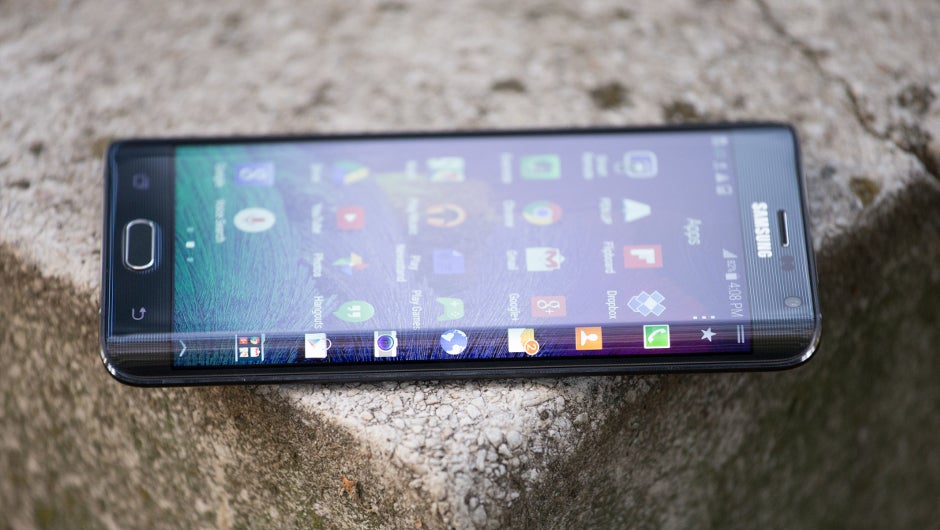
Last week was more of an introduction to the device in general, as I was acquainting myself with its most obvious or often used functions. This week – let's dive deeper into a couple of specific topics. We noticed that the device's peculiar shape still creates a lot of questions about its handling, so in this article – I will go in-depth about the curved Edge screen – from how it looks, to how it feels, handles, and every TouchWiz function associated with it, together with how useful it actually is.
Week 2: A double-edged sword
As previously mentioned, the Edge Screen does add beauty and “wow” factor to the Galaxy Note Edge, together with some multi-tasking functionality (more on that later), but does add an inconvenience in handling. Compared to the
Galaxy Note 4, the Edge is slightly shorter, and slightly wider, and with a “missing” right bezel – a lot of people still wonder how it would handle. So, let's start from there.
Handling the Edge
Let me start by saying that I generally hold the Galaxy Note Edge – or any Note (any phablet, really) device – with my left hand. I suppose it's an intuitive thing – a right-handed person is expected to operate the S Pen, or the large screen for that matter, with their right hand – so that gets the question of “Which way is the Edge Screen supposed to face?” out of the way. Fear not if you are a leftie, or just prefer to hold the phone with the Edge Screen towards your palm – either position creates drawbacks and benefits of its own. And, if you are dead-set on wanting the Edge Screen to face left – Samsung has released a software update, which allows the user to turn the Note Edge every which way they desire – yes, upside-down, too (
check here for more information on how that works). I've spent some time operating the device in any position, so let's check them out.
- Edge Screen opposite palm
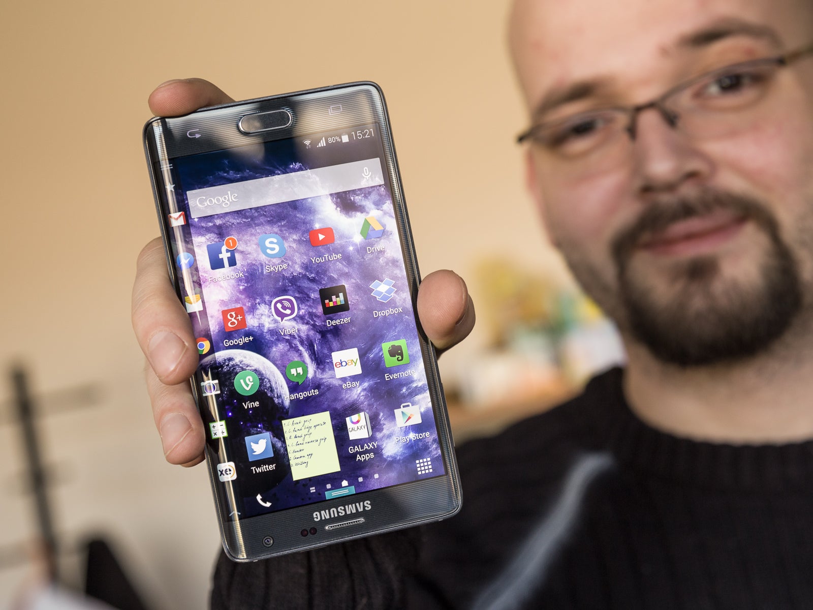
Gripping the Note Edge is not hard or unstable, but doesn't feel as good in the hand as a fully-framed handset
When I hold the Note Edge in the left hand, one side pressed against the palm, with fingers wrapped around the right bezel, the lack of a metal frame is evident – the device's right edge jabs softly against the fingers and, while the grip doesn't feel loose – it's not as comfortable as with a fully framed device, and one sometime misses holding just a "regular" Note 4 in their hands.
The Note Edge may be only slightly wider than its sibling (by 0.15”), but the difference is definitely felt, as trying to reach the furthest parts of the display is often accompanied with changing your grip on the
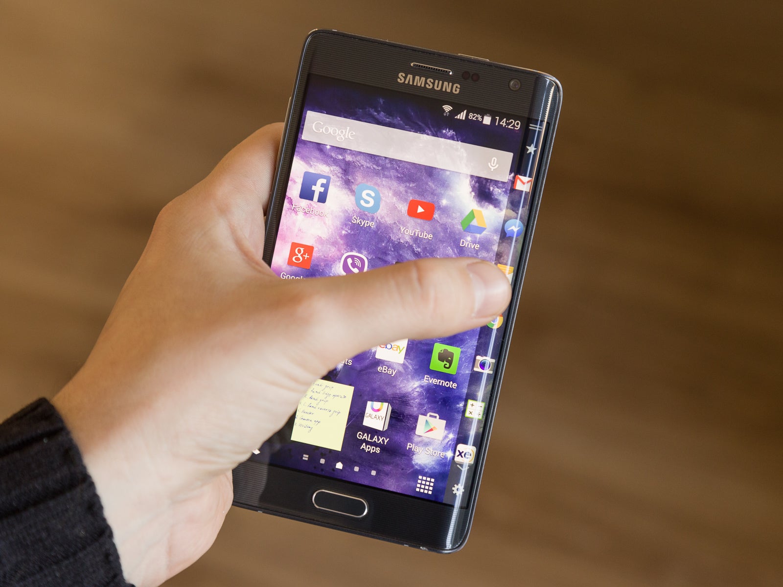
People with larger hands will be able to touch the Edge Screen with their thumb after some hand gymnastics and risk of dropping
handset and stretching the thumb out, especially when trying to reach the Edge Screen. Yes, there is One-Handed mode available, though, I can't say I feel safer when using it – first, the gesture to activate it requires the user to quickly swipe in and out of the display with their thumb, which leads to some shaky handling during the process; secondly – even in One-Handed mode, you're still holding a device, a tad too wide for comfort. If I am to compare the Note 4 experience to this – the latter is a taller device, yes – and it involves just as much shimmying the handset around your palm, when operating with one hand; but, when it One-Handed mode, it adds a smidgen better handling, due to the narrower body and flat frame on both ends of it.
Of course, if one buys a phablet, they do it knowing full well that single-handed operation is not what these devices are meant for. Still, let's check out how the device handles when the Edge Screen is up against the palm.
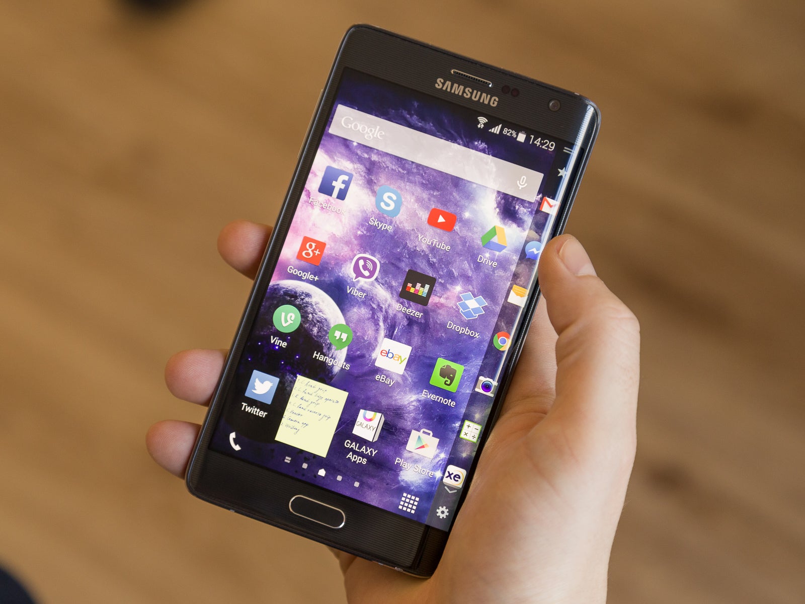
Holding the Note Edge in the right hand gives the user a very direct access to the curved secondary display. However, since the thumb can only bend so much, this specific scenario allows us to circle through Edge panels with ease, but not operate their entire length. I'd also say it feels a bit more uncomfortable, as it doesn't leave a feel for a solid grip inside the palm, and it increases the chances for accidental taps.
The amount of user inquiries and complaints about the Edge Screen being on the “wrong side” of the device prompted Samsung to release an OTA patch, which allows the user to turn the handset around, and have the screen flip to accommodate the new position. A drawer, holding software navigational buttons, appears in the bottom of the screen, and while not exactly a very rational way to hold your phone – it may offer just what some people need. In my experience – holding the phone upside-down just felt way too weird and disctracting, and accessing the software keys at the bottom was a chore, as it required me to first “pull” the drawer out, before touching the desired button. Not to mention that to receive or make calls, the user, naturally, still has to flip the phone around, so that adds a bit more confusion, and detraction from user experience.
I've got to say – by the end of week two, I've already accepted the fact that handling the Galaxy Note Edge in ways like changing hands, or picking it up from a flat surface, will more often than not result in an accidental screen tap, so the best way to deal with it is to just grab the device in the most secure way you can, and then close any app that might have opened in the process. Samsung did add a touch-ignore function of sorts to the Edge screen – if you keep your finger on the same spot for 0.5 seconds, the screen ignores the input. So it's really best to just plant your grasp in one spot and move the phone to wherever you wished, trusting that the touch-ignore will do its job.
On the software side of things
Now that we've got handling out of the way, let's take a deep, detailed look of all the little things that TouchWiz does with the Edge Screen, in order to make it worth our trouble.
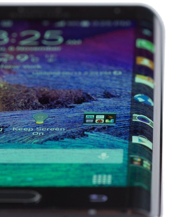
First of all, do know that the Edge panel is only visible, the way you see it in pictures, when the phone is on a home screen. Launching an app, or even going inside the apps drawer, causes the panel to hide from view – this gives us some more real estate to work with and prevents accidental operation. Should the user desire to use a panel – they need to “pull” it in by swiping right-to-left.
As touched upon last week – there aren't that many Edge panels available for download yet, much less ones that were actually of any significant use, but after some careful vetting, I ended up with a combination of “Favorite Apps”, “Task Manager”, “S Planner”, “Data Meter”. In this combination, the Edge Screen provides quick access to most often used apps, quick, alt-tab-like multi-tasking, easy view of the user's daily agenda, and much needed info about how our monthly Data usage is going.
Additionally, the Edge has an ever-present drop-down menu, which houses some nifty tools – a ruler, which turns the handset's curved bezel into a... well – ruler; a timer, stopwatch, and torch controls, and an S Voice shortcut, which allows the user to quickly record whatever audio they need to. All of these panels launch on the Edge Screen only, leaving the main screen free for whatever you were doing. Pretty nifty, and while I found myself rarely in need of these functions, it's reassuring to know that they are at a swipe's distance, and don't need their own shortcut somewhere on the home screens.
As far as notifications go, the Edge Screen pretty much doubles with the top-side Notifications tray – you get a logo of the respective app, along with as much of the actual message's text as can fit on the display strip. Yes, a bit anticlimactic, though, the Edge notifications do display a bit more text, if that makes it sound any better.
This can be a little distracting when in a full-screen app – as mentioned above, the Edge detracts itself when you are operating the phone, providing some extra room on the side of the screen – so, when a notification pops up, you suddenly feel as if the screen gets cramped. This could certainly become a problem if someone spams you on a messaging app, for example, though, thankfully, the most popular ones are “smart” in that aspect, as they only show you a notification once, even if an overly zealous chatter is punching out 47 lines per minute. As far as accidentally touching a notification that just popped up on the Edge – I can say that this doesn't happen, though, to be perfectly honest – I often find myself waiting for one to disappear, or reaching to close it, before proceeding with whatever I was doing (thankfully, Samsung added a little X, which appears at the bottom of the Edge panel with each notification, allowing the user to quickly dispatch it).
The way TouchWiz handles calls is here to make amends – when you are operating any app on the phone, and it happens to ring – the caller info, together with the accept / reject buttons appear on the Edge, rather than minimizing your app. Whenever you are in-call, tapping an icon, which appears in the top-right of the screen, will send the call status to the Edge panel, freeing up the main screen for whatever you need to do (take a note, for example).
And finally, the curved screen has two ways to work as a clock, having it glow even if the main screen is off. The first way to achieve this is by turning the Edge panel on autonomously – without waking up the main screen. To do this, the user has to swipe their finger up and down the Edge – just once per direction is enough – however, it takes a while (sometimes – quite a while) for the screen to go on, and the user is often left wondering, whether the command registered.
Alternatively, the Edge has a Night Clock setting, which, when on, leaves the panel constantly on, albeit at the lowest brightness, with a digital clock, displayed in white numbers on black background. A pretty cool function, which can, unfortunately, only be set to be active a maximum of 12 hours per day – Samsung meant it as a night clock only, after all, and didn't give the user to decide whether they want to have it on permanently, which is just a bit disappointing. To be fair, at minimum brightness, the clock is pretty hard to spot during daylight, so let's say the lack of user choice here is not the biggest of crime on Samsung's part.
Last words on the Edge Screen
So, what's the final judgement on the Edge Screen and its functionality? Well, the secondary screen offers quick-access to multitasking, frees up some space, and looks undeniably cool, while the phone's wider display (than the Note 4) allows the user to fit a couple more characters per a line of text. Does that make it worth the extra price? Well, if you are looking to get your money's worth in the form of functionality – the answer is "no" – the Note Edge doesn't offer $120 (the usual difference between Note 4's and Note Edge's retail prices) worth of pure productive function. However, if you factor in the "cool" and "fresh" – not even to impress others with the handset, but for your own, personal user enjoyment of holding something different – you will find it hard to convince yourself to buy the "cheaper" Note 4.
My personal choice? I'd go with the Edge.
Next week
Now that everything about the Edge Screen has been said, next week, we'll take a look at the handset's Note-esque features – TouchWiz, the Display, and the S Pen. Tune in to see how the Note Edge fares as a regular daily driver, and whether / how much the S Pen's features in the Note 4 / Note Edge enhance user experience!
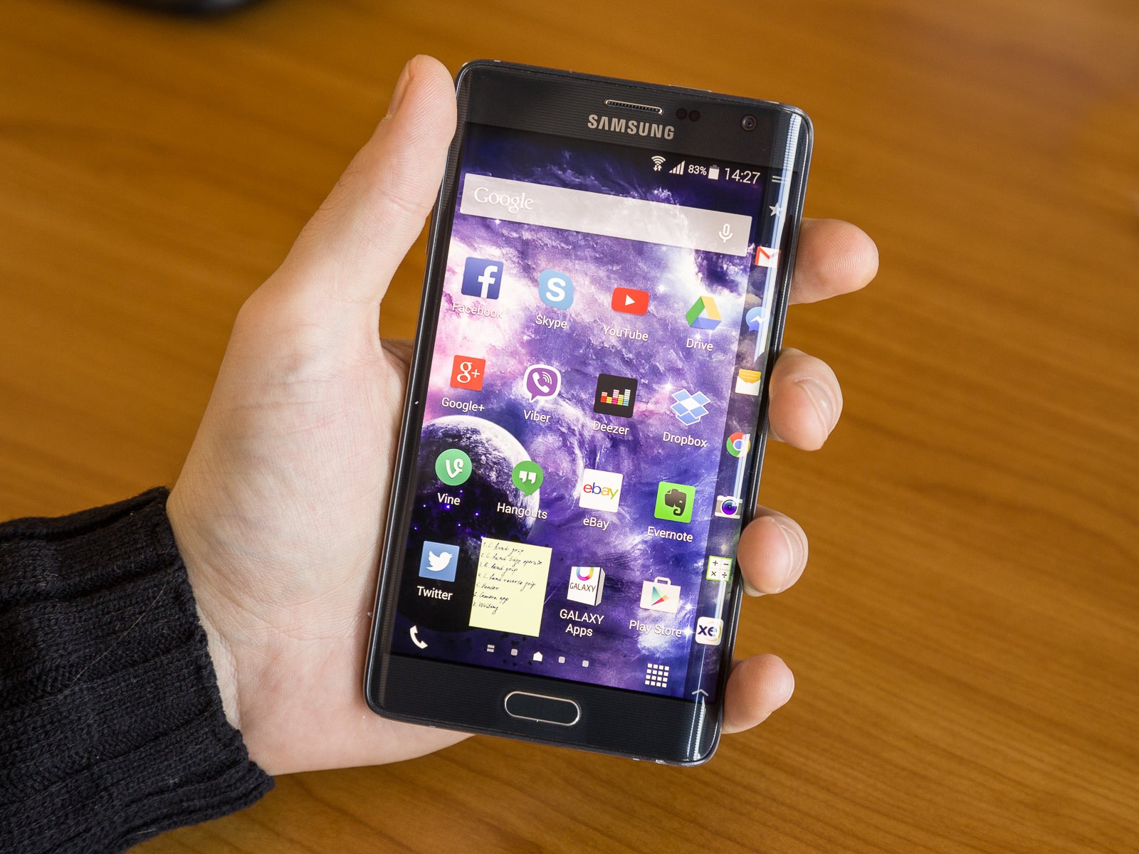 Gripping the Note Edge is not hard or unstable, but doesn't feel as good in the hand as a fully-framed handset








Things that are NOT allowed: