Living with the Samsung Galaxy Note Edge, week 1: Look at those curves!
This article may contain personal views and opinion from the author.
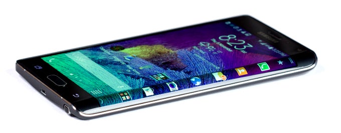
Introduction
The Samsung Galaxy Note Edge has been out for a couple of months now – though, in select markets only – and while we did take the device through the usual steps of extensively testing and evaluating it, just as we do with every flagship, there is still a lot that cannot be covered with a general, short-term review of the smartphone. Namely – all the little nuances, benefits, and small, irritating drawbacks that a pocketable computer-class device can only show once it has been used as a daily driver for a while.
So, as you've seen PhoneArena do before in the “Living with...” series, I will be taking the Samsung Galaxy Note Edge on a 4-week journey as my handset, judging its form and function, looking for the nitpicky details, and generally draw a more detailed outline of the phone's positive and negative sides.
Of course, seeing as this will be a long-term review, one in which I will inevitably have to express a subjective opinion on how some of the device's features serve my needs, one may be legitimately concerned with my predisposition towards Samsung, or its flagships, and how that would affect the opinions expressed in this article. So, let me start it off with a disclaimer that Sammy's phones haven't had my favor, nor have I condemned them in any way ever since the Galaxy S III – the Galaxy S line just fell off my “potential personal device” radar back then. I did try to get into the Note 3 on a couple of occasions, but found that it just doesn't serve my needs as much (not yet, at least). So I'd say that, before laying my hands on the Galaxy Note Edge, I was pretty Samsung-neutral.
So, without further ado, let's jump straight in!
Living with the Samsung Galaxy Note Edge, week 1
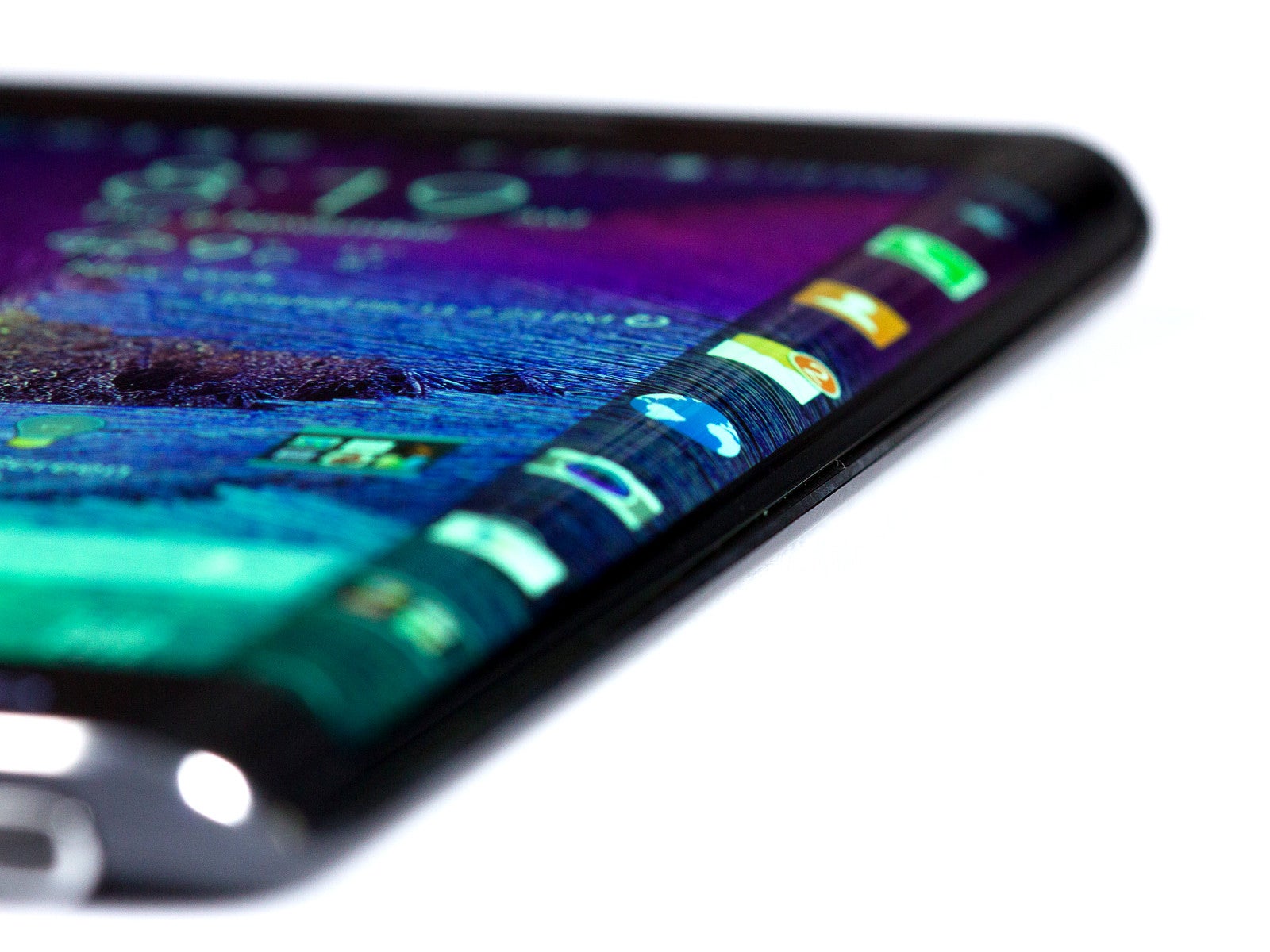
Well, one thing is for sure, looking at the display panel when it's on is a pleasureful experience – the offset curve gives it a bezel-less appearance on the right side, and having Sammy's default wallpapers on-screen is a beautiful view that doesn't get old fast.
The phone is slightly wider than a Galaxy Note 4 and its right side gives the user a sense of vulnerability, which prompts constant care while handling. Add to that the fact that one would prefer to avoid accidental touches when picking up the device and you've got some pretty awkward handling situations, especially when picking it up from a flat surface, or using the camera. The Edge Screen's sensitivity to touch has been lowered, Samsung says, in strides to prevent accidental operation and, in turn, getting used to utilizing it without a hitch requires a couple of days. Once there, however, swiping through Edge panels is a breeze.
Of course, finding uses and benefits to justify the device's odd shape (and hence – a tad harder handling) is the first thing that will pop in anyone's mind, so let's take a look at all the Edge Screens that are currently available to us.
Looking for the Edge Screen's functionality
The Edge Screen is still a pretty new concept and app developers have yet to figure out uses for it, so naturally – the selection of apps for the phone's secondary display is still mostly limited to Samsung-made ones.
The pre-installed Edge panels are Favorite Apps, Twitter, three different Yahoo-powered streams for Finance, Sports, and News, a briefing panel, and a Memory Match game.
Additionally, one can download an S Planner (Sammy's calendar app) panel, a task manager, S Note panel, CNN breaking news stream, webpage bookmarks panel, a RAM Status meter, a Data Usage meter, and a couple of simple games that incorporate the Edge Screen in the gameplay.
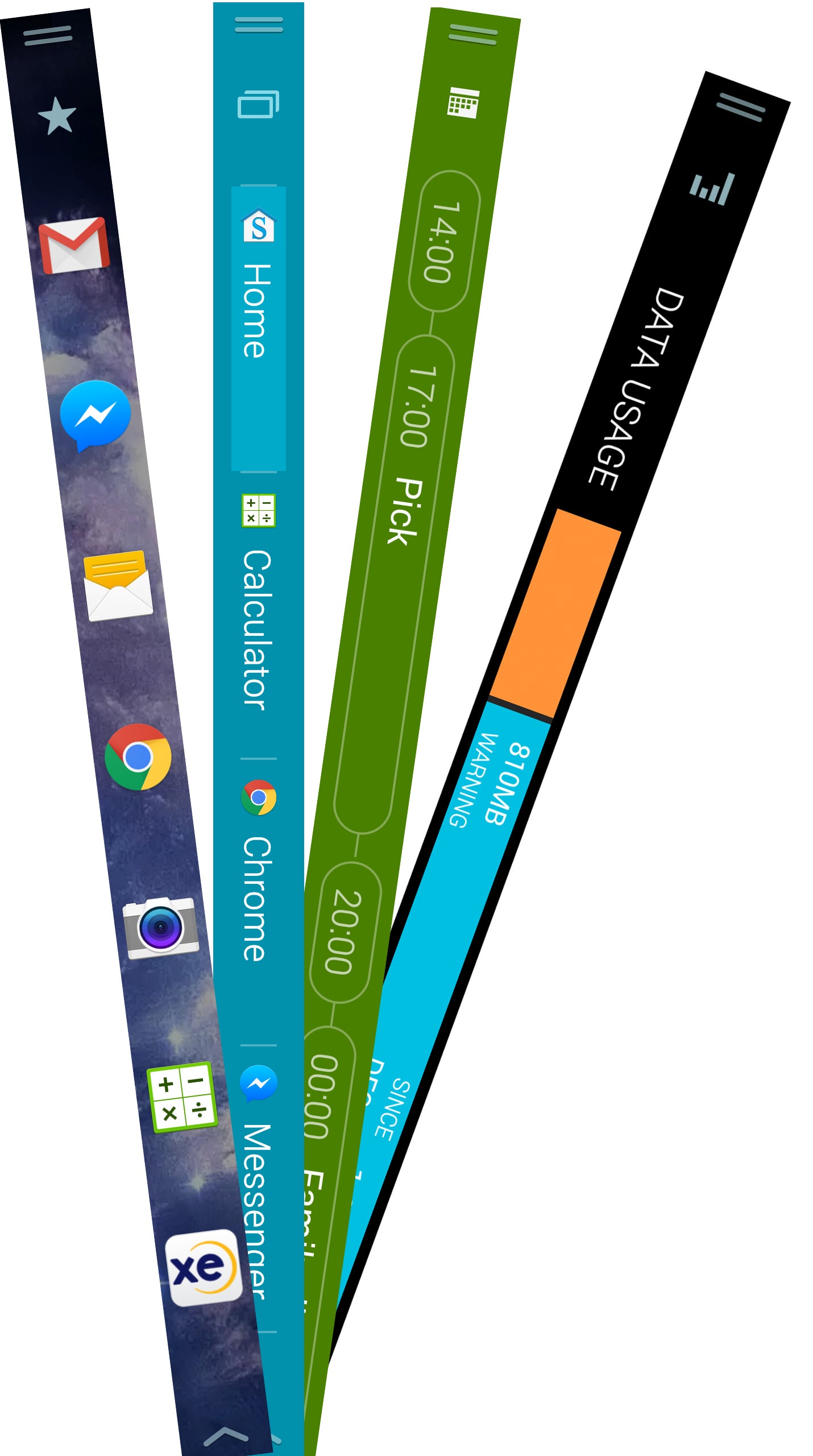
- Favorite Apps – allows the user to place shortcuts to their most often used apps on it. Said apps will therefore be launchable from any screen, granting faster access, while allowing the user to shave off a home screen, keeping things tidy.
- Task Manager – displays a list of currently active apps (note – active, not “recently used”) and allows the user to switch between them for some quick multitasking.
- S Planner – linked to your calendar – it will show you your next event for the day – nifty for reminders.
- Data Meter – “fills up” the Edge panel with color, creating a real-time visual representation of how much Data you've used up this month.
This is pretty much the core of (currently) useful panels, the rest either seem redundant, due to the fact that they double with TouchWiz's normal notifications, or they just serve a rather useless function.
Of course, you could add a Yahoo or BBC news panel in there, if you are heavy on news consuming, however, I found that the slowly scrolling headlines are often irritating – it's much more effective to just open your desired app or media and sift through the headlines yourself.
In my experience so far, the number of Edge panels should be moderated – keeping it as low as 4 or 5 is OK for use, while any more of that looks a bit redundant, as its easier to navigate to a needed app, instead of to scroll endlessly through the Edge Screen until you find your desired panel.
Oh, hello again, TouchWiz. Have you lost some weight?
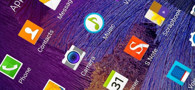
Yes, the Galaxy Note Edge is still a Samsung device, and as such – for better or worse – it is equipped with Samsung's TouchWiz interface. See, a lot of people dislike Sammy's take on Android, because it is so choke-full of features that its settings are often a labyrinth to navigate and, no matter the cutting-edge hardware that's humming under the hood, it always tends to deliver a sluggish and choppy experience.
One can see that Samsung has tried to remedy that with the new version of TouchWiz, found on the Note 4 and Note Edge. In particular – the infamous random stutters and hangups that detract from that buttery smooth “flagship experience” when scrolling through the home screen and app drawer are gone – or at least have not appeared within the first week of usage.
Unfortunately, this is as far as improvements in UX go, as the random delays when launching / closing apps are still present. These are especially annoying when trying to launch S Voice via spoken command, then hanging around your phone, staring at it with a confused look for a few seconds, trying to figure out whether it “heard” you or not.
The settings menu seems to have been slimmed down just a bit, and its options have been slightly reordered and properly color-coded. Still, while some options have found their logical, and rightful place, there are still some paradoxical decisions here – for example, the “Motions and Gestures” menu holds the Direct Call, Smart Alert, Mute/Pause, and Palm Swipe to Capture options, while the Air Wake Up option (hover hand over screen to wake the device up) is found in “Accessibility” → “Dexterity and Control”. Furthermore, you can find the Smart Stay option (screen doesn't turn off while you are looking at it) in the “Display” section. Confused? You're not alone.
The Settings menu does offer a search bar, but since this phone has a lot of options – you often don't know exactly what you are looking for. Setting the device up completely to one's own standards takes around 3 runs through its options menus – preferably in 2 or 3 different days – you will forget where to find all of the stuff for sure, but you will at least know what you are looking for. The “Quick Settings”, which can be customized and are always stickied at the top of the Settings menu help with sifting through the clutter and are useful for those options, which you need to access more often than others.
More TouchWiz experiences to follow next week.
The S Pen: Do you really use this?
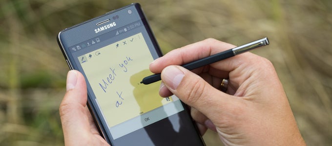
As previously mentioned, I did try to get into the Note 3 a while back. I thought the S Pen was “nifty” but it was barely at the level of usefulness that would outweigh the Note 3's drawbacks.
Well, Sammy did work on its stylus yet again and, this time around, added functions which make it a viable tool not only for taking notes, but sharing them, without worrying that you are sending a blotch of badly scribbled text to the other party. What I am talking about is the new “Smart Select” function – it allows you to transform your own, hand-written notes into actual print-text format, which you can freely copy / paste in messages. Now, this adds another layer of usefulness to the Action memos altogether.

Nifty, yes, but I found one irritating drawback – the fact that Sammy's designers decided that said button should be colored the same as the stylus itself makes it hard to find in dimly-lit environments. Yes, I am fairly sure that after some days of usage, muscle memory will kick in and I will be able to find it easier, but still – this is a poor choice as far as functional design goes.
Button finding issues aside, a week in with the Galaxy Edge – I can say that I am enjoying the S Pen. Its handwriting-to-text recognition is still a bit inaccurate at times – even when you are absolutely positive that you've carefully written out a letter. However, there is something intuitive about pulling the stylus out and scribbling down an Action Memo, having it instantly sync with Evernote, that virtual keyboards just can't beat. I will keep using it for the weeks to come, so, naturally, expect more details as time passes.
The Battery
Just like shown by our battery test – the Edge may not have as big of a juicer as its sibling – the Note 4 – but still manages to keep the screen glowing for a considerable amount of time. As far as real-life experience goes – it hasn't been an easy week for this Note Edge – with all the new app installs, gaming, YouTube video watching – the phone still managed to hold a 30% charge by the time we would reach home. And even at that percentage – I wasn't worried, as the Power Saving mode definitely helps me squeeze out extra hours out of the thing. I have yet to try Ultra Power Saving.
Stay tuned for Week 2



Things that are NOT allowed: