Living with the Apple iPhone 6: design, display, and something more (week 1)
This article may contain personal views and opinion from the author.

I've enjoyed my first week of intense exploration of the iPhone 6. I've got the gold version, which is gorgeous. What's not so gorgeous? My first patches of silver hair (or should I say 'space grey'?).
Design can make or break a product
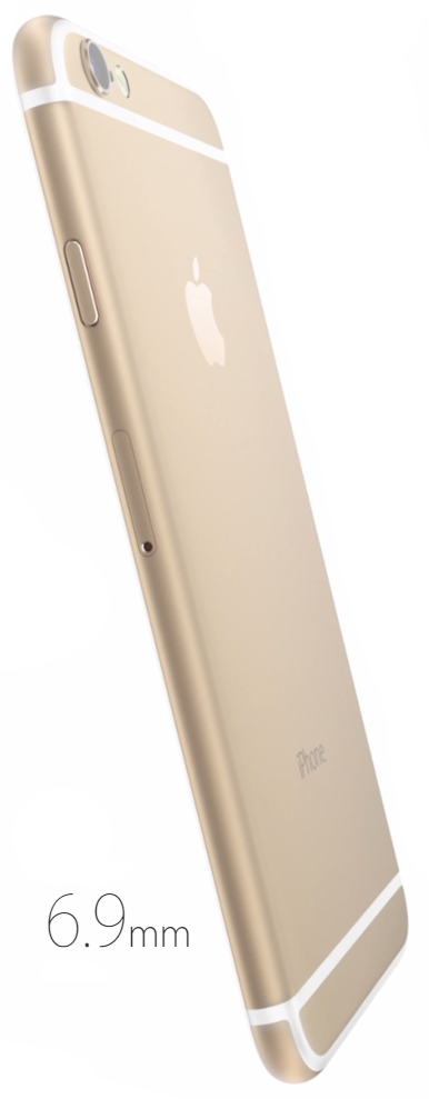
The iPhone 6 is a result of the strict focus and design discipline that Apple has imposed on itself throughout the years. After spending a few months with Apple’s iPhone 6 darling, I can say that this new design has withstood the test of time and comes out as being very practical and good-looking at the same time. It is a combination of different factors that intertwine in that one feeling of premium experience with the iPhone 6: the thinness of the phone makes it stand out among all current flagships (only the Sony Xperia Z3 comes close to the slim profile, all else seem terribly chubby in comparison), the color options and the extremely stylish gold version in particular make it very desirable to people of different walks in life, and it's important to note that this appeal is clearly a decisive factor and a critical advantage for the iPhone over its rivals. Apple’s reality distortion field is said to funny effects on people, but I can't say this widespread admiration is unjust: every time I pick up the iPhone 6 after using most any other phone, I felt wowed by the thinness and the sturdy design. I've felt in a similar way about few other devices in the past: the HTC One S was one such phone, and in most recent years, the HTC One (M8) has taken a special place in my heart also, but it's a place reserved for few phones, and the iPhone 6 seems to have found it. This appeal grows on you over time: one also appreciates all the little details - the well-crafted and responsive volume buttons, the presence of the useful mute switch, the lock key that is positioned conveniently right next to your thumb.
My experience has also shown that after months of use I've found no practical consequences from the iPhone 6’s camera bulging out. The attention this issue has gotten is understandable and fair given that in the past, we (and others) have critiqued Nokia for the terrible camera hump of the Lumia 1020 (which is in fact multiple times larger and sticks out in a much more visually offending way) and the Galaxy S5 and Note 4 for the same. Yet, my experience shows that this is more of a tableside tease that tech-involved people bring up rather than a real-life problem.
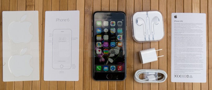
Display: the underdeserved hype around resolution, and the overlooked importance of color accuracy
Apple is often associated with pushing state-of-the-art technology before everyone else: the company was the first with high-resolution displays on the iPhone 4, iPad with Retina display, iMac; it has killed the CD in favor of the more advanced USB flash drive in the Macbook Air; it has done away with the physical keyboard on smartphones.
Yet, not so many people talk about Apple’s ability to withstand pressure and stand its ground in NOT introducing features that it considers of little value. Lately, smartphone makers have gone on a wild race to increase the resolution of smartphone displays: we saw 720p, then 1080p, then quickly another jump to Quad HD (1440 x 2560 pixels), while Apple - puzzlingly for some - sticks with a 4.7” display with a resolution of 750 x 1334 pixels. The average spec-counting crows (and those individuals tend to be very vocal) are quick to summon hell and high water on Apple for such allegedly short-sighted decision that seemingly puts the iPhone in the stone edge of technology. The truth, however, is more complicated than that, as mathematical analysis shows that the human eye finds very little visible difference between resolution going over pixel densities of 320ish ppi (the iPhone 6 has 326ppi). My personal experience is that there is close to zero practical consequences from this comparatively lower resolution, and everything looks sharp enough - we could not see any pixelization on the screen.
Resolution is only a part of a good screen. What doesn't get enough attention is the actual color reproduction
At the same time, what gets much less attention - while at the same time being a factor with such huge variances with big significance for the quality of an image - is the color accuracy of displays. Apple's iPhone 6 display delivers very good color with none of the plaguing issues like ghosting that are typical of some AMOLED displays. Comparatively speaking, it is among the best smartphone displays in terms of color calibration. This does not mean it's perfect: being an avid night reader, I've found the level of minimum brightness on the iPhone 6 to be too bright, which makes for an uncomfortable, eye-strain-inducing experience. Also, color saturations are slightly off and the screen is just slightly bluish, whereas I would prefer seeing Apple stick closer to the industry standard color temperature with less of that cold tonality.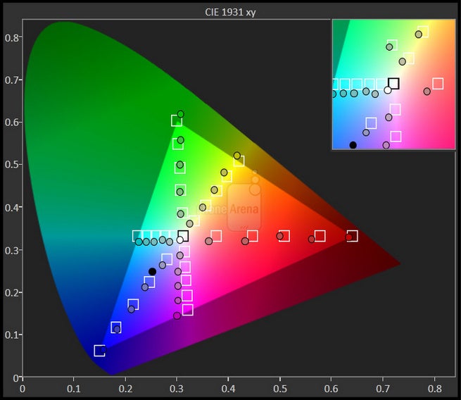
Apple's iPhone 6 has a good color accuracy (but it's a slight step back from the 5s)
An ode to the physical button
It's remarkable how Apple has managed to keep the continuity in the iPhone design. The only thing that has changed in some 8 years is the position of the lock key - from its up-top position to the right. Everything else remains positioned in pretty much the same way, including the most visible birthmark of the iPhone: its round home key.
To smartphone newcomers (strange as it is, they do still exist, and I've had a personal encounter with some of them, my parents) the physical home key is a true life saver: it's - reassuringly - always there, and you just press it to go back to safety after wandering into some obscure menu.
It's more than that, of course: it makes communication with Siri possible without having to ever look at the screen (call us crazy, but we think that’s one of the core ideas of having a voice assistant), while on both Android and Windows Phone, one needs to look and interact with the phone for even the simplest voice command. I find a great deal of tranquility in being able to dictate a late-night message or set an alarm without having to break the comfort of the night’s meditative darkness. Naturally, I'm not trying to argue that this is something that all users would need, but it's just a nice feature missing on other platforms.
Stay tuned for part 2 of our ‘Living with the Apple iPhone 6’ series, where we pay closer attention to the iOS interface and what sets it apart from Android and Windows Phone.
Apple iPhone 6 (silver) design
Follow us on Google News




Things that are NOT allowed:
To help keep our community safe and free from spam, we apply temporary limits to newly created accounts: