Lenovo S2 smartphone hands-on

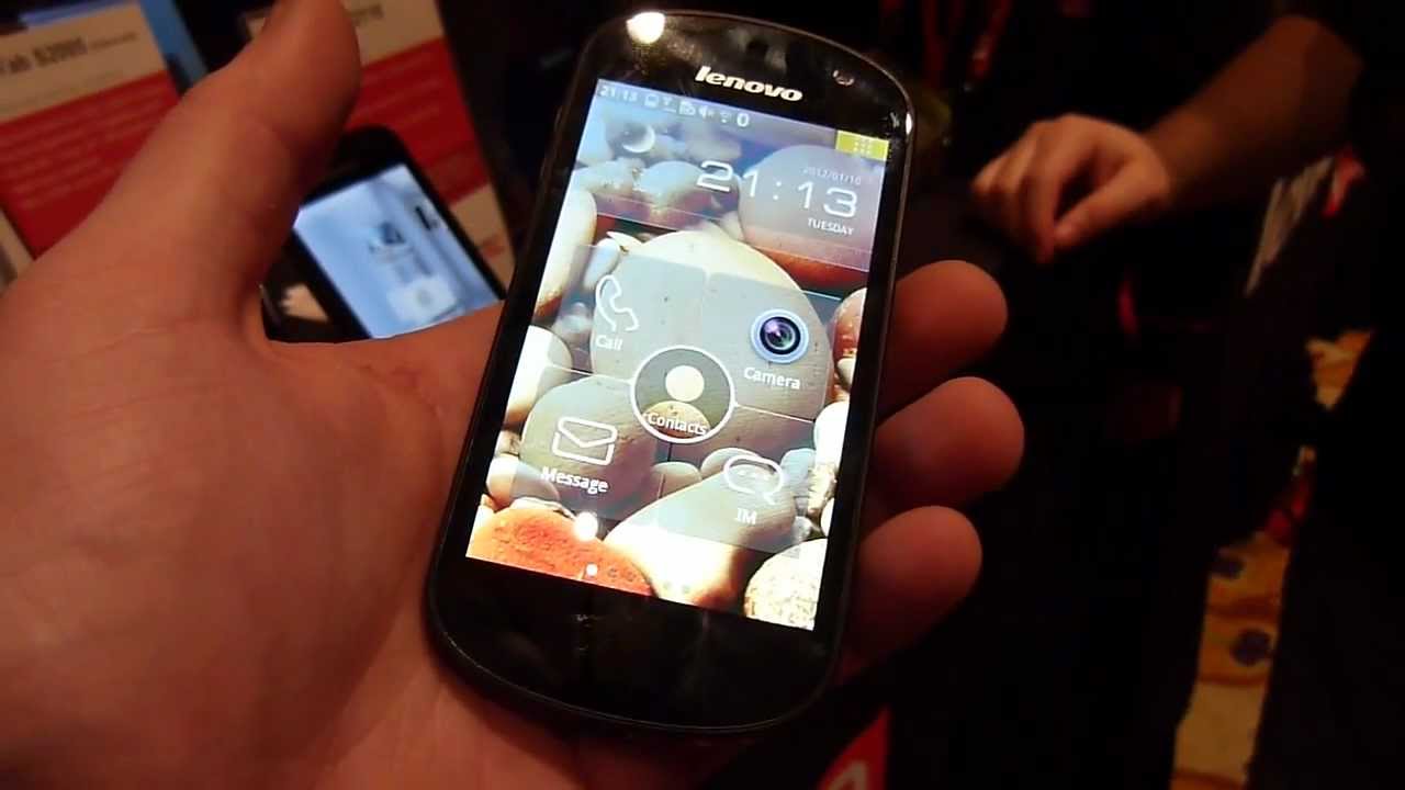
It’s been known for some time now that Lenovo was ready to enter the smartphone market. We’ve seen some phones pop up from time to time, including the Lenovo S2 smartphone that we were able to give the hands-on treatment to. While this phone is currently only destined for release in China, it will give us a window into what Lenovo envisions with their handsets and perhaps give us a preview of things to come.
The Lenovo S2 has some decent specs but in no way is it a high-end device. Some specs will almost certainly catch your attention, such as the Android 2.3 platform that will apparently get upgraded to ICS at some point, the 8 megapixel shooter or the single-core 1.4GHz processor, but others may have you scratching your head such as the miniscule 512MB of RAM.
Specs aside, the Lenovo S2 had some decent hardware. The 3.8-inch display is pretty good, but nothing to write home about. Colors weren’t the best but text seemed to look nice. The phone teeters on the hefty side but it feels solid in the hand and has an overall nice feel to it. The back of the handset has a nice matte finish to it that doesn’t seem to attract too many fingerprints. Lenovo also chose to replace the standard Android capacitive buttons with one capacitive home button that sits in the middle of a gesture area. The frame of the Lenovo S2 is constructed of metal and was a nice touch, but there is nothing really that sets it apart in terms of appearance.
The big thing with the Lenovo S2 is the heavy custom user interface that overlays its Android underpinnings. When we say heavy, we mean heavy. They call the interface Clover (which is found on other Lenovo mobile products as well) and it will make you wonder if you are really using an Android device or not. The heavy UI matched with a single-core Snapdragon processor probably isn’t the best match and the smartphone’s overall performance showed that. Going between screens was laggy and the selection of an icon was usually met with some hesitation.
Overall the Lenovo S2 is underwhelming to say the least. They did some good things in terms of hardware design but the package just feels incomplete. Even though this phone may not be coming to the US anytime soon, if at all, tell us what you think about the Lenovo S2.


Things that are NOT allowed: