LG V30 vs LG G6 vs LG V20: An interface comparison
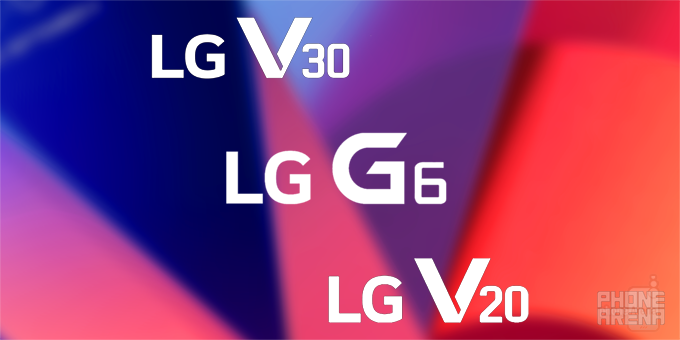
LG's UX interface has definitely gone a long way for the past few years, with the G6 and the latest V30 being the best examples of what the South Korean manufacturer is capable of.
While the V30 and the G6 are pretty much similar to one another in terms of visuals, the older V20 stands from the pack with the slightly more dated albeit crude and manly interface.
LG's general aesthetics are clearly visible in all screenshot collages down below. It's hard not to like LG's design approach and user-friendly interfaces which are both simplistic and pleasing to use.
It's definitely gone a long way, but how has it evolved over the past year or so? Well, while the answer to that question can be easily visualized with a couple of pictures. After all, a picture is worth a thousand words, so here are a few thousand words that will show you how LG ha stepped up its game
Lock screen, home screen, and notifications bar
Minor changes is what characterizes LG's interfaces advances between the V30 and the G6, though the V20 is obviously a tad more different than the newer instances of LG's interface.
Settings menu
While the V30 and the G6 are pretty much similar to one another in terms of visuals, the older V20 stands from the pack with the slightly more dated albeit crude and manly interface.
Stock apps and multi-tasking
LG's general aesthetics are clearly visible in all screenshot collages down below. It's hard not to like LG's design approach and user-friendly interfaces which are both simplistic and pleasing to use.
Camera
V30's camera app has gone more minimal and functional, even moreso than the G6 earlier this year. Yet, at the same time, it still has all the essential buttons and toggle conveniently placed at your fingertips.


Things that are NOT allowed: