LG UX 4.0 vs new TouchWiz vs Sense UI 7: UI comparison, vote for the better one here!
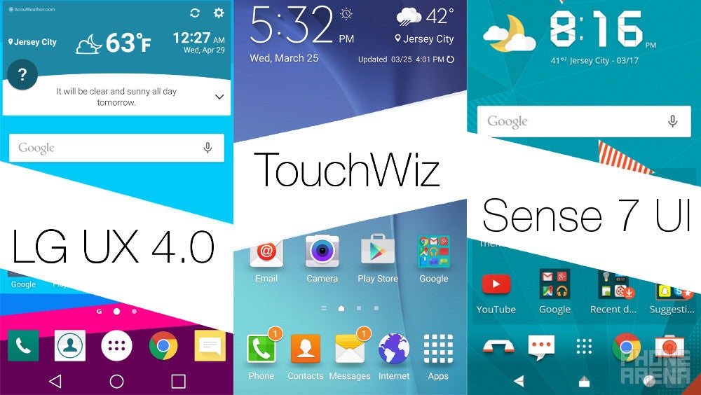
Just yesterday (April 28), LG unveiled its newest Android champion, the LG G4, that will wage war on the likes of Samsung, Apple, HTC, Sony, and the rest of its rivals.
Apart from the slightly improved internals and the revamped design, the G4 is mostly similar to the G3 in a number of key areas. The user interface one is among the departments that have received some love - the G4 comes with LG UX 4.0, the newest rendition of its user interface.
With all major players on the market having unveiled their newest interface offerings, we decided to put LG's newest UI against Samsung's toned-down TouchWiz and HTC's Sense 7 UI in a quick interface comparison. The latter came out victorious in one of our recent comparisons, beating Samsung's TouchWiz UI by a slight margin.
The app drawers on all three UIs are pretty standard and similar, though Sense once again has a hidden ace up its sleeve - one of the widgets on the home screen is contextually-aware and will change the apps and folders that appear in it according to your location and time of day. LG UX 4.0 also comes with a similar functionality - the Smart Notice widget is also touted as being contextually-aware and more "intelligent" than ever. Samsung, on the other hand, has decided to keep things simple and has not included a feature of the type in its newest TouchWiz. Which one's your favorite?
All three have made use of Lollipop's recent apps carousel to some extent. LG has thrown in the option to clear all of your active apps at once, as well as the option to launch the Dual Window multi-tasking feature. In the new TouchWiz, Samsung has also put a "Close All" button; HTC also allows you to do so but only if you enable the grid view of Sense 7's recent apps menu. Which one's your favorite?
One of the most essential apps of each and every smartphone is the dialer one. All three user interfaces provide you with an easy way to dial in a number, with LG UX 4.0 arguably in the lead - its buttons are slightly larger, thus easier to press. On the other hand, both TouchWiz and Sense 7 give have grid-like patterns between the different digits, making it a bit more easier to discern the individual buttons. Which one's your favorite?
It's pretty arguable which of the three provides a better organized way to show you your images and albums. In LG's camp, we have a large featured album with your photos at the top, while the rest of your albums are sorted right below it. In the meantime, TouchWiz treats you to small thumbnails of your albums, while Sense 7 exhibits landscape miniatures of your albums. Open an image and all three provide you with the most essential options - edit, share, delete, and others.
Despite the differences, we can safely say that all three user interfaces are pretty multimedia-oriented and are adorned with feature-rich music players. We are not quite sure which one's our favorite - the Material Design one in LG UX 4.0, the immersive music player in TouchWiz, or the clean solution that Sense 7 brings to the table? We'd love to hear your opinion on this topic.
Although they are not among the most interesting apps you have on your phone, you can't argue that the built-in calendar, calculator, and clock apps are not useful. Check how the three UIs fare against one another and cast a vote for your favorite right below.
Here's where things become interesting! All three UIs come with camera apps that have their strengths and weaknesses. It's important to say that each of the refreshed UIs gives you access to manual controls, different shooting modes, as well as features that set it apart from the competition. We're not going to scratch camera performance (we usually do that in our dedicated camera comparisons), yet we (read: you) are going to compare the camera apps of LG UX 4.0, TouchWiz, and Sense 7. Take a look at the screenshot collages we've combined below and vote for your favorite.
Is it going to beat LG UX 4.0 as well? It remains to be seen. As usual, we will compare the UIs in a few key areas and ask you which is the winner in each one. Voting will be open until May 6.
The trio is similar in terms of lock screen design. However, Sense UI sets itself apart as the only UI that offers more lock screen shortcuts. As usual, these are closely tied to the apps, shortcuts, or folders you have in the dock on your home screen. Surely, LG's UX 4.0 and the new TouchWiz also come with lock screen shortcuts - both allow you to access the camera and, in Samsung's case, the dialer. Which one's your favorite?
Lock screen and home screen
The trio is similar in terms of lock screen design. However, Sense UI sets itself apart as the only UI that offers more lock screen shortcuts. As usual, these are closely tied to the apps, shortcuts, or folders you have in the dock on your home screen. Surely, LG's UX 4.0 and the new TouchWiz also come with lock screen shortcuts - both allow you to access the camera and, in Samsung's case, the dialer. Which one's your favorite?
App drawer and notification drawer
The app drawers on all three UIs are pretty standard and similar, though Sense once again has a hidden ace up its sleeve - one of the widgets on the home screen is contextually-aware and will change the apps and folders that appear in it according to your location and time of day. LG UX 4.0 also comes with a similar functionality - the Smart Notice widget is also touted as being contextually-aware and more "intelligent" than ever. Samsung, on the other hand, has decided to keep things simple and has not included a feature of the type in its newest TouchWiz. Which one's your favorite?
Recent apps
All three have made use of Lollipop's recent apps carousel to some extent. LG has thrown in the option to clear all of your active apps at once, as well as the option to launch the Dual Window multi-tasking feature. In the new TouchWiz, Samsung has also put a "Close All" button; HTC also allows you to do so but only if you enable the grid view of Sense 7's recent apps menu. Which one's your favorite?
Dialer
One of the most essential apps of each and every smartphone is the dialer one. All three user interfaces provide you with an easy way to dial in a number, with LG UX 4.0 arguably in the lead - its buttons are slightly larger, thus easier to press. On the other hand, both TouchWiz and Sense 7 give have grid-like patterns between the different digits, making it a bit more easier to discern the individual buttons. Which one's your favorite?
Gallery
It's pretty arguable which of the three provides a better organized way to show you your images and albums. In LG's camp, we have a large featured album with your photos at the top, while the rest of your albums are sorted right below it. In the meantime, TouchWiz treats you to small thumbnails of your albums, while Sense 7 exhibits landscape miniatures of your albums. Open an image and all three provide you with the most essential options - edit, share, delete, and others.
Music player
Despite the differences, we can safely say that all three user interfaces are pretty multimedia-oriented and are adorned with feature-rich music players. We are not quite sure which one's our favorite - the Material Design one in LG UX 4.0, the immersive music player in TouchWiz, or the clean solution that Sense 7 brings to the table? We'd love to hear your opinion on this topic.
Calendar, calculator, and clock
Although they are not among the most interesting apps you have on your phone, you can't argue that the built-in calendar, calculator, and clock apps are not useful. Check how the three UIs fare against one another and cast a vote for your favorite right below.
Camera app interface
Here's where things become interesting! All three UIs come with camera apps that have their strengths and weaknesses. It's important to say that each of the refreshed UIs gives you access to manual controls, different shooting modes, as well as features that set it apart from the competition. We're not going to scratch camera performance (we usually do that in our dedicated camera comparisons), yet we (read: you) are going to compare the camera apps of LG UX 4.0, TouchWiz, and Sense 7. Take a look at the screenshot collages we've combined below and vote for your favorite.






Things that are NOT allowed: