LG Revolution Hands-on at CTIA 2011
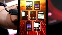
We came across in Orlando at what seems to be the final version of the LG Revolution, one of the hotly anticipated smartphones for Verizon's newly-crafted 4G LTE network.
The handset has changed since we handled the prototype, both inside and out. On the design front we will now have an entirely different battery cover. Back in black is what's in store for the retail version of the LG Revolution. The silver back cover from the prototype will be gone for good to give the Revolution a more streamlined black look, as per the rep's opinion. The metal strip in the middle of the back cover that seems to be a trademark for LG's high-end Android handsets lately, is still here, and still painted in black. It just gets lost in all the blackness of the phone's back.
And as all high-end LG handsets lately, the Revolution sports an HDMI port, below the volume rocker on the right side, for mirroring your phone's display on a big screen TV, although the phone has DLNA, too. Until DLNA-enabled TVs are the norm, and the standard is flawless, cabling up your phone to a larger display is an easy way to watch movies or play games on your TV via a smartphone, so we welcome the port's inclusion on the LG Revolution.
The software has also received some new twists, compared to the first version we saw, and for the better, judging from the short presentation that was given to us of the 2.0 version of the Optimus UI. The rep said these capabilities are already rolled to LG's European versions, and to some in the US, like the recently announced LG Optimus C for Cricket, but it was cool to see them demoed on the LG Revolution.
The other thing shown was something resembling the helicopter view in HTC Sense, for homescreen management, which looks more elaborate than what we have on the LG Optimus 2X, for instance. Most importantly, it shows that UI innovation is not stalling, and companies keep coming with new ideas to make our mobile lives easier.
Have a look at the short video presentation of what is most likely to be the final version of the LG Revolution LTE phone for Verizon:
The handset has changed since we handled the prototype, both inside and out. On the design front we will now have an entirely different battery cover. Back in black is what's in store for the retail version of the LG Revolution. The silver back cover from the prototype will be gone for good to give the Revolution a more streamlined black look, as per the rep's opinion. The metal strip in the middle of the back cover that seems to be a trademark for LG's high-end Android handsets lately, is still here, and still painted in black. It just gets lost in all the blackness of the phone's back.
The software has also received some new twists, compared to the first version we saw, and for the better, judging from the short presentation that was given to us of the 2.0 version of the Optimus UI. The rep said these capabilities are already rolled to LG's European versions, and to some in the US, like the recently announced LG Optimus C for Cricket, but it was cool to see them demoed on the LG Revolution.
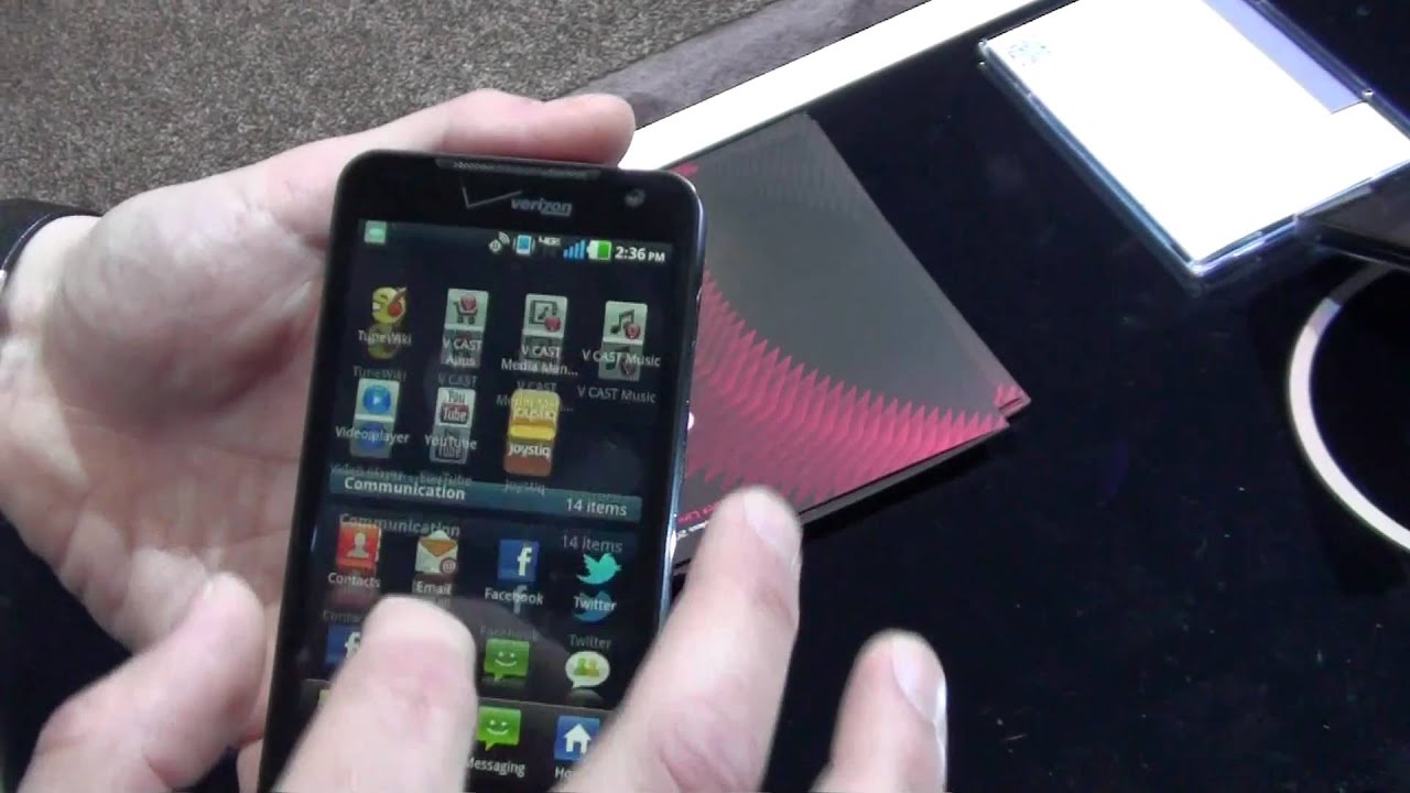
First off, both the apps in your main menu, and the contacts in your Phonebook can be categorized, and it takes a simple pinch with two fingers to take you from expanded list view to categorized view, where you can rearrange the categories at will. Looks quite handy, and something we can grow accustomed to use on a daily basis.
The other thing shown was something resembling the helicopter view in HTC Sense, for homescreen management, which looks more elaborate than what we have on the LG Optimus 2X, for instance. Most importantly, it shows that UI innovation is not stalling, and companies keep coming with new ideas to make our mobile lives easier.
Have a look at the short video presentation of what is most likely to be the final version of the LG Revolution LTE phone for Verizon:




Things that are NOT allowed: