LG G7 ThinQ vs Samsung Galaxy S9: Visual interface comparison
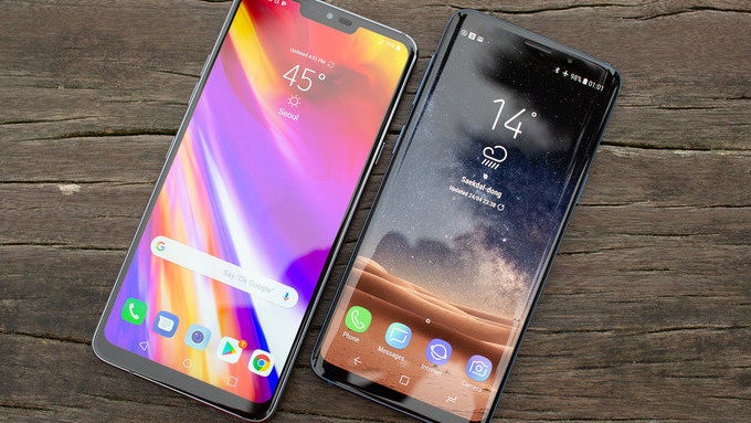
The LG G7 ThinQ was just recently unveiled as LG's latest flagship device, taking the mantle off of the LG G6 and bringing the company in 2018 with a loud bang. For what it's worth, the G7 ThinQ appears to be a very adequate answer to just about any of the more recent top-end flagship device that have been released so far, like the Galaxy S9/S9+ and the Huawei P20/P20 Pro.
We've already compared the interface of the LG G7 ThinQ with the one of its predecessor, revealing all the differences that LG has introduced, but what about the biggestone of the phone's biggest rivals, the Galaxy S9 and the Galaxy S9+?
Of course, as usual, there's only one way to find out. It's time to compare the G7 ThinQ and the Galaxy S9 and see how their interfaces look next to one another. Are there many diffferences? What about the similarities? Let's find out.
Of course, as usual, there's only one way to find out. It's time to compare the G7 ThinQ and the Galaxy S9 and see how their interfaces look next to one another. Are there many diffferences? What about the similarities? Let's find out.
Home screen
From the get go, it's quite easy to draw tons of similarities between the two home screens. Both LG and Samsung have opted for simplistic setups that are quite alike with their five-icon docks, the Google Search bar above, and a minimalist clock and weather widget near the middle of the screen.
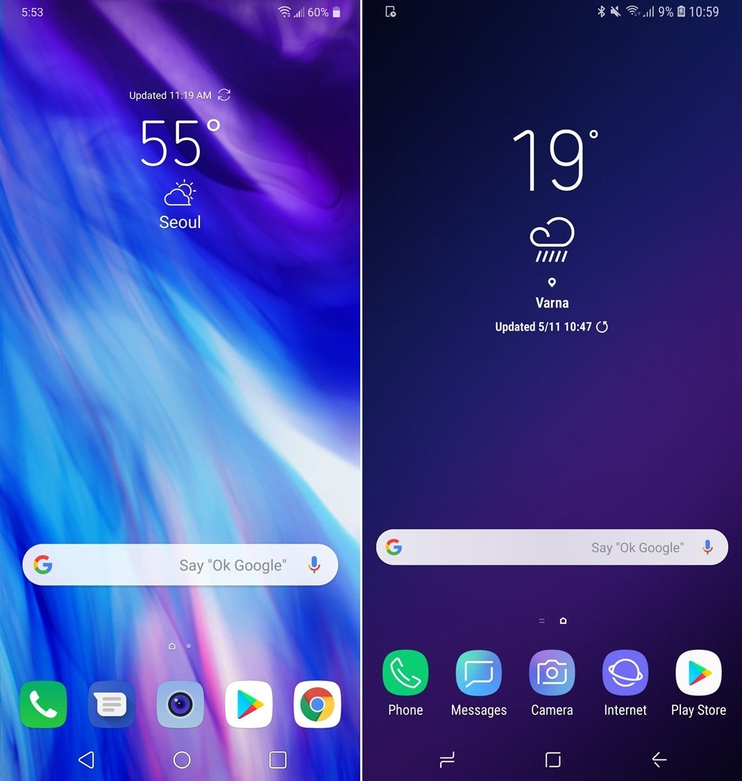
LG G7 ThinQ (left) vs Samsung Galaxy S9 (right)
Additional home screens
Both devices allow you to ditch the regular app drawer and go for all of your apps splattered across a couple of home screens, just like on iOS.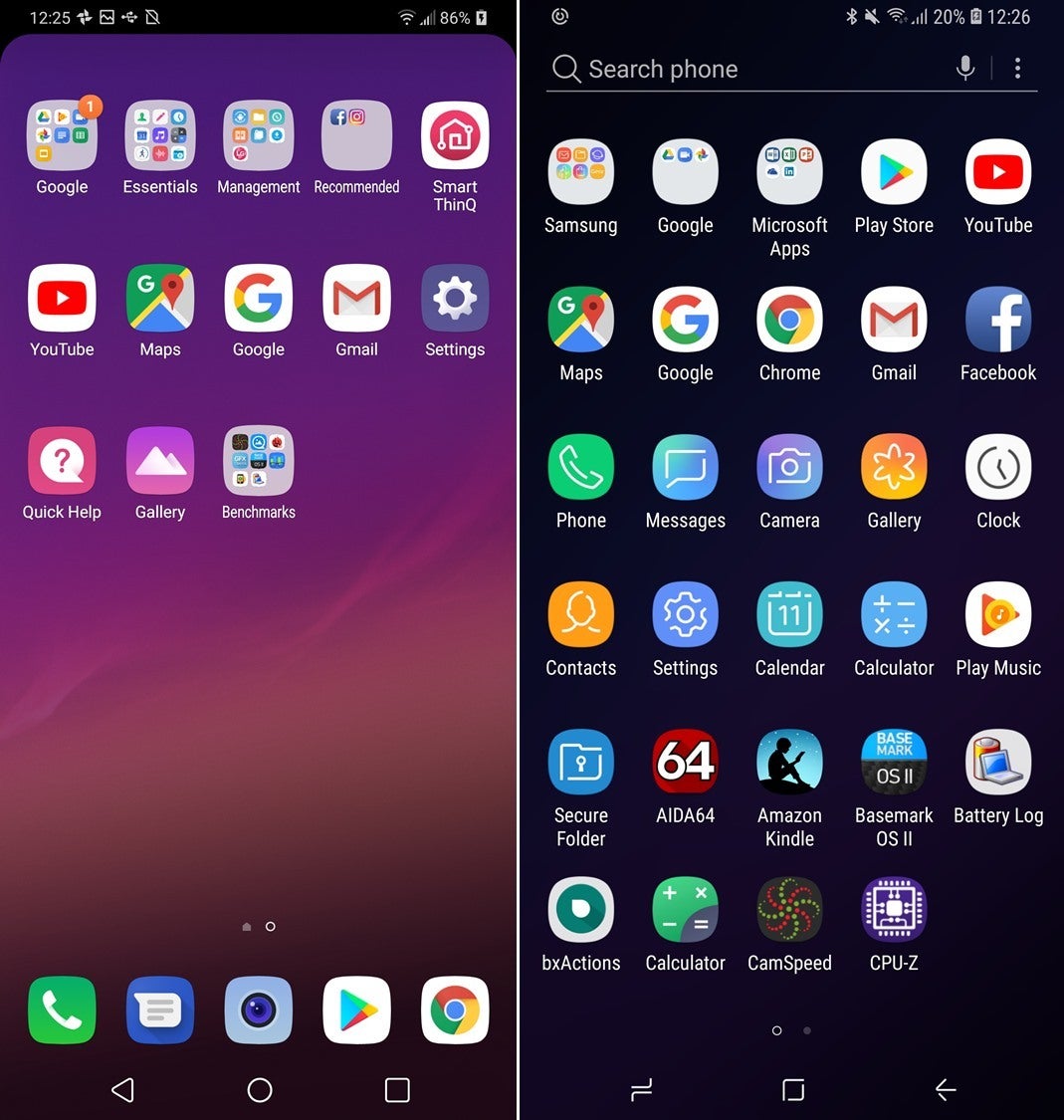
Quick settings and notifications
Expanding the quick settings and notifications bar once reveals another homage to minimalism. No text, just descriptive icons that easily reveal what functions is lying beneath. In case you're not fond of white backgrounds, tough luck - both devices feature such eyesore white backgrounds, but thankfully, users can customize these to their whims.
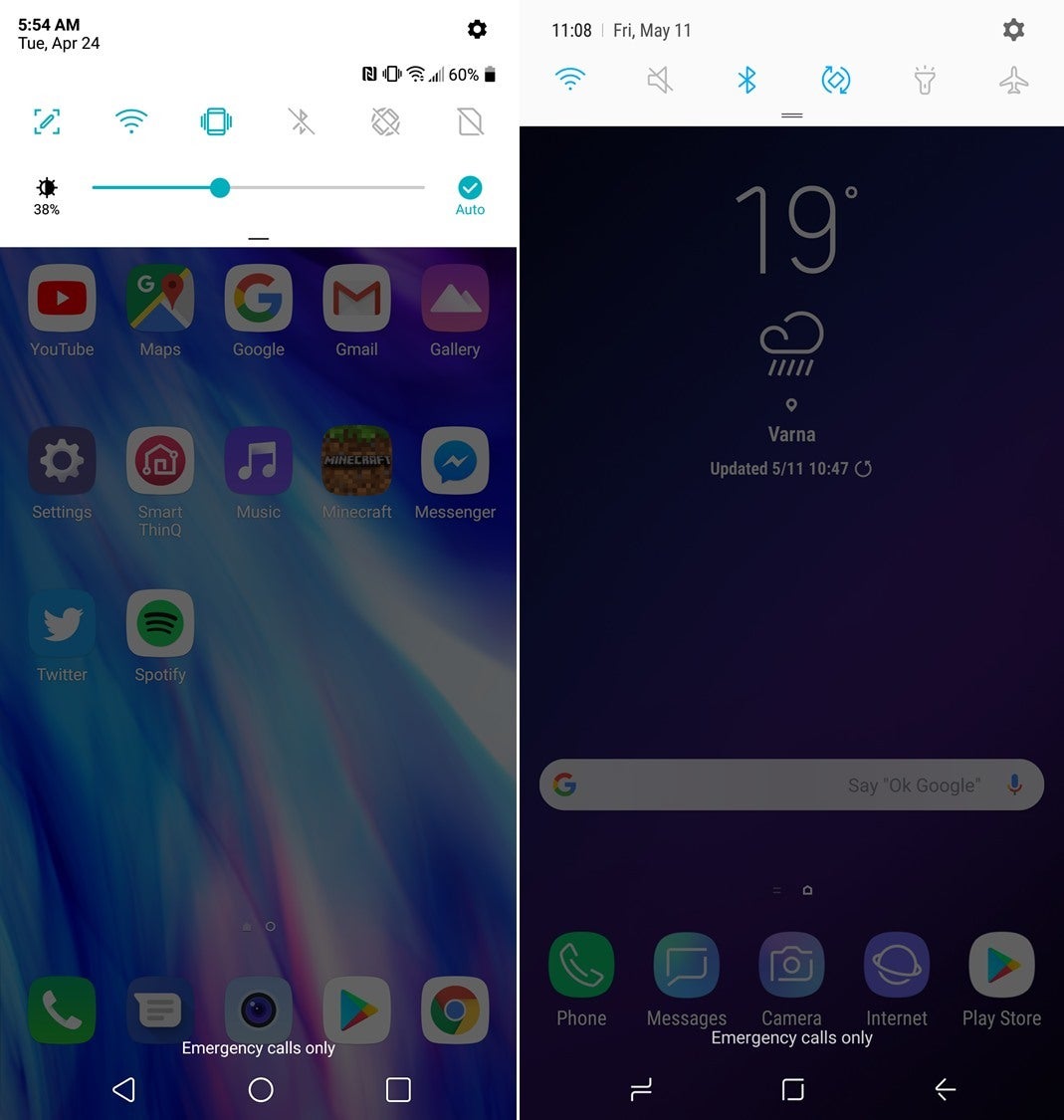
LG G7 ThinQ (left) vs Samsung Galaxy S9 (right)
Quick settings and notifications - expanded
Expanding the quick settings reveals that both LG and Samsung use a similar color shade - a bluish green for LG and a vivid blue for Samsung. In case you have developed a liking for Samsung's interface, switching over the LG's will certainly feel like home.
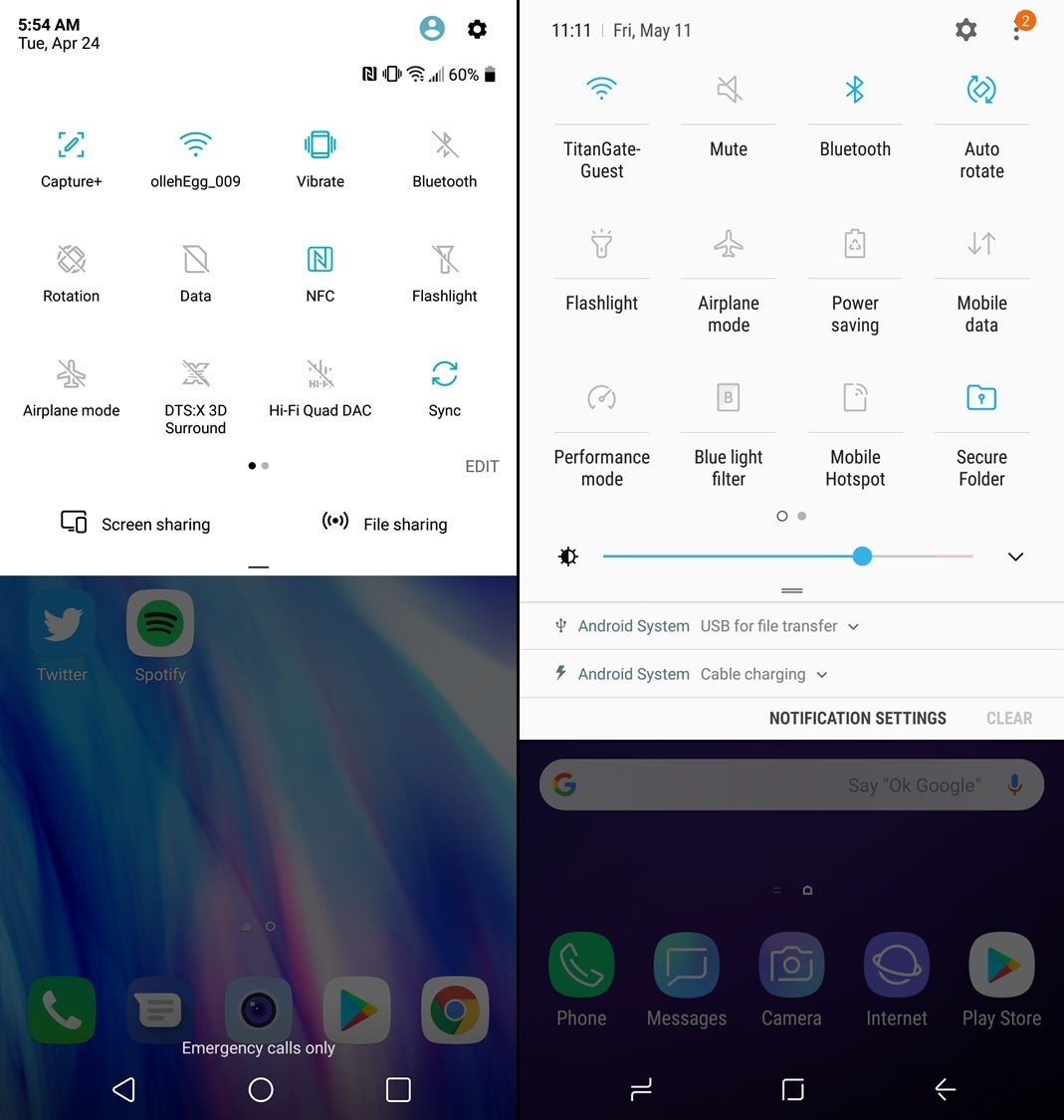
LG G7 ThinQ (left) vs Samsung Galaxy S9 (right)
Recent apps
Samsung has put its own swing on this app switcher business that most manufacturers leave unchanged and similar to the stock Android implementation. As a result, you get a more condensed implementation of the recent apps, whereas LG is mostly relying on whatever Google designed in stock Android. We can't really find a fault in that.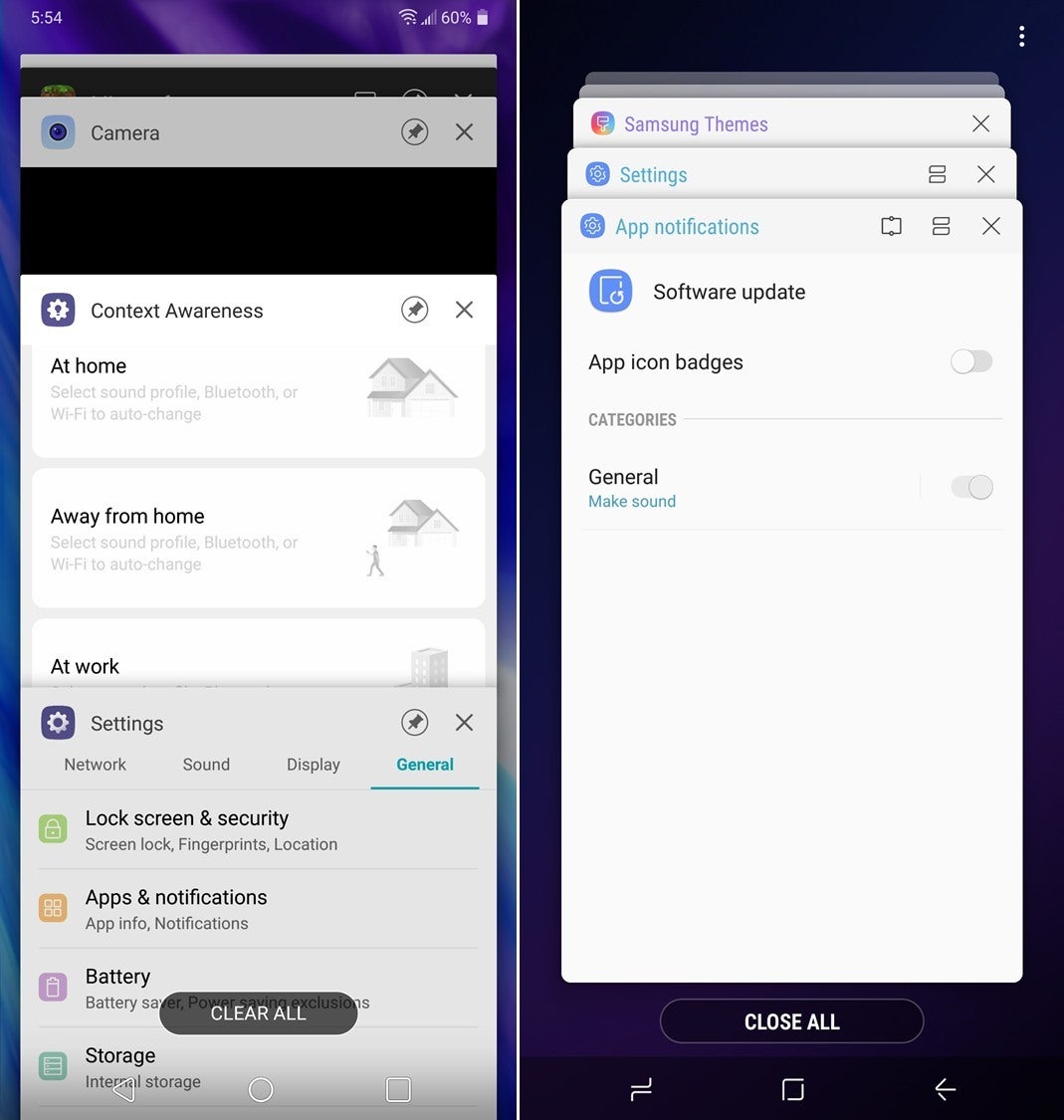
LG G7 ThinQ (left) vs Samsung Galaxy S9 (right)
Phone
The Phone app on both devices is quite intuitive and modern-looking, making it super-easy to find your way around and have all the essential features at your fingertips.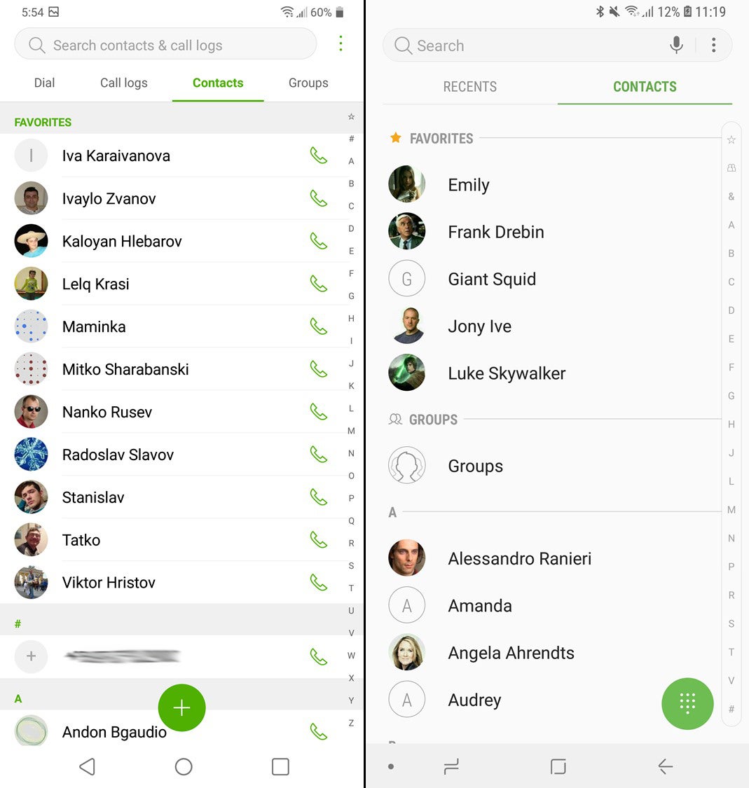
LG G7 ThinQ (left) vs Samsung Galaxy S9 (right)
Messaging
What's notable here is that LG has opted for a splash of color that makes the interface appear a bit more modern, whereas Samsung's implementation relies on a predominantly white interface.
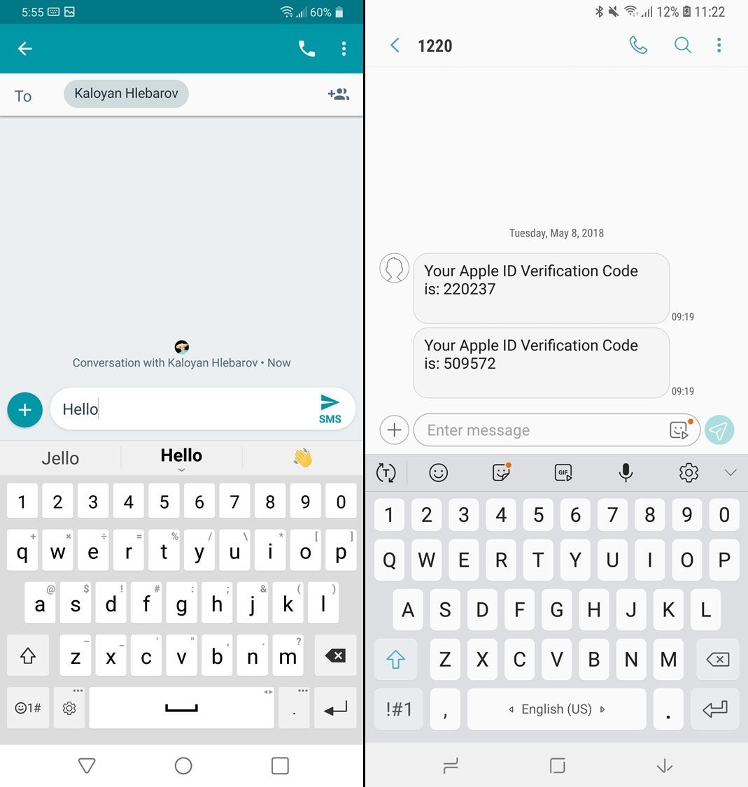
LG G7 ThinQ (left) vs Samsung Galaxy S9 (right)
Folders
Both devices feature full-screen folders that fill up the screen and are quite aesthetically pleasing. There are quirks with both - the Galaxy S9 features a nifty "Add apps" button on the bottom, whereas the LG has such a button right near the folder name field.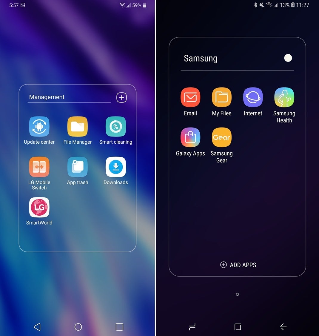
LG G7 ThinQ (left) vs Samsung Galaxy S9 (right)
Settings
Traditionally, LG separates the standard Settings menu of Android into four separate tabs that make it a bit easier to get to the desired option, and that's just exactly what you see on the LG G7 ThinQ. General, Display, Sound, and Network tabs make this normally-convoluted menu a bit more intuitive to get around. Samsung, on the other hand, has opted for a more succinct settings menu, with many features and functionalities hidden away and requiring you to use the built-in search function a bit more often.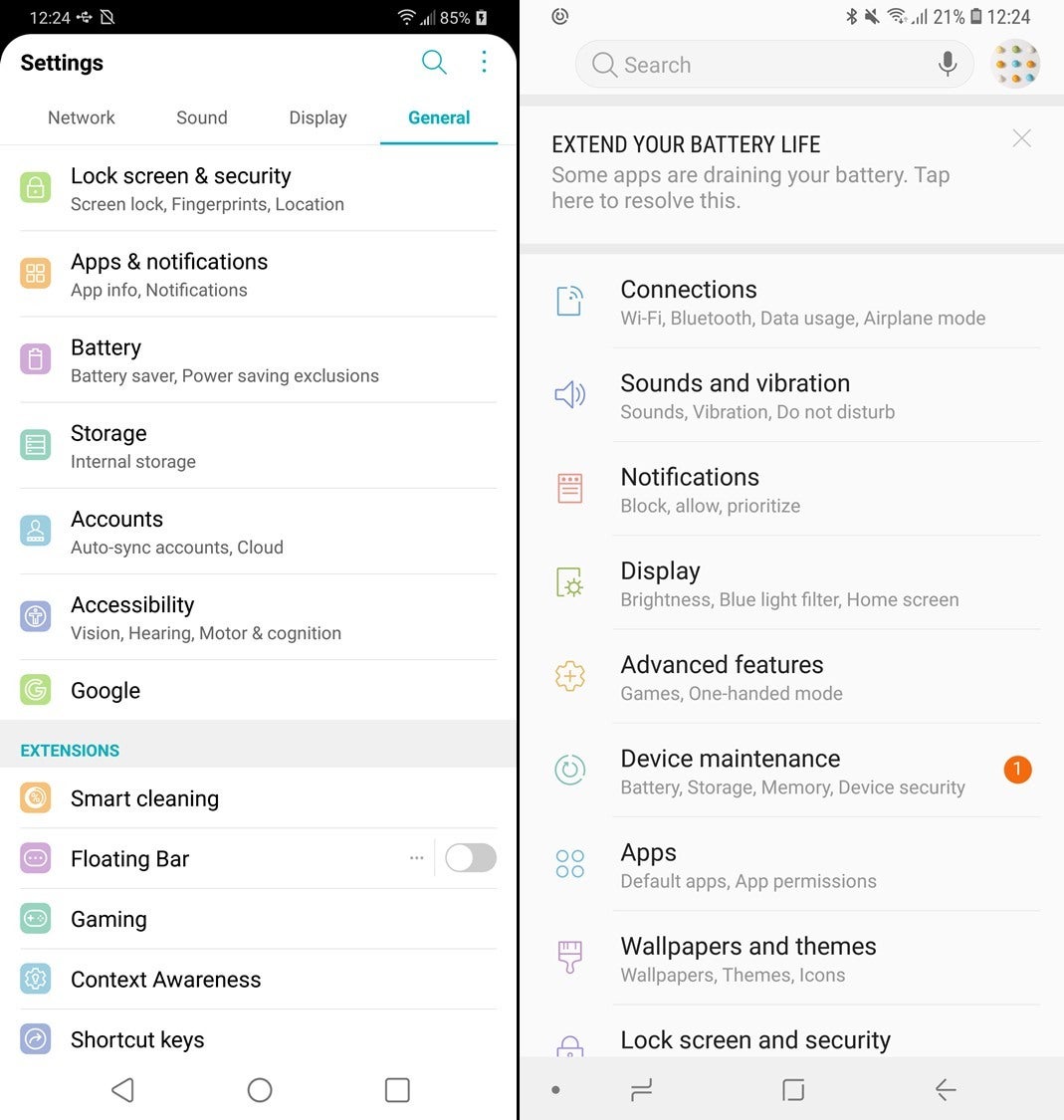
LG G7 ThinQ (left) vs Samsung Galaxy S9 (right)
Gallery
There isn't anything to compare here - both gallery apps put your photos front and center, making your own content the highlight of the app, just as it should be.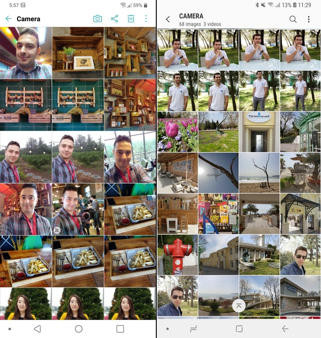
LG G7 ThinQ (left) vs Samsung Galaxy S9 (right)
Camera
When you flick open the camera of both devices, you will be greeted by two interfaces that have a couple of similarities. The interface of the LG camera app is opting for icons, whereas the Galaxy S9 puts its faith into good ol' non-ambiguous text. The camera switcher on the G7 ThinQ is at the top of the screen when positioned in landscape mode, whereas you will have to tap the zoom switcher in the right corner of the viewfinder with the Galaxy S9. Yet, both phones let you do that even more easily by simply sliding the shutter button up and down.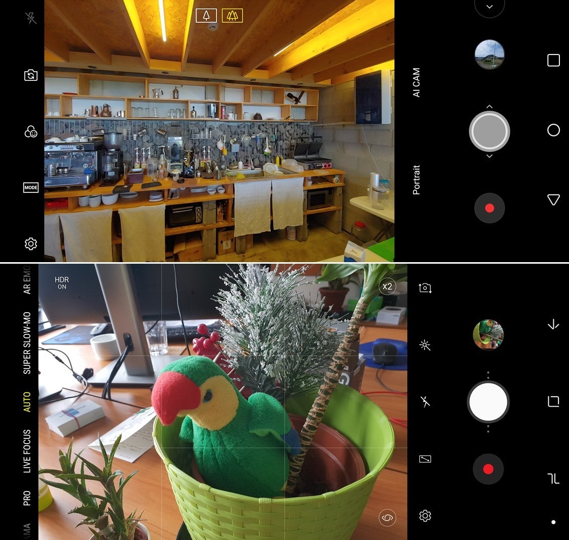
LG G7 ThinQ (top) vs Samsung Galaxy S9 (bottom)
In the end of the day, it's time to call quits and see who's in favor of either interface. Drop a vote in the poll we've embedded beneath and let us know which one stole your heart. Of course, vocal criticism is also welcome - we'd love to read your thoughts in the comments section below.
Which interface do you fancy more?
LG G7 ThinQ
51.73%
Samsung Galaxy S9/S9+
48.27%
Follow us on Google News



Things that are NOT allowed:
To help keep our community safe and free from spam, we apply temporary limits to newly created accounts: