LG G6 vs G5: User interface differences, a visual comparison
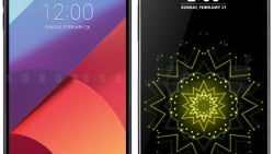
As the story goes, every major Android smartphone manufacturer has their own user interface on top of Google's operating system to separate themselves from the pack. And with every big smartphone release, the UI is evolved further — features are added and visuals get a facelift. After all, we can't have software looks staying the same, while hardware design evolves further.
As expected, the LG G6's interface looks different than the one on its predecessor. Partly to make use of the new 2:1-ratio display, partly to make the visuals more streamlined with the looks of the actual phone, and, of course, partly to add some extra pizzazz to the mix.
“But how different is it?” you might ask. Well, we took the G5 along for our hands-on with the new G6 and made some screenshots of the main screens and apps you are bound to use on a daily basis. Check out the gallery below for a side-by-side and our comments on what you're looking at.
“But how different is it?” you might ask. Well, we took the G5 along for our hands-on with the new G6 and made some screenshots of the main screens and apps you are bound to use on a daily basis. Check out the gallery below for a side-by-side and our comments on what you're looking at.







Things that are NOT allowed: