LG G5 (LG UX) vs Samsung Galaxy S7 (TouchWiz) vs Apple iPhone 6s (iOS 9): how they differ visually
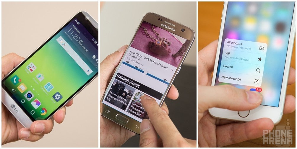
Smartphone interfaces have matured quite a bit, but they still have ways to go.
Thankfully, this isn't the case with any of the three top-shelf smartphones we've lined up here – the LG G5, Samsung Galaxy S7, and Apple iPhone 6s. Not only are they among the finest-looking, best-handling handsets available on the market, but each one is pretty much a breeze to use thanks to the combination of fast hardware and a polished user experience. Different as they are in terms of graphic design and organization, LG UX, Samsung TouchWiz, and Apple iOS 9 do share a common goal, which is presenting a wealth of functionality in a straightforward fashion. Featuring plenty of eye candy and being easy to get around, each is a delightful example of modern-day mobile computing.
LG G5 (LG UX) vs Samsung Galaxy S7 (TouchWiz) vs Apple iPhone 6s (iOS 9)
Also read:
Follow us on Google News





Things that are NOT allowed:
To help keep our community safe and free from spam, we apply temporary limits to newly created accounts: