Huawei MediaPad M1 hands-on: an 8-inch looking HTC One
Budget tablets are sometimes expected to have compromises somewhere to help justify the low cost associated to them. However, the Huawei MediaPad M1 doesn’t see much of that happening and can widely be argued for bucking the trend with its HTC One-like design and modest specs sheet. We’ll obviously delve into what it has to bring to the table, but just know that it’ll be bearing a price point of €299 when it’s released in several international markets later on in Q1 2014.
Design
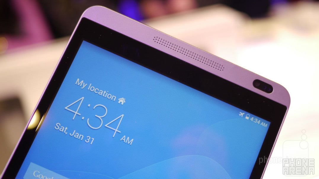
Right from the start, the design of the Huawei MediaPad M1 reminds us of the iconic design attached to the HTC One. Honestly, if we’re to place the prized smartphone right next to it, some people would probably agree that it’s a larger sized version of HTC’s flagship smartphone from last year.
So why does it look like the HTC One? Meticulously looking at the thing, we can name several elements that instantly remind us of the beloved flagship smartphone from HTC. Above and below the display, there are micro dots punched into the frame that make up its dual front-firing speakers. The resemblance is uncanny! It’s undoubtedly not an original design, but we’re still digging its looks nonetheless.
Display
Staring deeply into its 8-inch 800 x 1200 IPS display, we would’ve been more wowed if it employed a higher resolution, but regardless of that, we can’t complain either about what we’re given. Details are good, but not stellar – something we kind of expect with a slightly better than 720p resolution. Nevertheless, we’re pleased by the decent viewing angles, minimal distortion, and iridescent color production it’s able to deliver.
Interface and functionality
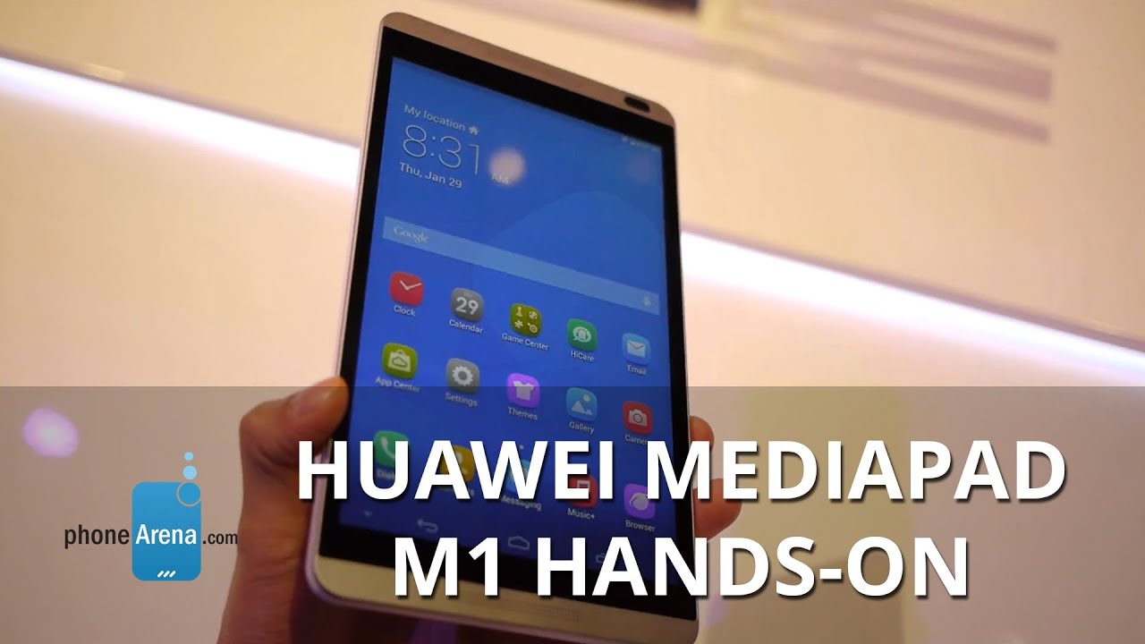
Much like the other new devices announced by Huawei during its MWC 2014 press conference in Barcelona, it’s running Huawei’s Emotion 2.0 UI on top of Android. Visually, the UI softens things by giving its set of widgets a “flatter” and more boxy look. Going with the theme of emotion, the colorful presentation helps to breath in some refreshing scenery with its experience. Oh yeah, there’s also a “Simple UI” option that dumbs down the presentation tremendously by eliminating the typical homescreen, and replacing it with colorful looking tiles a la Windows Phone – though, they’re not dynamic ones, but statics ones instead.
Processor and memory
Running a quad-core 1.6GHz processor, it seems to be an effective piece of silicon to handle most basic tasks. However, it lacks the snappiness that we’re accustomed to seeing with devices running Qualcomm’s Snapdragon 800 SoC. For the intended target, the Huawei MediaPad M1 isn’t meant to be a high flying thing. Rather, its focus is on consumers who are on a budget and plan to do simple things.
Two storage options will be available with the device: 8GB or 16GB. Needless to say, it would’ve been nice to see it offering higher capacities, but it’s worth mentioning that it has a microSD card slot for expansion.
Camera
There’s hardly anything impressive with its set of cameras, since it packs a 5-megapixel rear camera and a 1-megapixel front-facing one. Frankly, the tally of them both are widely regarded as average, so at least users have the convenience of snapping up photos whenever the opportunity arises – albeit, don’t expect its quality to be anything phenomenal.
Expectations
Huawei makes good low and mid-range devices, so it doesn’t shock us that the Huawei MediaPad M1 fits the bill. Certainly, the design of the tablet is sure to catch a few prying eyes, since it has a close resemblance to the HTC One, but we have to bear in mind that we’re getting a premium looking thing in a mid-range product. Cementing its worth in the field, the MediaPad M1 will sport a modest €299 ($411) pricing when it’s released in Europe, Russia, the Middle East, China, Japan, Asia Pacific, Australia and Latin America later on in Q1 2014.



Things that are NOT allowed: