How to use Portrait Lighting on iPhone 8 Plus / X
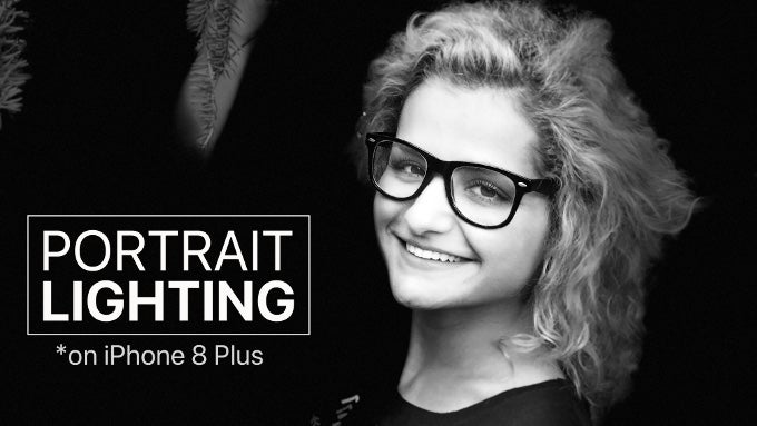
The iPhone X and iPhone 8 Plus come with a brand new camera feature: Portrait Lighting, and Apple says it is way more than just a filter. The company has allegedly spent countless hours setting up studio lights and studying the renaissance masters to understand and bring portrait lighting to your iPhone pictures without any additional real light and just a tap away.
Is this new Portrait Lighting really that great and what can you expect from it in real life?
We shot and analyzed over a hundred pictures with the new iPhone 8 Plus to see what Portrait Lighting is all about.
But first, let's take a look at the four light presets that come with it:
- Studio Light: lightens up the face with no harsh shadows
- Contour Light: highlights the edges of the face with deeper shadows, brightens up central parts of the face, creates more contrast
- Stage Light: same as contour light, but replaces the background to black, to isolate the subject
- Stage Light Mono: same as stage light, but converts the picture to contrasty and slightly grainy black and white
All of these effects are available when you open the iPhone camera in Portrait mode. They will not work in any other mode, and they will not work on the smaller iPhone 8. And yes, you can pick the right effect after you capture a picture, just remember to shoot in Portrait mode. One last important disclaimer: Portrait Lighting is still in Beta at the moment of this writing.
The big difference-maker here is the blurred background with Portrait Mode that really makes our beautiful model Betty stand out in the picture. But you can also see that the iPhone has a lot of trouble with that hair. You notice something right away when snapping pictures with Portrait Mode: the results look best for people with short hair, but the phone gets really confused when it's windy and you have to photograph somebody with a long hair. Portrait Mode itself is far from perfect: notice the weird artifacts around Betty's hand and around her hair, it all looks messy.
Next up, we have the Studio Light effect. The effect brings in extra light to the face and gives it more definition. The eyes are something that is key to a portrait and that's why professional photographers love shooting with studio lights: it brings that extra flare out in a typically darker region like the eyes. Here, Studio Light does not do anything extraordinary, but the slightly brighter overall tonality of the picture lightens up the eyes as well, which is nice. However, with this effect, this image becomes a bit too flat and devoid of nuance.
Secondly, we have the Contour Light effect. Notice the lower area of the cheeks: it's darker, while the nose and the central parts of the face are brighter, it's a bit like using Dodge & Burn in Photoshop, but the effect is not subtle at all, it's rather stark. In our picture, it almost looks as if someone changed the skin color of our model, it does not look natural at all, but if you are looking to make a bolder statement, this would do.
Thirdly, we have Stage Light. It cuts off the background completely and we have a portrait with a black background. The result is really not great. You can see parts ot the tree branches that should not be there, and a lot of Betty's hair and parts of her face are missing.
Disclaimer: Keep in mind that we took Portrait Lighting and Portrait Mode to test in challenging conditions. You can get better results on a brighter day and against a simple background. More on that in our upcoming review!
Lastly, we have Stage Light Mono. This black and white effect is so close to a filter, it's really hard to see why Apple thinks it is more than that. Is it a good filter, though? I think it is: it adds some grain to the image, which gives it that depth and artistic film look, and it has those memorable white and silver tones that contrast strongly and nicely. When our model saw this image she jokingly said: that would make a great obituary picture. So much for the artsy look! There is some truth to those words.
We took one more set of pictures with Betty just to doublecheck whether the issues with the hair were not accidental. But nope, it is all the same here: parts of the hair are missing and tree branches are mistakenly included in Stage Light photos.
We also took a picture of Nick at his desk here in the office, rocking that Mona Lisa smile. You can see how the Studio Light effect brings more life to the picture, cheers it up and hides some imperfections that show up more with age. Then, the Contour Light is way more dramatic and less subtle. Again, it makes a statement, but it almost makes the picture look unreal.
Stage Light works much better with this portrait of Nick. It's in our messy office, full of boxes and other items that simply mess up a great picture. Stage Light makes them disappear and creates a memorable portrait. Also, it works much better with Nick's short hair as it's able to pin-point his face almost perfectly. The mono look is also very punchy and looks stylish. We could start making a PhoneArena yearbook with those pictures!
We also had Peter re-enact August Rodin's The Thinker in our back yard. The Portrait Mode picture turned out a bit underexposed, but using Studio Light fixed a lot of that and gave it that more up-beat look. Contour Light was way more dramatic. Stage Light again had troubles separating the background properly and parts of it remained on Peter's hand (hey and his right hand was not supposed to be in that picture, right?).
Finally, yours truly posed for the new camera. I was the least lucky: the camera could not properly separate the background and cut off parts of my hair and ear. The Stage Light versions were particularly bad: I almost look like a Half-Life game character from those days when Half-Life was young and Counter Strike did not exist yet.
Final words
At the end of the day, we have to admit: we enjoyed playing around with Portrait Lighting on the iPhone 8 Plus.
It's all built in the camera and Photos app, and it's convenient and easy to use.
Portrait Lighting is in beta and it shows.
Is Portrait Lighting more than a filter, though, and is it the next revolution in photography? Hardly so. It's an effect that people will use, though, and this is what matters. As to all that talk about studying the Renaissance masters and photo studio lighting... well, we think that Michelangelo and Raphael's paintings will not be challenged any time soon. And most certainly not by Portrait Lighting in its current form.






Things that are NOT allowed: