How to get all the news, without even unlocking your device (Android)

Once you install Corgi, you are advised to turn off the system lockscreen, although you can still unlock your device using a fingerprint and Corgi's built-in security features, which include the standard swipe, pattern and pin options. Once you're done with the initial setup, you can then move on to customizing the way you'll be ingesting news in the future. To be fair, the app is not that rich in options and that's absolutely fine, considering that what's on offer is more than adequate in its scarcity. Corgi has two main ways of presenting news – in a feed and a magazine style – and we will go over both of them in a little more detail.
One swipe away from all the latest stories
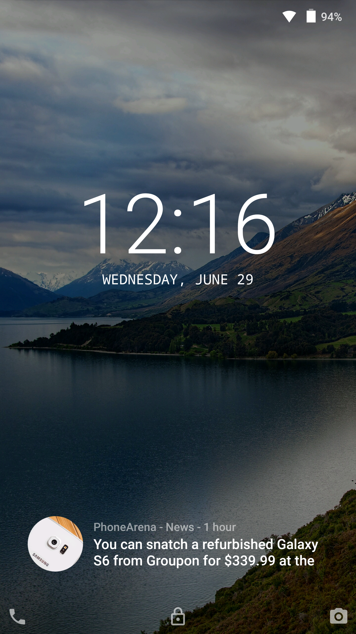
Let's start off with feed view, since it's our personal favorite. This option keeps things looking as close to the stock Android lockscreen as possible – swipe up from the left bottom corner to open the dialer app, swipe up in the middle to unlock the device and swipe up from the bottom right corner to get to the camera. There's also the very useful – in our opinion – but entirely optional “Hot News Widget”, which displays the latest headlines at the bottom of the screen and can be swiped over left and right for more headlines. The real deal however, is hidden to the right of the main lockscreen, and presents you with list of all your news in a Google-Now-esque card style. You can tap each card to expand the article, read it in Corgi's built-in browser, share it, or open it in your browser of choice, while Corgi remains as a floating bubble on top.
While scrolling the endless list of stories, you can always return to the top with a single press of the “Top” button, while a single pull down from there will refresh the entire list. It's really neat that if, say you scroll quite bit down the list and tap on an article to expand it, and then you unlock your phone to do some stuff and lock it again, when you come back to Corgi, it will remember where you left off and which articles have been expanded. You also have the option to choose a custom wallpaper, use the one on your homescreen or try the photo of the day feature.
If you don't like endlessly scrolling up and down, Corgi lets you do it left and right
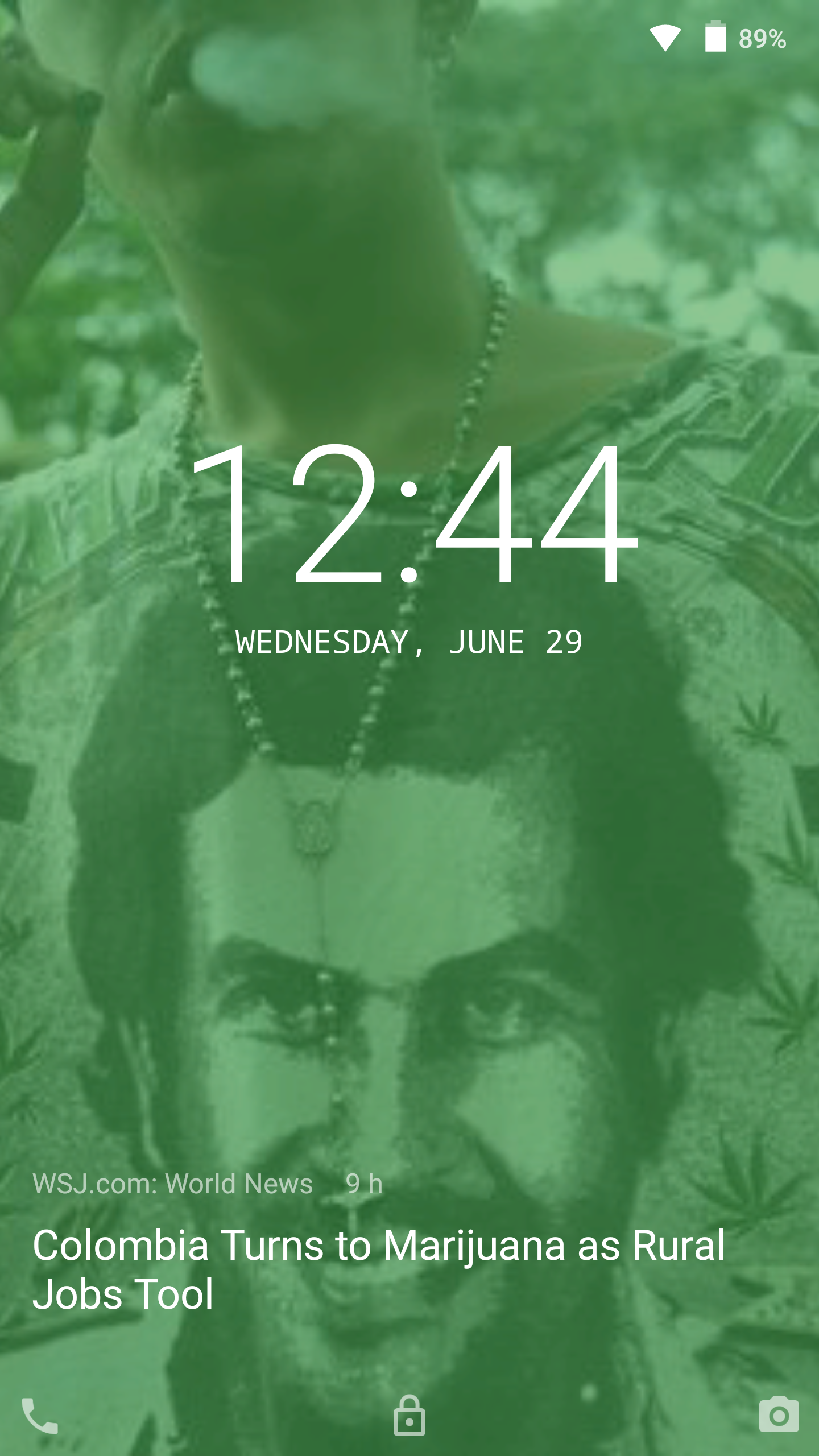
Now, let's take a look at the magazine view. This mode aims to emulate the experience of flipping through the pages of a magazine on your lockscreen. New stories take up the whole screen with their own image and a headline at the bottom. Articles without a header image fill the screen with a single solid color, that's chosen at random. You can see which colors are available in the options menu and disable the ones you don't like, as well as the color tint that's added on top of headers. Double tapping an article expands it and gives you the same options of reading and interacting with it as described above. The magazine view is a cool option, and it's actually what Corgi initially began with, but it just doesn't hold a candle to the more refined feed mode, in our opinion at least.
In magazine view, once you swipe away from the first article on the lockscreen, you can't access the notifications menu anymore – which by the way is not your system's menu, but a built-in one – and any notifications will also “stick” to that initial page, so you have to go back in order to read them. Let's hope that this mode will be improved upon in future versions.
We've been playing around with Corgi for some time now, and we can confidently say that it's gotten much, much better since its initial release and that it's the best app for getting all the news straight to your lockscreen right now. Don't take our word for it though, try it for your self, it's completely free. Download Corgi on the Play Store.






Things that are NOT allowed: