Here's how Google looks seen through 14 different Android browsers
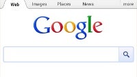
Android is known for the variety of options it offers and when it comes to browsers you have tons of choice. Google alone makes you choose between the stock Android browser and the recently released mobile version of Chrome.
For most, picking the ideal browser is a judgment based on its combined speed and looks appeal, and if you’re the one preferring the design and visual part, you won’t regret checking out how Google’s home page looks in 14 different Android browsers.
Google’s own Chrome and Android stock browser are at the beginning of the comparison, and it also includes some of the more popular browsers out there like Dolphin, Opera and Firefox. With it you can judge literally judge a browser by its front cover. The front cover of the Internet seems to be Google for most, and it renders very differently from the simplistic Chrome to the miniature Opera fonts.
Check out all the images below and let us know - which one you like best? Why?
source: Brad Frost via TheVerge







Things that are NOT allowed: