Hands-on with the Motorola DEVOUR
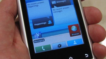
The Motorola DEVOUR A555 (formally known as the Calgary) is expected to be released by Verizon Wireless any day now as it will follow on the heels of the popular Motorola DROID and HTC DROID ERIS. The Motorola DEVOUR and DROID are both about the same physical size overall, though the first thing we noticed is that the display on the DEVOUR was smaller (3.1" compared to 3.7") and has a lower resolution (320x480 opposed to 480x854), which makes it similar to the display on the HTC DROID ERIS. However, images on the screen looked good and text was clear enough to read. The silver and black body with blue accents has a more distinctive look to it than the all-black DROID, and while it may not feel as robust as the DROID, it's still made of aluminum and not plastic, which is a definite plus. The internal QWERTY keyboard has individual buttons this time around and the number keys have their own row. This, combined with the space between the keys, makes typing on the DEVOUR a bit more user-friendly than the one-piece keyboard on the DROID. Though the optical d-pad on the DEVOUR can take some practice, as its tracking of movement is a bit finicky.
The DEVOUR runs on Android 1.6, so it's a bit behind the DROID in that aspect, but it is the first smartphone on Verizon to come with the MOTOBLUR user interface, which we've seen before on the Motorola CLIQ. It combines all of your social networking (such as Facebook, Google, MySpace, and Twitter) with your Email, Messaging, and Calendar and shows them on any the 5 homescreens via widgets. It is a nice feature and is simple to use, though not as polished as the Sense UI on the HTC DROID ERIS, as there are some differences in functionality between them.
So far in the short time that we've used the Motorola DEVOUR, it seems like a nice device, but be sure to check back for our upcoming in-depth review as we put the DEVOUR through its paces.






Things that are NOT allowed: